Proven Seattle Met email designs you can use
1. Where Does the Eastside End?
Objective
This email aims to introduce a refreshed editorial format for Seattle Met Daily by offering readers context and behind-the-scenes insight into the publication’s thinking, while engaging them with locally relevant stories that spark curiosity and conversation about regional identity and culture.
Why this works
The email opens with a personal editorial note that humanizes the brand, explaining the redesign as a thoughtful evolution rather than a random change, which builds trust and invites readers into the editorial process instead of just broadcasting updates.
How to implement
By leading with a provocative, regionally specific question, 'Where does the Eastside end?', the campaign taps into local identity and debate, turning a simple newsletter into a conversation starter that encourages readers to reflect, engage, and share their own perspectives.
Pro Tip
The primary CTA 'Read More' is repeated identically across all content blocks, diluting urgency and reducing click-through potential; tailoring CTAs to each article’s tone (e.g., 'Discover the Debate' or 'Plan Your Fall Hike') would better match intent and increase engagement. • The hero image featuring a giant question mark over a scenic view is visually striking but lacks immediate context; adding a short sub-headline or tagline directly on the image (e.g., 'The Eastside Debate Starts Here') would clarify the purpose and improve scroll-to-action conversion.
2. 🏃 Running Into 2026 Like...
Objective
This email aims to engage readers by shifting the traditional New Year’s self-improvement narrative toward community-driven fitness, specifically spotlighting Seattle’s local running clubs as a fresh, social way to start 2026. It also promotes local culture and events to deepen reader connection to the city.
Why this works
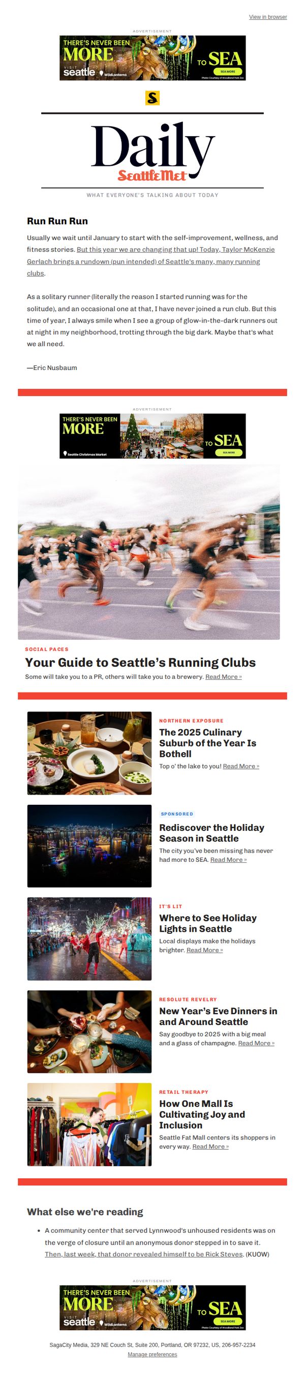
By reframing New Year’s resolutions around community running clubs instead of solo goals, the email taps into social motivation and local pride, making self-improvement feel less intimidating and more like a shared, joyful experience rooted in Seattle’s identity.
How to implement
The playful tone and personal anecdote from the writer humanize the content, turning a generic fitness topic into a relatable, neighborhood-level story that invites readers to see themselves as part of the scene, not just observers of it.
Pro Tip
Add a clear, visually distinct CTA button beneath the hero image, such as 'Find Your Running Club', to convert passive readers into active explorers, rather than relying solely on the generic 'Read More' links scattered throughout the content. • Include a short, scannable list or map graphic of top 3 running clubs with meeting times/locations directly under the hero section to reduce friction for readers who want to act immediately after being inspired by the story.
3. 🍜 Inside the Mind of a Ramen Genius
Objective
This email aims to engage readers with a compelling food story centered on a local chef’s creative ramen hack, while also promoting Seattle Met’s broader content ecosystem through curated articles and sponsored features. It seeks to position the brand as a cultural curator of Seattle’s food and lifestyle scene.
Why this works
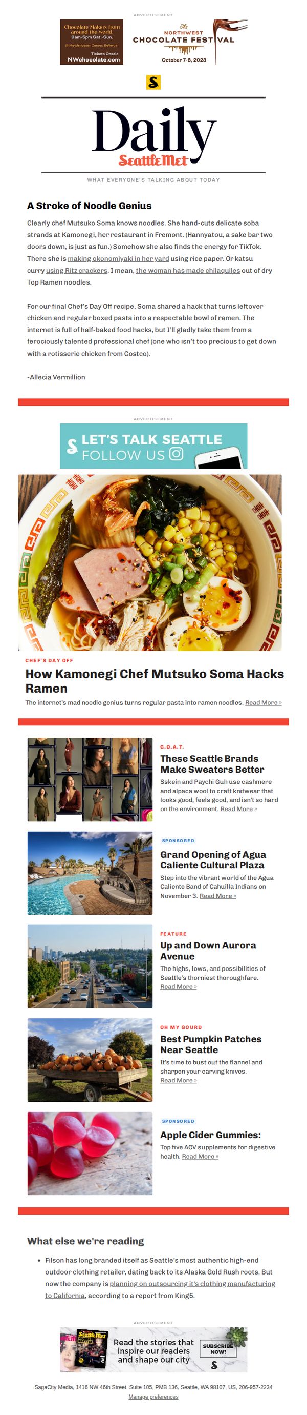
The email brilliantly humanizes a chef by spotlighting quirky, relatable hacks, like turning Costco rotisserie chicken into ramen, making gourmet creativity feel accessible and fun for everyday home cooks.
How to implement
By weaving in TikTok energy and backyard experiments, the campaign taps into Gen Z and millennial food culture, positioning Seattle Met as a bridge between professional culinary art and viral, DIY food trends.
Pro Tip
The primary CTA 'Read More »' is visually underwhelming and buried beneath the hero image; it should be larger, bolder, or button-styled to create stronger visual hierarchy and drive more clicks to the main story. • The email lacks a clear visual or textual transition between the main feature and the 'What else we’re reading' section, which could confuse readers, adding a subtle divider or subheader like 'More Stories You’ll Love' would improve flow.
4. Bulk-Size Feelings About Costco | Farewell to Bitterroot BBQ | Blake Island's Uncertain Future
Objective
To engage local readers with curated, culturally relevant stories that reflect Seattle’s evolving lifestyle, food scene, and community identity while reinforcing Seattle Met’s role as the go-to source for insider city insights.
Why this works
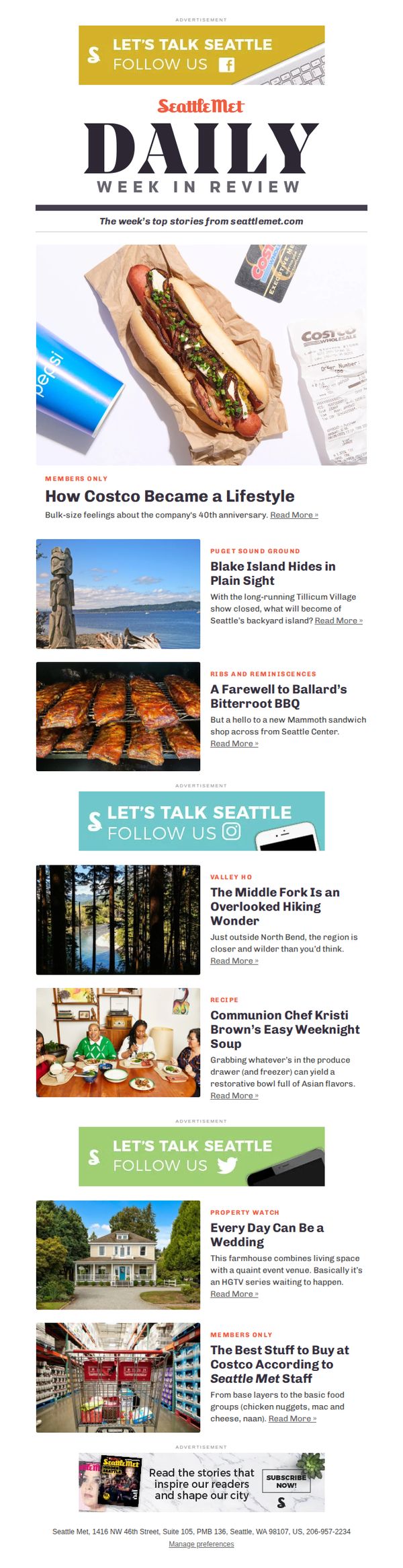
The email opens with a visually rich, emotionally resonant hero image that ties Costco’s cultural impact to everyday Seattle life, making a corporate milestone feel personal and relatable to readers.
How to implement
By blending nostalgia, local history, and forward-looking curiosity, like the Blake Island story, it creates narrative tension that compels readers to click, not just because of information, but because of emotional investment in the city’s future.
Pro Tip
The CTA 'Read More »' is repeated identically across all articles, reducing urgency and differentiation, consider customizing CTAs per story (e.g., 'Discover the Secret Trail' or 'Taste the Farewell BBQ') to match emotional hooks and boost click-through rates. • The email lacks a clear visual hierarchy guiding the reader from top to bottom; adding subtle dividers, section headers with color accents, or directional arrows would improve flow and help readers prioritize content based on interest.
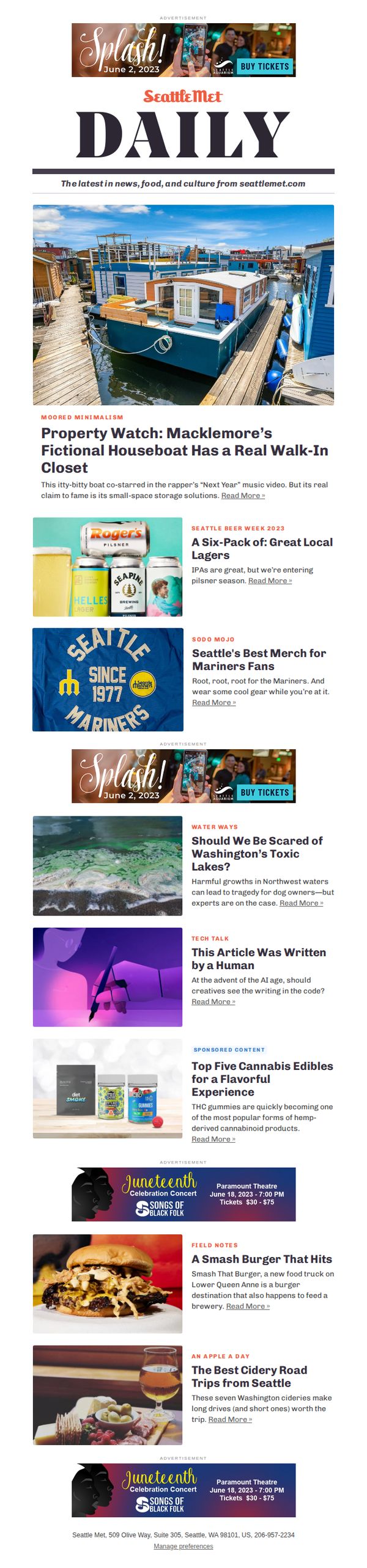
5. Macklemore's Fictional Houseboat | Great Local Lagers
Objective
This email aims to engage local readers with curated, culturally relevant content that highlights Seattle’s unique lifestyle, from celebrity-adjacent real estate to local beer and food scenes, while subtly promoting events and sponsored content to drive traffic and brand loyalty.
Why this works
The email opens with a visually arresting hero image of Macklemore’s fictional houseboat, immediately anchoring the reader in local pop culture while teasing a quirky, human-interest story that feels both exclusive and relatable to Seattleites.
How to implement
By weaving in seasonal themes like ‘Seattle Beer Week’ and ‘Juneteenth Concerts,’ the campaign smartly ties editorial content to timely, community-driven events, creating natural urgency and relevance without overt sales pressure, which builds trust and habitual readership.
Pro Tip
The primary CTA 'Read More' is generic and repeated across every article; customizing CTAs to reflect each story’s hook (e.g., 'See the Closet That Stole the Show' or 'Grab Your Pilsner Picks') would increase click-through rates by aligning with user intent. • The email lacks a clear visual hierarchy for sponsored content, adding subtle badges like 'Sponsored' or 'Partner Feature' near ads would improve transparency and trust without disrupting the editorial flow, especially for readers sensitive to native advertising.