Semaine email designs from top brands
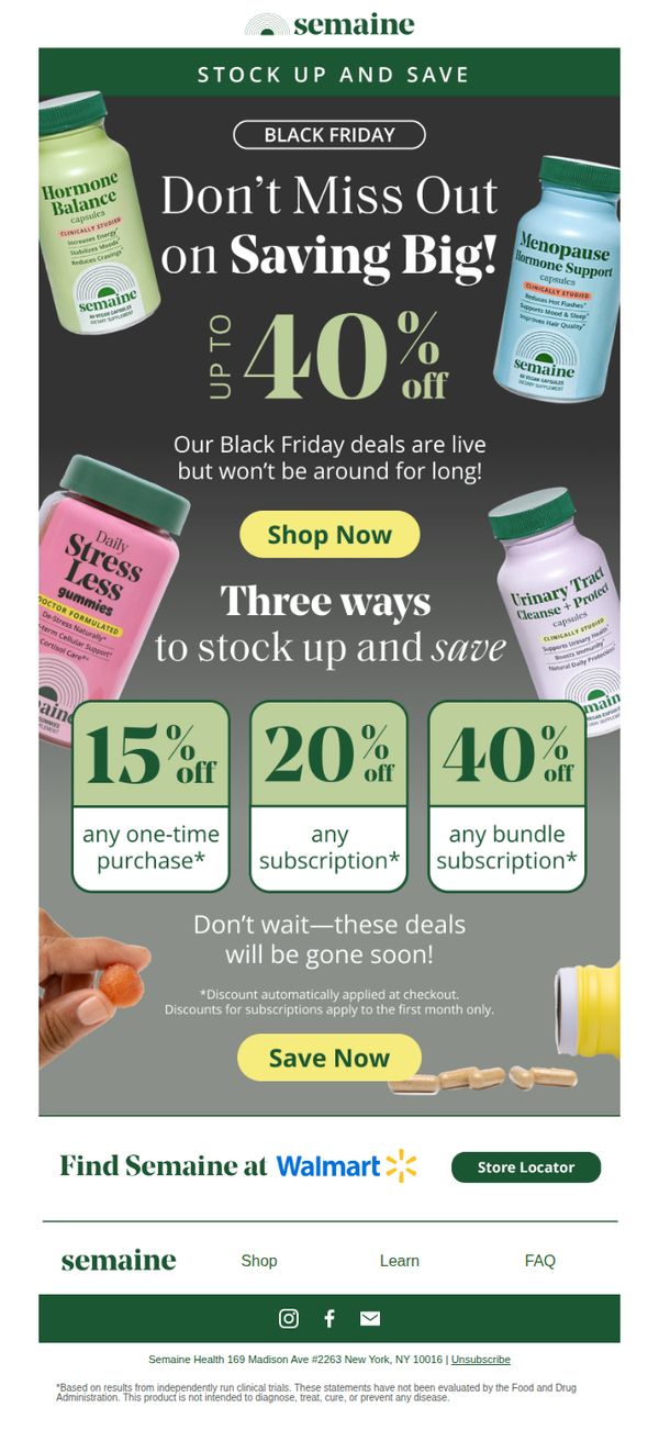
1. The Biggest Sale of the Year is Here! 🎊
Objective
This email aims to drive immediate purchases by highlighting Semaine’s Black Friday sale with tiered discounts, encouraging customers to stock up on supplements while creating urgency through time-limited offers and clear savings breakdowns.
Why this works
The email brilliantly uses tiered discounting, 15%, 20%, and 40% off, to guide customers toward higher-value subscription bundles, subtly nudging them toward long-term loyalty while making the savings feel personalized and achievable.
How to implement
By visually anchoring each discount tier to a specific product bottle and using bold, contrasting color blocks, the email transforms complex pricing into an intuitive, scannable visual hierarchy that reduces decision fatigue and accelerates conversion.
Pro Tip
Add a small visual indicator (like a red badge or pulsing border) around the 40% off bundle offer to draw the eye to the highest-value conversion path, since it’s the most profitable for the brand and most beneficial for the customer. • Include a micro-testimonial or social proof snippet near the ‘Save Now’ CTA, such as ‘Over 10,000 customers stocked up last week’, to reduce hesitation and reinforce that the deal is trusted and popular.
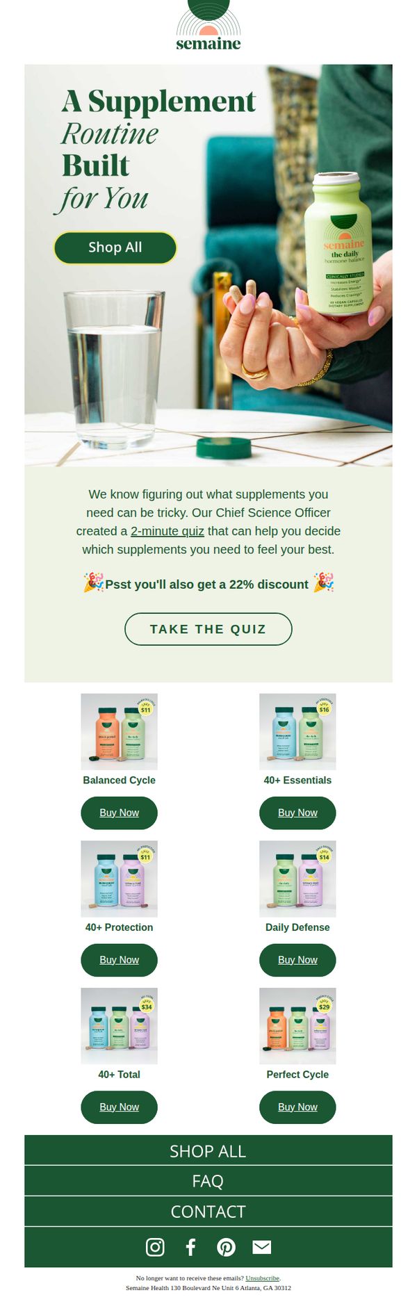
2. Powerful Hormonal Support ✨
Objective
This email aims to guide subscribers toward personalized hormonal supplement routines by offering a quick, science-backed quiz that recommends products tailored to their needs, while incentivizing immediate action with a 22% discount.
Why this works
The email brilliantly reduces decision fatigue by positioning the quiz as a personalized, science-backed solution, not just another marketing gimmick, which builds trust and makes the user feel understood before they even click.
How to implement
By anchoring the discount to the quiz completion rather than a direct product purchase, the campaign turns a transactional offer into an experiential reward, increasing engagement while subtly guiding users toward higher-intent product recommendations.
Pro Tip
Add a subtle countdown timer or urgency indicator near the 22% discount offer to increase conversion pressure without disrupting the calm, trustworthy tone of the email. • Include a short testimonial or user result snippet under the quiz CTA, e.g., '92% of users found their perfect match in under 2 minutes', to reinforce social proof and reduce quiz abandonment.
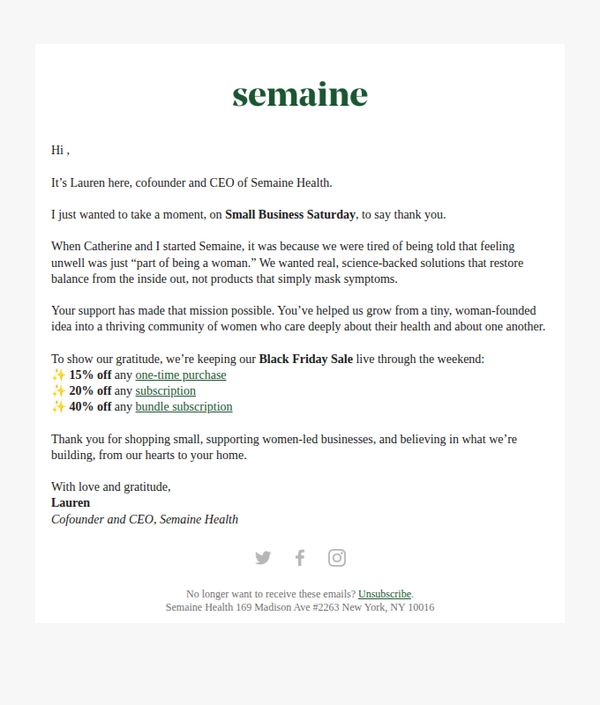
3. A Note from One of Our Founders 🩷
Objective
The email aims to express heartfelt gratitude to customers on Small Business Saturday while extending Black Friday discounts as a gesture of appreciation, reinforcing brand loyalty and encouraging immediate purchases from a mission-driven, women-led business.
Why this works
The email opens with a personal, founder-led message that humanizes the brand and builds emotional trust by tying the sale to a larger mission of women’s health and community support, making the discount feel like a shared celebration rather than a transaction.
How to implement
By anchoring the promotion to Small Business Saturday, the brand taps into cultural momentum and customer values, supporting women-led businesses, turning a discount into a meaningful act of solidarity that deepens customer connection beyond price alone.
Pro Tip
Add a visual hero banner or product image above the founder’s note to immediately capture attention and reinforce the brand’s aesthetic, since the current text-only layout risks losing visual engagement before the emotional message lands. • Include a clear, button-style CTA for each discount tier (e.g., 'Shop One-Time Purchase', 'Start Subscription', 'Grab Bundle') directly under the offer list to reduce friction and guide users toward the action that best matches their intent.
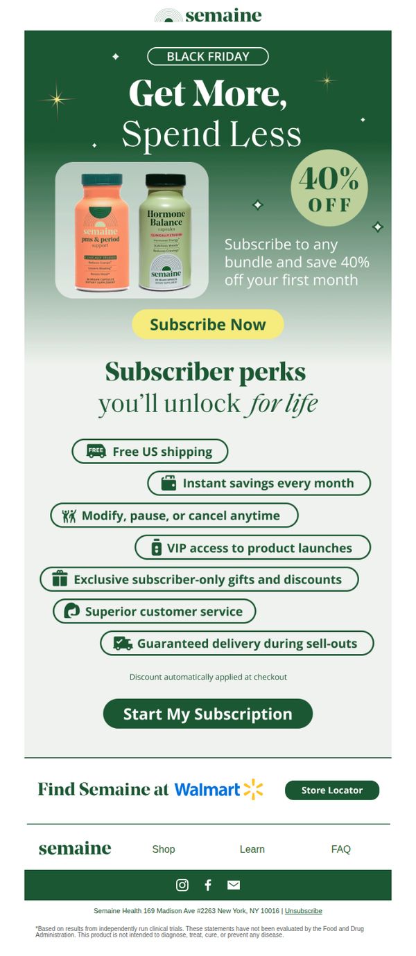
4. Black Friday Came Early! 🥳
Objective
This email aims to drive immediate subscription sign-ups by promoting an early Black Friday deal, 40% off the first month, while highlighting long-term subscriber benefits to reduce perceived risk and increase conversion. It leverages urgency and value stacking to turn casual browsers into committed customers.
Why this works
The email brilliantly frames the discount as a gateway to lifelong perks, not just a one-time sale, this transforms a transactional offer into a relationship-building moment that appeals to long-term value seekers.
How to implement
By visually anchoring the 40% discount next to product imagery and using a bold, contrasting CTA button, the design eliminates friction and guides the eye directly to the conversion point without overwhelming the user.
Pro Tip
Add a countdown timer near the CTA to reinforce urgency, since this is a Black Friday promotion, time-sensitive pressure could significantly boost conversions by making the offer feel exclusive and fleeting. • Include a short testimonial or social proof near the product images to validate the efficacy of the supplements, especially since health products require higher trust before purchase.
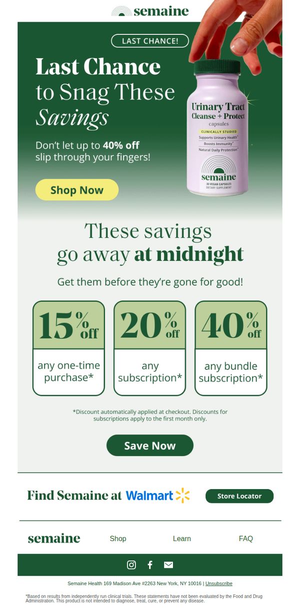
5. 📣 Last Call for Black Friday Deals!
Objective
This email aims to drive immediate purchases by emphasizing urgency and limited-time Black Friday discounts, encouraging subscribers to act before the sale ends at midnight. It targets both new and returning customers with tiered savings based on purchase type.
Why this works
The email leverages time-sensitive urgency with a clear deadline, ‘These savings go away at midnight’, which psychologically nudges hesitant buyers to act immediately rather than delay their decision.
How to implement
It smartly tiers discounts to match customer behavior: one-time buyers get 15%, subscribers get 20%, and bundle subscribers unlock the highest 40% savings, which incentivizes higher lifetime value through subscription commitment.
Pro Tip
Add a countdown timer above the 'Save Now' button to visually reinforce urgency and create real-time pressure, which can increase conversion rates by making the deadline feel more immediate and tangible. • Include a short testimonial or customer review near the offer section to build social proof, especially since the product is clinically studied, a real user quote could bridge trust gaps for skeptical first-time buyers.
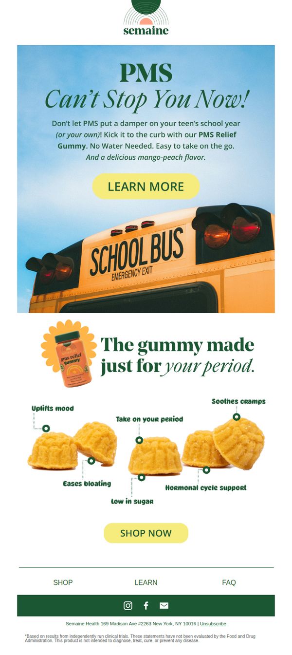
6. Back to School Without the PMS 🏫
Objective
This email aims to reposition the brand’s PMS Relief Gummy as an essential back-to-school tool for teens and parents, reframing period discomfort as a manageable hurdle rather than a disruption to academic life. It leverages seasonal timing to drive immediate purchases with a playful, empowering tone.
Why this works
The email brilliantly ties a health product to a cultural moment, back-to-school, making PMS relief feel timely and relevant rather than clinical, which helps normalize the conversation while driving urgency through seasonal alignment.
How to implement
By visually anchoring the product to a school bus and using phrases like 'Can’t Stop You Now!', the campaign transforms a potentially embarrassing topic into an empowering, rebellious statement that resonates emotionally with teens and their caregivers.
Pro Tip
Add a subtle countdown timer or urgency indicator near the 'SHOP NOW' CTA to capitalize on back-to-school timing, since the current design lacks temporal pressure despite the seasonal hook. • Include a short testimonial or user quote near the product grid to build social proof, especially from a teen or parent, since the current layout relies solely on functional claims without emotional validation.
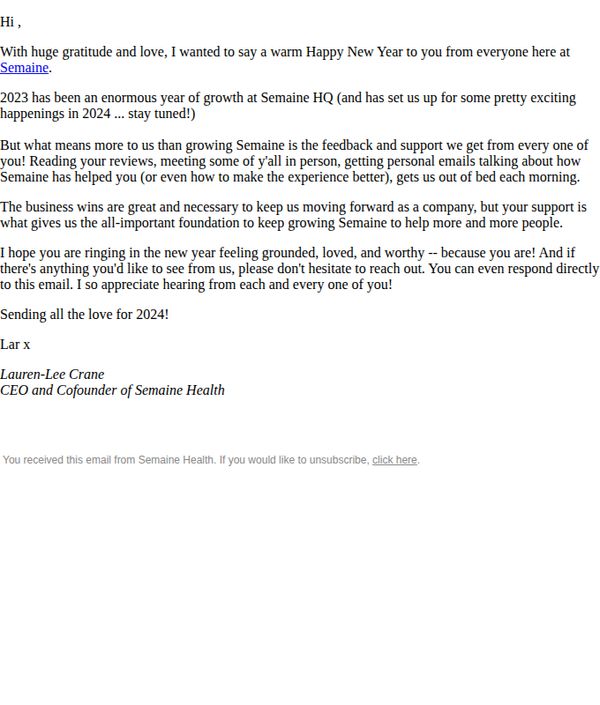
7. From Our Founder 💖
Objective
To express heartfelt gratitude to customers for their support in 2023, reinforce emotional connection with the brand, and subtly set the stage for upcoming 2024 initiatives by inviting ongoing feedback and engagement.
Why this works
The email opens with genuine warmth and personal voice, making the reader feel seen and valued, a powerful emotional hook that transforms a routine update into a meaningful brand moment.
How to implement
By centering customer feedback as the true engine of growth, not just business metrics, the message builds trust and positions the brand as listener-first, which deepens loyalty beyond transactional relationships.
Pro Tip
Add a secondary CTA above the footer, such as 'Share Your Story With Us', to actively convert emotional resonance into measurable engagement, rather than relying solely on an unsubscribe link as the only interactive element. • Incorporate a visual element, even a simple signature graphic or brand emblem, to break up the text-heavy layout and reinforce brand identity, making the founder’s message feel more personal and polished.
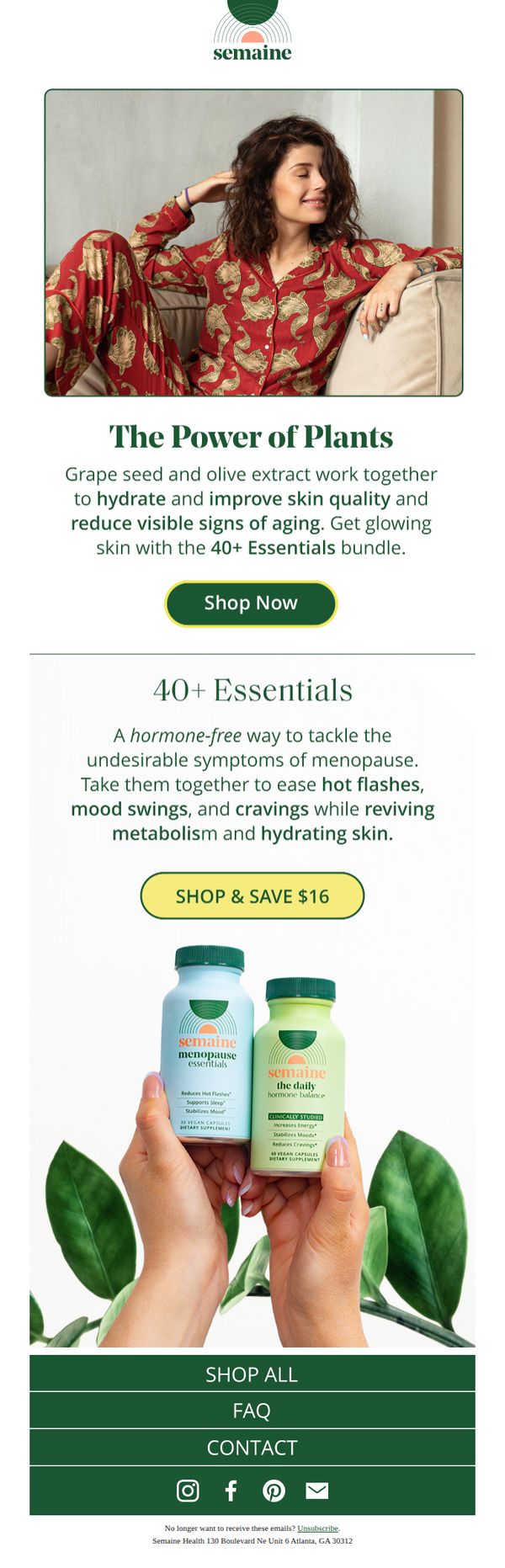
8. Flawless Skin 💅
Objective
This email aims to drive sales of Semaine’s 40+ Essentials bundle by highlighting its plant-based formula for glowing skin and menopause symptom relief, positioning it as a holistic, hormone-free solution for women over 40.
Why this works
The email brilliantly ties skin health to menopause relief, creating a dual-benefit narrative that speaks directly to the emotional and physical needs of its target demographic, making the product feel essential rather than optional.
How to implement
Using a lifestyle image of a relaxed, confident woman in cozy pajamas subtly communicates comfort and self-care, aligning the product with aspirational daily rituals rather than clinical solutions, which builds emotional resonance.
Pro Tip
Add a subtle countdown timer next to the 'Shop & Save $16' CTA to create time-sensitive urgency, encouraging immediate action without disrupting the clean aesthetic of the email. • Include a short customer testimonial or quote beneath the product grid to build social proof and reinforce the efficacy claims, especially around mood swings and skin hydration, which are key pain points mentioned.
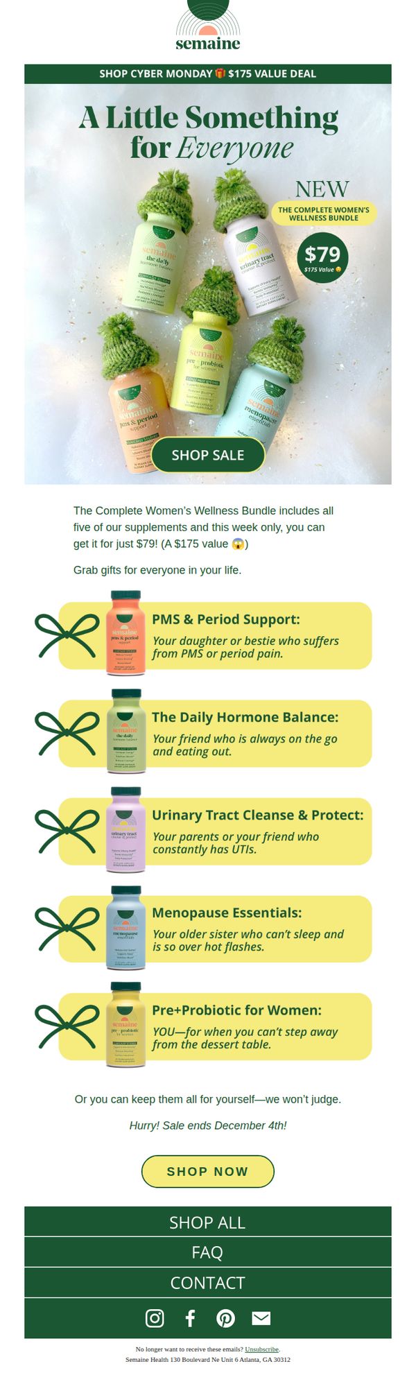
9. All Five Supplements for Over 50% Off! 🔥
Objective
This email aims to drive immediate sales by promoting a limited-time Cyber Monday deal on Semaine’s Complete Women’s Wellness Bundle, positioning it as a high-value gift or personal wellness investment for women over 50. It leverages urgency and emotional gifting triggers to convert subscribers before the December 4th deadline.
Why this works
The email brilliantly frames each supplement as a thoughtful gift for specific female relationships, like a daughter with PMS or a sister in menopause, making the bundle feel personal, empathetic, and emotionally resonant rather than just a product pitch.
How to implement
By anchoring the $79 price against a $175 value and adding a playful wink emoji, the campaign creates perceived savings that feel generous and exciting, turning a discount into a celebratory event rather than a mere transactional offer.
Pro Tip
Add a visible countdown timer near the CTA to amplify urgency beyond the text ‘Sale ends December 4th,’ since visual scarcity cues significantly boost last-minute conversions in time-sensitive promotions. • Include a short testimonial or customer quote near the product grid to build social proof, especially since the email positions the bundle as a gift, real stories from recipients would validate its value and emotional impact.
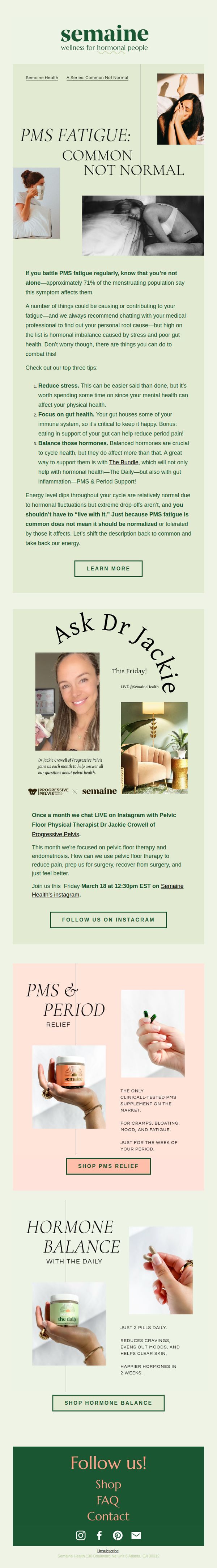
10. PMS Fatigue: is it normal? 😴
Objective
This email aims to educate readers on PMS-related fatigue by validating their experience and offering science-backed solutions, while gently guiding them toward Semaine’s hormonal wellness products and expert-led content to build trust and drive conversions.
Why this works
The email brilliantly reframes PMS fatigue from a personal failing to a systemic issue by citing that 71% of menstruating people experience it, which instantly builds rapport and reduces shame while positioning Semaine as a compassionate authority.
How to implement
By embedding product recommendations within educational content, like linking gut health to hormonal balance and then introducing 'The Bundle', the campaign makes the sales pitch feel like a natural, helpful next step rather than a hard sell.
Pro Tip
The CTA 'LEARN MORE' is too generic for an audience already seeking solutions; replacing it with a benefit-driven phrase like 'Get Your Energy Back' would better align with the emotional pain point and increase click-through intent. • The product sections for PMS Relief and Hormone Balance lack visual hierarchy or urgency cues, adding a subtle badge like 'Clinically Tested' or 'Most Popular' near the product images would strengthen perceived value and guide decision-making.