Supermarket emails worth copying from real grocery brands
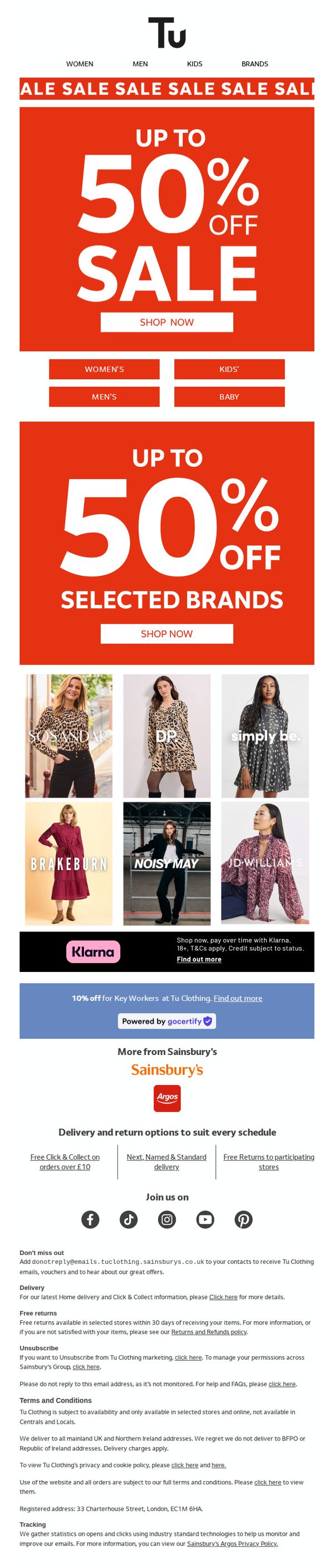

1. Sainsbury's: ✨Up to 50% off still on
Objective
To drive immediate sales by highlighting ongoing discounts of up to 50% off across multiple categories and brands, encouraging urgency through bold visual hierarchy and clear calls to action. The email also reinforces brand trust by featuring recognizable partner brands and flexible payment options.
Why this works
The email leverages bold, high-contrast red and white visuals to instantly communicate urgency and discount magnitude, making the 50% off offer impossible to ignore and immediately actionable for time-sensitive shoppers.
How to implement
By featuring recognizable brand names like SOSANDAR, JD WILLIAMS, and NOISY MAY alongside lifestyle imagery, the email builds credibility and emotional connection, helping customers visualize the products in real-life contexts and reducing purchase hesitation.
Pro Tip
Add a countdown timer beneath the hero banner to amplify urgency, since the subject line says 'still on,' a visible timer would reinforce that the sale is actively expiring, increasing click-through rates. • Reposition the Klarna banner higher, ideally below the first CTA, to ensure payment flexibility is seen before users decide to abandon the cart due to cost concerns, especially since it’s a key conversion enabler.
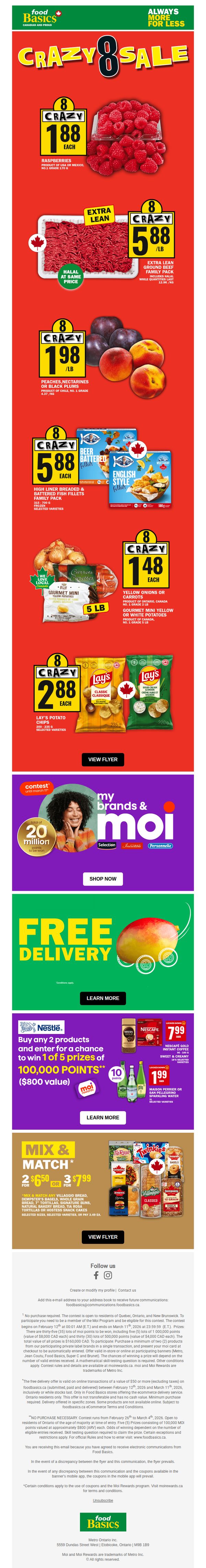
2. Food Basics : GR8 Deals? Try Crazy 8 Deals 🔥
Objective
This email aims to drive immediate in-store and online purchases by highlighting time-sensitive 'Crazy 8' deals across popular grocery categories, while also promoting loyalty program engagement and free delivery incentives to increase basket size and customer retention.
Why this works
The email leverages urgency and simplicity by anchoring every deal to the number '8', a memorable, rhythmic hook that makes pricing feel like a game, encouraging quick decisions without overwhelming the shopper with complex math or conditions.
How to implement
By visually grouping high-impact items like raspberries, ground beef, and Lay’s chips with bold yellow price tags against a red background, the design creates instant visual hierarchy, guiding the eye to the most compelling deals without requiring users to read fine print first.
Pro Tip
The 'Crazy 8' pricing format, while catchy, lacks context, adding a small comparison like 'Save $2.00 vs. regular price' next to each item would strengthen perceived value and reduce hesitation for price-sensitive shoppers. • The CTA 'VIEW FLYER' is generic and passive; replacing it with action-oriented, benefit-driven text like 'GRAB YOUR CRAZY 8 DEALS BEFORE THEY’RE GONE' would better align with the urgency of the sale and increase click-through intent.
3. The Fresh Market: Custom cuts & weekend treats ahead
Objective
This email aims to drive weekend shopping by highlighting time-sensitive deals on fresh proteins, prepared foods, and pantry staples, while encouraging in-store or curbside pickup through clear pricing and product visuals.
Why this works
The email masterfully ties product availability to weekend timing, creating urgency by anchoring deals to Saturday pizza nights and Sunday dinners, which emotionally resonates with customers planning meals ahead.
How to implement
Each product tile includes not just price but also the exact savings amount and weight or count, which builds trust by making value tangible and transparent without forcing customers to calculate discounts themselves.
Pro Tip
Add a countdown timer or 'Deal Ends Sunday' banner above the Weekend Deals section to reinforce urgency, since the current date range is buried in small text and lacks visual prominence. • Include a small customer testimonial or star rating next to high-value items like the salmon fillet or filet mignon to reduce perceived risk and validate premium pricing with social proof.
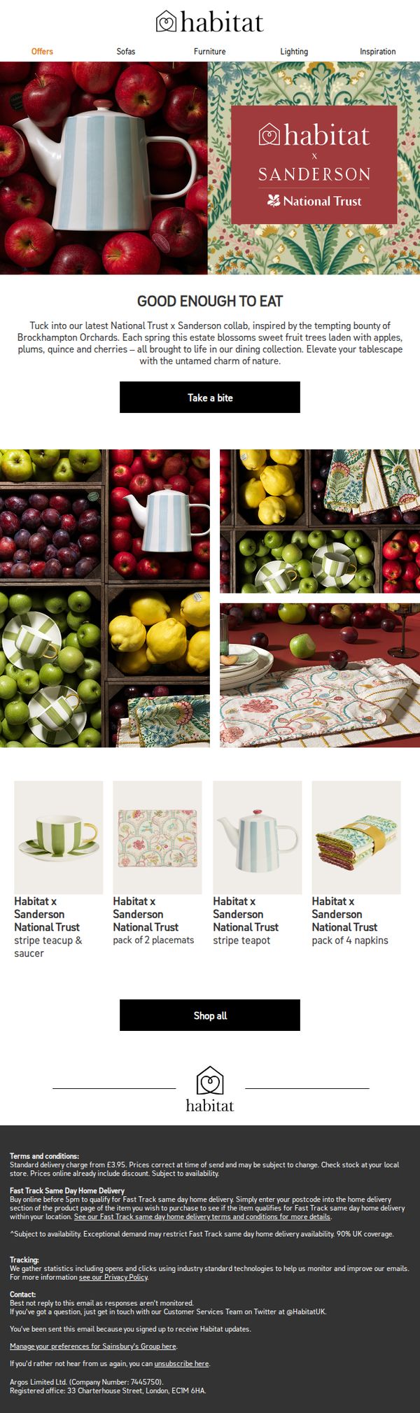
4. Sainsbury's: Habitat x Sanderson National Trust
Objective
This email aims to drive immediate engagement and sales for the Habitat x Sanderson x National Trust collaboration by showcasing nature-inspired tableware and textiles, while evoking seasonal charm and heritage storytelling to connect emotionally with home decor enthusiasts.
Why this works
The email masterfully blends storytelling with product promotion by anchoring the collection in the seasonal bounty of Brockhampton Orchards, transforming a simple product launch into an immersive, nature-inspired experience that resonates with eco-conscious and design-savvy shoppers.
How to implement
Using rich, high-resolution photography of fruit-laden crates and patterned textiles side-by-side creates a visual narrative that subtly reinforces the collection’s organic inspiration, making the products feel both luxurious and grounded in real-world beauty without needing excessive copy.
Pro Tip
Add a subtle countdown timer or limited-edition badge near the 'Take a bite' CTA to create urgency, since the collaboration implies exclusivity, this would nudge hesitant shoppers to act before the collection sells out or disappears. • Include a short testimonial or customer review snippet under the product grid to build social proof, especially since this is a premium collaboration, even one line like 'Loved how the teapot brought spring to my kitchen!' could boost conversion.
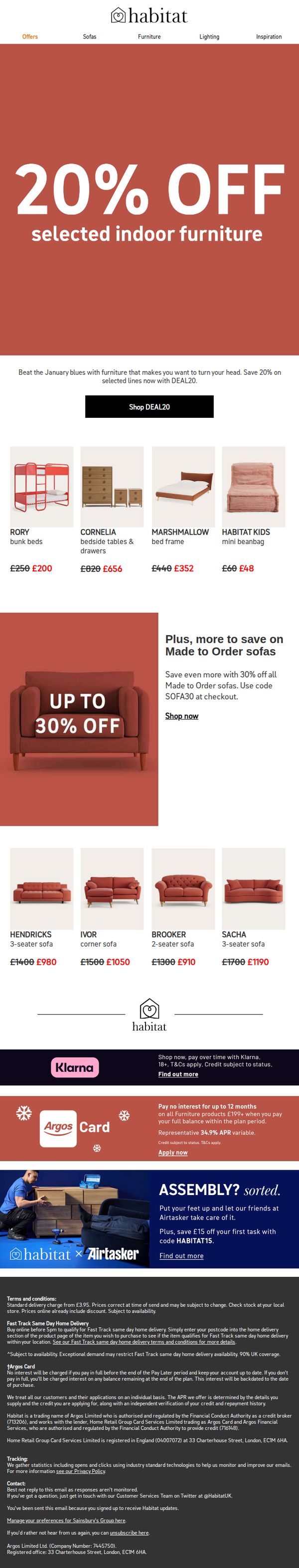
5. Sainsbury's: This is your reminder: 20% off selected indoor furniture
Objective
This email aims to re-engage customers by reminding them of a limited-time 20% discount on selected indoor furniture, encouraging immediate purchase through urgency and visual product examples. It also promotes additional savings on made-to-order sofas to increase average order value.
Why this works
The email leverages emotional timing by framing the discount as a solution to 'January blues,' making the offer feel personally relevant and psychologically compelling rather than just transactional.
How to implement
By showcasing specific products with strikethrough pricing and bold savings, the email creates instant visual proof of value, reducing decision friction and encouraging quick clicks from price-sensitive shoppers.
Pro Tip
Add a countdown timer near the CTA to reinforce urgency, since the email’s reminder nature implies time sensitivity but lacks a visual cue to prompt immediate action. • Include a small testimonial or customer rating under one or two featured products to build social proof, especially for higher-ticket items like sofas, which benefit from trust signals.
6. The Fresh Market: Wednesday BOGOs: Buy one, discover more
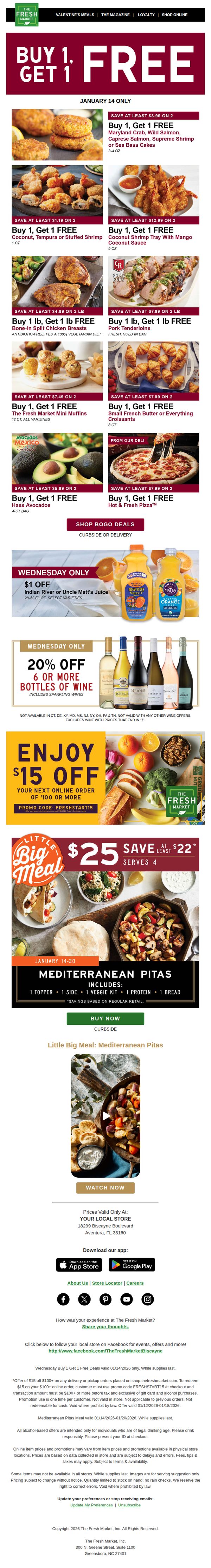
Objective
This email aims to drive immediate in-store and online traffic by promoting time-sensitive BOGO deals and exclusive discounts on popular items, encouraging customers to take advantage of limited-time savings while highlighting meal solutions like the 'Little Big Meal' to increase basket size.
Why this works
The email masterfully combines urgency with variety by stacking multiple BOGO offers under a single bold headline, making it easy for shoppers to scan and instantly identify high-value deals without feeling overwhelmed by choice.
How to implement
By anchoring the promotion to a specific day, Wednesday, the campaign creates a ritualistic shopping behavior, encouraging repeat visits while leveraging the psychological power of time-limited offers to reduce decision fatigue and boost conversion.
Pro Tip
Add a countdown timer or 'Hurry, offer ends tonight!' banner near the top to amplify urgency, especially since the BOGO deals are valid for one day only, this would reduce hesitation and increase immediate click-throughs. • Include customer testimonials or star ratings next to high-ticket items like the Mediterranean Pitas or wine bundles to build social proof and reduce perceived risk, especially for first-time buyers of meal kits or premium beverages.
7. The Fresh Market: Celebrate our new Aventura store!
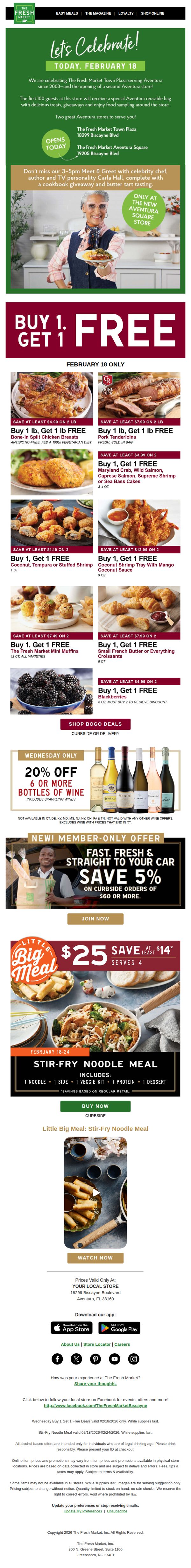
Objective
This email aims to drive foot traffic and excitement for The Fresh Market’s new Aventura Square store opening by highlighting exclusive in-store events, limited-time BOGO deals, and member-only savings to convert local shoppers into first-time visitors.
Why this works
The email brilliantly anchors its entire campaign around a single, emotionally resonant event, the grand opening of a new store, which transforms a routine promotion into a community celebration that customers feel compelled to attend.
How to implement
By featuring a celebrity chef meet-and-greet with tangible perks like cookbook giveaways and butter tart tastings, the email elevates the in-store experience beyond transactional shopping into a memorable, shareable social occasion that drives urgency and FOMO.
Pro Tip
The primary CTA 'SHOP BOGO DEALS' is buried beneath multiple product images; relocating it above the product grid or adding a sticky CTA bar would significantly improve conversion by reducing scroll friction and guiding users toward the core offer faster. • The wine discount section lacks visual emphasis and clear hierarchy, adding a countdown timer or bold badge like 'WEDNESDAY ONLY!' directly on the wine bottles would increase perceived urgency and prevent the offer from being overlooked amid the BOGO-heavy layout.
8. Farm Boy : Discover Wholesome Favourites with "A Farm Boy Fresh Twist"
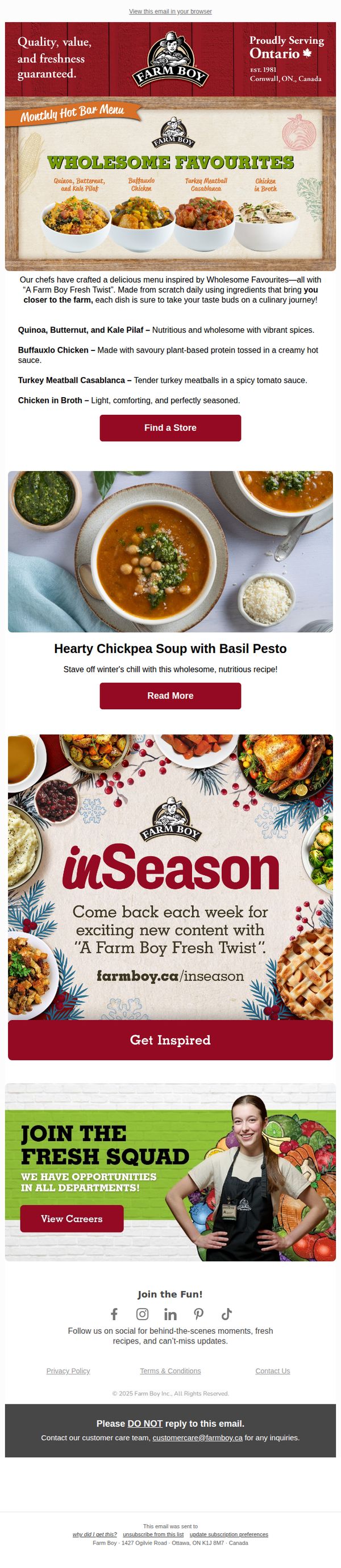
Objective
This email aims to drive foot traffic and engagement by showcasing Farm Boy’s seasonal hot bar menu with a fresh, wholesome twist, while also promoting recipe inspiration and career opportunities to strengthen brand loyalty and community connection.
Why this works
Farm Boy brilliantly ties seasonal comfort food to their brand identity by framing each dish as a 'fresh twist' on wholesome favorites, making familiar meals feel new and exciting while reinforcing their farm-to-table values.
How to implement
The email strategically layers multiple CTAs, not just to shop, but to explore recipes and careers, creating a holistic brand experience that turns a simple menu promotion into a community-building touchpoint across customer and employee audiences.
Pro Tip
Add a subtle countdown or seasonal urgency tag (e.g., 'Available until March 31') near the Hot Bar Menu section to nudge immediate store visits instead of passive browsing. • Reposition the 'Join the Fresh Squad' careers section higher or separate it visually, its current placement under recipe content dilutes its impact and confuses the primary goal of driving food-related engagement.
9. Waitrose: Prefer not to get messages about a particular event?
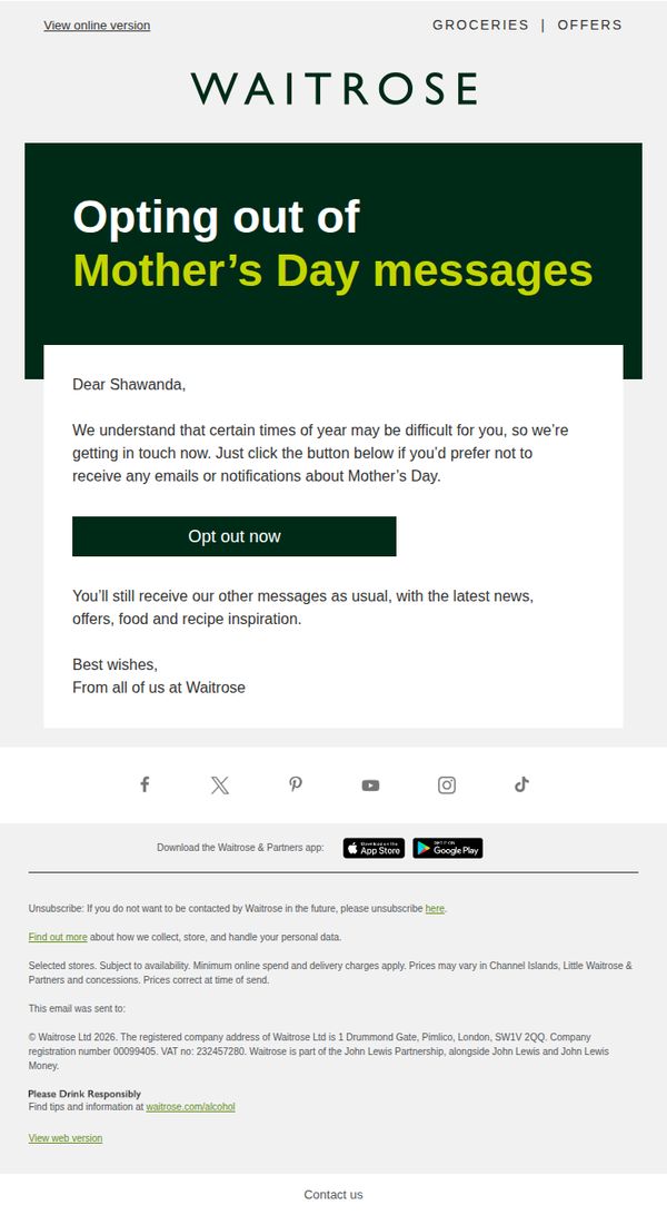
Objective
This email aims to respectfully allow customers who may find Mother’s Day messaging emotionally difficult to opt out of related communications, while reassuring them they’ll still receive regular brand updates and offers.
Why this works
Waitrose demonstrates emotional intelligence by proactively acknowledging that seasonal campaigns like Mother’s Day can be triggering for some customers, turning a potential point of friction into a moment of brand empathy and trust.
How to implement
The email’s tone is warm and human, not transactional, by addressing the recipient by name and offering an easy, no-questions-asked opt-out, which reinforces customer-centric values without sacrificing brand voice.
Pro Tip
Add a brief sentence or icon near the CTA to visually reinforce that opting out is instant and reversible, reducing hesitation for users who may fear losing all future communications. • Include a short, empathetic line after the CTA, such as 'We’re here for you, whatever the season', to further humanize the message and strengthen emotional resonance without adding clutter.
10. Sainsbury's: Have you seen this yet?
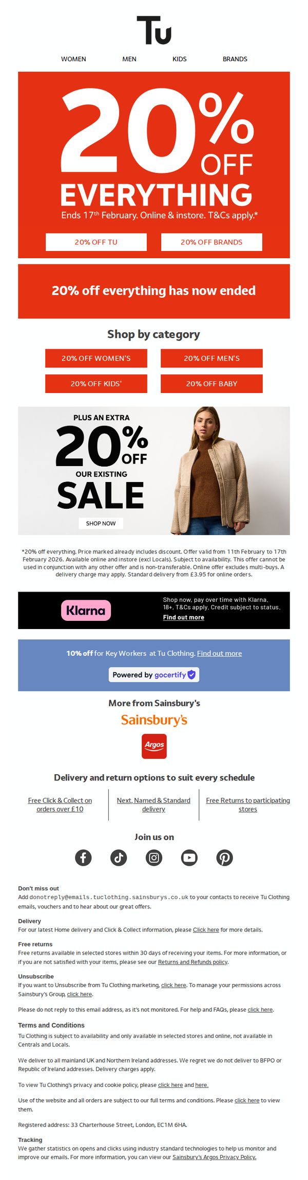
Objective
To drive immediate sales by promoting a time-sensitive 20% off everything sale across Tu Clothing, while also encouraging category-specific browsing and highlighting additional discounts for key workers and financing options through Klarna.
Why this works
The email leverages urgency effectively by prominently displaying a bold, red banner with a clear end date, creating immediate FOMO that motivates shoppers to act before the 20% off everything sale expires.
How to implement
By segmenting the offer into categories like Women’s, Men’s, Kids’, and Baby, the campaign personalizes the shopping experience and guides users to relevant sections, increasing the likelihood of conversion through targeted navigation.
Pro Tip
The email states the main 20% off everything sale has ended, which contradicts the headline and creates confusion, this message should be removed or repositioned to avoid undermining the urgency and credibility of the ongoing promotions. • The Klarna and Key Worker discount sections are visually buried below the main offer; they should be elevated or integrated into the hero or category grid to increase visibility and conversion for these high-intent customer segments.