Sainsbury’s campaign emails worth copying
1. Sale on! Up to 50% off Brands & Tu
Objective
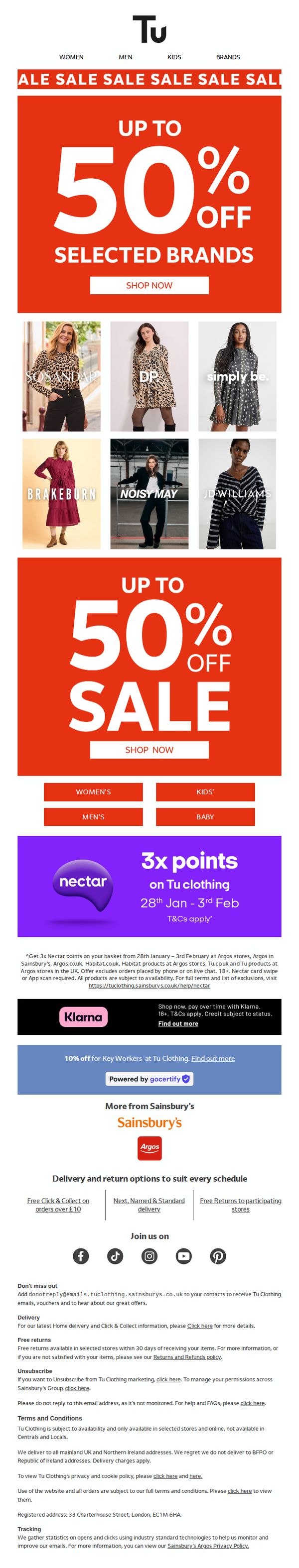
This email aims to drive immediate sales by highlighting a limited-time sale of up to 50% off selected brands and Tu clothing, while also incentivizing loyalty through Nectar points and financing options to lower purchase barriers.
Why this works
The email leverages urgency and exclusivity by prominently displaying 'Up to 50% Off' in bold, high-contrast typography, immediately capturing attention and framing the sale as a time-sensitive opportunity not to be missed.
How to implement
It smartly integrates loyalty and payment incentives, like 3x Nectar points and Klarna financing, directly beneath the main offer, reducing friction and appealing to both reward-driven and budget-conscious shoppers without cluttering the primary message.
Pro Tip
Add a countdown timer beneath the 'Up to 50% Off' banner to visually reinforce urgency and encourage immediate clicks, especially since the sale dates are already defined (28th Jan – 3rd Feb). • Reposition the Klarna and Nectar offers into a dedicated 'Why Buy Now?' section above the product grid to make financial incentives more prominent and emotionally compelling before the user scrolls to browse products.
2. Habitat x Sanderson National Trust
Objective
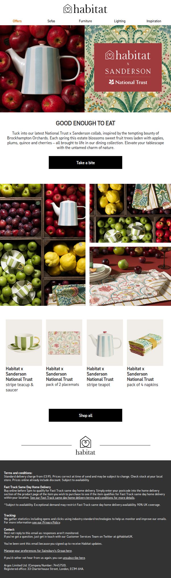
This email aims to drive immediate engagement and sales for the Habitat x Sanderson x National Trust collaboration by showcasing nature-inspired tableware and textiles, while evoking seasonal charm and heritage storytelling to connect emotionally with home decor enthusiasts.
Why this works
The email masterfully blends storytelling with product promotion by anchoring the collection in the seasonal bounty of Brockhampton Orchards, transforming a simple product launch into an immersive, nature-inspired experience that resonates with eco-conscious and design-savvy shoppers.
How to implement
Using rich, high-resolution photography of fruit-laden crates and patterned textiles side-by-side creates a visual narrative that subtly reinforces the collection’s organic inspiration, making the products feel both luxurious and grounded in real-world beauty without needing excessive copy.
Pro Tip
Add a subtle countdown timer or limited-edition badge near the 'Take a bite' CTA to create urgency, since the collaboration implies exclusivity, this would nudge hesitant shoppers to act before the collection sells out or disappears. • Include a short testimonial or customer review snippet under the product grid to build social proof, especially since this is a premium collaboration, even one line like 'Loved how the teapot brought spring to my kitchen!' could boost conversion.
3. SALE top picks
Objective
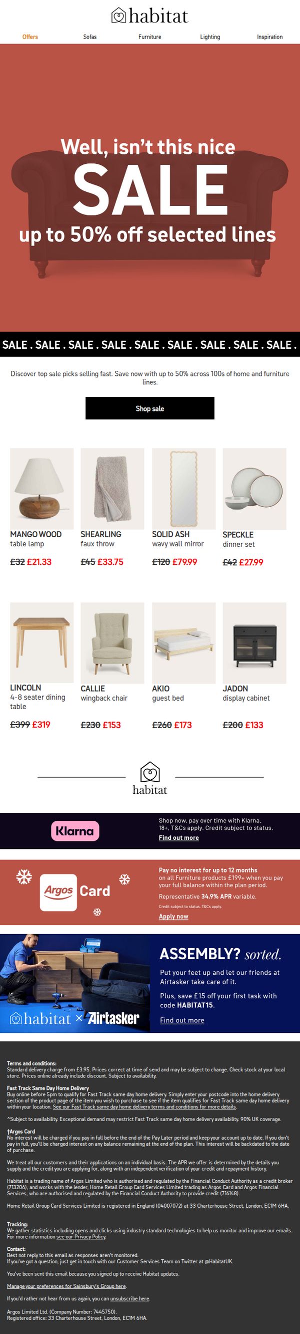
This email aims to drive immediate sales by highlighting time-sensitive discounts of up to 50% off selected home and furniture items, encouraging recipients to shop now before popular items sell out.
Why this works
The email leverages urgency and social proof by stating 'top sale picks selling fast,' which taps into FOMO and motivates quick decisions without sounding pushy or artificial.
How to implement
Each product in the grid clearly displays both original and discounted prices with red strikethroughs, making savings instantly visible and psychologically compelling to budget-conscious shoppers.
Pro Tip
The hero section’s headline 'Well, isn’t this nice SALE' feels casual to the point of undermining urgency; rephrasing to 'Hurry, Up to 50% Off Ends Soon' would better align with the scarcity-driven objective. • The product grid lacks visual hierarchy, adding badges like 'Bestseller' or 'Almost Gone' to top-performing items would guide attention and reinforce the 'selling fast' message more effectively.
4. From barrel to baggy 👖
Objective
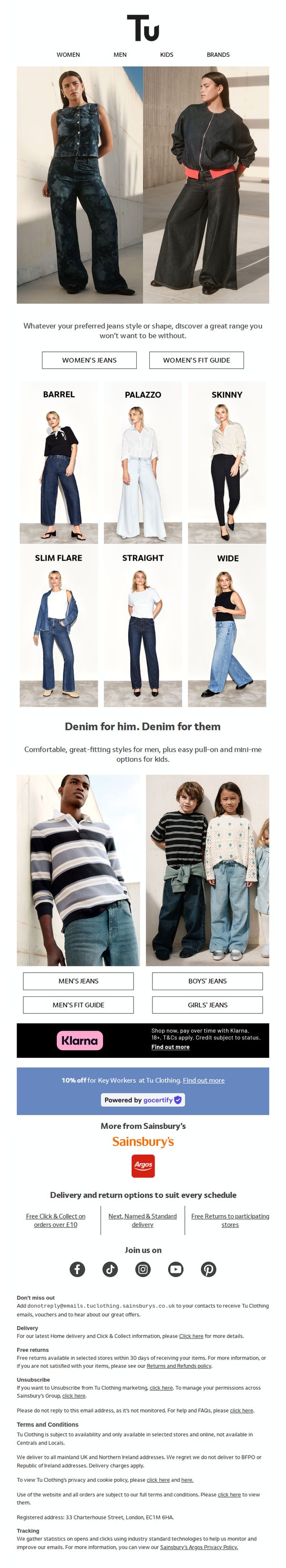
This email aims to drive engagement and sales for Tu Clothing’s denim collection by showcasing diverse fits and styles for women, men, and kids, while encouraging immediate browsing through clear category CTAs and promotional offers.
Why this works
The email brilliantly organizes denim styles into labeled visual grids, making it effortless for shoppers to identify their preferred fit, whether barrel, palazzo, or skinny, without scrolling through endless product pages.
How to implement
By segmenting denim offerings by gender and age group with dedicated CTAs, the campaign creates a personalized shopping journey that reduces decision fatigue and guides users straight to their relevant category with minimal friction.
Pro Tip
Add a subtle countdown timer or urgency indicator near the 10% Key Worker discount to create time-sensitive motivation, especially since the offer lacks a visible expiration date, which may reduce immediate action. • Integrate a short customer testimonial or star rating beneath the denim style grid to build social proof and reassure shoppers about fit and comfort before they click through to product pages.
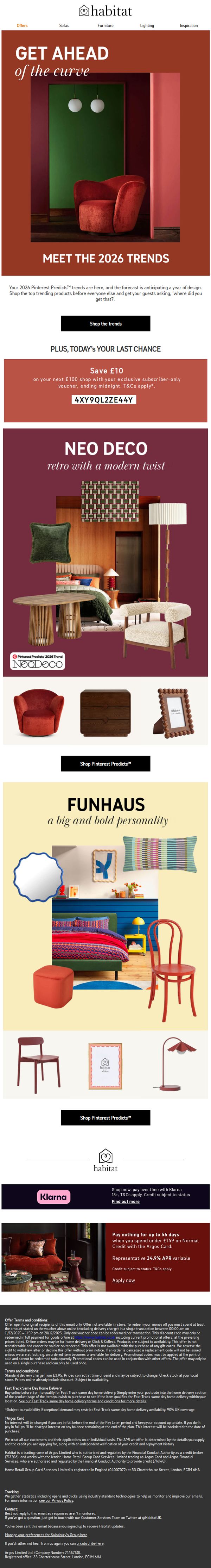
5. Your 2026 trend forecast
Objective
This email aims to position Habitat as a trend-forward home decor brand by showcasing 2026 Pinterest Predicts™ styles, encouraging immediate purchases through time-sensitive offers and exclusive subscriber discounts to drive urgency and conversion.
Why this works
By anchoring the campaign in Pinterest’s 2026 trend forecast, Habitat creates instant credibility and FOMO, positioning itself not just as a retailer but as a curator of future-proof design that customers can’t afford to miss.
How to implement
The email smartly layers urgency with exclusivity, offering a subscriber-only £10 discount that expires at midnight, turning a general trend report into a personalized, time-bound shopping event that boosts conversion likelihood.
Pro Tip
Add a countdown timer next to the subscriber voucher offer to visually reinforce urgency and increase perceived scarcity, which could boost last-minute conversions before the midnight deadline. • Include a short testimonial or social proof snippet under each trend section (e.g., '92% of customers who bought Neo Deco items said they received compliments') to build trust and validate the trend’s appeal.
6. Homeware under £25
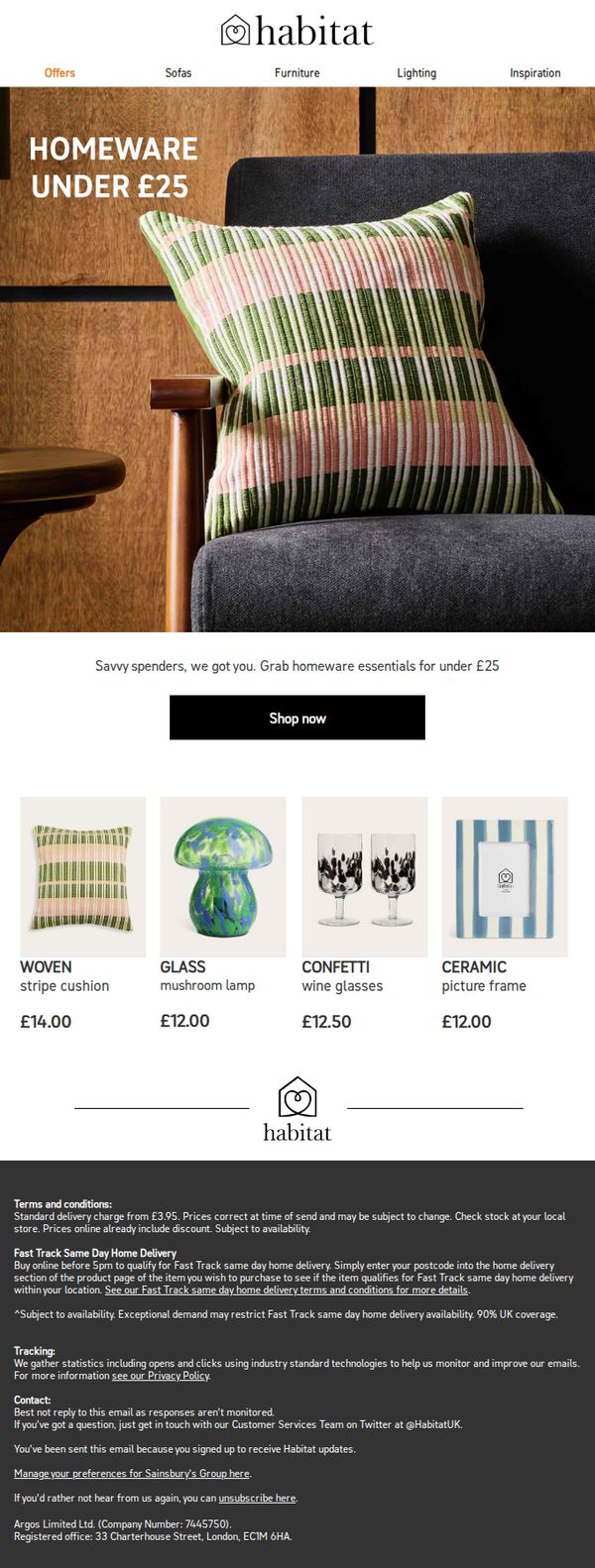
Objective
This email aims to drive immediate purchases by highlighting affordable homeware items under £25, targeting budget-conscious shoppers with a clear, visually appealing selection of everyday essentials.
Why this works
The email opens with a bold, benefit-driven headline that immediately communicates value, 'Homeware Under £25', which speaks directly to price-sensitive shoppers and sets clear expectations for what’s inside.
How to implement
Each product is presented with a clean, high-quality image, a descriptive name, and a prominently displayed price, making it easy for users to scan, compare, and decide, a design choice that reduces friction and accelerates conversion.
Pro Tip
Add a subtle countdown timer or limited-stock indicator near the CTA to create urgency, since the current design lacks time-sensitive triggers that could nudge hesitant shoppers toward immediate action. • Include a short testimonial or customer rating under one or two products to build social proof, especially for new or lesser-known items like the mushroom lamp, which could increase perceived trust and reduce purchase hesitation.
7. Great value styles at prices you'll love
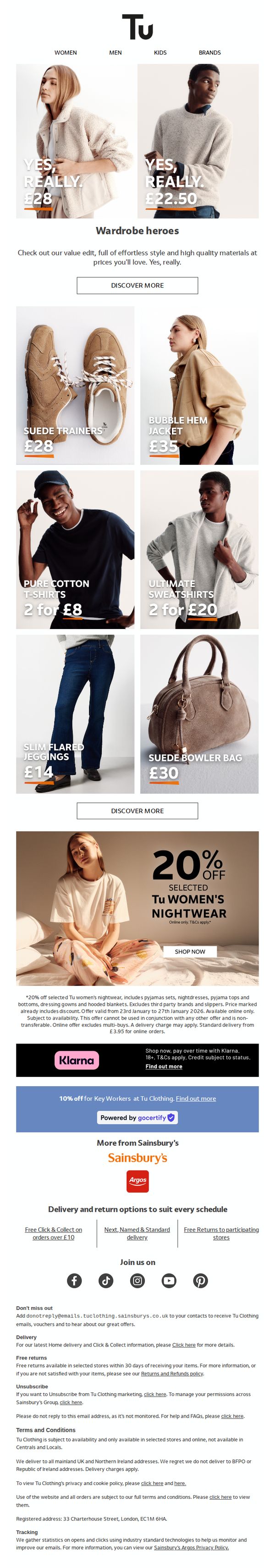
Objective
To drive immediate sales by showcasing affordable, high-quality fashion items under the Tu brand, while reinforcing value messaging and encouraging exploration of the full collection through clear CTAs and promotional offers.
Why this works
The email brilliantly anchors its value proposition with punchy, conversational phrases like 'YES, REALLY.' paired with bold pricing, making affordability feel surprising and irresistible rather than expected.
How to implement
By featuring both gender-inclusive hero visuals and a tightly curated product grid with clear pricing and bundling offers, the campaign effectively balances emotional appeal with practical decision-making cues for shoppers.
Pro Tip
Add a subtle countdown timer beneath the 20% off nightwear offer to heighten urgency and encourage immediate action, especially since the promotion is time-limited and online-only. • Reposition the Klarna and Key Worker discount banners higher in the flow, perhaps directly under the main CTA, to ensure financing and loyalty incentives are visible before users scroll past the product grid.
8. Notes of spring
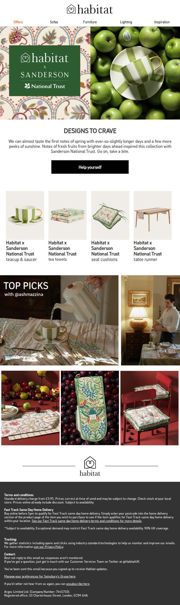
Objective
This email aims to introduce and drive sales for the limited-edition Habitat x Sanderson x National Trust spring collection by evoking seasonal warmth and heritage charm, encouraging immediate browsing through a clear CTA and curated product visuals.
Why this works
The email brilliantly ties seasonal emotion to product storytelling by using phrases like 'Notes of fresh fruits from brighter days ahead' to frame the collection as a sensory experience, not just home goods, making it feel timely and irresistible.
How to implement
By featuring a named influencer, @ashmazzina, in the 'Top Picks' section, the campaign adds social proof and curation credibility without overt promotion, subtly guiding shoppers toward trusted selections while maintaining an editorial, lifestyle-driven tone.
Pro Tip
Add a subtle countdown timer or 'Limited Stock' indicator near the CTA to amplify urgency, since the collaboration’s exclusivity is a key selling point but currently lacks time-sensitive reinforcement to nudge immediate action. • Reposition the 'Help yourself' CTA to appear directly beneath each product tile in the grid, not just once under the hero, this reduces friction by making the action visible at the point of interest, increasing conversion likelihood.
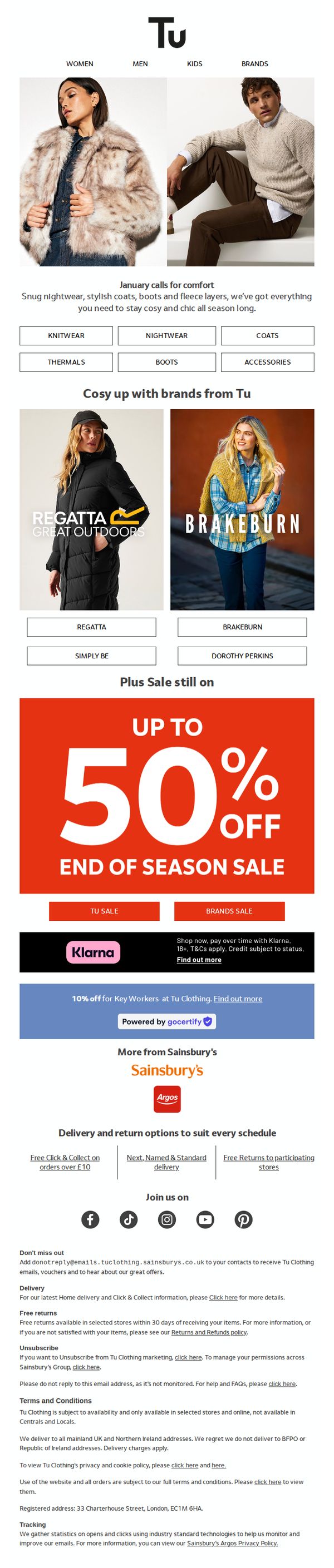
9. It’s cold outside! Cosy up this January
Objective
This email aims to drive winter apparel sales by encouraging customers to shop cozy, seasonally appropriate clothing from Tu and partner brands during an end-of-season sale. It leverages seasonal urgency and comfort-focused messaging to convert cold-weather shoppers into buyers.
Why this works
The email brilliantly ties seasonal weather to emotional comfort, using phrases like 'Cosy up this January' to create an immediate psychological connection that motivates shoppers to act on their desire for warmth and style.
How to implement
By featuring both Tu’s own line and partner brands like Regatta and Brakeburn, the email broadens its appeal without diluting focus, giving customers variety while maintaining a unified cozy winter theme that feels curated, not cluttered.
Pro Tip
Add a countdown timer beneath the 'UP TO 50% OFF' banner to amplify urgency, since this is an 'End of Season Sale,' a visible timer would push hesitant shoppers to act before the deal expires. • Include a small testimonial or customer review snippet near the product grid (e.g., 'Rated 4.8/5 for warmth & comfort') to build social proof and reduce perceived risk for first-time buyers of winter apparel.
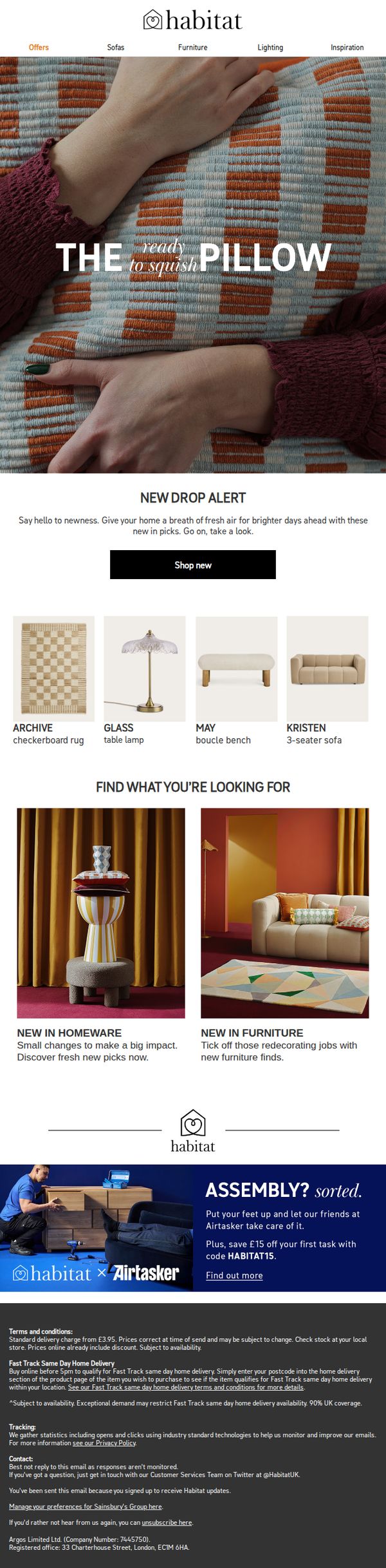
10. This just in: Pieces to elevate every room
Objective
To drive immediate engagement with Habitat’s latest home decor and furniture arrivals by highlighting tactile, trend-led pieces that refresh living spaces. The email aims to convert curiosity into clicks with a clear 'Shop new' CTA and strategic product groupings.
Why this works
The email masterfully uses tactile language like 'ready to squish' to evoke sensory appeal, making inanimate objects feel inviting and emotionally resonant, a subtle but powerful technique to boost desire and reduce purchase hesitation.
How to implement
By splitting the product grid into two distinct categories, 'New in Homeware' and 'New in Furniture', the email guides users through logical shopping paths, reducing decision fatigue and helping them self-segment based on their current renovation or styling goals.
Pro Tip
The hero section’s headline 'THE ready to squish PILLOW' visually dominates but lacks a direct link to the CTA, adding a subtle arrow or hover effect on the pillow image that leads to the 'Shop new' button would strengthen visual flow and reduce friction. • The 'Find what you’re looking for' section uses compelling imagery but doesn’t include direct category links or filters, embedding clickable category headers (e.g., 'Browse Homeware') would improve navigation and reduce bounce rate by guiding users deeper into the funnel.