Swimwear email examples & ideas from real brands
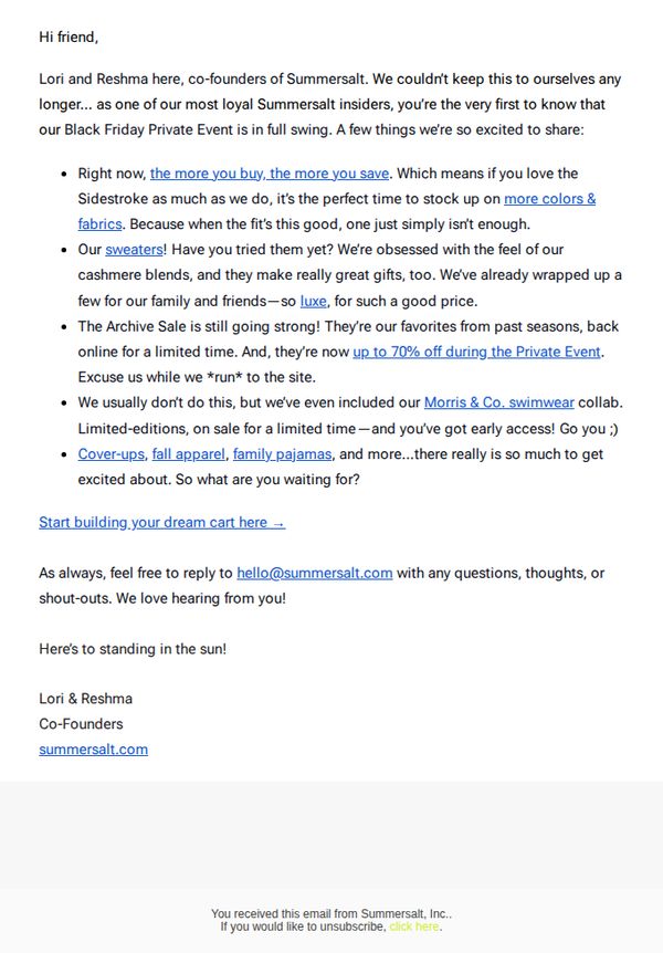
1. Summersalt: The Inside Scoop 🤫
Objective
This email aims to drive immediate sales by giving loyal customers early access to Summersalt’s Black Friday Private Event, while creating urgency through limited-time offers and exclusive product highlights.
Why this works
The email leverages founder-led storytelling to build trust and exclusivity, making loyal customers feel like insiders who get first access to the best deals, a powerful emotional hook that drives urgency without sounding salesy.
How to implement
By highlighting specific product categories like sweaters, archive sale items, and limited-edition collaborations, the email creates a sense of curated discovery that encourages browsing beyond the obvious, increasing average order value through strategic product placement.
Pro Tip
Add a visual countdown timer near the CTA to reinforce the limited-time nature of the Private Event, which would increase urgency and reduce hesitation among recipients who might otherwise delay clicking. • Include a small product grid or thumbnail carousel beneath the CTA showcasing top-selling or most-anticipated items from the sale, helping users visualize what’s available and reducing the cognitive load of navigating to the site blindly.
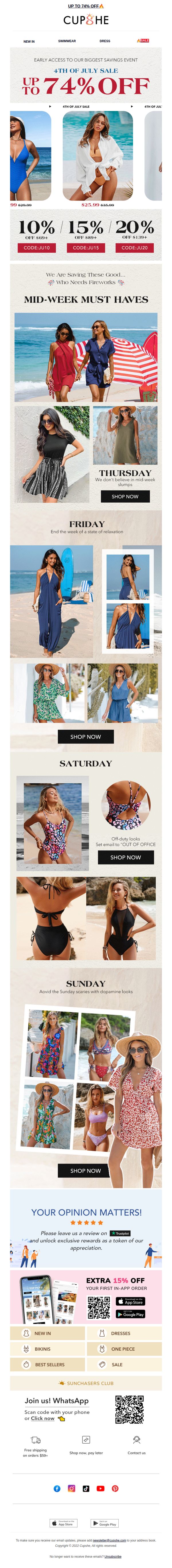
2. Cupshe: 🔥 VIP ACCESS - 4th OF JULY SALE- STARTS NOW! 🔥
Objective
This email aims to drive immediate sales by granting VIP early access to a limited-time 4th of July sale with discounts up to 74%, while also encouraging app downloads and customer reviews through targeted incentives.
Why this works
The email brilliantly leverages urgency and exclusivity by framing the sale as VIP-only early access, making subscribers feel privileged and more likely to act immediately rather than wait for the public launch.
How to implement
By organizing products around daily themes like 'Thursday' and 'Sunday,' the campaign creates a narrative rhythm that turns browsing into a curated experience, subtly guiding customers through the week’s best styles without overwhelming them.
Pro Tip
Add a visible countdown timer in the hero section to reinforce urgency, since the 4th of July date is time-sensitive and a ticking clock would increase conversion pressure without being intrusive. • Replace the generic 'SHOP NOW' CTA buttons with context-specific variations like 'Grab Thursday’s Must-Haves' or 'See Sunday’s Dopamine Styles' to strengthen relevance and reduce decision fatigue.
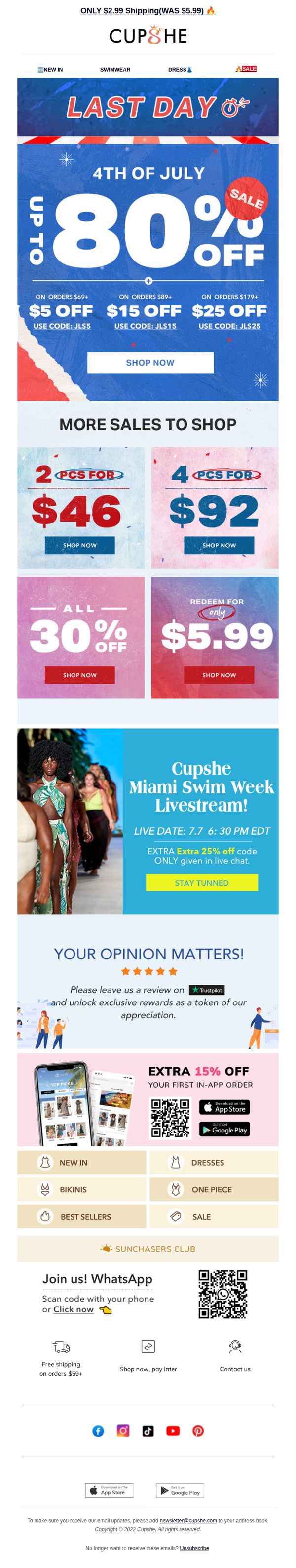
3. Cupshe: ⚠️LAST DAY: 4th Of July Sale
Objective
This email aims to drive immediate purchases by emphasizing the urgency of the 4th of July sale’s final day, while also promoting additional discounts, a live event, and app downloads to boost engagement and lifetime customer value.
Why this works
The email masterfully combines urgency with layered incentives, using a 'LAST DAY' banner, tiered discount codes, and a shipping price drop, to create multiple psychological triggers that compel immediate action without overwhelming the reader.
How to implement
By integrating a live event promotion with an exclusive in-chat discount, the campaign transforms passive browsing into real-time engagement, turning a sales email into an interactive experience that builds community and FOMO simultaneously.
Pro Tip
The hero section’s 'UP TO 80% OFF' headline lacks visual hierarchy, consider increasing font size or adding a contrasting background to ensure it dominates the fold and immediately communicates the sale’s magnitude before users scroll. • The 'MORE SALES TO SHOP' grid uses inconsistent CTA button colors (blue, red, yellow) that dilute brand cohesion, standardizing to one primary color (e.g., red) would strengthen visual focus and reduce decision fatigue for users scanning multiple offers.
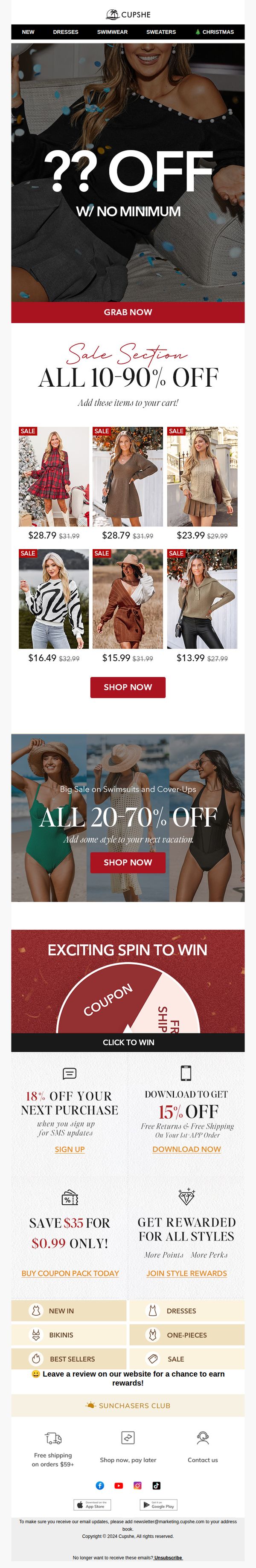
4. Cupshe: Sale on Sale! 💪LET'S GOOOO!
Objective
This email aims to drive immediate sales by creating urgency around a limited-time sale with deep discounts across multiple categories, while also encouraging app downloads and SMS sign-ups to boost long-term customer engagement and retention.
Why this works
The email masterfully uses mystery discount language like '?? OFF' to spark curiosity and urgency, compelling users to click without knowing the exact savings, a psychological trigger that boosts conversion by making the deal feel exclusive and time-sensitive.
How to implement
By segmenting discounts into themed sections, general sale, swimwear, and gamified spin-to-win, the campaign caters to different shopper motivations, increasing relevance and reducing decision fatigue while keeping the visual flow dynamic and engaging across multiple scroll sections.
Pro Tip
The hero section’s '?? OFF' headline lacks clarity, adding a specific example discount (e.g., 'Up to 90% OFF') or a countdown timer would strengthen urgency and reduce ambiguity without sacrificing intrigue. • The 'Exciting Spin to Win' section visually competes with the main sale offers; repositioning it below the swimwear sale or reducing its visual weight would help maintain focus on the primary conversion goal: driving immediate purchases.
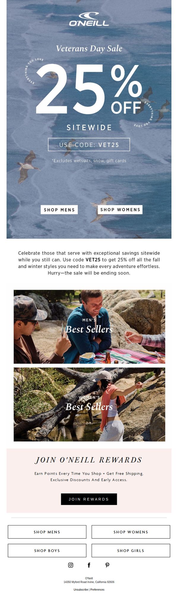
5. O'Neill: Celebrate Veterans Day with Epic Savings While It Lasts
Objective
This email aims to drive immediate sales by honoring Veterans Day with a time-sensitive 25% sitewide discount, encouraging customers to shop fall and winter gear while celebrating those who serve. It also promotes long-term loyalty by inviting users to join the O’Neill Rewards program.
Why this works
The email brilliantly ties patriotic sentiment to urgency by framing the discount as a tribute to veterans, making the promotion feel meaningful rather than purely transactional, which deepens emotional engagement and drives faster conversions.
How to implement
By featuring lifestyle imagery of men and women enjoying outdoor adventures, the email visually reinforces product relevance and aspirational use, subtly guiding shoppers toward categories they might not have considered while still aligning with seasonal needs.
Pro Tip
Add a visible countdown timer near the hero section to reinforce urgency, since the phrase 'sale will be ending soon' lacks specificity and may not trigger immediate action without a visual time constraint. • Include a small testimonial or social proof snippet near the offer section, such as 'Over 10,000 veterans shopped with us last year', to strengthen credibility and emotional resonance with the target audience.
6. Cupshe: 😘 Get Your Exclusive Offer!
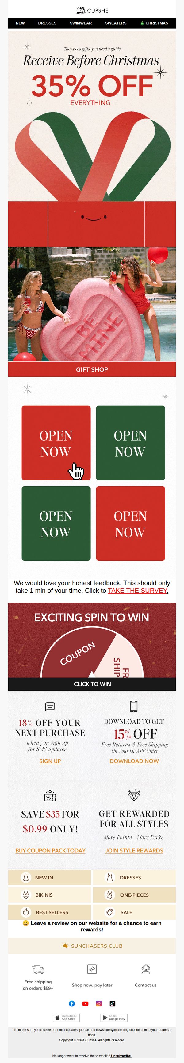
Objective
This email aims to drive immediate holiday shopping by offering a time-sensitive 35% discount across all products, while also encouraging engagement through gamified elements like a spin-to-win wheel and survey participation to boost customer loyalty and data collection.
Why this works
The email brilliantly merges holiday urgency with playful visuals, like the candy cane heart and poolside models, to make a discount feel like a festive gift rather than a sales tactic, which emotionally primes shoppers to act quickly.
How to implement
By embedding multiple 'OPEN NOW' CTAs in contrasting red and green blocks, the design leverages color psychology and repetition to guide the eye and reduce decision fatigue, making it effortless for users to click through to desired categories.
Pro Tip
The 'EXCITING SPIN TO WIN' section lacks visual hierarchy, consider enlarging the wheel graphic and adding a countdown timer to create urgency, since the current design risks being overlooked amid competing CTAs. • The survey CTA is buried between promotional blocks; relocate it to the footer or pair it with a micro-incentive (e.g., 'Complete survey → Get 5% off next order') to increase response rates without diluting the primary sales message.
7. Junk London: Final call for our Boxing Day Sale 💔
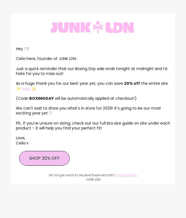
Objective
This email aims to create urgency and drive last-minute sales by reminding subscribers that the Boxing Day sale ends at midnight, while also expressing gratitude and teasing upcoming 2026 collections to maintain engagement beyond the sale.
Why this works
The email opens with a warm, personal tone from the founder, which humanizes the brand and builds trust, readers are more likely to act when they feel they’re hearing from a real person who genuinely cares about their experience.
How to implement
By embedding the discount code directly into the message and clarifying it auto-applies at checkout, the brand removes friction and reduces cart abandonment, making the offer feel effortless and instantly rewarding for the customer.
Pro Tip
Add a visual countdown timer near the CTA to reinforce urgency, seeing the clock tick down increases FOMO and nudges hesitant shoppers to act before midnight. • Include a small hero image or product carousel showcasing bestsellers or sale highlights to give visual context to the discount, helping customers quickly visualize what they’re saving on.
8. Cupshe: LABOR DAY CLOTHING SALE👗
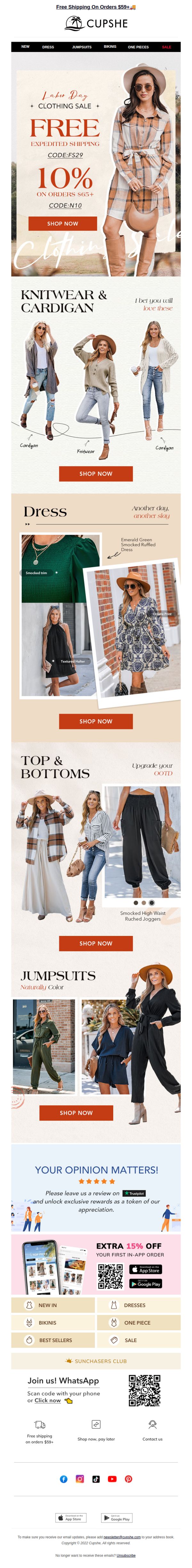
Objective
This email aims to drive immediate sales during the Labor Day promotion by highlighting time-sensitive discounts and free shipping offers, while also encouraging app downloads and customer engagement through reviews and social sharing.
Why this works
The email strategically layers multiple offers, free shipping, percentage discounts, and promo codes, to create urgency without overwhelming the reader, making it easy for shoppers to choose their preferred incentive and act quickly.
How to implement
Each product category is visually anchored with lifestyle imagery and descriptive micro-copy like 'Naturally Color' or 'Upgrade your OOTD,' which emotionally connects with the customer’s identity and daily wardrobe needs rather than just listing items.
Pro Tip
The hero section’s dual promo codes (FS29 and N10) are visually close but lack clear differentiation, adding a small icon or color-coded label for each offer would reduce confusion and improve conversion clarity. • The 'Your Opinion Matters!' section interrupts the shopping flow; relocating it to the footer or making it a collapsible pop-up after scroll would preserve momentum while still capturing valuable customer feedback.
9. Beach Riot: think BRIGHT AND BOLD this season
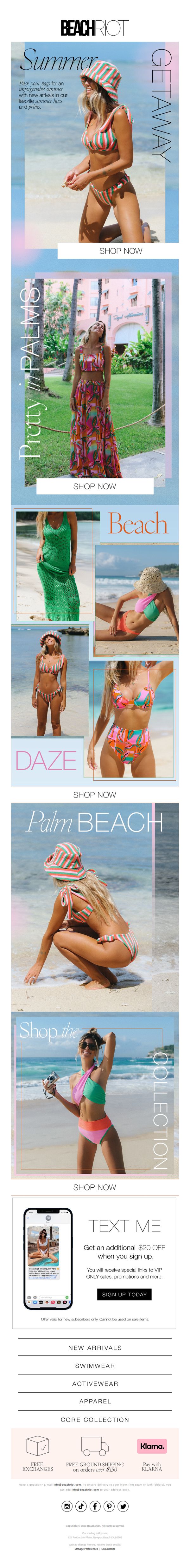
Objective
This email aims to drive immediate engagement and sales by showcasing Beach Riot’s vibrant summer swimwear collection, encouraging subscribers to shop bold new arrivals while incentivizing sign-ups with a $20 discount offer.
Why this works
The email masterfully uses aspirational beach imagery paired with bold typography to instantly evoke summer escapism, making the viewer feel the excitement of a getaway before they even click through to shop.
How to implement
By segmenting the collection into themed visual blocks like 'Getaway,' 'Palm Beach,' and 'Daze,' the campaign creates mini-stories that guide the shopper emotionally through different vacation vibes, increasing product relevance and desire.
Pro Tip
Add a subtle countdown timer next to the $20 discount offer to create urgency and reduce sign-up hesitation, especially since the incentive is time-sensitive for new subscribers only. • Include a small testimonial or social proof badge near the 'Shop the Collection' CTA to build trust, for example, 'Loved by 10K+ beach lovers', since visual appeal alone may not convert skeptical first-time buyers.
10. Cupshe: 🐣EASTER SAVINGS! ALL 60% OFF & Extra 35% OFF
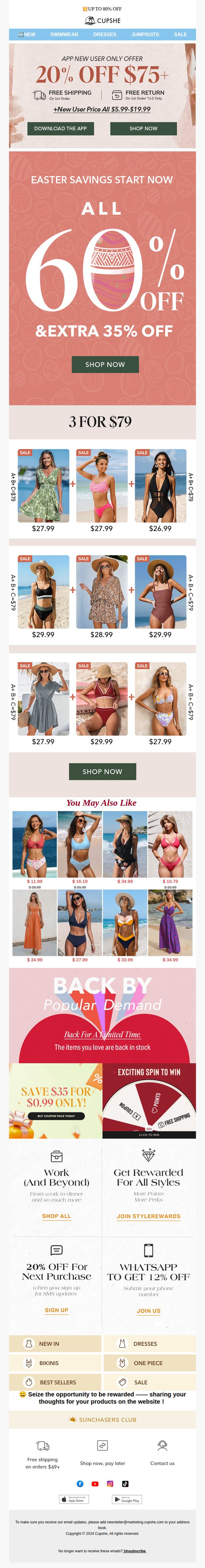
Objective
This email aims to drive immediate sales by promoting a limited-time Easter sale with deep discounts, while also encouraging app downloads and new user sign-ups through exclusive offers. It leverages urgency and social proof to convert browsers into buyers.
Why this works
The email brilliantly layers discounts, 60% off plus an extra 35%, to create a perception of unbeatable value, making the offer feel exclusive and time-sensitive, which compels immediate action from price-sensitive shoppers.
How to implement
By showcasing curated 3-for-$79 bundles with clear pricing and visual groupings, the email reduces decision fatigue and encourages higher cart values through smart product pairing that feels personalized and effortless to shop.
Pro Tip
The 'Extra 35% Off' is visually underemphasized, consider integrating it into the main hero headline or using a contrasting color to ensure it doesn’t get lost, since stacking discounts is the core conversion driver. • The 'You May Also Like' section lacks personalization cues; adding dynamic recommendations based on past browsing or purchase history would increase relevance and click-through rates significantly.