Proven The New Yorker email designs you can use

1. What Your Airplane-Seat Choice Says About You
Objective
To engage subscribers with witty, culturally relevant content while subtly promoting subscription through a limited-time offer at the bottom. The email balances humor, editorial depth, and conversion by leveraging The New Yorker’s signature voice to entertain and convert.
Why this works
The email masterfully blends editorial humor with subtle conversion tactics by placing the subscription CTA only after delivering substantial, entertaining content, building trust before asking for action.
How to implement
Using a playful, personality-driven headline like 'What Your Airplane-Seat Choice Says About You' hooks curiosity while aligning with The New Yorker’s voice, making the content feel both insightful and entertaining without being salesy.
Pro Tip
The CTA 'SUBSCRIBE' is visually strong but lacks persuasive microcopy, adding a short benefit like 'Join 1M+ readers who get daily wit & insight' would strengthen conversion intent without disrupting the tone. • The email’s layout buries the subscription offer at the very bottom after multiple content blocks, consider adding a sticky CTA bar or a mid-email teaser to capture early interest from readers who may not scroll fully.
2. David Zaslav, Hollywood Antihero
Objective
This email aims to drive engagement with The New Yorker’s daily newsletter by highlighting its most provocative and culturally relevant stories, while subtly encouraging subscriptions through a compelling value proposition and limited-time offer.
Why this works
The email opens with a bold, personality-driven headline that frames a complex media executive as a cultural antihero, instantly hooking readers with narrative tension and moral ambiguity rather than dry reporting.
How to implement
By weaving together hard news, cultural commentary, and playful diversions like quizzes and cartoons, the email mirrors the magazine’s editorial DNA, offering intellectual depth without sacrificing accessibility or delight.
Pro Tip
The CTA 'Subscribe today' appears twice but lacks visual hierarchy, consider making the bottom CTA button larger or using contrasting color to draw attention after users scroll through content. • The 'Free Gift' offer in the Culture Dept. section is buried mid-email; move it closer to the hero section or integrate it into the main CTA block to increase perceived value and conversion likelihood.
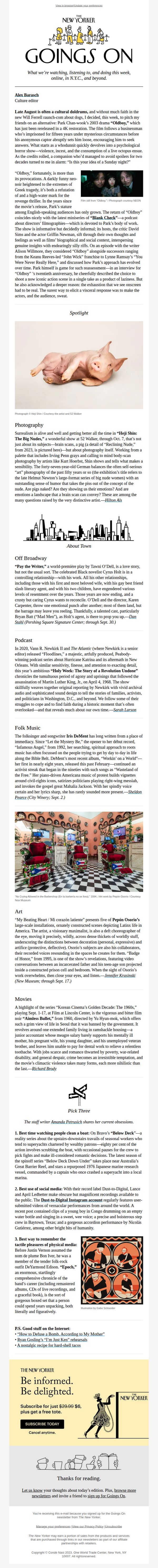
3. Goings On: The Surreal Nudes of Heji Shin
Objective
This email aims to inform readers about culturally rich events, exhibitions, and media across New York City and beyond, while subtly encouraging subscription through a value-driven closing offer. It positions The New Yorker as a curator of intelligent, offbeat, and emotionally resonant experiences.
Why this works
The email masterfully blends highbrow cultural critique with accessible, human-centered storytelling, like describing a pig’s portrait as both surreal and emotionally evocative, to make avant-garde art feel personally relevant and worth exploring.
How to implement
By curating not just events but emotional experiences, from the exhaustion of watching ‘Oldboy’ to the tenderness in Iris DeMent’s music, the newsletter transforms passive consumption into active cultural participation, deepening reader loyalty through shared feeling.
Pro Tip
Add a visual hierarchy to the 'Pick Three' section by using icons or numbered badges next to each item to guide attention and improve scannability for mobile users who may miss the curated nature of the list. • Reposition the subscription CTA higher in the email, perhaps after the first major cultural highlight, to capture interest at peak engagement rather than waiting until the end when reader momentum may have waned.
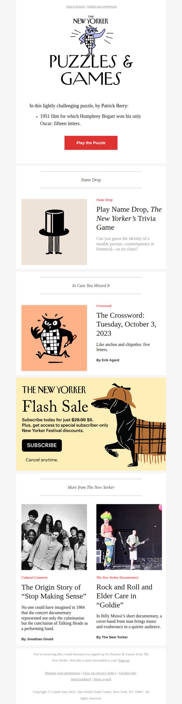
4. Today’s Crossword Puzzle
Objective
This email aims to engage subscribers with daily puzzle content while subtly promoting a subscription through a limited-time flash sale. It balances entertainment with conversion by offering immediate playability and exclusive subscriber perks.
Why this works
The email opens with a clever, bite-sized puzzle teaser that immediately rewards curiosity, turning passive readers into active participants within seconds of opening the message.
How to implement
By embedding a flash sale directly beneath the puzzle content, the campaign leverages user momentum, making the subscription offer feel like a natural next step rather than a disruptive sales pitch.
Pro Tip
Add a countdown timer to the Flash Sale section to create urgency, without it, the $6 offer feels static and less compelling, especially since the price drop is already dramatic. • Include a micro-testimonial or user stat near the CTA (e.g., 'Over 50,000 puzzlers played yesterday') to build social proof and nudge hesitant users toward clicking 'Play the Puzzle.'
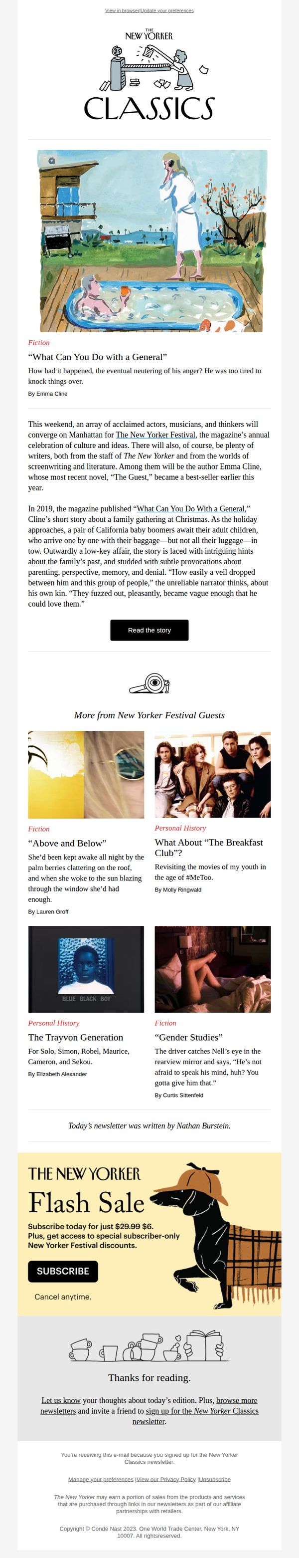
5. Parenthood, Perspective, and the Lure of Denial
Objective
This email aims to engage readers with curated literary content centered on themes of parenthood and perspective, while subtly promoting The New Yorker Festival and driving subscriptions through a limited-time flash sale offer.
Why this works
The email masterfully blends literary storytelling with promotional intent, using emotionally resonant fiction to draw readers in before introducing the subscription offer, making the commercial ask feel like a natural extension of the content experience.
How to implement
By anchoring the campaign around a timely cultural event, the New Yorker Festival, it creates urgency and relevance, positioning the subscription not just as access to articles, but as entry into a curated intellectual community with exclusive event perks.
Pro Tip
The CTA 'SUBSCRIBE' is visually strong but lacks persuasive microcopy, adding a benefit-driven phrase like 'Join 1M+ readers for $6' above the button would reinforce value and reduce friction. • The festival mention appears mid-email without a dedicated visual anchor or link to event details; adding a small 'Learn More About the Festival' button near the festival paragraph would improve conversion pathways.
6. David Remnick on Trump’s Bloody Campaign Promises

Objective
To engage readers with high-impact political commentary and cultural analysis while driving subscriptions through a limited-time offer. The email positions The New Yorker as essential reading for understanding urgent democratic threats and cultural moments.
Why this works
The email opens with a bold, emotionally resonant headline that frames Trump’s rhetoric as a direct threat to democracy, immediately establishing urgency and intellectual gravity that compels readers to engage with the deeper analysis inside.
How to implement
By pairing David Remnick’s authoritative voice with a visceral image of Trump mid-rant, the email leverages credibility and visual tension to create a narrative hook that feels both journalistic and cinematic, drawing readers into the story before they even scroll.
Pro Tip
Add a subtle countdown timer next to the flash sale CTA to heighten urgency and reduce decision fatigue, readers are more likely to act when they perceive scarcity, especially after consuming dense political content. • Include a short testimonial or subscriber quote near the subscription offer to reinforce social proof; for example, 'Over 50,000 readers subscribed after reading Remnick’s piece on democracy’s fragility, join them today.'
7. How Legal Immigration Became a Deportation Trap
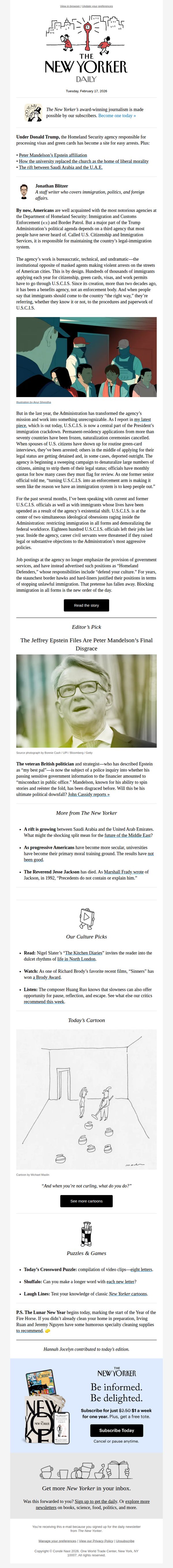
Objective
This email aims to inform subscribers about the transformation of U.S. Citizenship and Immigration Services into an enforcement tool under the Trump administration, while also promoting deeper engagement with The New Yorker’s journalism and encouraging new subscriptions through a compelling value proposition.
Why this works
The email masterfully opens with a provocative, policy-driven headline that immediately signals depth and urgency, drawing in politically engaged readers by framing immigration not as a border issue but as a bureaucratic betrayal of legal process.
How to implement
By embedding the subscription CTA within a visually distinct, value-packed footer that includes a tangible perk, a free tote, the campaign transforms a passive newsletter into a conversion engine without compromising editorial tone or reader trust.
Pro Tip
The primary CTA 'Read the story' is buried below a long article excerpt; moving it higher or making it visually bolder would improve click-through by reducing friction for readers already primed by the headline. • The subscription offer in the footer uses a price anchor ($2.50 → $1/week) but doesn’t clarify the discount’s duration or urgency; adding a subtle countdown or 'Limited Time Offer' tag would increase perceived scarcity and conversion pressure.