Proven Thrive Internet Marketing Agency email designs you can use
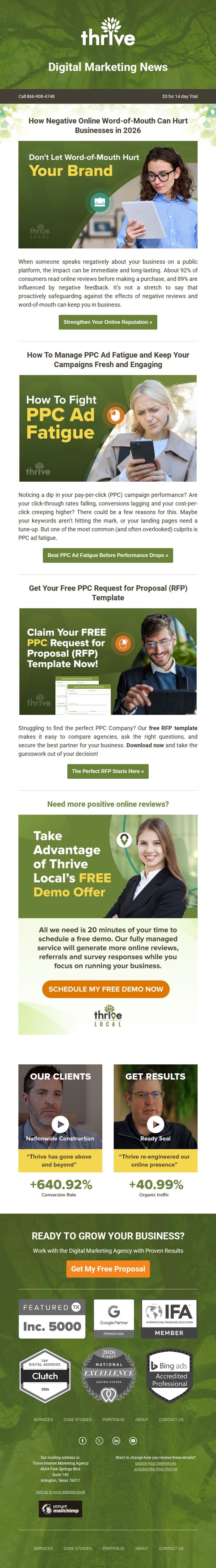
1. How Negative Online Word-of-Mouth Can Hurt Businesses in 2026 📉
Objective
This email aims to educate businesses on the risks of negative online word-of-mouth while positioning Thrive as the solution through reputation management and PPC expertise. It drives conversions by offering free resources and demos to capture leads and build trust.
Why this works
The email opens with a fear-based but data-backed hook about negative word-of-mouth, immediately creating urgency and relevance for business owners who rely on public perception to drive sales and retention.
How to implement
Each content block is paired with a highly specific, benefit-driven CTA that matches the reader’s inferred intent, whether they’re worried about reviews, ad fatigue, or agency selection, making the journey feel personalized and frictionless.
Pro Tip
The primary CTA 'Get My Free Proposal' appears only once at the bottom; adding a sticky or repeated CTA button after each major section would capture attention earlier and reduce drop-off for readers who don’t scroll fully. • The 'Education Section' on PPC ad fatigue lacks a visual hierarchy, using bullet points or icons to break down symptoms (e.g., falling CTR, rising CPC) would make the content scannable and increase retention for time-poor business owners.
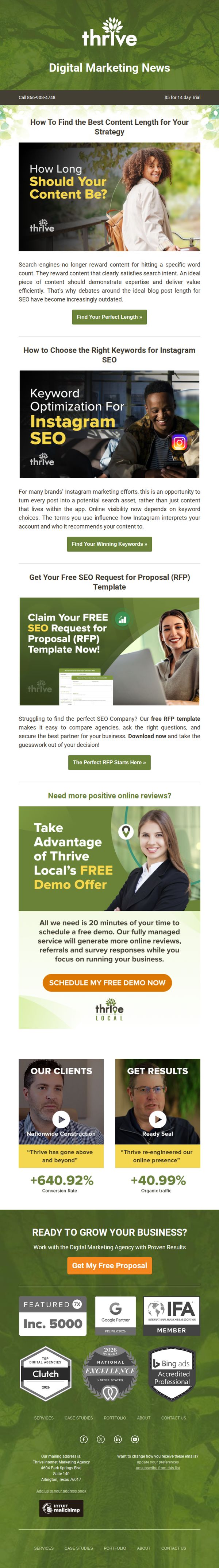
2. How To Find the Best Content Length for Your Strategy 🔎
Objective
This email aims to educate subscribers on modern content strategy best practices while positioning Thrive as a trusted authority, ultimately driving conversions through free tools, demos, and proposal requests to acquire new digital marketing clients.
Why this works
The email smartly reframes outdated SEO myths into educational hooks, like ditching word count obsession for intent-driven content, which builds credibility while subtly positioning Thrive as the guide to modern, results-focused marketing strategy.
How to implement
Each content module is paired with a hyper-relevant CTA that matches the reader’s intent, whether they’re researching content length, Instagram keywords, or agency selection, this alignment reduces friction and increases conversion likelihood by speaking directly to micro-moments of need.
Pro Tip
The primary CTA 'Get My Free Proposal' appears only once at the bottom, missing opportunities to re-engage readers mid-funnel; adding a sticky or repeated CTA after each educational section would capture interest while momentum is high. • The 'Thrive Local' demo offer section visually competes with the main brand message and lacks clear differentiation; repositioning it as a sub-brand or adding a visual separator would prevent audience confusion and reinforce the core agency value proposition.
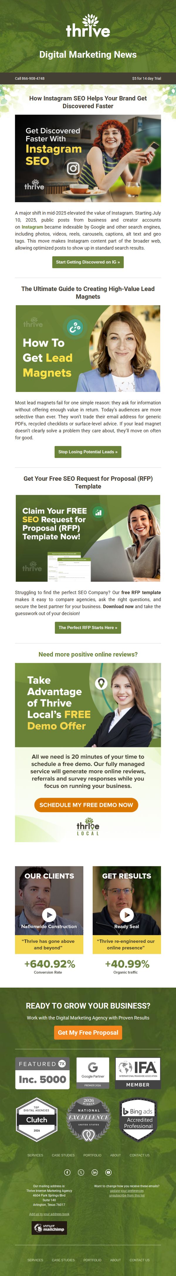
3. How Instagram SEO Helps Your Brand Get Discovered Faster 📱
Objective
This email aims to educate readers on the newly enhanced discoverability of Instagram content via search engines and convert them into leads by offering actionable resources and a free demo. It positions Thrive as an authority in digital marketing while guiding prospects toward personalized solutions.
Why this works
The email smartly anchors its value proposition in a timely, platform-specific update, Instagram becoming indexable by Google, which immediately positions the brand as a forward-thinking authority and creates urgency around SEO optimization for social content.
How to implement
Each content block is strategically paired with a clear, benefit-driven CTA that aligns with the reader’s stage in the funnel, whether they’re seeking education, tools, or direct consultation, which reduces friction and increases conversion likelihood across diverse audience segments.
Pro Tip
The primary CTA 'Get My Free Proposal' appears only at the bottom, missing mid-funnel opportunities, adding a sticky or floating CTA button after the first two sections would capture interest while readers are still engaged with educational content. • The email lacks a visual hierarchy that guides the eye from the headline through each offer; using subtle dividers, icons, or directional arrows between sections would improve flow and help readers intuitively navigate the multiple value propositions without feeling overwhelmed.
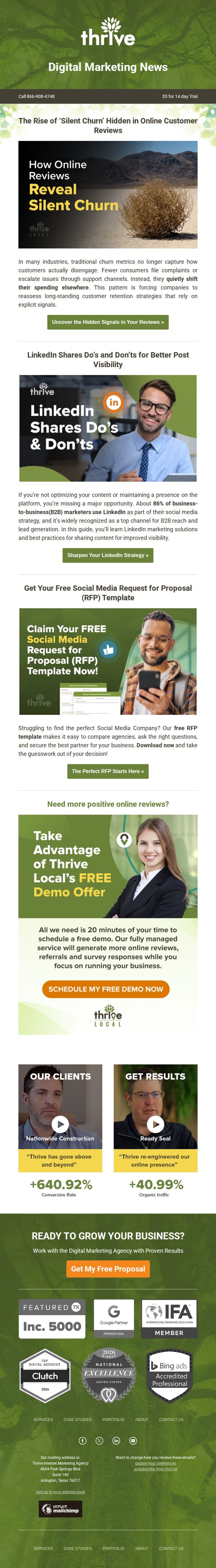
4. The Rise of ‘Silent Churn’ Hidden in Online Customer Reviews 🔎
Objective
This email aims to educate B2B marketers on the hidden threat of 'silent churn' revealed through online reviews while positioning Thrive as the solution through a free demo and social media resources. It seeks to convert readers into leads by offering actionable tools and social proof.
Why this works
The email opens with a compelling, industry-specific pain point, 'silent churn', that immediately resonates with B2B marketers who may not realize how customer disengagement hides in plain sight within online reviews, making the message instantly relevant and urgent.
How to implement
By embedding a free RFP template and LinkedIn strategy guide within the content flow, the email delivers immediate value before asking for commitment, building trust and positioning Thrive as a helpful authority rather than just a sales-driven agency.
Pro Tip
The primary CTA 'SCHEDULE MY FREE DEMO NOW' appears mid-email but lacks visual hierarchy compared to secondary CTAs; increasing its size, contrast, or adding a subtle animation would better guide users toward the desired action without competing with other offers. • The email presents multiple offers (RFP template, LinkedIn guide, demo) without clear prioritization; adding a numbered or tiered visual cue (e.g., 'Step 1: Download Template → Step 2: Book Demo') would streamline the user journey and reduce decision fatigue.