Travel + Leisure email gallery from real brands
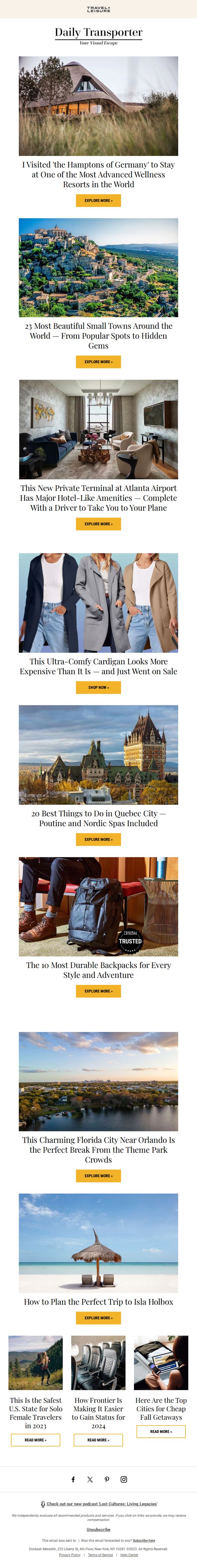


1. One of the Most Advanced Wellness Resorts in the World
Objective
To engage subscribers with visually rich, curated travel content that inspires wanderlust and drives clicks to in-depth articles, while subtly promoting affiliated products and services through strategic placement and trusted endorsements.
Why this works
The email masterfully blends aspirational travel storytelling with practical product recommendations, creating a seamless journey from inspiration to action without disrupting the reader’s emotional engagement or sense of discovery.
How to implement
By featuring a mix of luxury destinations, hidden gems, and budget-friendly tips, the campaign appeals to a broad audience while maintaining editorial credibility, a smart balance that keeps readers returning for both escapism and utility.
Pro Tip
The CTA 'EXPLORE MORE »' is repetitive across all sections and lacks urgency or personalization, consider varying CTAs like 'See Why Travelers Love This Resort' or 'Grab This Deal Before It’s Gone' to better match content context and drive higher conversion. • The bottom section with three small article previews uses 'READ MORE »' CTAs that visually compete with the dominant 'EXPLORE MORE »' buttons above, unify the CTA design language or elevate the bottom section with a stronger visual hierarchy to avoid diluting user focus.
2. FAA Issues Ground Stop for NYC Airport
Objective
To inform subscribers of breaking travel news while curating a mix of timely deals, destination highlights, and lifestyle content that keeps them engaged with Travel + Leisure’s brand and drives clicks to featured articles and shopping offers.
Why this works
The email opens with urgent, real-time travel disruption news to immediately capture attention, then smoothly transitions into curated deals and destinations, turning anxiety into opportunity without losing editorial credibility or reader trust.
How to implement
Each article preview pairs high-impact visuals with emotionally resonant headlines, like ‘Rent Shrek’s House on Airbnb for Free’, blending whimsy and practicality to spark curiosity and drive clicks across diverse audience segments with minimal friction.
Pro Tip
Replace generic 'READ MORE »' CTAs with action-oriented, benefit-driven text like 'See How to Claim Your Free Trip' or 'Shop Fall Cardigans Before They Sell Out' to increase conversion intent and align with each section’s unique value proposition. • Add a subtle visual hierarchy using icons or badges (e.g., 'New', 'Trending', 'Editor’s Pick') next to article titles to help readers quickly prioritize content based on relevance or urgency, improving scanability in a dense layout.
3. This Florida City Has the Best Beach in North America
Objective
This email aims to drive engagement by showcasing trending travel destinations, timely deals, and lifestyle content that aligns with readers’ seasonal interests, particularly fall travel and shopping, while subtly promoting affiliate products and brand partnerships.
Why this works
The email opens with a high-impact, emotionally resonant headline about a top beach destination, immediately capturing wanderlust while anchoring the reader in a specific, credible geographic claim that invites curiosity and clicks.
How to implement
Strategically interspersing shoppable product highlights, like fall boots and travel gadgets, within editorial content creates a seamless blend of inspiration and commerce, making affiliate promotions feel native rather than disruptive to the reader’s journey.
Pro Tip
Add a visual hierarchy to the CTA buttons, perhaps varying color or size, to distinguish editorial content links from shoppable product CTAs, helping users intuitively navigate between inspiration and purchase intent. • Include a brief personalization tagline or dynamic field (e.g., ‘Based on your love of beach getaways…’) near the top to increase relevance and connection, especially since the content spans diverse travel and shopping interests.
4. Southwest Has 50% Off Flights Right Now
Objective
This email aims to drive immediate engagement and clicks by highlighting time-sensitive travel deals and curated travel content, positioning Travel + Leisure as a trusted source for smart, timely travel planning and product discovery.
Why this works
The email leads with a high-impact, time-sensitive deal, Southwest’s 50% off flights, immediately capturing attention and creating urgency, which is a proven tactic to boost click-through rates in travel marketing.
How to implement
By blending promotional content with editorial-style travel tips and product roundups, the email maintains reader interest beyond the sale, subtly building brand authority while guiding users toward multiple conversion paths without feeling pushy.
Pro Tip
The primary Southwest sale CTA is visually buried under the hero image; moving the 'READ MORE »' button higher or adding a sticky 'Book Now' banner would reinforce urgency and improve conversion for the campaign’s core offer. • The email lacks a clear visual hierarchy between editorial content and shoppable products, adding subtle badges like 'Sponsored' or 'Shop This' to product sections would improve transparency and user trust without disrupting flow.
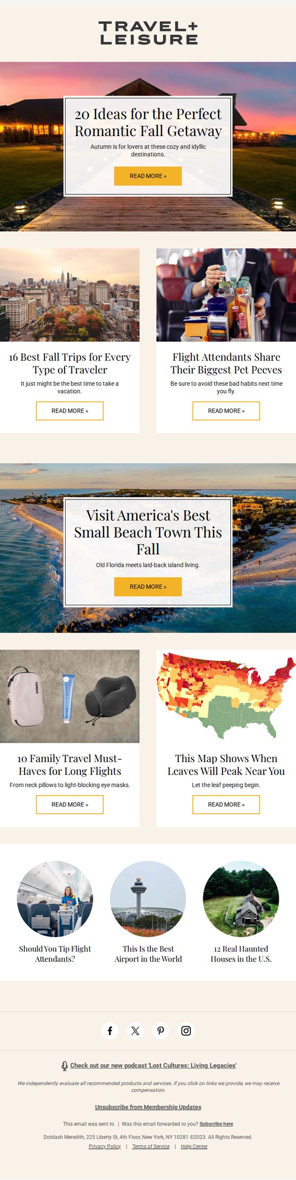
5. Where to Go This Fall + Flight Attendant Secrets + More
Objective
To inspire fall travel through curated destination ideas, insider tips, and practical travel gear recommendations while driving engagement with clickable content and brand loyalty through podcast promotion.
Why this works
The email brilliantly blends aspirational travel imagery with practical, relatable content like flight attendant pet peeves and family travel gear, making dream destinations feel achievable and grounded in real-world advice.
How to implement
By organizing content into visually distinct, scannable blocks with consistent CTA buttons, the email guides the reader smoothly from inspiration to action without overwhelming them with information or design clutter.
Pro Tip
Add a subtle countdown or seasonal urgency tag (e.g., 'Book by Oct 15 for peak foliage') near the hero section to nudge readers toward immediate action without disrupting the inspirational tone. • Integrate a personalized subject line or dynamic content block (e.g., 'Top Fall Picks Near [City]') to increase relevance and open rates by leveraging subscriber location data if available.
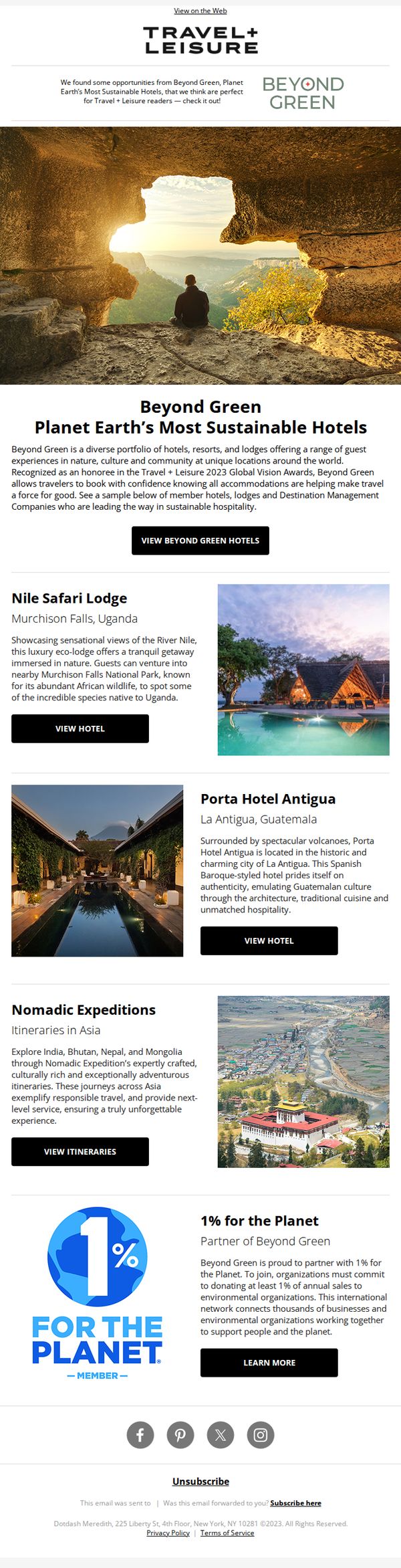
6. Beyond Green: Sustainable Stays at International Escapes
Objective
This email aims to inspire Travel + Leisure readers to choose eco-conscious travel by showcasing Beyond Green’s portfolio of sustainable hotels and experiences, while reinforcing the brand’s authority in responsible tourism through awards and partnerships.
Why this works
The email opens with a powerful visual metaphor, a traveler framed by nature, immediately aligning the brand with immersive, responsible travel while subtly signaling that sustainability enhances, rather than limits, the luxury experience.
How to implement
Each property highlight pairs evocative imagery with concise storytelling that emphasizes cultural authenticity and environmental stewardship, making sustainability feel aspirational and emotionally resonant rather than transactional or guilt-driven.
Pro Tip
Add a subtle countdown or urgency cue near the 'VIEW BEYOND GREEN HOTELS' CTA to encourage immediate action, since sustainable travel often involves early booking for peak seasons or limited-availability eco-lodges. • Include a short testimonial or guest quote under one of the hotel highlights to humanize the experience and reinforce social proof, especially since luxury travelers often rely on peer validation before committing to high-end sustainable stays.
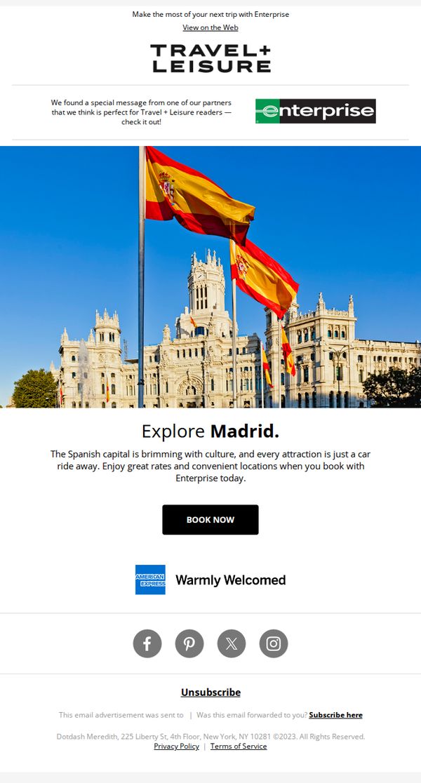
7. Explore Madrid With Enterprise
Objective
This email aims to inspire Travel + Leisure readers to plan a trip to Madrid by highlighting its cultural richness and accessibility via Enterprise rental cars, while driving immediate bookings through a compelling visual and concise offer.
Why this works
The email leverages a stunning hero image of Madrid’s architecture and flags to instantly evoke wanderlust, pairing visual grandeur with a simple, benefit-driven message that positions car rentals as the key to unlocking the city’s cultural treasures.
How to implement
By aligning with a trusted brand like Enterprise and featuring American Express as a partner, the email builds credibility and reassures readers that their travel logistics will be seamless, reliable, and financially rewarding through trusted affiliations.
Pro Tip
Add a subtle countdown timer or limited-time offer badge near the CTA to create urgency, since the current design lacks any time-sensitive incentive that could nudge hesitant travelers to book immediately. • Include a short testimonial or user rating from a recent Madrid traveler who used Enterprise, placed just above the CTA, to add social proof and reinforce trust in the rental experience beyond brand logos.
8. What Flight Attendants Notice First About Passengers

Objective
This email aims to engage travelers by delivering a curated mix of intriguing travel insights, destination highlights, and product recommendations that spark curiosity and encourage clicks to deeper content or shopping pages. It positions Travel + Leisure as a trusted source for smart, stylish, and surprising travel advice.
Why this works
The email masterfully blends curiosity-driven headlines with visually rich imagery to create an irresistible scroll experience, making each article feel like a personal travel tip rather than a generic list.
How to implement
By alternating between destination guides, product roundups, and quirky travel hacks, the campaign maintains high engagement by catering to multiple traveler personas without diluting its editorial voice or brand authority.
Pro Tip
Add a subtle visual hierarchy to the CTA buttons, perhaps by using a slightly darker shade of yellow for product-related 'SHOP NOW' buttons, to help users instantly distinguish between editorial and commercial intent without disrupting the clean design. • Include a short, personalized intro line at the top (e.g., 'Hi [Name], here’s what’s trending in travel this week') to increase perceived relevance and reduce the generic newsletter feel, especially since the content is highly curated and timely.
9. The Best U.S. Airlines of 2023
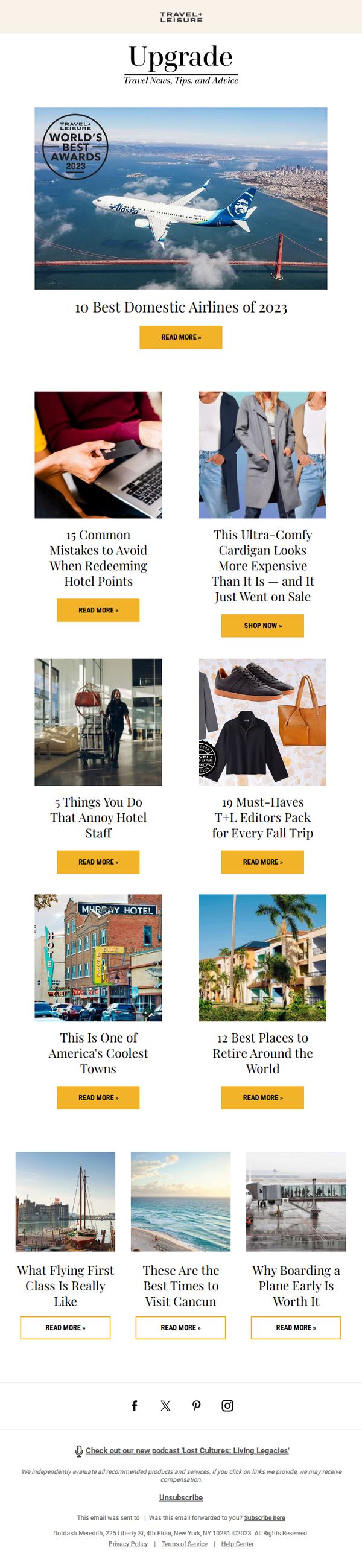
Objective
This email aims to engage readers by showcasing Travel + Leisure’s authoritative rankings and curated travel content, encouraging clicks to deepen engagement and drive traffic to their website while reinforcing brand authority in the travel space.
Why this works
The email leverages a prestigious award badge prominently in the hero section to instantly establish credibility and entice readers with exclusive, expert-vetted content that feels both aspirational and trustworthy.
How to implement
By mixing practical travel advice with lifestyle-driven product picks and destination inspiration, the email creates a well-rounded content ecosystem that appeals to multiple reader motivations without feeling cluttered or salesy.
Pro Tip
Add a subtle visual hierarchy to the CTA buttons, such as varying button sizes or colors for top-performing articles, to guide attention toward high-value content like the airline rankings or editor’s picks. • Include a short teaser snippet under each headline to clarify the article’s unique value, helping readers quickly decide which content aligns with their interests and reducing bounce rates.
10. This Stunning Beach Was Named No. 1 in the U.S.

Objective
To drive engagement and clicks by showcasing the top 10 trending travel stories of the moment, leveraging curiosity and FOMO around top-ranked destinations, luxury travel gear, and seasonal experiences. The email aims to position Travel + Leisure as the go-to authority for curated, high-impact travel inspiration.
Why this works
The email masterfully combines aspirational imagery with authoritative rankings to create instant credibility and emotional pull, making readers feel they’re accessing insider knowledge on the most coveted travel experiences of the year.
How to implement
By mixing destination highlights with product roundups like luxury travel accessories, the campaign subtly bridges inspiration with commerce, guiding readers from dream to do without breaking the editorial flow or feeling overly promotional.
Pro Tip
Add a subtle visual hierarchy to the CTA buttons, such as varying button sizes or colors for high-priority stories (e.g., the No. 1 beach), to guide users toward the most compelling content first and increase click-through on top-performing pieces. • Include a short, punchy teaser sentence under each headline (e.g., 'Voted by 10,000 travelers' or 'Only 3 spots left at this resort') to add urgency or social proof, enhancing persuasion without cluttering the clean layout.