The complete Vitality email collection
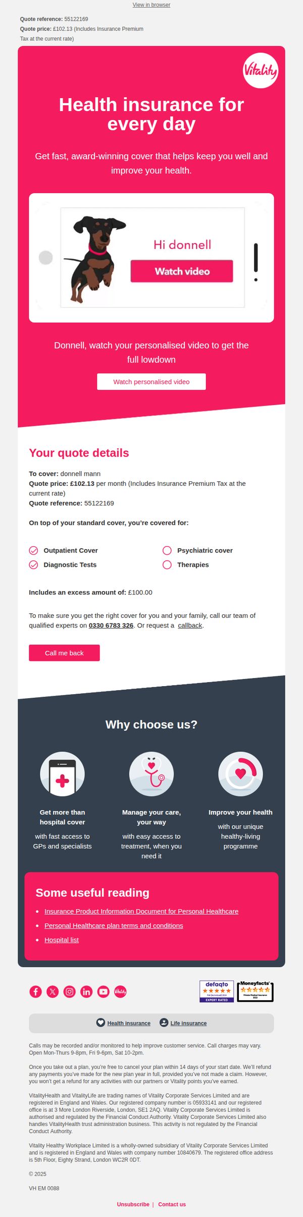
1. Donnell, don't forget about your health quote
Objective
This email aims to re-engage Donnell by reminding him of his personalized health insurance quote and encouraging him to watch a custom video that explains the benefits, coverage, and value of his specific plan to drive conversion.
Why this works
The email opens with a personalized video prompt featuring the recipient’s name and a friendly dog mascot, which instantly humanizes the message and reduces the friction of engaging with insurance content by making it feel conversational and tailored.
How to implement
By clearly listing what’s included and excluded in the quote, like outpatient cover and diagnostic tests versus psychiatric care, the email builds trust through transparency, helping the recipient feel informed rather than pressured, which is critical in high-consideration purchases like health insurance.
Pro Tip
Add a countdown timer or urgency indicator near the CTA to emphasize that the quote may expire or change, which would increase conversion by leveraging scarcity without being pushy, especially effective since the recipient already engaged enough to receive a quote. • Reposition the 'Call me back' button closer to the quote details or make it visually dominant, currently it’s buried under text, which reduces its effectiveness for users who prefer human interaction over self-service, especially in a high-trust category like health insurance.
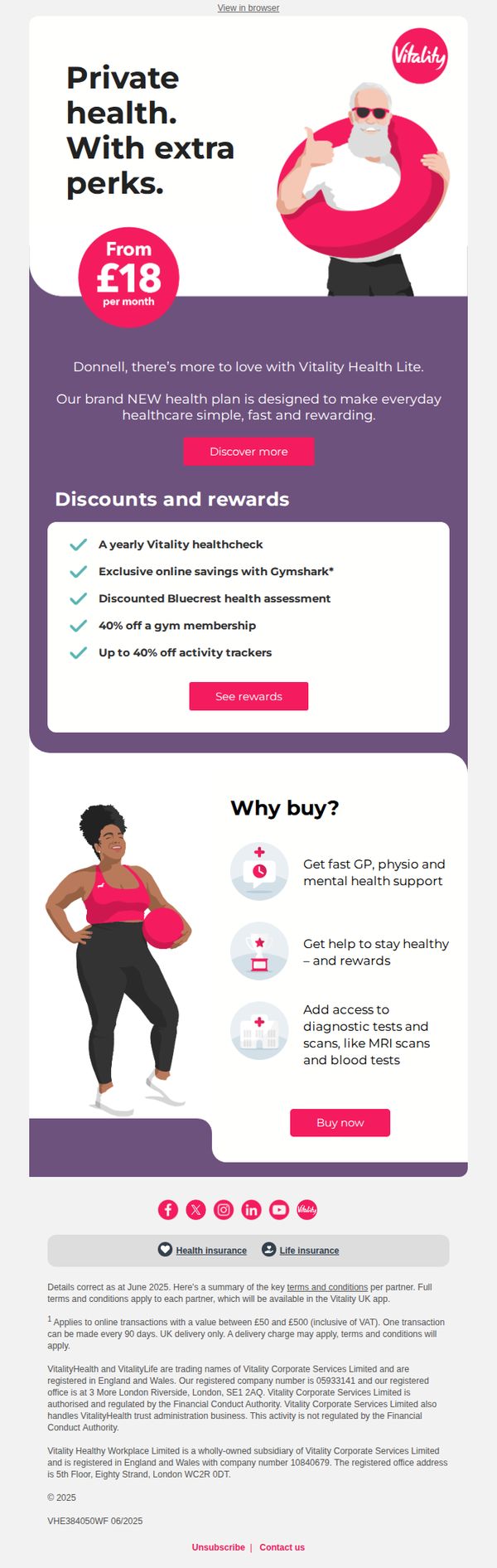
2. Affordable private health from £18 - plus extra perks
Objective
This email aims to drive sign-ups for Vitality’s new Health Lite plan by emphasizing affordability starting at £18/month and highlighting exclusive perks that enhance everyday healthcare. It positions the plan as simple, fast, and rewarding to appeal to cost-conscious consumers seeking added value.
Why this works
The email brilliantly anchors attention on affordability with a bold ‘From £18 per month’ visual, immediately lowering perceived barriers and making private healthcare feel accessible to a wider audience without sacrificing perceived value.
How to implement
By bundling tangible lifestyle perks like Gymshark discounts and activity tracker savings, the campaign transforms a health insurance product into a holistic wellness membership, appealing emotionally to users who want rewards beyond clinical care.
Pro Tip
Add a countdown timer or urgency trigger near the ‘Buy now’ CTA to encourage immediate action, especially since the offer implies limited-time perks like the 40% gym discount, which could be more compelling with time sensitivity. • Include a short testimonial or user quote near the ‘Why buy?’ section to humanize the benefits, for example, a real customer saying how fast GP access changed their health journey, to build trust and emotional resonance.
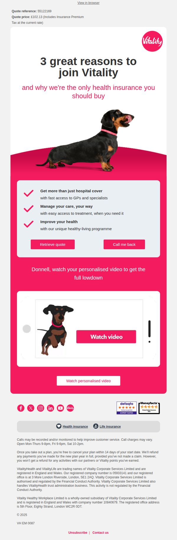
3. 3 great reasons to join Vitality
Objective
To persuade potential customers to choose Vitality health insurance by highlighting three unique value propositions that differentiate it from competitors, while encouraging immediate engagement through personalized video and quote retrieval.
Why this works
Vitality brilliantly frames its offering not just as insurance but as a holistic health empowerment tool, emphasizing fast GP access, flexible care management, and proactive wellness programs to position itself as the only plan worth choosing.
How to implement
The use of a playful dachshund in the hero section humanizes the brand and creates emotional resonance, subtly suggesting that Vitality cares for all family members, including pets, while keeping the tone light and approachable despite a serious subject.
Pro Tip
Add a subtle countdown timer or urgency cue near the 'Retrieve quote' CTA to encourage faster decision-making, especially since pricing is already displayed, this could reduce hesitation and increase conversion rates. • Reposition the 'Call me back' button slightly lower or visually de-emphasize it compared to 'Retrieve quote,' so users aren’t distracted from the primary goal of self-service quote generation, which aligns better with digital-first behavior.
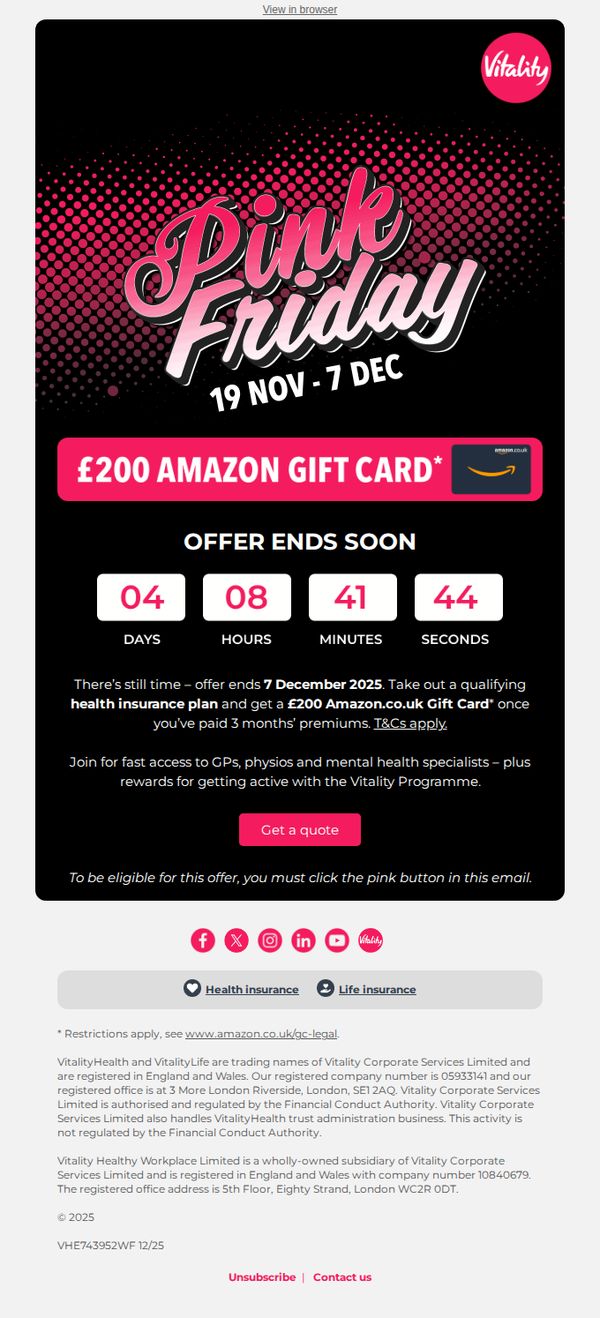
4. ⏳Last chance to claim your £200 gift card
Objective
This email aims to drive urgency and conversions by encouraging recipients to sign up for a qualifying health insurance plan before the deadline to claim a £200 Amazon.co.uk gift card. It leverages time-sensitive messaging and a high-value incentive to prompt immediate action.
Why this works
The email masterfully combines a visually arresting gradient and bold typography to immediately communicate the ‘Pink Friday’ event, creating emotional resonance and urgency that aligns perfectly with the limited-time offer.
How to implement
By embedding a live countdown timer directly beneath the offer, the campaign transforms abstract urgency into a tangible, ticking motivator that compels users to act before the deadline expires on December 7, 2025.
Pro Tip
Add a secondary CTA above the countdown timer (e.g., 'See Plans Now') to capture users who may not immediately click 'Get a quote' but want to explore options first, reducing drop-off before the timer expires. • Include a micro-testimonial or social proof near the CTA, such as 'Over 10,000 members claimed their gift card last week', to reinforce credibility and reduce perceived risk for hesitant users.
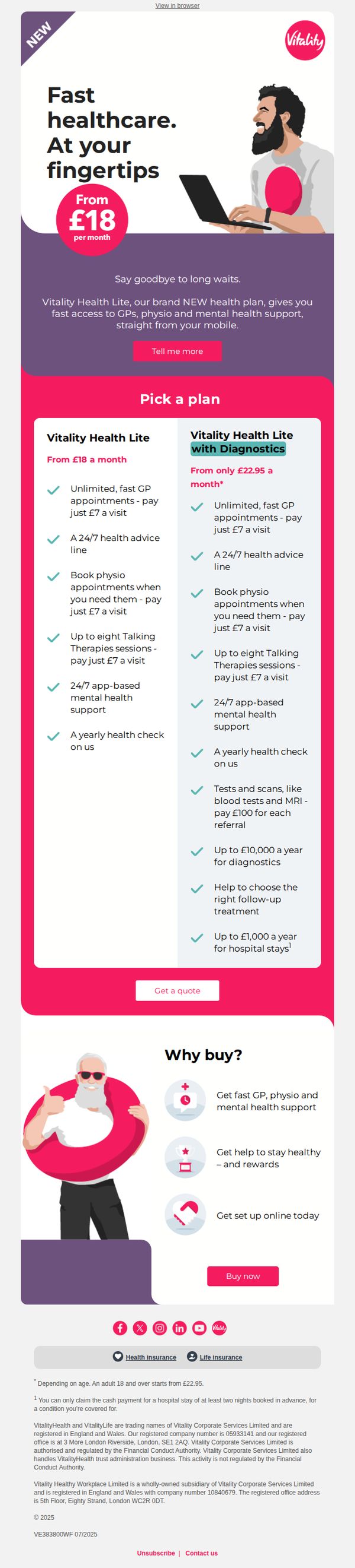
5. The NEW way to get fast private healthcare
Objective
This email aims to drive sign-ups for Vitality’s new Health Lite plan by highlighting fast, mobile-accessible private healthcare at an affordable starting price, while clearly differentiating between two plan tiers to guide user choice.
Why this works
The email brilliantly frames private healthcare as an instant, mobile-first convenience, not a luxury, by using phrases like 'at your fingertips' and showing a smiling user on a laptop, which emotionally aligns with modern expectations of speed and accessibility.
How to implement
By presenting two clearly contrasted plans side-by-side with identical visual styling and bullet-pointed benefits, the email reduces decision fatigue and empowers users to self-select based on their needs without feeling overwhelmed or confused by complex jargon.
Pro Tip
Add a subtle countdown timer or urgency indicator near the 'Get a quote' CTA to nudge procrastinators, since healthcare decisions are often delayed, a time-sensitive nudge could increase conversion without feeling pushy. • Include a short, real-user testimonial or satisfaction stat (e.g., '92% of members saw a GP within 24 hours') in the hero or offer section to build trust and validate the 'fast healthcare' promise with social proof.
6. Get rewarded for healthy habits 🙌
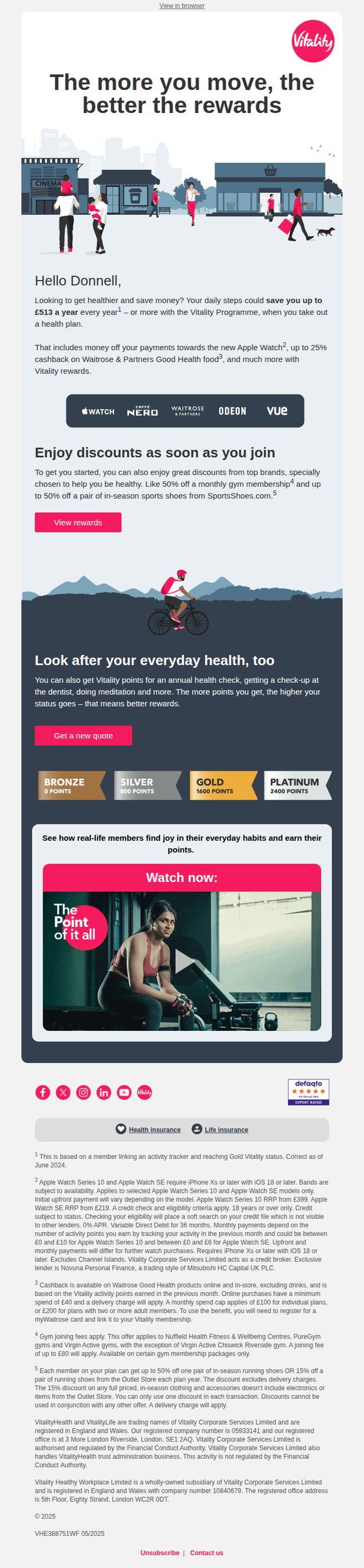
Objective
This email aims to motivate recipients to join the Vitality Programme by highlighting how daily healthy habits translate into tangible financial rewards, discounts, and wellness benefits, positioning health as an investment with immediate and long-term returns.
Why this works
The email brilliantly frames health not as a chore but as a rewarding behavior, tying physical activity directly to cashback, premium tech, and lifestyle perks, making wellness feel instantly valuable and financially smart.
How to implement
By featuring recognizable brand partners like Apple Watch, Waitrose, and Odeon, the campaign builds instant credibility and emotional resonance, showing users exactly where their rewards can be spent in real life, not just abstract points.
Pro Tip
Add a progress bar or tier visualizer under the 'Look after your everyday health' section to show how close the user is to reaching Bronze or Silver status, this would increase urgency and gamify the journey toward higher rewards. • Reposition the 'Get a new quote' CTA button closer to the top of the email, ideally right after the headline, so users who are already convinced don’t have to scroll past secondary offers to take action.
7. ⏳ Offer ends soon
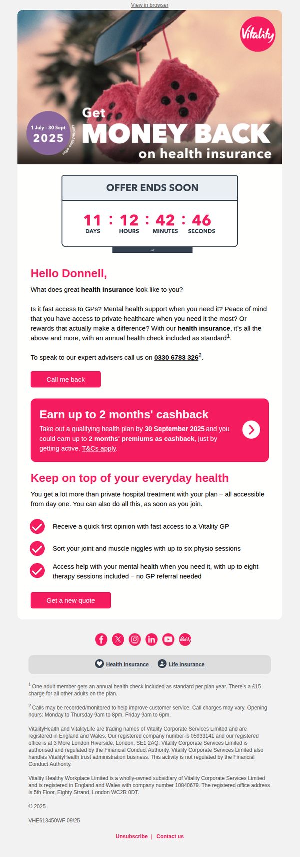
Objective
This email aims to drive immediate action by encouraging recipients to sign up for Vitality’s health insurance plan before the promotional offer expires, leveraging urgency and tangible benefits like cashback and instant healthcare access.
Why this works
The email masterfully combines urgency with value by front-loading a countdown timer and a bold cashback incentive, making the offer feel exclusive and time-sensitive without overwhelming the reader with fine print.
How to implement
By personalizing the greeting and framing health insurance around everyday needs, like fast GP access and mental health support, the email transforms a complex product into a relatable, lifestyle-enhancing solution that speaks directly to the recipient’s daily concerns.
Pro Tip
Add a secondary CTA button near the top of the email, such as 'See How It Works', to guide hesitant users who need more context before committing, reducing drop-off before the main 'Get a new quote' CTA. • Include a short testimonial or social proof snippet near the cashback offer to build trust, for example, '92% of members say they’d recommend Vitality', to counteract skepticism about the cashback claim and reinforce credibility.
8. Donnell, get fast access to GPs
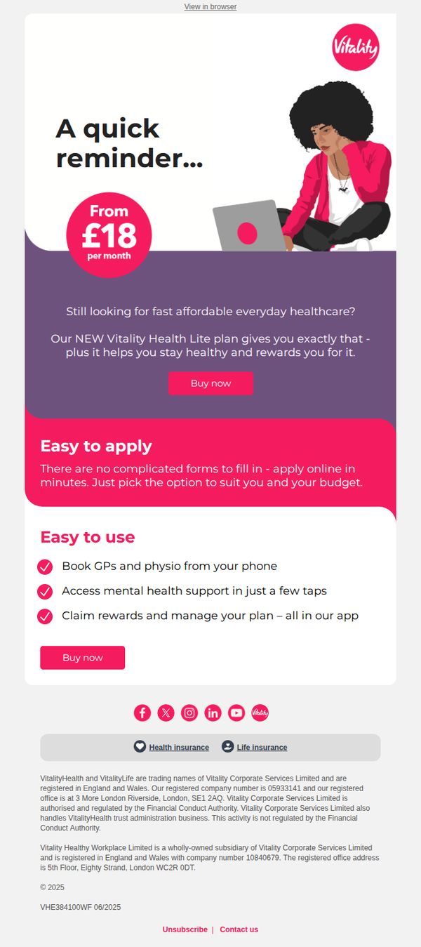
Objective
This email aims to re-engage the recipient by reminding them of the affordable, accessible healthcare benefits offered through Vitality’s new Health Lite plan, encouraging immediate sign-up with a clear value proposition and simplified user experience.
Why this works
The email opens with a personalized subject line and reminder tone that feels conversational yet urgent, making the recipient feel seen while gently nudging them toward action without sounding pushy or generic.
How to implement
By emphasizing ‘easy to apply’ and ‘easy to use’ in distinct sections, the campaign reduces perceived friction for potential customers, turning complex healthcare decisions into simple, mobile-friendly actions that align with modern consumer expectations.
Pro Tip
Add a subtle countdown timer or urgency indicator near the CTA to reinforce limited-time access or enrollment window, which could increase click-through rates by creating mild FOMO without compromising the calm, trustworthy tone. • Include a short testimonial or user quote under the ‘Easy to use’ section to provide social proof, real voices validating ease-of-use can significantly reduce skepticism and build trust before the final purchase decision.