Vueling email gallery from real brands
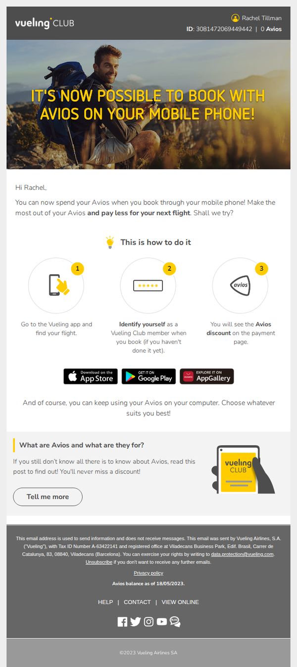
1. Knock, knock, Rachel. In case you haven't heard... 🤓
Objective
This email aims to inform Vueling Club member Rachel that she can now redeem Avios points directly through the mobile app when booking flights, encouraging immediate app usage to enhance loyalty engagement and reduce friction in point redemption.
Why this works
The email opens with a personal, conversational tone, addressing the recipient by name and using playful phrasing like 'Knock, knock', which immediately builds rapport and makes the update feel like a friendly heads-up rather than a corporate announcement.
How to implement
It simplifies a potentially complex feature by breaking down the mobile redemption process into three clear, visually supported steps, reducing cognitive load and making adoption feel effortless for even first-time users of the app’s loyalty function.
Pro Tip
Add a visual countdown or urgency trigger near the CTA (e.g., 'First 100 users this week get bonus Avios!') to transform passive awareness into immediate action, leveraging FOMO to drive app engagement beyond just informational intent. • Include a small testimonial or stat like '92% of members who switched to mobile booking saved 5+ minutes per transaction' to reinforce credibility and subtly highlight the efficiency benefit, strengthening the persuasive case for behavior change.
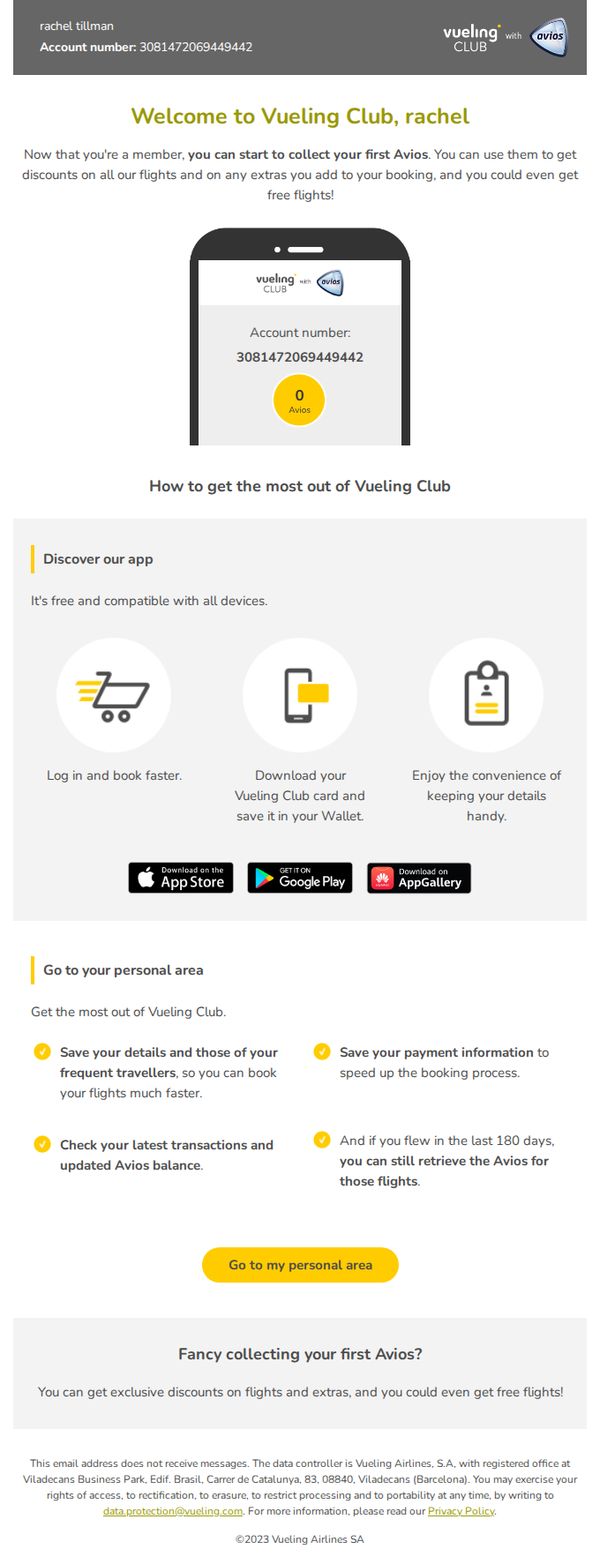
2. rachel, welcome to Vueling Club ✈️
Objective
This email welcomes new Vueling Club members and educates them on how to start earning and using Avios points for discounts and free flights, encouraging immediate engagement with the loyalty program through app usage and personal account management.
Why this works
The email immediately personalizes the experience by addressing the recipient by name and displaying their unique account number, which builds trust and reinforces membership legitimacy right from the first glance.
How to implement
By visually simulating the mobile app interface with a zero Avios balance, the email creates a tangible starting point that motivates users to take action and begin earning, turning abstract rewards into a visible, trackable goal.
Pro Tip
Add a subtle countdown or time-sensitive incentive (e.g., 'Earn double Avios on your first flight within 30 days') to create urgency and prompt faster engagement with the loyalty program. • Include a small visual indicator or progress bar near the '0 Avios' display to show how close the user is to their first reward tier, which can increase motivation to book and earn.
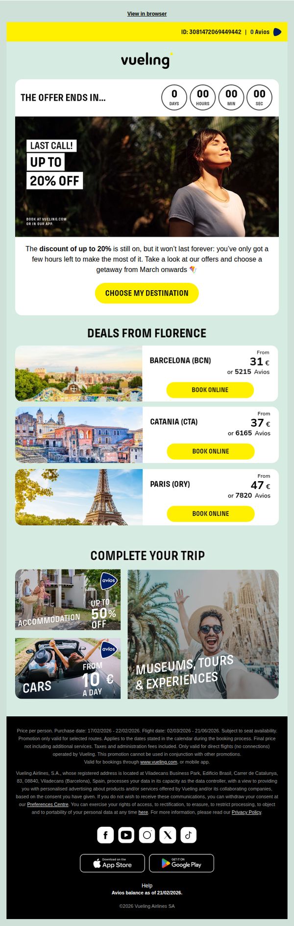
3. Tick tock… the 20% discount is slipping away 😶🌫️
Objective
This email aims to drive immediate flight bookings by creating urgency around a limited-time 20% discount, encouraging recipients to act before the offer expires while showcasing attractive destinations and complementary travel services.
Why this works
The email masterfully combines a real-time countdown timer with a bold 'LAST CALL!' headline to trigger FOMO, making the discount feel exclusive and time-sensitive rather than just another promotion.
How to implement
By anchoring deals to specific departure cities like Florence and pairing them with vivid destination imagery and transparent pricing in both euros and Avios, the email reduces decision friction and builds instant relevance for the recipient.
Pro Tip
The hero CTA 'CHOOSE MY DESTINATION' is generic, replacing it with action-driven text like 'GRAB 20% OFF BEFORE MIDNIGHT' would better align with the urgency created by the countdown timer and increase conversion intent. • The footer’s legal disclaimer is overly dense and visually disruptive; condensing it into a collapsible 'Terms & Conditions' link would improve readability and keep the focus on booking, not fine print.
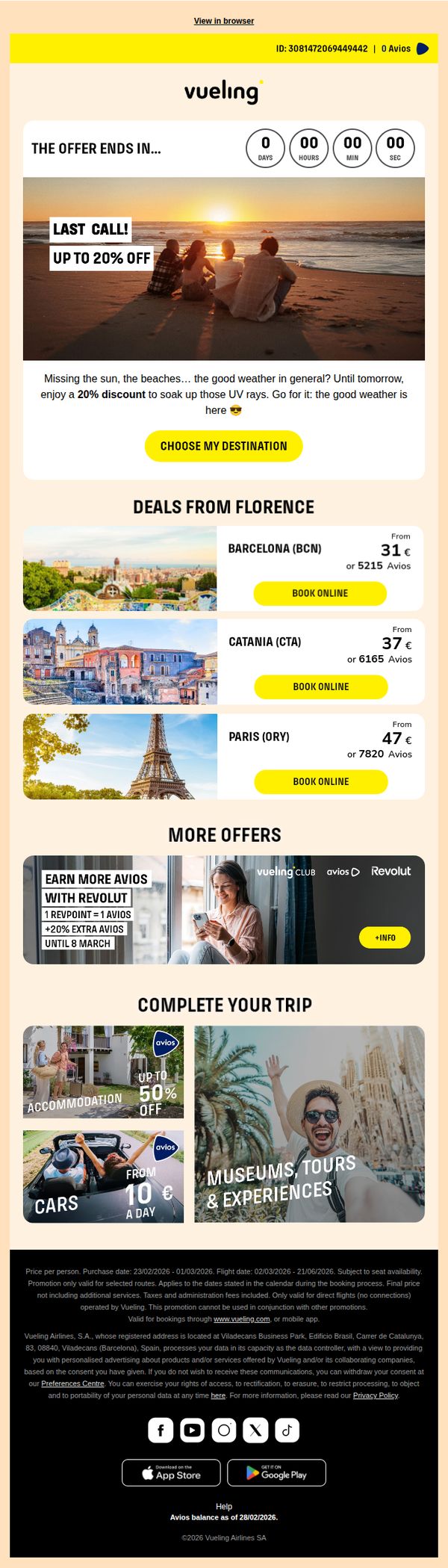
4. ☀️ Sunshine with 20% off. Only until Sunday! ☀️
Objective
To drive immediate flight bookings by promoting a limited-time 20% discount tied to sunny destinations, leveraging urgency with a countdown timer and emotional appeal to travelers missing good weather.
Why this works
The email brilliantly ties the emotional longing for sunshine to a time-sensitive discount, making the offer feel personally relevant and urgent rather than just another promotion.
How to implement
By featuring visually rich destination cards with dual pricing (euros and Avios), the campaign caters to both casual travelers and loyalty members, expanding its conversion potential without complicating the message.
Pro Tip
Add a subtle progress bar or dynamic counter under the countdown timer to visually reinforce urgency, making the 'last call' feel more tangible and emotionally compelling. • Reposition the 'CHOOSE MY DESTINATION' CTA to appear both above and below the destination grid, reducing friction for users who scroll past the hero section without clicking.