Westchester Magazine email designs from top brands
1. Property Tips All Prospective Sellers Should Know🏘️
Objective
This email aims to position Westchester Magazine as a trusted resource for prospective home sellers by delivering actionable, locally relevant real estate tips while subtly promoting partner brands and services that support the home-selling journey.
Why this works
The email smartly frames home-selling advice as a curated, local experience by tying tips directly to Westchester County’s seasonal and design culture, making the content feel hyper-relevant and trustworthy to its target audience.
How to implement
By integrating partner content seamlessly into the editorial flow, like Country Willow’s showroom space and Barrett Oswald’s interior design tips, the email builds credibility while creating natural, non-intrusive sponsorship opportunities that feel like value-adds, not ads.
Pro Tip
Add a clear, action-oriented CTA beyond 'SHARE!', such as 'Download Our Free Home Seller Checklist' or 'Book a Free Home Valuation Consultation', to convert engaged readers into leads or service users. • Include a brief testimonial or stat from a local seller who used these tips successfully, to strengthen social proof and reinforce the practical value of the advice beyond just editorial content.
2. Don't Miss the Area's Top-Rated Jack O'Lantern Event
Objective
The email aims to drive ticket sales for The Great Jack O'Lantern Blaze by highlighting its unique attractions and urgency, positioning it as a must-see fall tradition for families and Halloween enthusiasts in the Hudson Valley region.
Why this works
The email masterfully combines sensory storytelling with social proof by describing hand-carved pumpkins, fall treats, and special effects while citing over two million visitors to validate its status as the top-rated Halloween event in the country.
How to implement
It strategically frames the event as a bucket-list experience by mentioning new attractions like the pumpkin Ferris wheel and Day of the Dead tribute, which taps into FOMO and positions the event as evolving and worth revisiting even for past attendees.
Pro Tip
Add a countdown timer or 'limited tickets remaining' indicator near the CTA to amplify urgency, since the email mentions tickets are selling fast but doesn’t visually reinforce scarcity. • Include a small map or driving directions link near the venue address to reduce friction for first-time visitors, especially since the event is at a historic manor that may be unfamiliar to out-of-town guests.
3. Fall Craft Fairs to Attend in Westchester🍂
Objective
This email aims to drive local engagement by highlighting seasonal craft fairs and cultural events in Westchester County, encouraging readers to explore fall activities while subtly promoting ticketed events and local business recognition through the Best of Business Awards.
Why this works
The email opens with a sensory-rich headline that evokes autumn nostalgia, immediately connecting with local readers’ seasonal emotions and positioning craft fairs as immersive experiences rather than just shopping events.
How to implement
By blending editorial content with promotional elements, like the Best of Business Awards, it creates a natural bridge between community storytelling and commercial action, making the CTA feel like a continuation of discovery rather than a sales pitch.
Pro Tip
The primary CTA 'Read More' is generic and underwhelming for a seasonal event guide; replacing it with action-oriented text like 'Find Your Fall Fair' or 'Get Event Details' would better match the campaign’s goal of driving attendance. • The layout buries the ticketed event (Best of Business Awards) at the bottom with minimal visual distinction; elevating it with a contrasting background, icon, or countdown timer would increase conversion by aligning design hierarchy with business priority.
4. Westchester's Bioscience Industry Is Thriving➡️
Objective
To highlight the growth and vitality of Westchester’s bioscience industry while promoting local business events, awards, and community resources that reinforce regional economic momentum and reader engagement.
Why this works
The email opens with a bold, localized industry narrative that immediately positions Westchester as a rising hub, creating regional pride and relevance that pulls readers into deeper content with emotional and economic stakes.
How to implement
Strategically placing time-sensitive event promotions like the Women in Business Awards with clear ticketing CTAs transforms passive readers into active participants, blending editorial value with actionable community engagement.
Pro Tip
The primary CTA 'Read More' is overused and generic; vary CTAs by section (e.g., 'Explore Bioscience Growth', 'Grab Your Awards Tickets') to better reflect intent and increase click-through specificity. • The layout lacks visual hierarchy between editorial and partner content; use subtle dividers, icons, or background tints to distinguish native stories from sponsored sections without compromising cohesion.
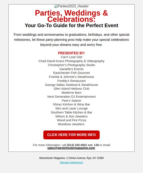
5. Your Go-To Guide for the Perfect Event
Objective
This email aims to position Westchester Magazine as a trusted resource for event planning by showcasing a curated list of local vendors, encouraging readers to click through for more details and potentially engage with advertisers. It also promotes brand authority through partnership visibility.
Why this works
By framing the email as a 'Go-To Guide,' the campaign taps into the reader’s desire for curated, trustworthy solutions, transforming a simple vendor list into a valuable resource that feels personalized and essential for event planning.
How to implement
Listing multiple local vendors under a single theme builds social proof and community trust, subtly signaling that these businesses are vetted and popular, a smart way to encourage clicks without aggressive sales language.
Pro Tip
Add a brief testimonial or quote from a past client or editor near the top to reinforce credibility and emotionally connect with readers before they scan the vendor list. • Include a small visual element, such as icons or logos, next to each vendor name to break up text density and make the list more scannable and engaging for mobile users.
6. Big Sip Exclusive Coupon Code
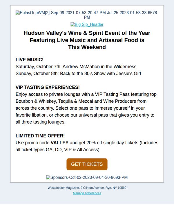
Objective
This email aims to drive immediate ticket sales for Hudson Valley’s Wine & Spirit Event by highlighting live music, VIP tasting experiences, and a time-sensitive 20% discount using a unique promo code to create urgency and exclusivity.
Why this works
The email smartly anchors excitement around live music acts with specific names and dates, giving potential attendees a tangible reason to attend beyond just wine tasting, which boosts emotional connection and FOMO.
How to implement
By clearly differentiating VIP tasting experiences with access to private lounges and top spirits, the email elevates perceived value and caters to both casual and premium audiences without diluting the core offer.
Pro Tip
Add a countdown timer or 'Only X tickets left' indicator near the CTA to amplify urgency, since the current 'Limited Time Offer' lacks real-time scarcity cues that could boost conversion. • Include a small map or venue photo in the hero section to help users visualize the event space and reduce friction in decision-making, especially for first-time attendees unfamiliar with the location.
7. The Westchester Housing Market Updates to Note🏡
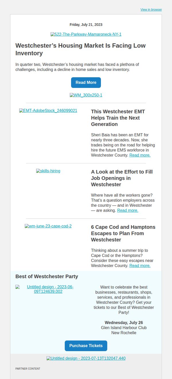
Objective
This email aims to inform Westchester Magazine readers about current local housing market trends while also promoting community engagement through event tickets and highlighting human-interest stories that reinforce the magazine’s role as a trusted local resource.
Why this works
The email opens with a timely, data-driven housing market insight that immediately establishes relevance for local homeowners and buyers, making the content feel urgent and worth reading rather than just promotional.
How to implement
By weaving in human-interest stories like the EMT training initiative and job market analysis, the email builds emotional connection and positions the brand as a community storyteller, not just a news source, which deepens reader loyalty.
Pro Tip
The primary CTA 'Read More' is repeated identically across all article links, reducing urgency and clarity, each should be tailored to the content (e.g., 'See Housing Trends' or 'Learn About Local Jobs') to better guide user intent. • The event promotion at the bottom lacks visual hierarchy and emotional pull, adding a compelling image, countdown timer, or testimonial quote from past attendees would increase ticket conversion rates.