How yoga studios and brands do yoga emails that drive sign-ups
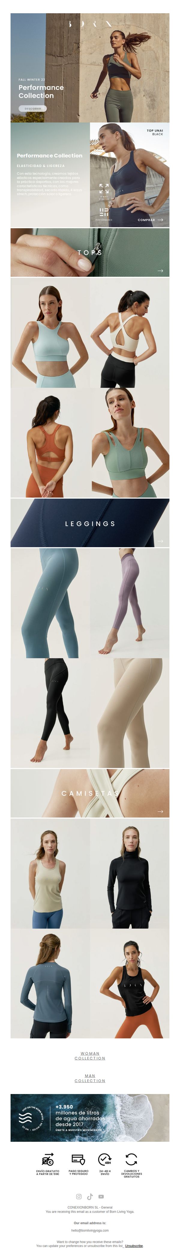
1. Born Living Yoga: Performance Collection | Elasticidad & ligereza 🏋️
Objective
This email aims to introduce and drive sales for Born Living Yoga’s Fall Winter 23 Performance Collection by highlighting its technical fabric benefits and showcasing curated product categories tailored for active lifestyles. It seeks to convert interest into purchases through visually rich product displays and clear CTAs.
Why this works
The email masterfully blends performance-driven messaging with aspirational visuals, positioning the collection not just as apparel but as essential gear for movement, which elevates perceived value and emotional connection with the target audience.
How to implement
By segmenting the product lineup into intuitive categories like Tops, Leggings, and Camisetas with dedicated visual grids, the email reduces cognitive load and enables effortless browsing, a smart UX strategy that mirrors e-commerce best practices for conversion optimization.
Pro Tip
Add a time-sensitive element like a countdown timer or limited-quantity badge near the 'COMPRAR' CTA to create urgency and nudge hesitant shoppers toward immediate action, especially since the collection is seasonally themed. • Include a short customer testimonial or review snippet under one of the product grids to build social proof, this would strengthen credibility and reduce perceived risk for first-time buyers unfamiliar with the Performance Collection’s fit or function.
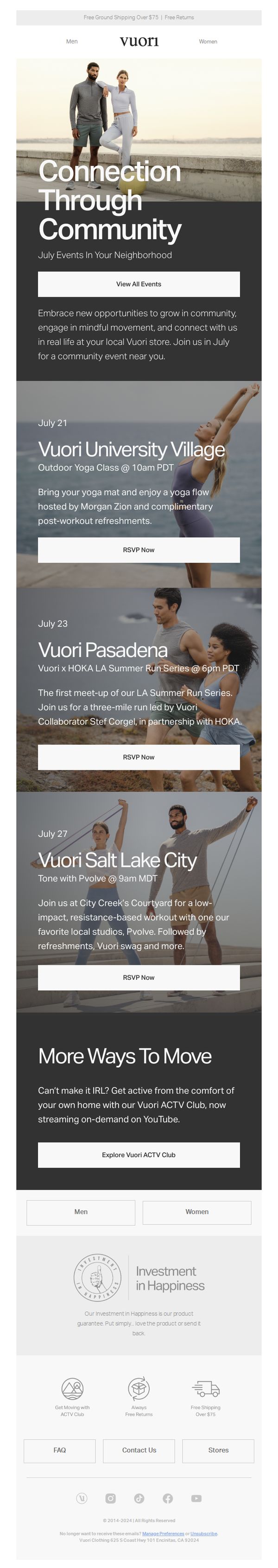
2. Vuori: You're Invited: July Community Events
Objective
This email aims to drive local community engagement by inviting subscribers to in-person fitness events hosted by Vuori, while also offering a digital alternative to maintain connection for those unable to attend physically.
Why this works
Vuori brilliantly blends local community building with brand identity by hosting hyper-local fitness events that feel personal and inclusive, turning customers into active participants rather than passive buyers.
How to implement
The email strategically offers an IRL-to-digital fallback with the ACTV Club, ensuring no subscriber feels excluded, a smart retention tactic that reinforces brand loyalty through accessibility and flexibility.
Pro Tip
Add a subtle countdown timer or 'limited spots' indicator under each RSVP button to create urgency and encourage faster decision-making without disrupting the clean layout. • Include a small map pin or store address snippet under each event location to reduce friction for local attendees who may not know where 'Vuori University Village' or 'City Creek’s Courtyard' is located.
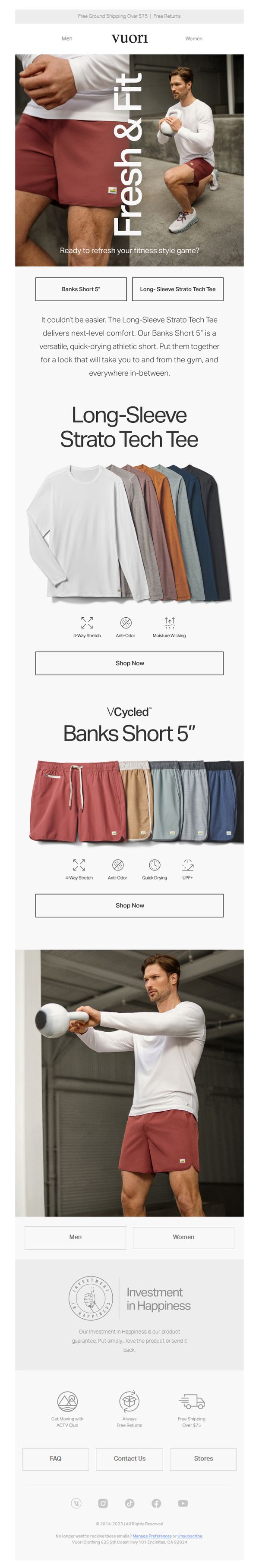
3. Vuori: Our most versatile athletic pieces
Objective
This email aims to showcase Vuori’s most versatile athletic wear by highlighting two key products, the Long-Sleeve Strato Tech Tee and Banks Short 5”, and encouraging immediate purchase by emphasizing comfort, performance, and style for active lifestyles.
Why this works
Vuori brilliantly positions its apparel as lifestyle enablers, not just gym gear, by showing the same outfit transitioning seamlessly from workout to everyday wear, making the products feel indispensable rather than optional.
How to implement
Each product is given its own spotlight with clear, benefit-driven icons (like 4-Way Stretch and Anti-Odor) that instantly communicate performance value without overwhelming the reader, turning features into compelling reasons to buy.
Pro Tip
Add a limited-time offer or urgency element (e.g., 'Only 48 Hours Left') near the CTA buttons to increase conversion by tapping into FOMO, especially since the email currently lacks any time-sensitive incentive. • Include a short customer testimonial or review snippet under each product to build social proof, currently, the 'Investment in Happiness' section is too generic and doesn’t directly reinforce product trust at the point of decision.
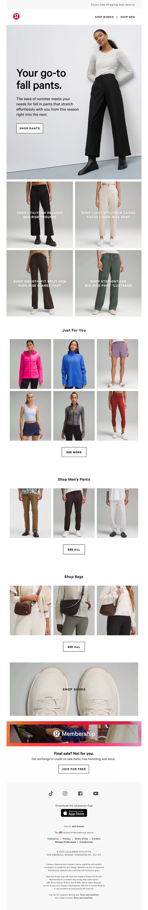
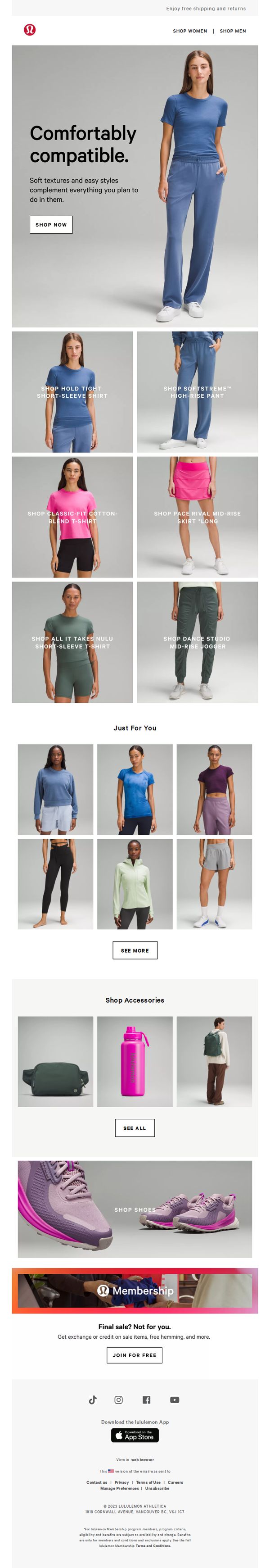
4. Lululemon: Like a walk in the park
Objective
This email aims to drive sales of Lululemon’s fall pant collection by highlighting comfort, versatility, and seasonal transition, while also encouraging membership sign-ups through exclusive post-sale benefits.
Why this works
The email brilliantly frames fall pants as a seamless bridge between summer ease and autumn functionality, making the product feel essential rather than optional for seasonal wardrobe transitions.
How to implement
By showcasing multiple pant styles with clear, concise labels and direct links, the email reduces decision fatigue and empowers shoppers to quickly find their ideal fit without overwhelming them with choices.
Pro Tip
Add a subtle countdown timer or urgency indicator near the 'SHOP PANTS' CTA to nudge immediate action, especially since the email promotes seasonal items that benefit from perceived scarcity. • Include a short testimonial or social proof snippet under the hero section, such as '92% of customers say these pants are their fall wardrobe staple', to reinforce trust and reduce hesitation.
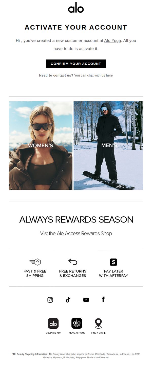
5. Alo Yoga: Alo Customer Account Invitation
Objective
This email aims to guide new customers through account activation while immediately introducing them to Alo Yoga’s loyalty program and core brand benefits to encourage engagement and first purchase. It also subtly promotes gender-specific product lines to personalize the onboarding experience.
Why this works
The email smartly pairs account activation with immediate value by highlighting the Alo Access Rewards Shop, turning a functional step into an engaging brand introduction that primes users for future purchases.
How to implement
By visually splitting the hero section into Women’s and Men’s categories with lifestyle imagery, Alo Yoga personalizes the onboarding experience without requiring user input, making new customers feel seen from the first click.
Pro Tip
Add a countdown timer or urgency cue near the 'CONFIRM YOUR ACCOUNT' CTA to increase activation rates by creating a subtle sense of time-sensitive value tied to the rewards program. • Include a brief personalized welcome message (e.g., 'Welcome, [First Name]!') above the activation prompt to strengthen emotional connection and increase perceived relevance of the account setup step.
6. Lululemon: Meet your top matches
Objective
This email aims to drive personalized product discovery by showcasing curated apparel and accessories based on the recipient’s preferences, encouraging immediate engagement through targeted CTAs and reinforcing brand loyalty via membership benefits.
Why this works
The email leverages personalization by curating 'top matches' for each recipient, making the experience feel tailored and increasing the likelihood of conversion through relevance and emotional connection.
How to implement
By grouping products into clearly labeled categories with direct CTAs, the email reduces decision fatigue and guides users seamlessly from browsing to buying without overwhelming them with options.
Pro Tip
Add a subtle countdown timer or limited-availability indicator near the 'Shop Now' CTA in the hero section to create urgency without disrupting the clean aesthetic. • Include a short testimonial or social proof snippet under the 'Just For You' section to reinforce trust and validate the personalization engine’s recommendations.
7. Lululemon: New school year, go-to gear

Objective
To drive back-to-school apparel and accessory sales by positioning Lululemon gear as essential, versatile campus wear for students. The campaign aims to convert interest into purchases through curated product categories and a membership incentive.
Why this works
The email brilliantly frames everyday campus life as a lifestyle moment, not just a shopping occasion, making the gear feel essential rather than optional by aligning products with student identity and daily routines.
How to implement
Each product category is anchored with a strong visual context, like a lecture hall or football field, that subtly communicates functionality and emotional resonance, helping shoppers envision the items in their own lives without needing lengthy descriptions.
Pro Tip
Add a subtle countdown timer or urgency indicator near the 'Final Sale? Not for you.' section to nudge hesitant shoppers by reinforcing the exclusivity of membership perks during a high-intent back-to-school window. • Integrate a small 'Top Picks for Campus Life' badge or icon on 2–3 hero products to guide overwhelmed shoppers and highlight items most aligned with the campaign’s lifestyle messaging, reducing decision fatigue.
8. Lululemon: Make every practice feel perfect
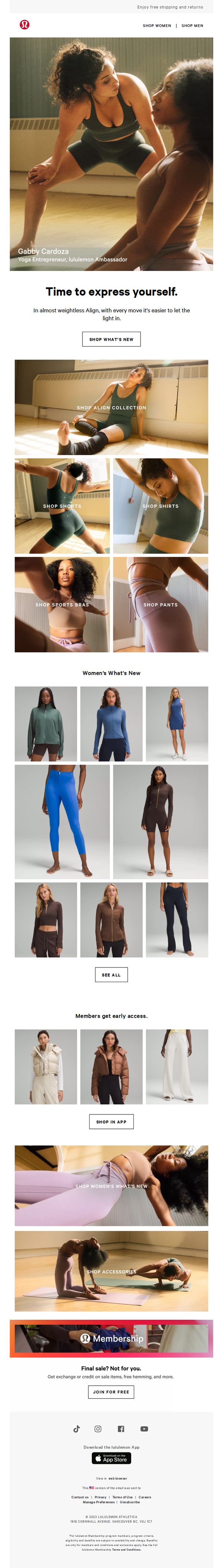
Objective
This email aims to inspire movement and self-expression through Lululemon’s Align collection while driving traffic to new product launches and encouraging membership sign-ups by highlighting exclusive benefits for members.
Why this works
The email opens with a powerful emotional hook, 'Time to express yourself', that ties movement to identity, making the product feel like a tool for personal empowerment rather than just activewear.
How to implement
By featuring real ambassadors like Gabby Cardoza in authentic, unposed moments, the brand builds trust and relatability, subtly signaling that these products are tested and loved by people who live the lifestyle.
Pro Tip
Add a subtle countdown timer or urgency indicator near the 'Final sale? Not for you.' section to reinforce the exclusivity of member benefits and nudge non-members toward immediate sign-up. • Include a short testimonial or quote from a member about how early access or free hemming improved their shopping experience, this would strengthen social proof and make the membership offer more tangible.
9. Lululemon: The latest for your greatest
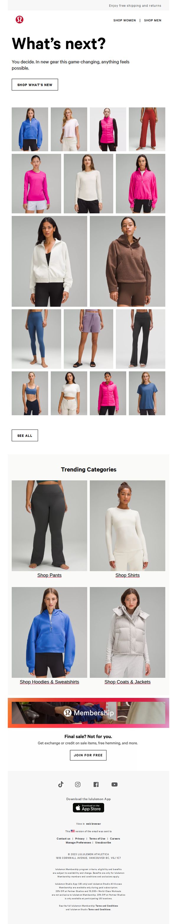
Objective
This email aims to drive engagement and sales by showcasing Lululemon’s newest apparel collection, encouraging recipients to explore fresh styles that empower their active lifestyles. It also promotes membership benefits to increase loyalty and repeat purchases.
Why this works
The email opens with a bold, empowering headline, 'What’s next?', that positions the customer as the decision-maker, subtly aligning new product drops with personal growth and active ambition, which deepens emotional resonance.
How to implement
By using a clean, grid-based product layout with diverse models in natural poses, the email visually communicates inclusivity and versatility, making it easy for shoppers to imagine themselves in the gear without overwhelming them with clutter.
Pro Tip
Add a subtle countdown or 'New Arrivals Just In' badge near the hero section to create urgency and signal freshness, encouraging immediate clicks rather than passive scrolling. • Include a short testimonial or social proof snippet under the 'What’s next?' headline, such as 'Join 2M+ athletes who upgraded their routine', to reinforce credibility and motivate action through community validation.
10. Vuori: Last Chance for Ground Shipping for Mother's Day
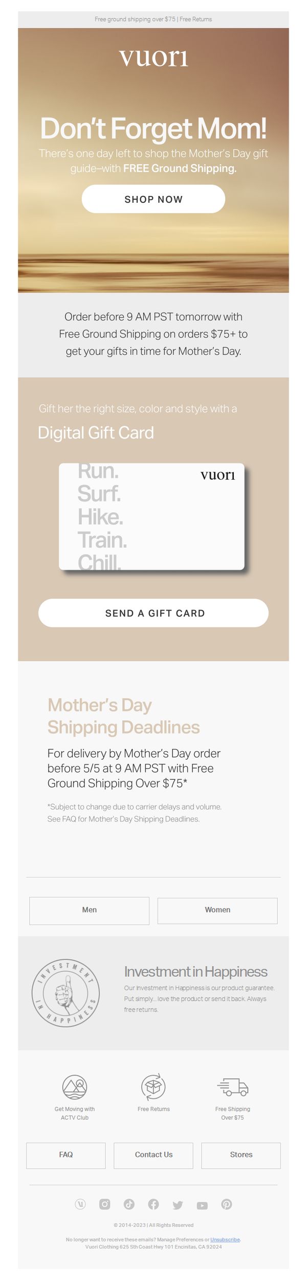
Objective
This email aims to drive last-minute Mother’s Day gift purchases by emphasizing a time-sensitive shipping deadline and promoting free ground shipping on orders over $75, while also encouraging digital gift card adoption as a convenient alternative.
Why this works
The email leverages urgency with a precise cutoff time, 'Order before 9 AM PST tomorrow', which transforms passive browsing into immediate action by anchoring the deadline to a real-world clock rather than a vague 'last chance' phrase.
How to implement
By positioning the digital gift card as a solution to gifting uncertainty, 'Gift her the right size, color and style', the campaign reframes a potential objection into a benefit, making the gift card feel personalized and thoughtful rather than impersonal.
Pro Tip
Add a visual countdown timer near the hero CTA to reinforce urgency in real time, as the current static 'one day left' message loses impact for users who may open the email hours after receiving it. • Include a small product grid or 'Top Mother’s Day Picks' section beneath the gift card CTA to guide indecisive shoppers toward popular items, reducing friction for those who prefer physical gifts over digital cards.