Proven Architectural Digest email designs you can use
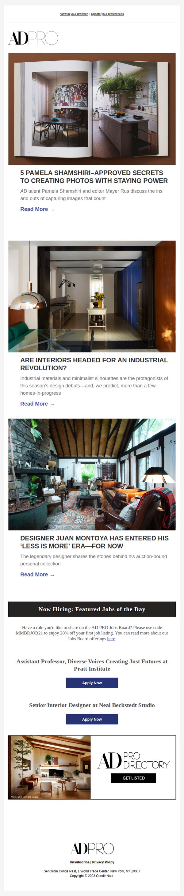
1. Designer Juan Montoya Has Entered His ‘Less Is More’ Era—For Now
Objective
To engage design professionals and enthusiasts by spotlighting high-profile industry figures and trends, while subtly promoting AD PRO’s job board and directory services through curated editorial content that aligns with their professional interests.
Why this works
By leading with a compelling designer profile that hints at a stylistic evolution, the email taps into readers’ curiosity about industry shifts, making the content feel timely and insider-driven rather than promotional.
How to implement
The seamless integration of job listings within editorial content, framed as ‘Featured Jobs of the Day’, positions career opportunities as natural extensions of the design conversation, increasing relevance and reducing ad fatigue.
Pro Tip
Add a subtle countdown or urgency cue (e.g., 'Limited-time 20% discount on job listings') near the 'Apply Now' buttons to nudge immediate action without disrupting the editorial tone. • Include a short testimonial or stat from a designer who successfully hired via AD PRO Jobs to build social proof and reinforce the value proposition of the job board section.
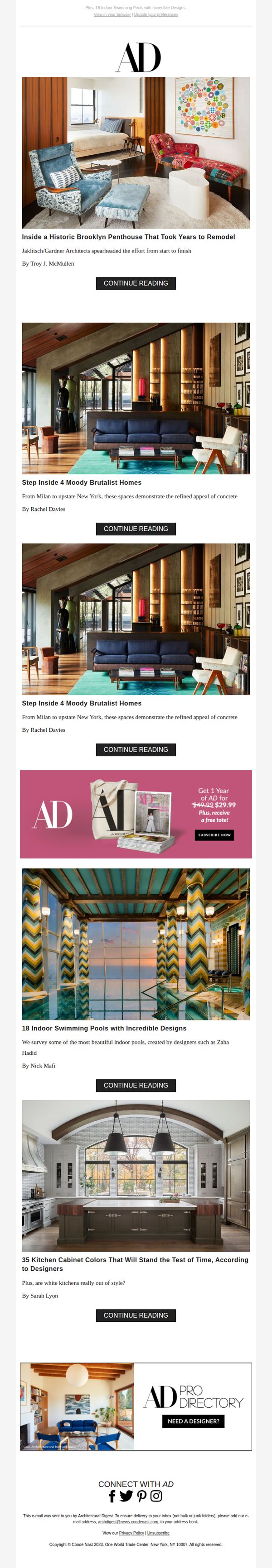
2. These 35 Kitchen Cabinet Colors Will Stand the Test of Time
Objective
This email aims to drive engagement with Architectural Digest’s premium content by highlighting visually compelling, design-forward stories that appeal to interior design enthusiasts, while also promoting a limited-time subscription offer to convert readers into paying subscribers.
Why this works
The email strategically leads with high-impact, emotionally resonant imagery from iconic homes to immediately capture attention and establish credibility, making readers feel they’re being granted exclusive access to world-class design stories.
How to implement
By embedding a bold, time-sensitive subscription offer mid-email, Architectural Digest capitalizes on peak reader interest, right after they’ve been hooked by stunning visuals, turning passive scrollers into potential paying customers without disrupting the editorial flow.
Pro Tip
The subscription CTA is visually buried within a pink banner that clashes with the editorial tone; repositioning it as a sticky footer bar or floating button would increase visibility without compromising the aesthetic cohesion of the design. • The repeated use of identical 'CONTINUE READING' CTAs for every article reduces urgency and personalization; tailoring the button text to each story (e.g., 'See the Cabinet Colors Designers Swear By') would better align with user intent and boost click-through rates.
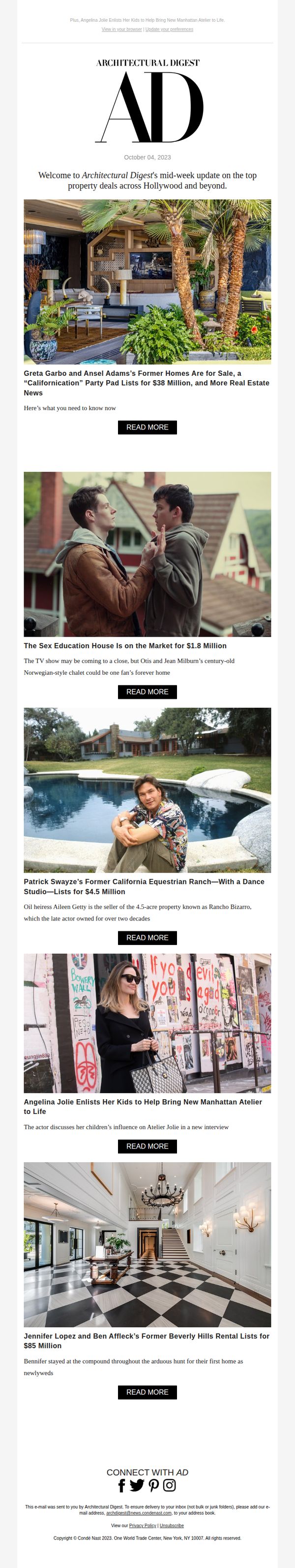
3. Homes Tied to Patrick Swayze, Jennifer Lopez & Ben Affleck List—This Week in Celeb Real Estate News
Objective
This email aims to engage readers with curated, celebrity-linked real estate stories to drive traffic to Architectural Digest’s website while reinforcing its authority in luxury lifestyle and property coverage. It leverages star power and exclusivity to maintain subscriber interest and encourage content exploration.
Why this works
Architectural Digest masterfully blends celebrity nostalgia with high-end real estate by spotlighting homes once owned by icons like Patrick Swayze and Jennifer Lopez, creating emotional hooks that drive clicks while reinforcing luxury branding.
How to implement
Each story is framed with a compelling headline and a concise, curiosity-driven subhead that teases just enough context to entice readers without giving away the full narrative, encouraging them to click through for the full story.
Pro Tip
Add a subtle visual hierarchy to the 'READ MORE' buttons, such as varying button size or color intensity based on story priority, to guide readers toward the most compelling or timely content first. • Include a short, punchy teaser quote from one of the featured celebrities (e.g., Angelina Jolie on her kids’ influence) directly under the headline to add personal voice and increase emotional resonance before the CTA.
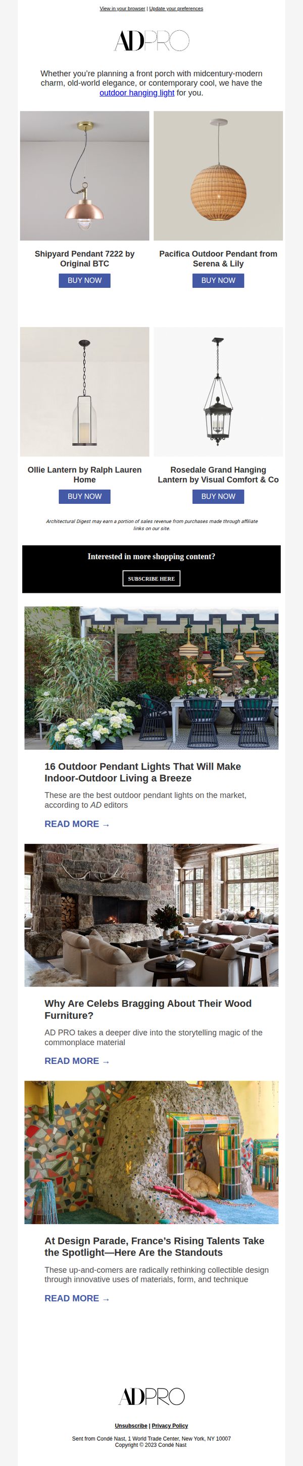
4. Pendant Lights That Make Indoor-Outdoor Living a Breeze
Objective
This email aims to inspire readers with curated outdoor pendant lighting options while driving direct sales through product-specific CTAs. It also seeks to deepen engagement by offering editorial content that positions AD PRO as a trusted authority in design and lifestyle.
Why this works
The email brilliantly bridges aspirational design with actionable commerce by pairing high-end product visuals with editorial context, making each purchase feel like a curated design decision rather than a simple transaction.
How to implement
By featuring diverse styles, from midcentury modern to rustic lanterns, the campaign speaks to multiple aesthetic preferences without diluting its core message, effectively widening its appeal while maintaining brand authority.
Pro Tip
Add a subtle countdown timer or limited-availability tag near the 'BUY NOW' buttons to create urgency, especially since the email promotes specific curated products rather than evergreen inventory. • Reposition the 'SUBSCRIBE HERE' CTA to appear after the first two editorial sections instead of sandwiched between product and content, to better capture interest after establishing value through storytelling.
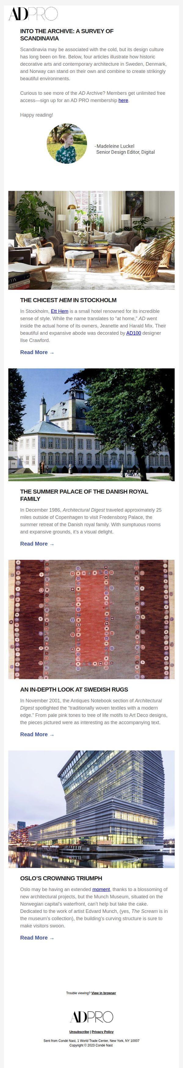
5. Into the Archive: A Survey of Scandinavia
Objective
This email aims to engage readers with curated archival content spotlighting Scandinavian design and architecture, while subtly encouraging AD PRO membership sign-ups by highlighting exclusive access to the full archive. It positions Architectural Digest as a cultural authority and deep resource for design professionals and enthusiasts.
Why this works
The email masterfully frames Scandinavia not as a cold, distant region but as a vibrant design powerhouse, using evocative language and curated archival gems to reframe perception and spark curiosity in readers’ minds.
How to implement
By anchoring each article preview with a compelling visual and a tight, story-driven summary, the email transforms archival content into irresistible narrative hooks that invite deeper exploration without overwhelming the reader.
Pro Tip
Add a visual hierarchy to the article previews, such as bold headlines, consistent image sizing, or subtle dividers, to improve scannability and help readers quickly identify which stories align with their interests. • Include a brief testimonial or quote from a designer or architect about the value of AD’s archive to reinforce social proof and strengthen the emotional pull toward membership conversion.
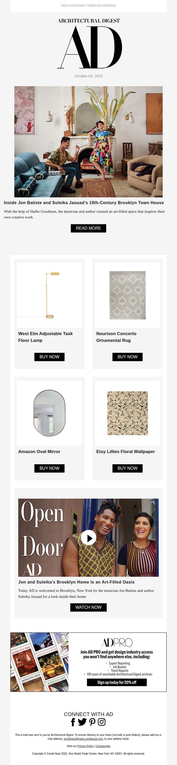
6. OPEN DOOR ALERT: Inside Jon Batiste and Suleika Jaouad’s Brooklyn Town House
Objective
To drive engagement with Architectural Digest’s exclusive home tour of Jon Batiste and Suleika Jaouad’s Brooklyn townhouse while promoting shoppable interior products and encouraging AD PRO membership sign-ups with a limited-time discount.
Why this works
The email brilliantly leverages celebrity storytelling to create emotional resonance, positioning the home tour not just as decor inspiration but as a narrative of creativity and partnership that readers want to step into.
How to implement
By embedding shoppable product tiles directly beneath the hero image, the campaign turns passive admiration into immediate purchasing intent, seamlessly blending editorial content with e-commerce in a way that feels organic and aspirational.
Pro Tip
The 'READ MORE' CTA is visually underwhelming and buried beneath the hero image; repositioning it as a larger, color-contrasted button directly over the hero photo would significantly boost click-through rates. • The AD PRO offer at the bottom feels disconnected from the main narrative; integrating a subtle teaser like 'Want more behind-the-scenes access? AD PRO members get exclusive tours like this first' would strengthen relevance and conversion intent.