How AWeber does product and education emails
1. Send the better email. Every time.
Objective
This email aims to educate existing AWeber users on how to run split tests to improve email performance, while also promoting a free virtual workshop that teaches how to write on-brand emails quickly using the Newsletter Assistant.
Why this works
The email brilliantly frames split testing not as a technical chore but as a data-driven superpower that removes guesswork, turning uncertainty into confidence with every send, which makes the feature feel indispensable rather than optional.
How to implement
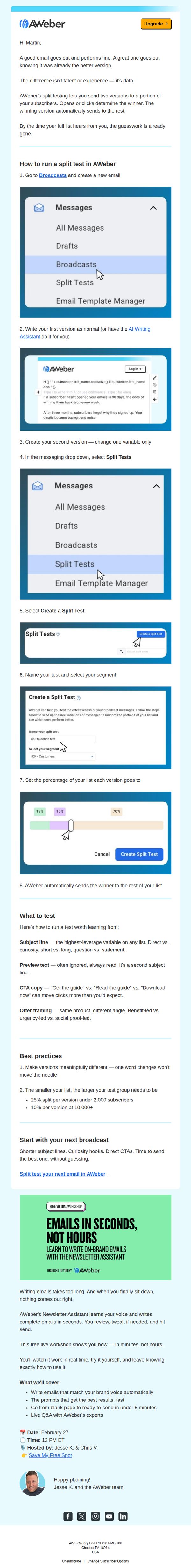
By embedding annotated screenshots directly into the step-by-step guide, AWeber transforms a potentially dry tutorial into a visual walkthrough that reduces friction and builds user confidence, making complex features feel accessible even to beginners.
Pro Tip
The primary CTA 'Split test your next email in AWeber →' is buried near the bottom, move it higher, perhaps after the step-by-step guide, to capture momentum while the user is still engaged with the educational content. • The workshop section uses a bright green background that visually competes with the brand’s blue UI screenshots, consider toning it down or using AWeber’s primary blue to maintain visual cohesion and reinforce brand identity throughout the email.
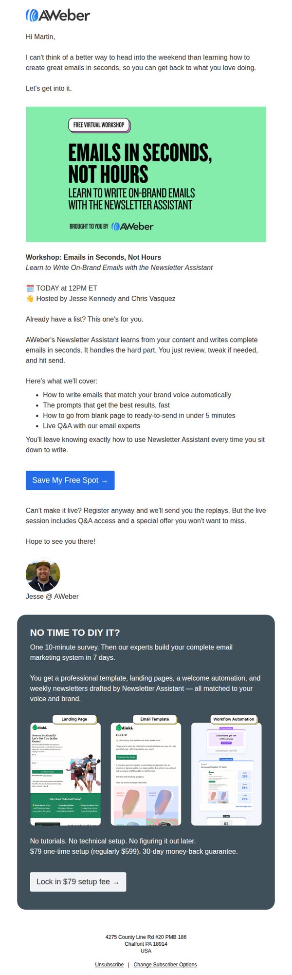
2. Live workshop today: Write great emails in seconds
Objective
This email aims to drive immediate registration for a live virtual workshop that teaches users how to write on-brand emails quickly using AWeber’s Newsletter Assistant, while also promoting a premium setup service for those who can’t attend live.
Why this works
The email opens with a warm, conversational hook that ties the workshop to the recipient’s weekend freedom, making the value feel personal and time-sensitive rather than transactional.
How to implement
It clearly outlines the workshop’s tangible outcomes, like writing emails in under 5 minutes and matching brand voice automatically, which transforms abstract promises into concrete, results-driven benefits that build trust.
Pro Tip
The CTA button ‘Save My Free Spot →’ is strong, but adding a secondary CTA below the workshop description, like ‘Watch Replay + Get Special Offer’, would capture users who are hesitant to commit to the live time. • The dark gray service section at the bottom feels visually disconnected from the rest of the email; integrating its color palette or adding a subtle border/separator would improve visual flow and reduce cognitive friction between the two offers.
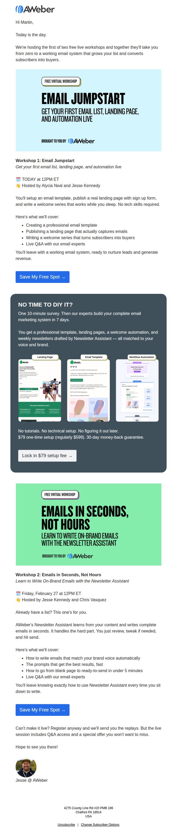
3. Email Jumpstart is live today!
Objective
This email aims to drive immediate registration for two live AWeber workshops by positioning them as essential, no-tech-skill-required solutions for building a revenue-generating email system. It also promotes a premium setup service as a time-saving alternative for busy users.
Why this works
The email brilliantly frames the workshops as a complete, turnkey solution, not just training, by promising attendees will leave with a working email system ready to nurture leads and generate revenue, which taps directly into the emotional desire for instant results.
How to implement
By offering a premium $79 setup service as a ‘no time to DIY’ alternative, the email respects different user motivations and creates a secondary conversion path that feels helpful rather than pushy, increasing overall campaign effectiveness without alienating busy professionals.
Pro Tip
Add a countdown timer or urgency indicator next to the 'Save My Free Spot' CTA for Workshop 1, since it’s happening today, this would visually reinforce immediacy and reduce procrastination among hesitant registrants. • Include a short video testimonial or quote from a past attendee under each workshop section to build social proof and reduce perceived risk, especially for users unfamiliar with AWeber’s training quality.