Proven BetterMe Pilates email designs you can use
1. Verify your email address →
Objective
This email aims to confirm the user’s email address after quiz completion, while reinforcing their personal fitness goal and guiding them toward immediate engagement with their customized Pilates plan. It also sets expectations for future value through tips, offers, and progress tracking.
Why this works
The email immediately validates the user’s effort by acknowledging quiz completion, then ties it directly to their personal goal, creating emotional resonance and reducing friction before asking for confirmation.
How to implement
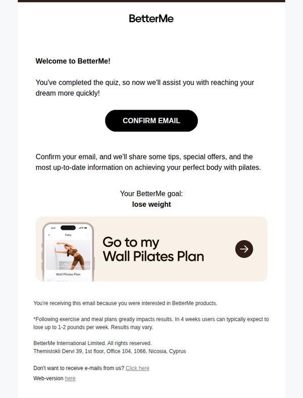
By previewing the user’s custom plan with a mobile screenshot and directional arrow, the email transforms a simple verification step into a teaser for tangible, personalized value they’re about to unlock.
Pro Tip
Add a secondary CTA below the main button, such as 'View My Plan Later', to reduce pressure and accommodate users who aren’t ready to confirm, improving conversion without alienating hesitant subscribers. • Include a brief testimonial or social proof near the goal statement (e.g., '92% of users who confirmed saw results within 4 weeks') to strengthen trust and urgency around email verification.
2. gregory – Your plan is finished
Objective
This email aims to re-engage a user named Gregory by celebrating the completion of their fitness plan and offering an 80% discount on a personalized Wall Pilates program, positioning it as a natural next step in their wellness journey with expert coaching support.
Why this works
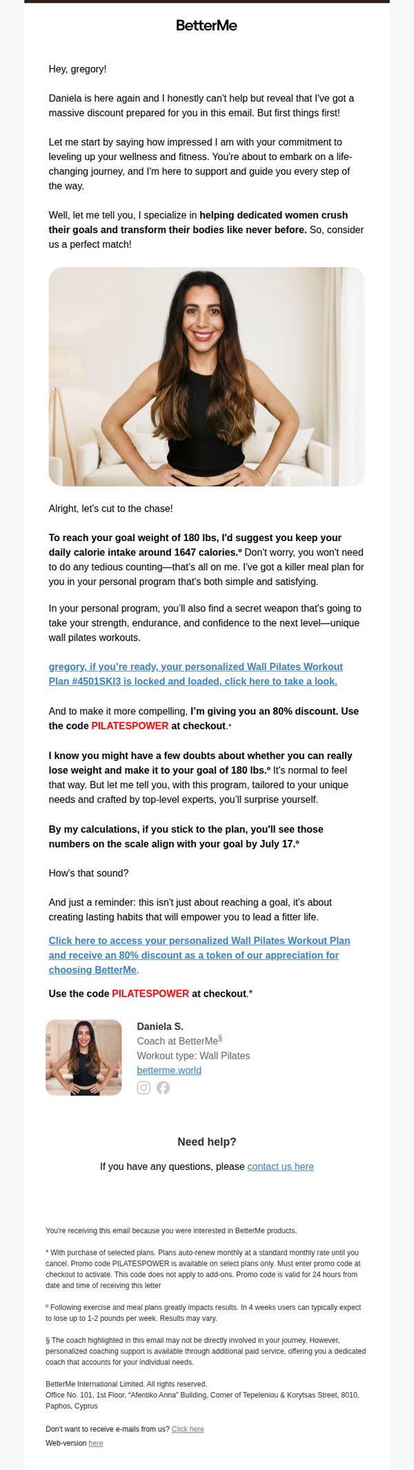
The email opens with personalization and emotional validation, praising the recipient’s commitment, which builds trust before introducing the offer, making the discount feel like a reward rather than a sales tactic.
How to implement
By embedding specific, data-driven guidance (like 1647 daily calories and a July 17 goal date), the message transforms from generic promotion into a credible, tailored roadmap that reduces buyer hesitation through perceived expertise.
Pro Tip
Add a visual countdown timer near the CTA indicating the 24-hour validity of the PILATESPOWER code to create urgency without relying solely on fine print, which is easily overlooked. • Include a short video thumbnail or GIF of the Wall Pilates workout in action beneath the coach’s photo to demonstrate value visually and reduce cognitive load for users who respond better to motion than text.
3. We have a surprise for you! 🎁 Your Plan is ready.
Objective
The email aims to re-engage users by offering time-sensitive, personalized weight loss plans with steep discounts, creating urgency to convert through fear of missing out and the promise of life-changing results.
Why this works
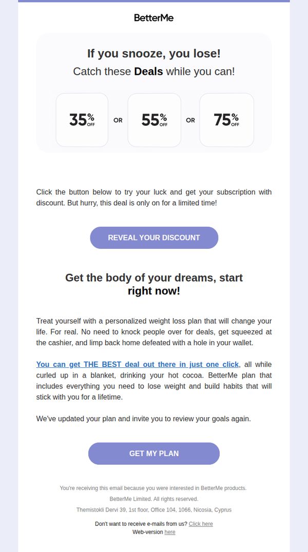
The email brilliantly uses urgency and gamification by framing discounts as a 'snooze and lose' challenge, turning a simple offer into an interactive, time-sensitive event that triggers immediate action.
How to implement
It personalizes the value proposition by positioning the plan as a life-changing, guilt-free solution you can access while relaxing, making the user feel understood and removing psychological barriers to purchase.
Pro Tip
Add a testimonial or social proof near the 'GET MY PLAN' CTA to reduce perceived risk, even one short quote from a user who achieved results with the plan would boost conversion confidence. • Include a small visual indicator (like a countdown timer or 'X spots left') near the discount section to reinforce scarcity beyond just text, making the urgency feel more tangible and real.
4. 👋 I've got a message you NEED to read
Objective
This email aims to re-engage a hesitant user by creating urgency around a personalized Pilates workout plan and offering a time-sensitive 80% discount to drive immediate conversion before the offer expires.
Why this works
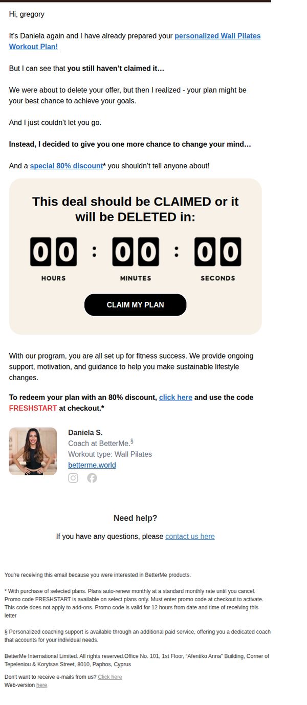
The email brilliantly personalizes urgency by naming the recipient and referencing their unclaimed plan, making the message feel like a private, last-chance intervention rather than a generic sales pitch.
How to implement
By framing the 80% discount as a secret offer you ‘shouldn’t tell anyone about,’ the campaign taps into psychological ownership and exclusivity, making the user feel privileged and more likely to act quickly.
Pro Tip
The countdown timer shows 00:00:00, which undermines urgency, it should display a live, active countdown to create real-time pressure and prevent the perception that the offer is already expired. • The email lacks a clear visual hierarchy around the CTA, the 'CLAIM MY PLAN' button should be larger, more colorful, or elevated with a subtle shadow to draw immediate attention and reduce friction in the conversion path.
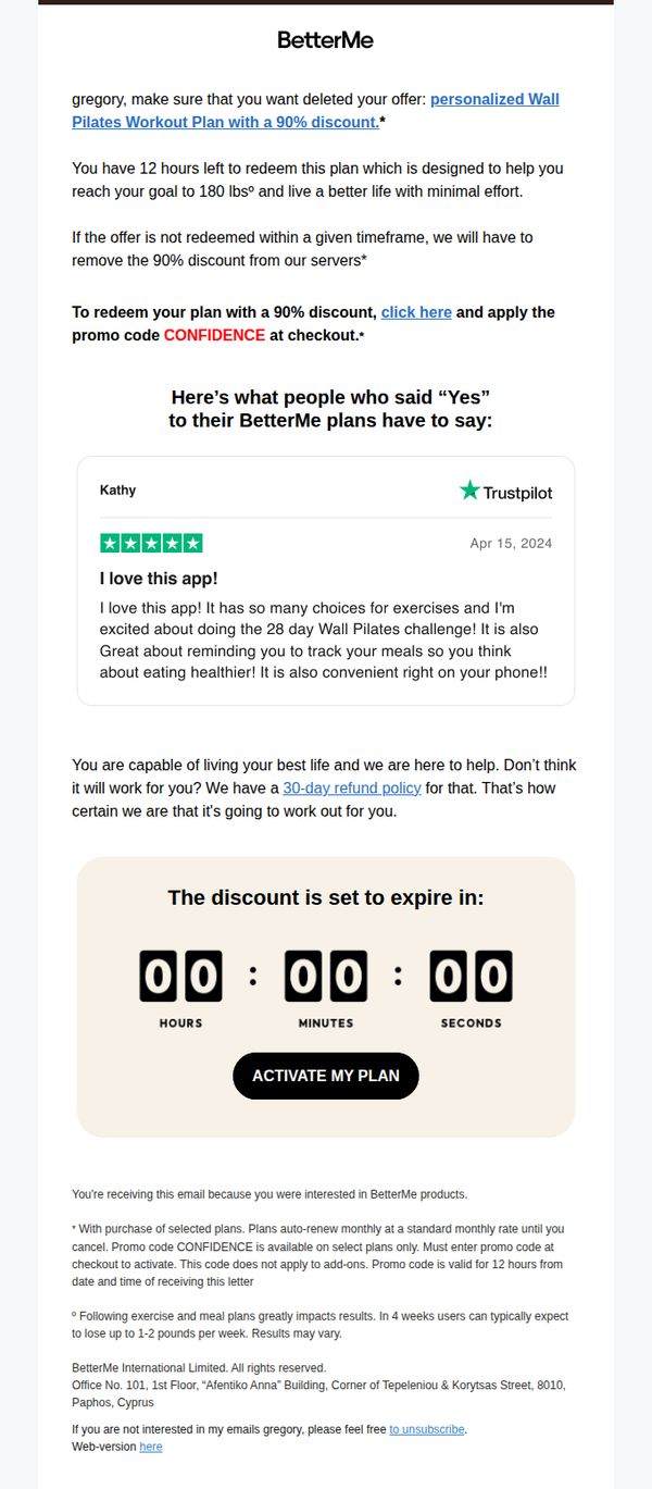
5. I'm about to cancel your offer
Objective
This email aims to create urgency and drive immediate action by warning the recipient that their 90% discounted Pilates plan offer is about to expire, encouraging them to redeem it before it’s removed from their account.
Why this works
The email leverages scarcity and urgency by framing the discount as actively being revoked unless the user acts within 12 hours, making the offer feel exclusive and time-sensitive rather than just promotional.
How to implement
Including a real Trustpilot testimonial from a user named Kathy adds social proof and emotional resonance, subtly validating the product’s value through peer experience rather than just corporate claims.
Pro Tip
Add a brief sentence above the countdown timer that restates the core benefit, such as 'Lose up to 1-2 lbs/week with minimal effort', to reinforce motivation right before the final CTA. • Replace the generic 'click here' link in the body with a more benefit-driven anchor text like 'Claim Your 90% Discount Before It’s Gone' to increase click-through intent and align with urgency messaging.
6. I will help you drop clothing size
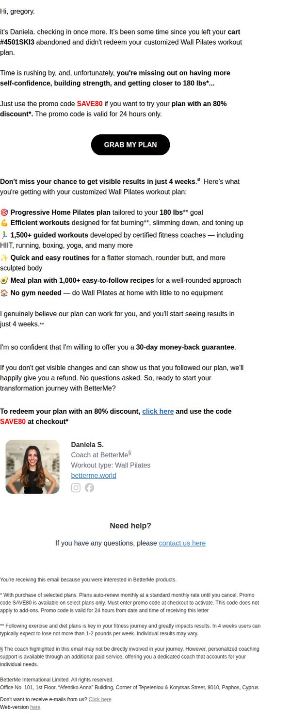
Objective
This email aims to re-engage a user who abandoned their cart by offering an 80% discount on a customized Wall Pilates workout plan, encouraging immediate redemption before the promo expires in 24 hours.
Why this works
The email creates urgency by tying the 80% discount to a 24-hour window, which leverages scarcity to push hesitant users toward immediate action without feeling pressured by long-term commitments.
How to implement
It personalizes the offer by referencing the user’s abandoned cart and specific goal of reaching 180 lbs, making the message feel tailored and relevant rather than generic or spammy.
Pro Tip
Add a countdown timer next to the CTA to visually reinforce the 24-hour urgency, making the time-sensitive offer more compelling and harder to ignore. • Include a small visual icon or bullet point next to each benefit (e.g., meal plan, 1,500+ workouts) to improve scannability and help users quickly grasp the value proposition without reading dense paragraphs.
7. I did this for you
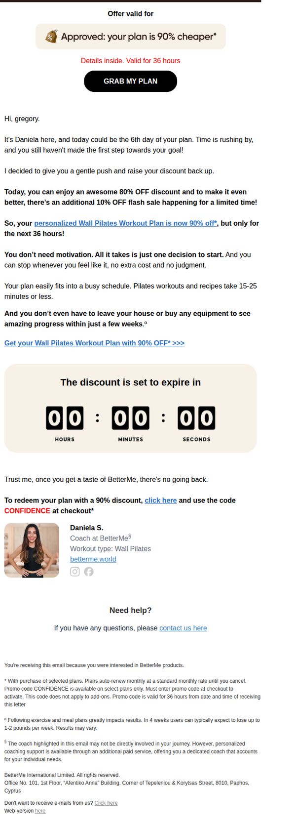
Objective
This email aims to re-engage a hesitant user by offering a time-sensitive 90% discount on a personalized Pilates plan, encouraging immediate action through urgency and personalization. It seeks to convert interest into purchase by reducing perceived friction and emphasizing convenience.
Why this works
The email opens with a personal, conversational tone from a named coach, creating instant trust and making the recipient feel seen rather than targeted by a faceless brand.
How to implement
By framing the discount as a 'gentle push' and combining an 80% base discount with a 10% flash sale, the campaign cleverly layers urgency and perceived value without overwhelming the reader.
Pro Tip
Add a brief bullet-point list under the discount timer highlighting key benefits (e.g., 'No equipment needed', '15-min sessions', 'Progress in weeks') to reinforce value during the final decision moment. • Replace the generic 'Need help?' section with a short video testimonial or animated GIF of a real user’s progress to build social proof and emotional resonance right before the footer.
8. gregory, 24 hours left to claim your 90% off plan
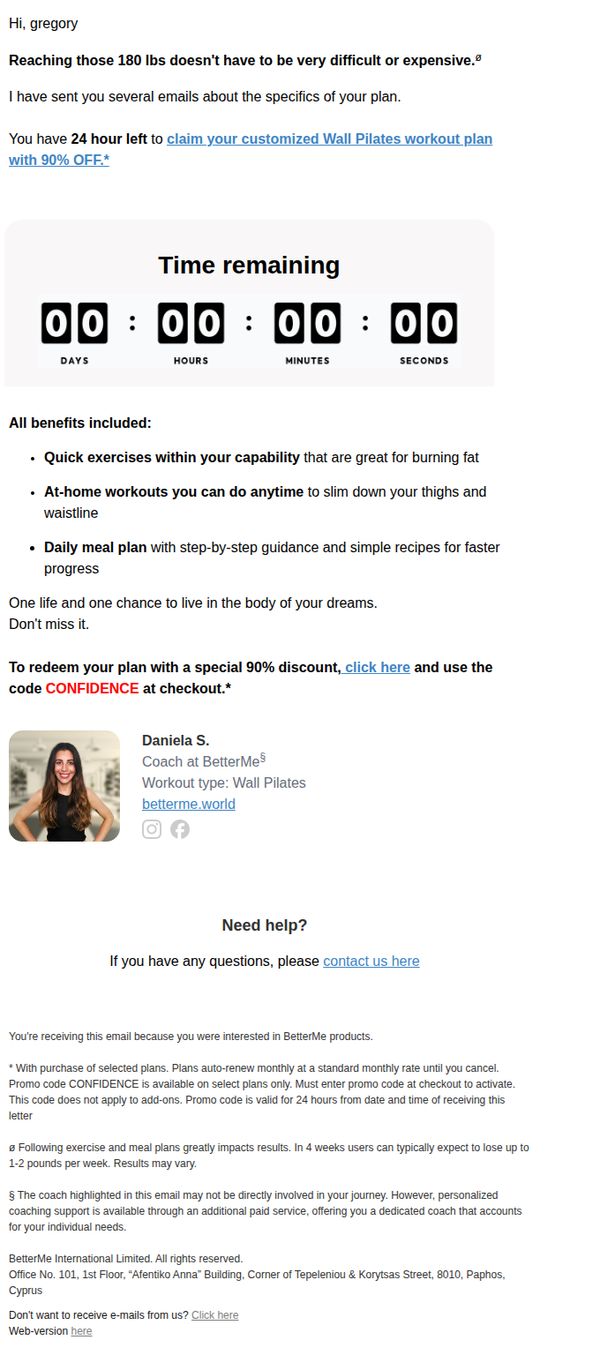
Objective
This email aims to create urgency and drive immediate conversion by reminding Gregory he has only 24 hours left to claim a heavily discounted, personalized Wall Pilates plan. It leverages scarcity, personalization, and social proof to reduce hesitation and prompt checkout action.
Why this works
The email opens with a personalized pain point, 'Reaching those 180 lbs doesn’t have to be very difficult or expensive', which instantly resonates with the recipient’s goal and frames the offer as an accessible solution rather than just another product.
How to implement
Including a live countdown timer with zeroed values creates artificial urgency while visually anchoring the 24-hour deadline, making the scarcity feel real and immediate, a powerful psychological trigger that compels action even if the timer is symbolic.
Pro Tip
The countdown timer shows all zeros, which undermines urgency, it should display a real, dynamic countdown (e.g., 23:59:59) to maintain psychological pressure and avoid signaling the offer is already expired or fake. • The CTA 'click here' is weak and generic, it should be action-oriented and benefit-driven, such as 'Claim My 90% Off Plan Before Time Runs Out' to better align with the urgency and value proposition of the offer.
9. Update: price drop for your program
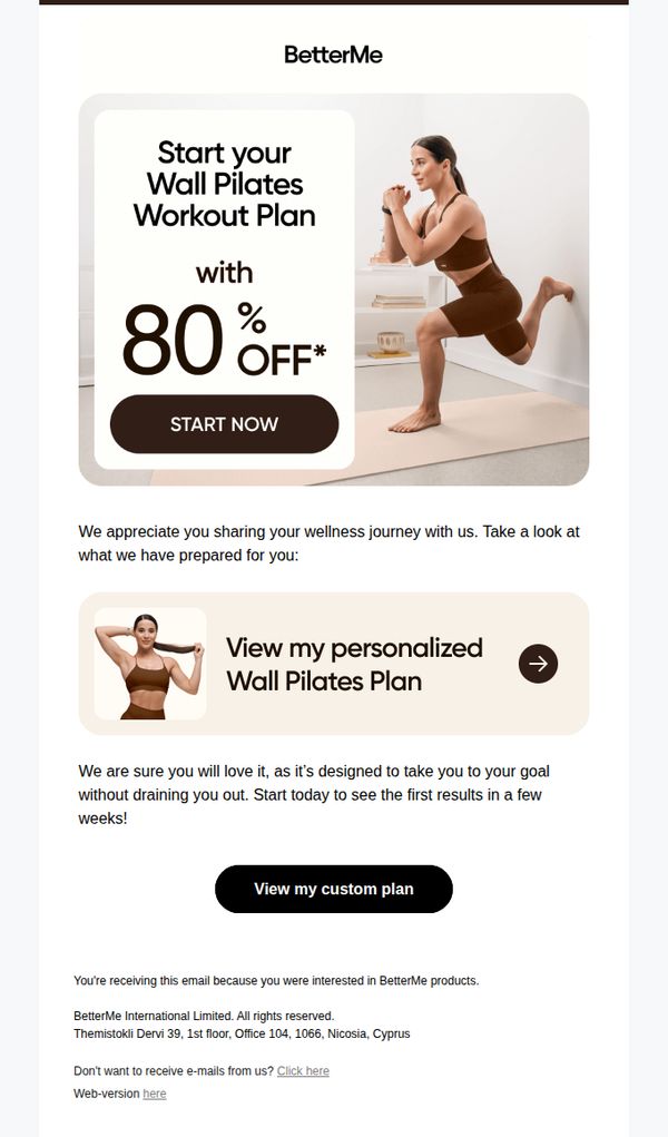
Objective
To re-engage users who previously showed interest in BetterMe Pilates by announcing a significant price drop and encouraging immediate enrollment through personalized plan access. The email aims to convert interest into action by emphasizing urgency and tailored fitness outcomes.
Why this works
The email leverages a dramatic 80% discount as a hook while pairing it with a strong visual of a woman mid-workout, creating an emotional connection between savings and tangible fitness results that motivates immediate action.
How to implement
Personalization is subtly reinforced through the phrase 'View my personalized Wall Pilates Plan,' which makes the recipient feel uniquely catered to without overwhelming them with data, increasing perceived value and trust in the program’s relevance.
Pro Tip
Add a countdown timer near the 'START NOW' CTA to amplify urgency around the 80% discount, since the current design lacks temporal pressure that could boost conversion rates for time-sensitive offers. • Include a short testimonial or result stat (e.g., '92% of users saw results in 3 weeks') beneath the personalized plan CTA to reinforce credibility and reduce perceived risk before the user commits to viewing their plan.
10. Oops I've made a mistake...
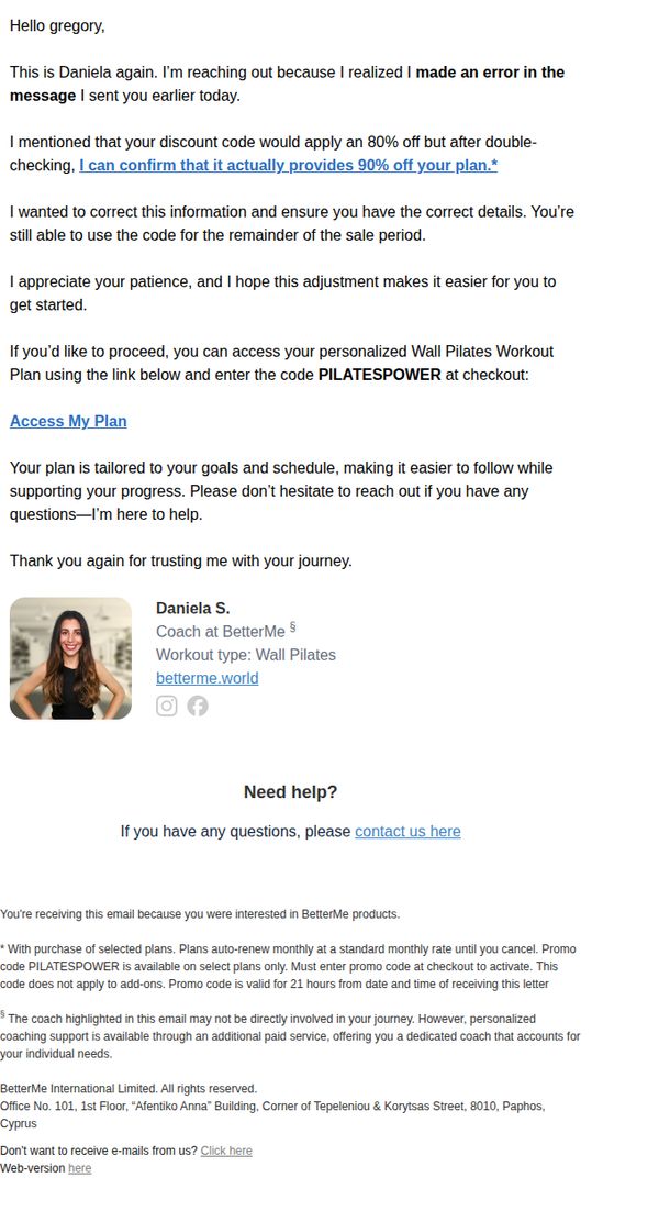
Objective
To correct a pricing error in a previous email and re-engage the recipient by offering a more generous 90% discount, reinforcing trust through personal accountability and encouraging immediate plan activation.
Why this works
The email turns a mistake into a trust-building moment by openly admitting the error and upgrading the discount, which reframes the correction as a customer-centric gift rather than a correction.
How to implement
Personalizing the message with a named coach and direct contact invitation creates emotional ownership and reduces friction, making the recipient feel supported rather than sold to during a critical conversion moment.
Pro Tip
Add a subtle countdown timer or expiration notice next to the promo code to reinforce urgency, since the 21-hour window is mentioned in fine print but not visually emphasized near the CTA. • Include a brief testimonial or progress stat (e.g., '92% of users see results in 2 weeks') near the CTA to strengthen social proof and reduce hesitation before checkout.