Bigblue email examples & ideas from real campaigns
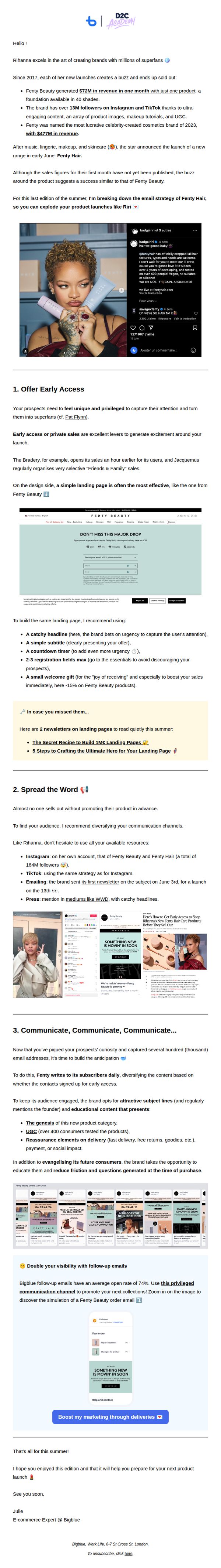
1. Your Ultimate Guide to Launching Products Like Fenty Beauty 💌
Objective
This email aims to educate e-commerce marketers on how to replicate Fenty Beauty’s high-impact product launch strategy by breaking down its email and social tactics into actionable steps. It positions Bigblue as a strategic partner for brands looking to generate buzz, drive early sales, and build loyal customer communities.
Why this works
Fenty Beauty’s genius lies in making early access feel like an exclusive club, not just a sales tactic, by combining urgency-driven landing pages with small welcome gifts, they turn casual browsers into emotionally invested superfans before the product even ships.
How to implement
The brand doesn’t just announce launches, it builds a narrative across channels, using Instagram, TikTok, and email in sync to create a cultural moment, proving that coordinated multi-channel storytelling is more powerful than any single platform’s reach alone.
Pro Tip
The CTA 'Boost my marketing through deliveries' is vague and doesn’t align with the educational tone, rephrase it to reflect the email’s value, such as 'Get My Fenty-Style Launch Playbook' to better match user intent and increase conversion. • The email lacks a clear visual hierarchy between sections, adding subtle dividers, bold section headers, or color-coded backgrounds would help readers scan the three core strategies more easily and reduce cognitive load.
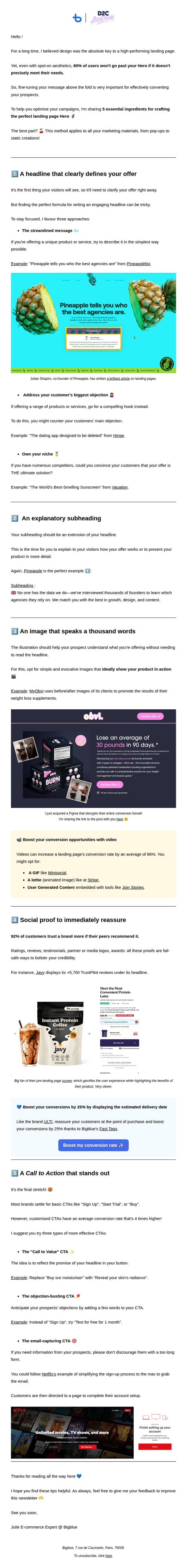
2. 5 Steps to Crafting the Ultimate Hero for Your Landing Page 🦸♀️
Objective
This email aims to educate marketers on how to build high-converting landing page heroes by breaking down five essential, actionable components, from headline to CTA, while subtly promoting Bigblue’s expertise and tools as the trusted guide for conversion optimization.
Why this works
The email brilliantly frames each hero component as a 'recipe ingredient,' making complex conversion psychology feel approachable and actionable for marketers of all levels, which increases engagement and retention of the core message.
How to implement
By embedding real-world brand examples like Pineapple, Obvi, and Netflix directly into each tip, the email transforms abstract advice into tangible, proven tactics that readers can immediately visualize applying to their own campaigns.
Pro Tip
The CTA button appears only once and is buried after four sections; adding a sticky or repeated CTA at the top and bottom would capture attention from skimmers and reinforce the conversion goal throughout the reader’s journey. • While the email references Bigblue’s tools (e.g., Fast Tags), it doesn’t explicitly link them to the five hero components, adding a short sidebar or footnote like 'Bigblue’s Hero Builder automates steps 1, 3 & 5' would strengthen product alignment and drive tool adoption.
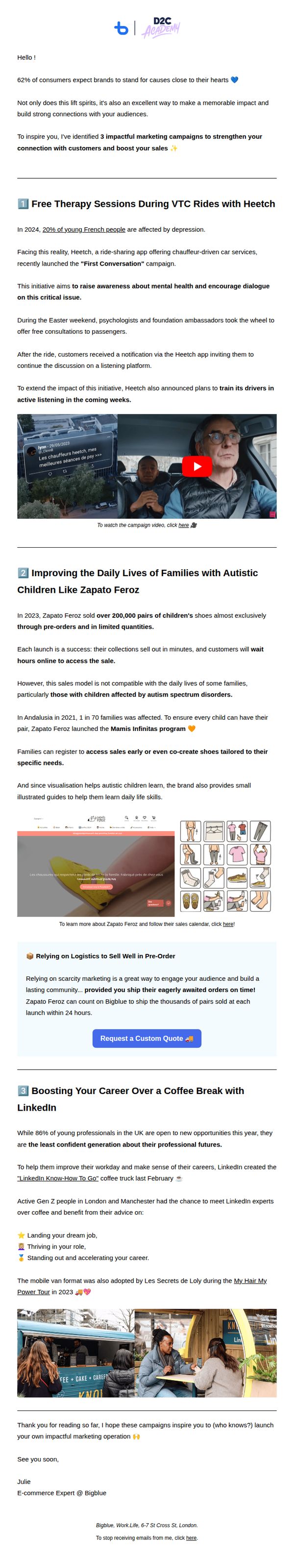
3. 3 Impactful Marketing Campaigns to Forge Strong Connections with Your Audience 💙
Objective
To inspire marketers by showcasing three real-world campaigns that successfully build emotional connections with audiences, while subtly positioning Bigblue as a thought leader in customer-centric marketing strategy.
Why this works
The email opens with a compelling statistic and emotional hook, 62% of consumers expect brands to stand for causes, immediately aligning the reader’s values with the content, which primes them to engage deeply with the case studies that follow.
How to implement
Each campaign example is structured with a clear narrative arc: problem, solution, emotional impact, and visual proof, this storytelling rhythm makes complex marketing strategies feel accessible, relatable, and immediately actionable for the reader.
Pro Tip
Add a visual hierarchy indicator (like numbered badges or icons) next to each campaign title to improve scannability and help readers quickly orient themselves within the long-form content. • Include a brief 'Why This Matters for You' summary after each case study to explicitly tie the campaign’s success back to the reader’s own marketing goals, increasing perceived relevance and urgency.
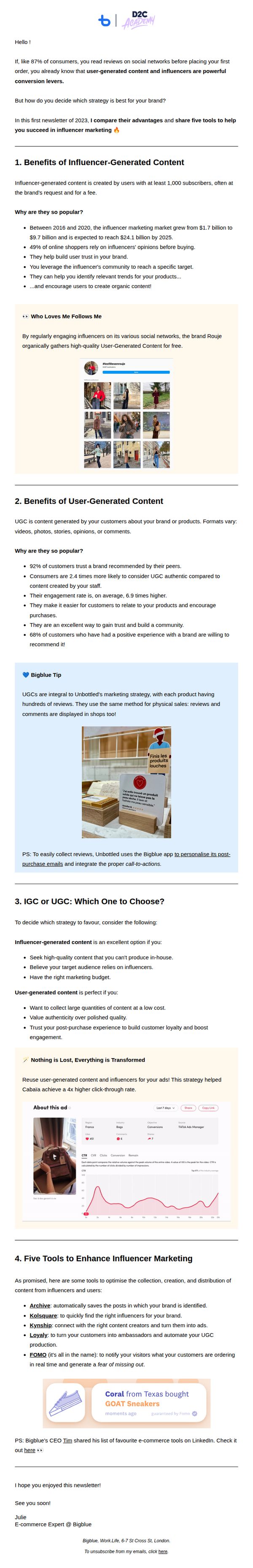
4. UGC vs IGC: Your Ultimate Guide to E-commerce Growth 📊
Objective
This email aims to educate e-commerce marketers on the strategic differences between User-Generated Content (UGC) and Influencer-Generated Content (IGC), helping them choose the right approach to drive conversions and brand growth. It also promotes Bigblue’s tools and expertise as a trusted resource in the space.
Why this works
The email smartly frames UGC and IGC not as competing tactics but as complementary strategies, helping brands choose based on their unique goals, whether it’s authenticity, scale, or budget, making the decision feel personalized and strategic rather than overwhelming.
How to implement
By embedding real-world examples like Rouje and Unbottled, the email transforms abstract marketing concepts into tangible, relatable case studies that build credibility and show exactly how brands are succeeding with these strategies in practice.
Pro Tip
Add a clear, visually distinct CTA button after the 'IGC or UGC: Which One to Choose?' section to guide readers toward the tools or a downloadable comparison guide, reducing friction in the decision-making journey. • Include a short video or animated graphic summarizing the UGC vs IGC decision tree to cater to visual learners and increase engagement, especially since the content is data-heavy and benefits from dynamic reinforcement.
5. 5 Tips to Transform Customer Support into a Loyalty Booster 💖
Objective
This email aims to educate e-commerce brands on transforming customer support into a strategic loyalty driver by sharing five actionable tips from a co-hosted webinar, ultimately encouraging readers to adopt Bigblue’s tools to improve retention and revenue.
Why this works
The email brilliantly frames customer support not as a cost center but as a profit engine, using data-backed claims like '5% loyalty improvement can boost revenue by 25% to 95%' to immediately capture attention and justify the strategic shift.
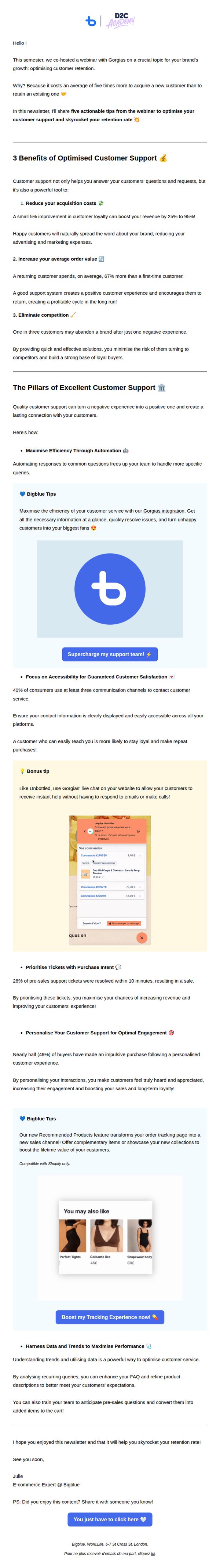
How to implement
By embedding real product integrations, like the Gorgias chat widget and Recommended Products feature, the email turns abstract advice into tangible, implementable solutions, making the value proposition feel immediate and actionable rather than theoretical.
Pro Tip
Add a countdown timer or urgency trigger near the CTA buttons to encourage immediate action, especially since the email references a past webinar, this could help convert passive readers into active users before interest fades. • Include a short customer testimonial or case study within the 'Bigblue Tips' section to reinforce social proof, as the current layout relies heavily on data and product features without showing real brand results.
6. 10 Killer Tips to Supercharge Your Checkout Process 💸
Objective
This email aims to educate e-commerce professionals on optimizing their checkout process to reduce cart abandonment and increase sales by sharing 10 actionable, data-backed tips. It positions Bigblue as a trusted authority while subtly promoting its own tools through embedded examples.
Why this works
The email brilliantly frames each tip as a data-driven solution to a specific pain point, like cart abandonment or checkout friction, making the advice feel urgent, credible, and immediately applicable to e-commerce managers seeking measurable results.
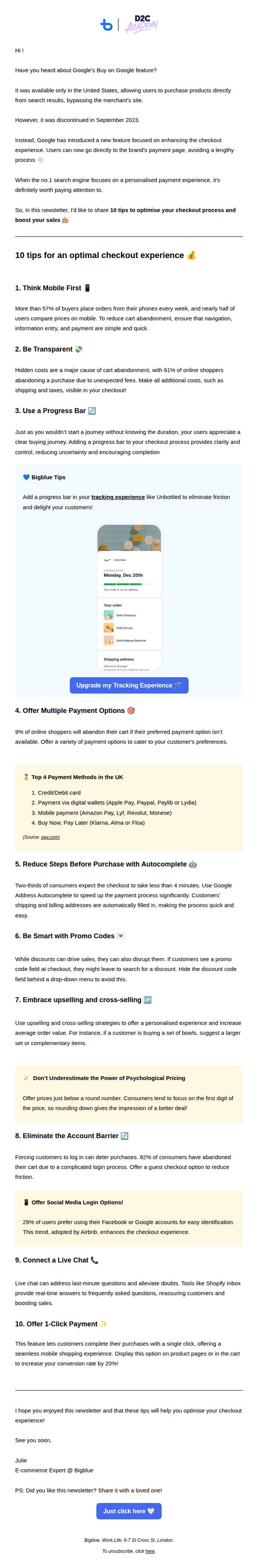
How to implement
By embedding a real-world example of a progress bar within the tracking experience, the email doesn’t just tell readers what to do, it shows them how it looks and works in practice, bridging the gap between theory and implementation with visual persuasion.
Pro Tip
The primary CTA 'Just click here' is vague and lacks urgency or benefit, rephrase it to reflect the value, such as 'Get Your Free Checkout Optimization Checklist' to better align with the educational goal and drive higher click-throughs. • The email lacks a visual hierarchy that guides the eye toward the most critical tips, consider adding icons, bold headers, or numbered badges to each tip to improve scannability and retention for time-poor readers.
7. Welcome to the D2C Academy, 🎓 - Unveil the secrets of e-commerce champions!
Objective
This email aims to welcome new subscribers to the D2C Academy by delivering immediate, high-value tactical advice on improving pop-up conversion rates, while positioning Julie as a trusted e-commerce expert and encouraging ongoing engagement with the newsletter series.
Why this works
The email opens with a personal, warm welcome from Julie, immediately establishing trust and authority by highlighting her five years of hands-on experience advising e-commerce brands, a smart move that turns a generic newsletter into a mentor-led masterclass.
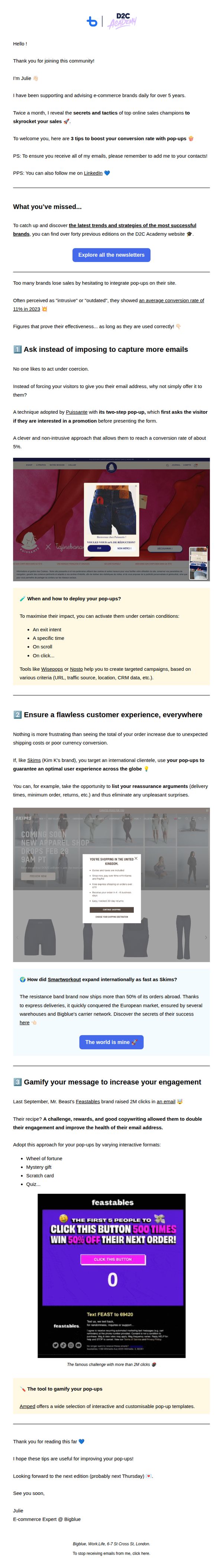
How to implement
Instead of vague advice, it delivers three concrete, data-backed pop-up strategies with real brand examples like Puissante, Skims, and Feastables, making the content instantly actionable and credible for time-strapped e-commerce operators looking for proven tactics.
Pro Tip
Add a secondary CTA button after each of the three tips (e.g., 'Try This Template' or 'Get the Tool') to capitalize on momentum and guide readers toward immediate action, rather than waiting until the end to engage. • Include a brief 'Why This Matters' stat or quote before each tip’s headline to reinforce urgency, for example, 'Brands using this method see 2.3x more email signups', to strengthen persuasion and reduce scroll-past behavior.