Bread Financial emails worth copying


1. One more step to better savings
Objective
This email aims to guide the recipient, Marta, to complete the final step in activating her Bread Savings account by funding it, thereby transitioning from sign-up to active usage and unlocking the 3-Month savings benefit.
Why this works
The email personalizes the recipient’s name upfront and frames the required action as 'one easy step,' reducing perceived friction and making account activation feel approachable rather than burdensome.
How to implement
It clearly ties the CTA to a tangible benefit, activating the 3-Month savings feature, which transforms a generic funding request into a value-driven milestone the user wants to achieve.
Pro Tip
Add a visual progress indicator or checklist above the CTA showing 'Step 3 of 3: Fund Your Account' to reinforce completion momentum and reduce abandonment by making the user feel closer to their goal. • Include a brief, bolded benefit statement directly under the CTA button, such as 'Start earning up to 5.00% APY today', to re-anchor the user’s motivation at the point of decision.
2. You'll need this code
Objective
This email aims to securely deliver a one-time authentication code to the recipient so they can complete their account setup or verification process without compromising sensitive information through direct reply.
Why this works
The email clearly separates the authentication code visually with bold typography and spacing, reducing user error and increasing confidence during sensitive account setup steps.
How to implement
By explicitly warning users not to reply with personal information and directing them to customer care instead, the brand builds trust and reduces phishing risk through proactive education.
Pro Tip
Add a visual indicator or icon next to the code (e.g., clipboard or copy button) to guide users toward copying it, reducing friction for less tech-savvy recipients. • Include a brief expiration notice for the code (e.g., 'Valid for 10 minutes') to create urgency and prevent user confusion if they delay completing the form.
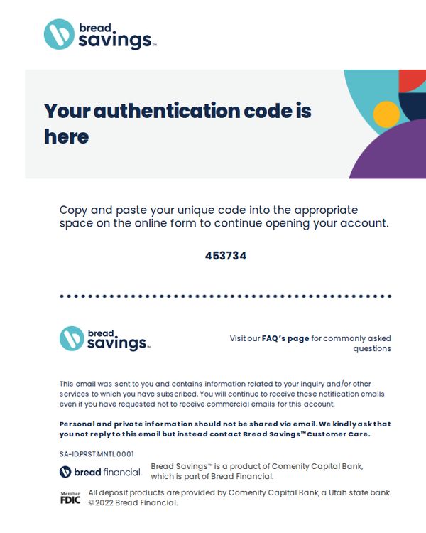
3. You'll need this code
Objective
This email aims to securely deliver a one-time authentication code to the recipient so they can complete their account setup or verification process without compromising sensitive information through direct reply.
Why this works
The email strategically avoids embedding the code in a clickable button or form field, forcing the user to manually copy it, a smart security measure that reduces phishing risk while still guiding them clearly to the next step.
How to implement
By placing the authentication code in a large, centered, high-contrast font with a dotted divider above and below, the design ensures immediate visual recognition and reduces user error during manual entry, a subtle but powerful UX win.
Pro Tip
Add a small visual cue or icon next to the code (like a clipboard or copy button) to subtly suggest the action of copying, reducing cognitive load for users unfamiliar with manual code entry workflows. • Include a brief time limit notice (e.g., 'Code expires in 10 minutes') near the code to create gentle urgency and reduce support tickets from expired codes, without adding friction to the core task.
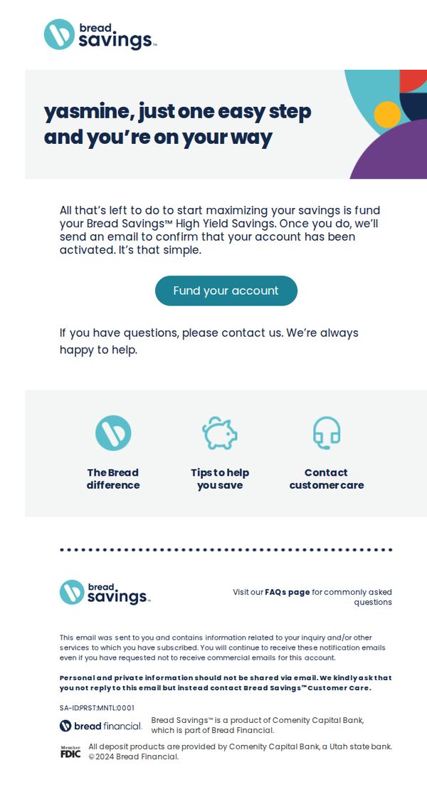
4. One more step to better savings
Objective
This email aims to guide the recipient, Yasmine, through the final step of activating her Bread Savings™ High Yield Savings account by funding it, while reinforcing trust and support through clear next steps and customer care resources.
Why this works
The email personalizes the experience by addressing the recipient by name and framing the final step as a simple, empowering action, turning account activation into a moment of progress rather than a chore.
How to implement
It strategically places a single, prominent CTA button labeled 'Fund your account' immediately after explaining the benefit, reducing friction and guiding the user toward the desired action without distraction.
Pro Tip
Add a subtle visual indicator, like a progress bar or step counter, to reinforce that this is the final step, which can increase completion rates by making the process feel more structured and nearly complete. • Include a brief, benefit-driven sentence under the CTA button, such as 'Start earning up to 4.50% APY today', to re-anchor the user’s motivation at the moment of decision.