Finance email designs from top brands
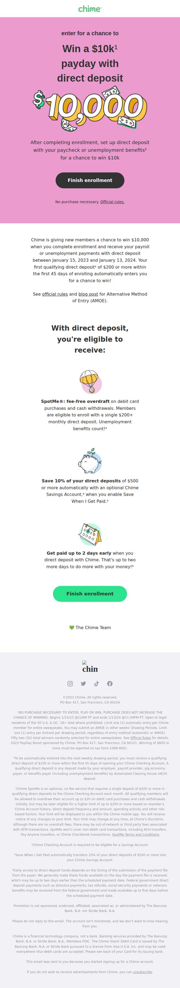

1. Chime: Your payday + $10K = 🤑. Enter for a chance to win.
Objective
This email aims to convert new users into active Chime members by incentivizing enrollment and direct deposit setup with the chance to win $10,000, while simultaneously highlighting key financial benefits of using Chime’s platform.
Why this works
Chime brilliantly ties a high-value financial reward to a simple user action, setting up direct deposit, making the incentive feel both attainable and immediately relevant to the recipient’s payday cycle.
How to implement
By visually anchoring the $10,000 prize with bold typography and playful dollar bill graphics, the email creates instant emotional engagement while subtly reinforcing the brand’s fun, approachable tone for everyday banking.
Pro Tip
Add a countdown timer near the CTA to create urgency around the January 13, 2024 deadline, visually reinforcing the limited-time nature of the $10K prize and encouraging immediate action. • Reposition the second 'Finish enrollment' CTA higher in the email, ideally after the first benefit bullet, to reduce scroll friction and capture attention while the user is still emotionally engaged with the offer.
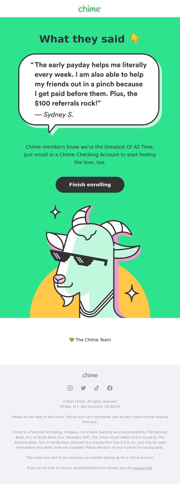
2. Chime: Why our users think we’re the GOAT 🐐
Objective
This email aims to convert partially enrolled users into active Chime members by showcasing authentic user testimonials that highlight key benefits like early payday access and referral rewards, while encouraging immediate account completion.
Why this works
Chime leverages real user quotes to build emotional trust, framing features like early payday access not as technical perks but as life-changing moments that empower users to help others, a powerful social proof tactic.
How to implement
The playful use of ‘GOAT’ and the cartoon goat mascot turns a financial service into a fun, culturally relevant brand moment, making the email feel less like a sales pitch and more like a community celebration.
Pro Tip
Add a subtle countdown timer or progress bar near the CTA to create urgency and visually reinforce that enrollment is nearly complete, which could reduce abandonment among users who started but haven’t finished. • Include a micro-testimonial or stat near the CTA, like ‘92% of users who finish enrollment get early payday within 24 hours’, to reduce perceived risk and reinforce the immediate value of taking action.
3. Mode Mobile : Futures Drop as Tech Selloff Gathers Pace 📉
Objective
This email aims to engage subscribers with timely market analysis and financial news while subtly promoting a health diagnostics product and a $50 Amazon gift card giveaway to boost open rates and conversions. It blends financial commentary with lifestyle and wellness offers to broaden appeal.
Why this works
The email brilliantly blends financial urgency with personal wellness by pairing market downturn commentary with a health diagnostics offer, creating emotional resonance that drives action without feeling overly salesy or disjointed.
How to implement
Using meme-style visuals with relatable financial anxiety (“I’m too afraid to ask”) humanizes complex market data, making the content more digestible and shareable while subtly reinforcing the value of clarity through the advertised health test.
Pro Tip
The CTA 'Order Now and Save 20%' is buried under multiple sections and lacks visual prominence, it should be repeated in a sticky banner or button near the top, especially since the health product is not the primary subject of the email. • The gift card giveaway section is visually underwhelming and lacks urgency cues like a countdown timer or progress bar, adding dynamic elements would increase perceived scarcity and drive faster entries.
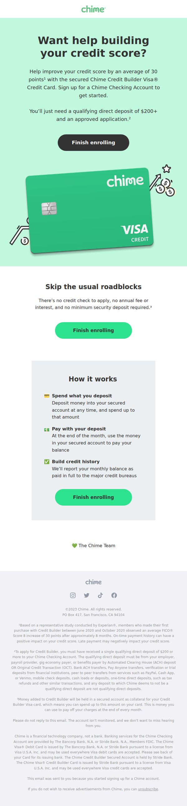
4. Chime: A better way to help build your credit history 📈
Objective
This email aims to convert users into Chime Credit Builder Visa cardholders by highlighting how the product helps build credit without traditional barriers. It emphasizes ease of enrollment, no credit check, and the tangible benefit of a 30-point average credit score increase.
Why this works
The email opens with a benefit-driven headline that speaks directly to a pain point, credit score improvement, and immediately follows with a specific, credible stat (30-point average increase) to build trust and urgency.
How to implement
By positioning the product as a solution that ‘skips the usual roadblocks,’ the email reframes the user’s perceived barriers, no credit check, no fees, no security deposit, turning objections into competitive advantages before the user even thinks to raise them.
Pro Tip
Add a subtle countdown timer or social proof badge (e.g., ‘12,000+ users enrolled this week’) near the first CTA to create urgency and reduce hesitation, especially since the offer is framed as a limited-time opportunity to build credit quickly. • Include a short testimonial or user quote under the ‘How it works’ section, even one sentence like ‘I saw my score jump 35 points in 6 months’, to humanize the stat and reinforce credibility for skeptical first-time credit builders.
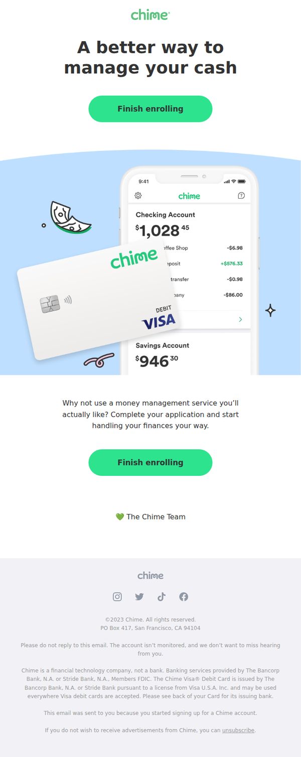
5. Chime: Your account is still waiting
Objective
This email aims to re-engage users who started but didn’t complete their Chime account setup, encouraging them to finish enrollment by highlighting the benefits of personalized money management and visualizing their potential account balances.
Why this works
The email leverages a sense of ownership by showing mock account balances and transaction history, making the unfinished account feel real and personally relevant to the recipient’s financial life.
How to implement
Using a clean, mobile-first visual of the app interface with a floating debit card creates instant familiarity and reduces perceived friction, subtly signaling that the product is intuitive and already tailored to the user.
Pro Tip
Add a brief social proof element, like ‘Join 12M+ members who’ve simplified their money’, near the CTA to reduce hesitation and reinforce trust for users on the fence about finishing enrollment. • Include a micro-copy line under the CTA such as ‘Takes 60 seconds’ to lower perceived effort and increase conversion by addressing the psychological barrier of time investment.
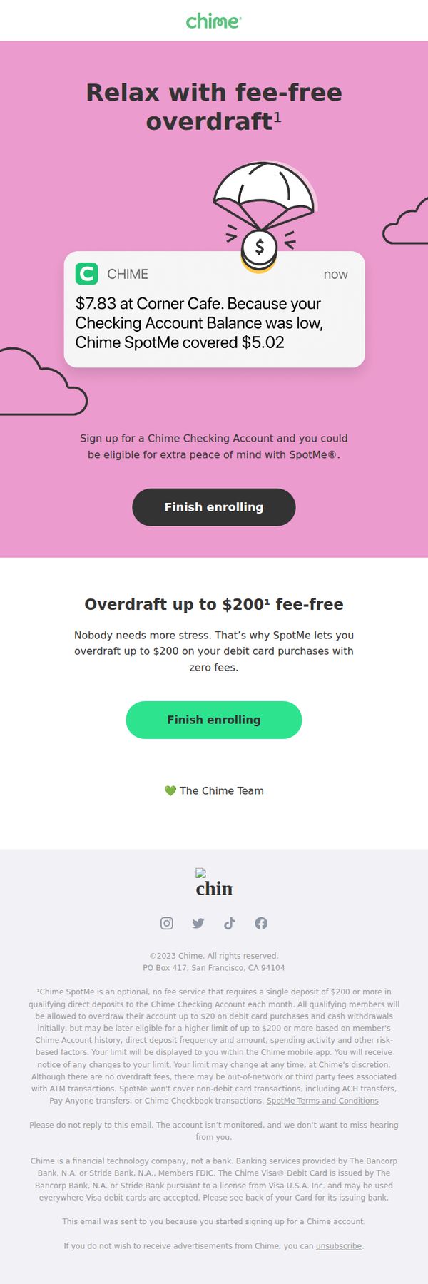
6. Chime: We'll Spot You - No More Overdraft Fees
Objective
This email aims to convert users who started signing up for a Chime account by highlighting the stress-free benefit of fee-free overdraft protection through SpotMe, encouraging them to complete enrollment with a clear, benefit-driven CTA.
Why this works
Chime brilliantly uses a simulated push notification to demonstrate SpotMe in action, making the abstract benefit of overdraft protection feel immediate, real, and emotionally reassuring to users who fear financial surprises.
How to implement
The email frames the $200 overdraft limit not as a credit line but as a stress-reduction tool, aligning the product feature with the user’s emotional need for peace of mind rather than just transactional convenience.
Pro Tip
Add a brief testimonial or social proof near the first CTA to build trust, for example, '92% of SpotMe users say they’ve avoided overdraft fees since enrolling', to reduce hesitation for users on the fence. • Include a small visual indicator (like a progress bar or checklist) showing how close the user is to completing enrollment, which could reduce drop-off by making the next step feel smaller and more achievable.
7. Bread Financial : You'll need this code
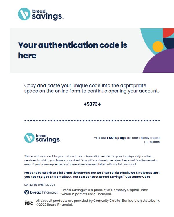
Objective
This email aims to securely deliver a one-time authentication code to the recipient so they can complete their account setup or verification process without compromising sensitive information through direct reply.
Why this works
The email clearly separates the authentication code visually with bold typography and spacing, reducing user error and increasing confidence during sensitive account setup steps.
How to implement
By explicitly warning users not to reply with personal information and directing them to customer care instead, the brand builds trust and reduces phishing risk through proactive education.
Pro Tip
Add a visual indicator or icon next to the code (e.g., clipboard or copy button) to guide users toward copying it, reducing friction for less tech-savvy recipients. • Include a brief expiration notice for the code (e.g., 'Valid for 10 minutes') to create urgency and prevent user confusion if they delay completing the form.
8. Gerber Life: Help protect their future with the Grow-Up® Plan
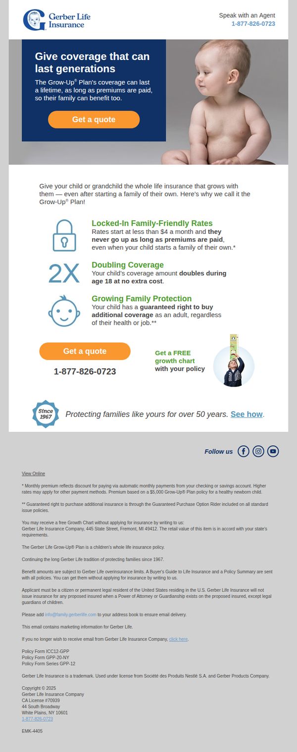
Objective
The email aims to encourage parents and grandparents to secure lifelong insurance coverage for children through Gerber Life’s Grow-Up® Plan, emphasizing generational protection and locked-in affordability. It seeks to drive immediate quote requests by highlighting unique benefits like doubling coverage at age 18 and guaranteed future purchase rights.
Why this works
The email brilliantly frames life insurance as a multi-generational gift, not just a financial product, positioning the Grow-Up® Plan as a legacy-building tool that grows with the child and protects their future family, which emotionally resonates with grandparents and parents alike.
How to implement
By anchoring the value proposition in concrete, easy-to-digest benefits like 'Locked-In Family-Friendly Rates' and 'Doubling Coverage at 18,' the email reduces cognitive load and builds trust through transparency, making complex insurance terms feel simple and reassuring to hesitant buyers.
Pro Tip
Add a subtle countdown timer or urgency indicator near the CTA to encourage faster action, since life insurance decisions often get delayed, this could be tied to a seasonal promotion or limited-time offer to boost conversion without altering the core message. • Reposition the phone number directly beside the primary CTA button instead of below it, so users who prefer speaking to an agent can act immediately without scrolling, reducing friction for high-intent prospects who may abandon the page if forced to search for contact info.
9. Varo: Need a cash advance up to $100? 🤑
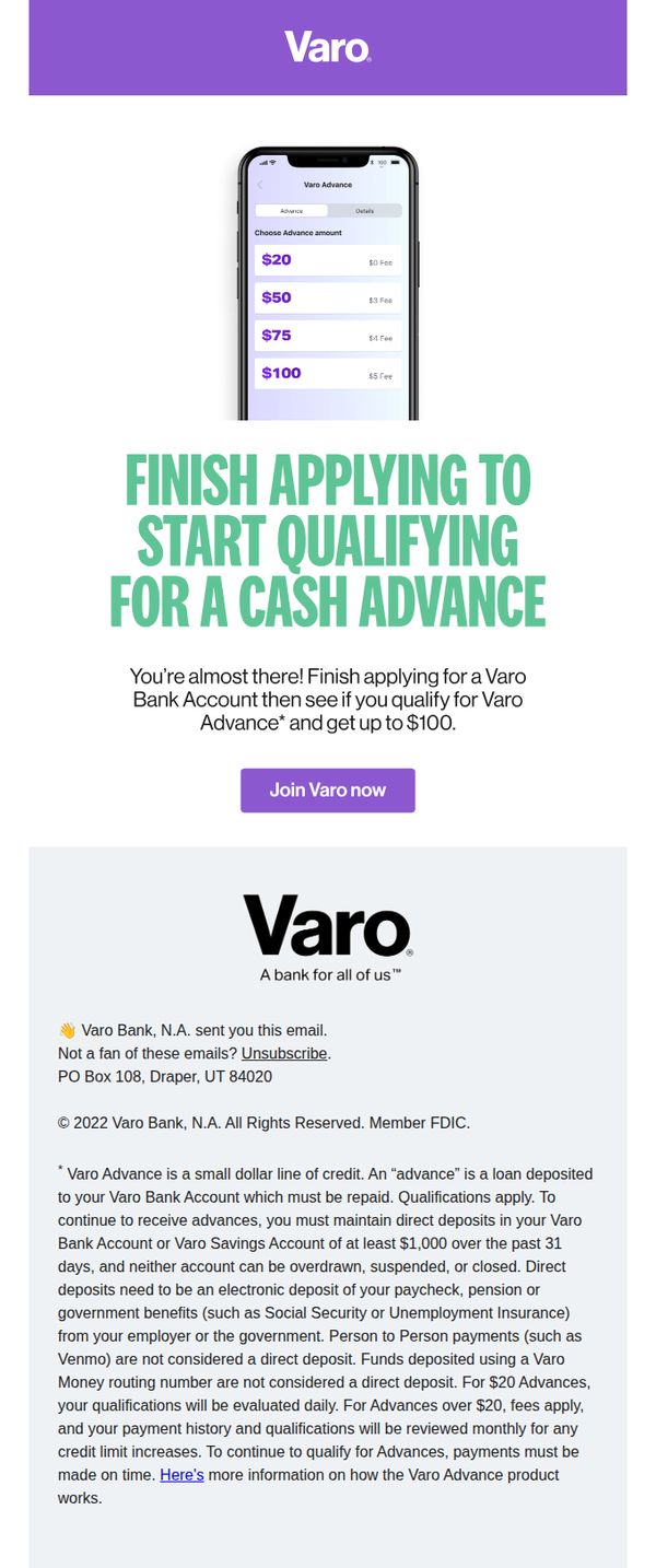
Objective
The email aims to convert interested users into Varo Bank account holders by prompting them to complete their application to qualify for a cash advance of up to $100, leveraging urgency and simplicity to drive immediate sign-ups.
Why this works
The email brilliantly uses a mobile screenshot to visually demonstrate the ease of selecting an advance amount, making the product feel tangible and instantly accessible to users who might otherwise hesitate.
How to implement
By framing the cash advance as a reward for finishing the application, not a loan, Varo reduces psychological friction and positions the offer as a benefit of joining, not a debt obligation, which increases conversion appeal.
Pro Tip
Add a brief testimonial or social proof near the CTA to reinforce trust, e.g., '90% of applicants qualify within minutes', to reduce hesitation for users unfamiliar with Varo Advance. • Include a small visual indicator (like a progress bar or checkmark) next to 'Finish applying' to subtly communicate how close the user is to qualifying, increasing perceived ease and momentum.
10. Gerber Life: Child whole life insurance starting at $3.70 per month
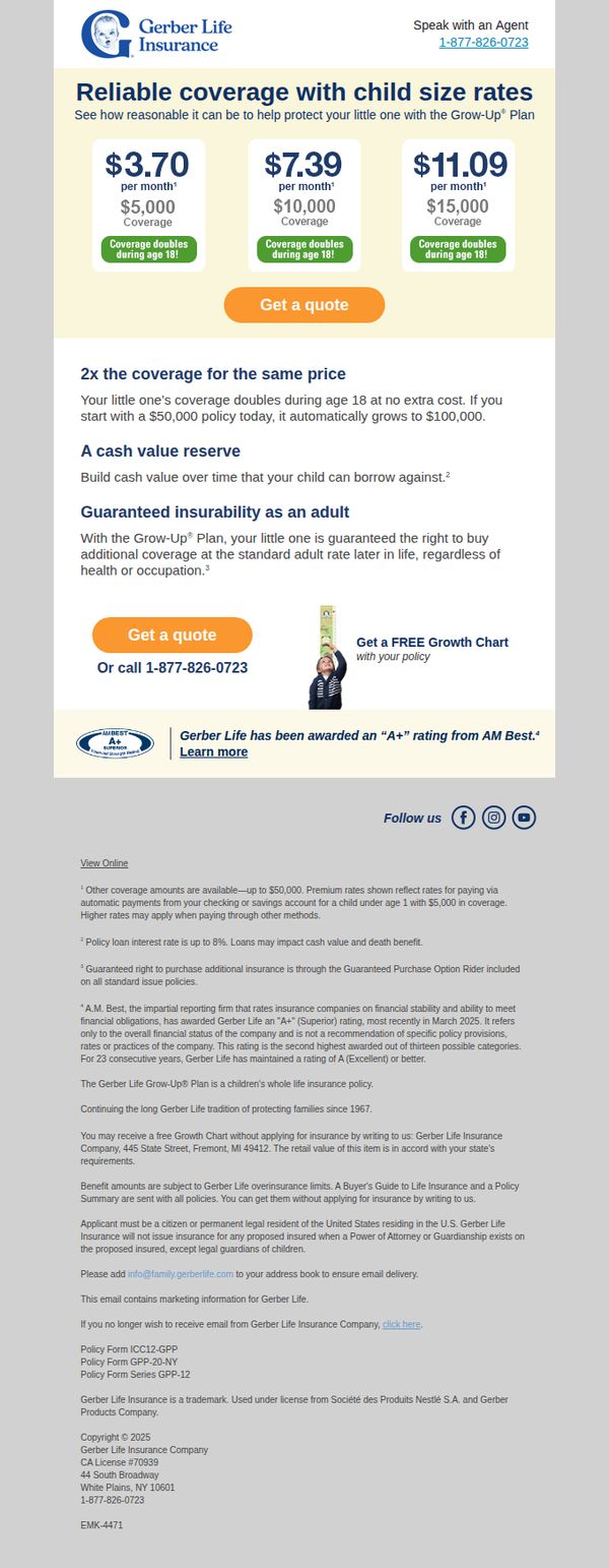
Objective
To encourage parents to secure affordable, lifelong protection for their children by highlighting low monthly premiums and automatic coverage growth, while driving immediate action through a simple quote request.
Why this works
The email brilliantly simplifies complex insurance terms by anchoring pricing to monthly costs and visualizing coverage growth with clear, child-friendly icons that make financial protection feel accessible and intuitive for overwhelmed parents.
How to implement
By emphasizing 'coverage doubles at age 18' without extra cost, the campaign taps into parental long-term planning instincts, turning a financial product into an emotional investment in their child’s future security and adulthood milestones.
Pro Tip
Add a subtle countdown timer or urgency trigger near the CTA (e.g., 'Limited-time rates for newborns') to nudge procrastinating parents into immediate action without compromising the calm, trustworthy tone. • Replace the generic 'Get a FREE Growth Chart' offer with a personalized preview (e.g., 'See how much coverage your child could have at 18') to make the benefit feel more relevant and emotionally compelling.