Chime email designs from top brands
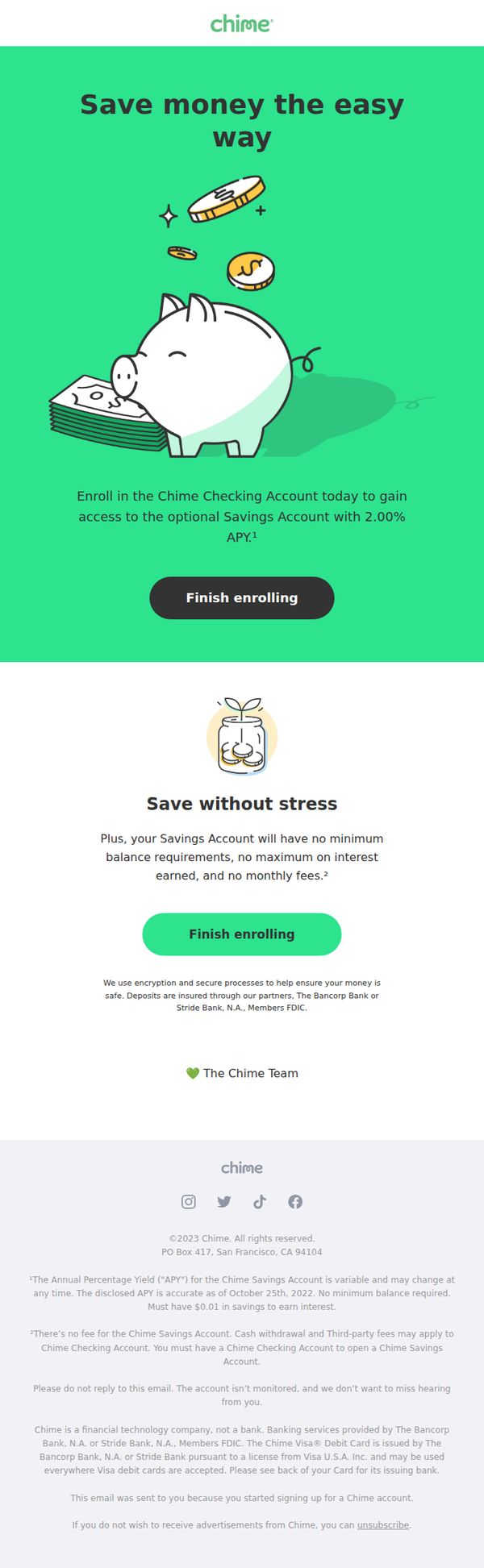
1. 1 Easy Way to Grow Your Savings
Objective
This email aims to convert users who started signing up for a Chime account by encouraging them to complete enrollment, highlighting the benefit of earning 2.00% APY on savings with no fees or minimums. It seeks to reduce friction and build trust through simplicity and security reassurance.
Why this works
The email uses a playful, approachable illustration of a piggy bank with coins to visually communicate savings growth without overwhelming the user, making financial products feel accessible and friendly to newcomers.
How to implement
By repeating the 'Finish enrolling' CTA twice with different color treatments, the campaign strategically reinforces urgency and action while accommodating visual scanning habits, increasing the likelihood of conversion without redundancy.
Pro Tip
Add a progress bar or step indicator above the first CTA to show users how close they are to completion, reducing perceived effort and increasing completion rates for partially enrolled users. • Include a brief testimonial or user stat (e.g., 'Over 12M users trust Chime with their savings') in the second section to strengthen social proof and reinforce the 'save without stress' message with real-world validation.
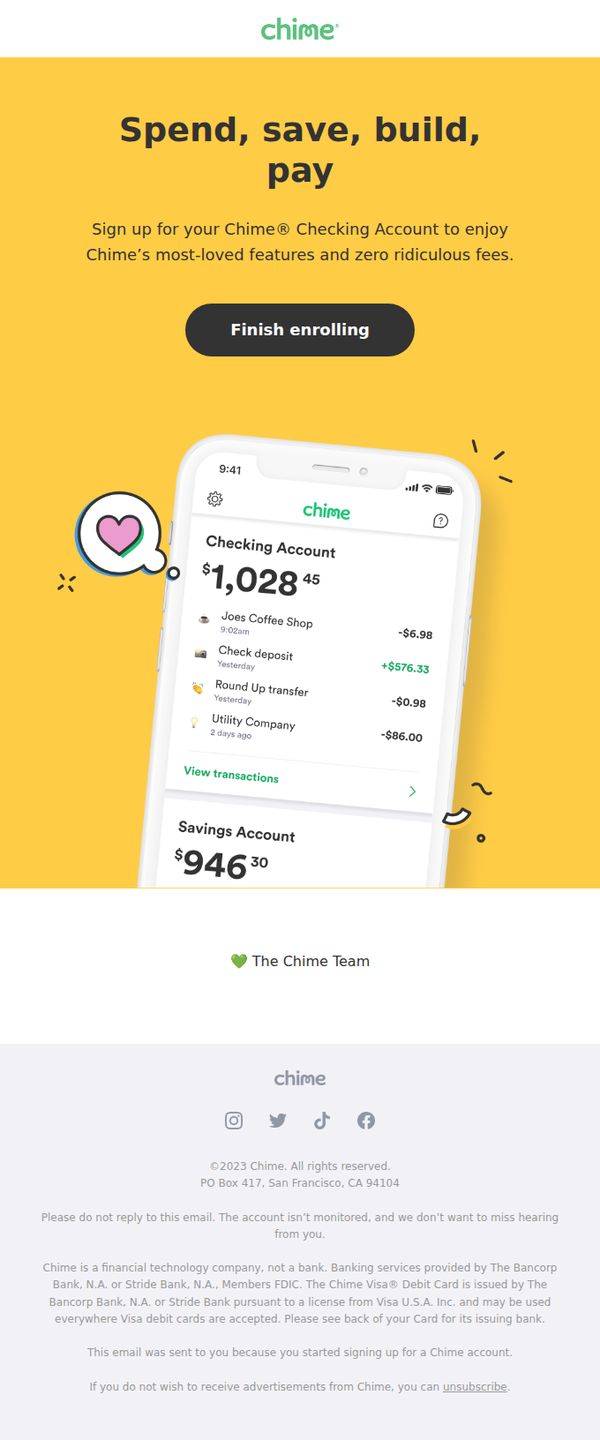
2. Financial flexibility is what you deserve
Objective
This email aims to convert users who started signing up for a Chime account by reminding them of the core financial benefits, spending, saving, building, and paying, while emphasizing zero fees and a seamless mobile experience to drive final enrollment.
Why this works
Chime brilliantly frames financial control as a right, not a privilege, using the empowering phrase 'Financial flexibility is what you deserve' to emotionally resonate with users who feel constrained by traditional banking fees and complexity.
How to implement
The email leverages a realistic, emotionally positive mobile screenshot, complete with a heart icon and clean transaction history, to visually demonstrate the ease and satisfaction of using Chime, making the abstract benefit of 'zero fees' feel tangible and trustworthy.
Pro Tip
Add a micro-copy line beneath the CTA like 'Join 12M+ members who’ve cut bank fees for good' to reinforce social proof and urgency without disrupting the clean layout. • Include a subtle progress indicator (e.g., 'You’re 90% done!') near the CTA to reduce abandonment by reminding users how little effort remains to complete enrollment.
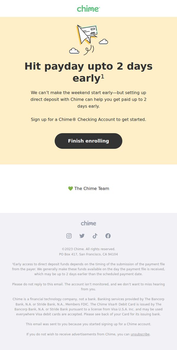
3. Chime helps you Get Paid up to 2 Days Early
Objective
This email aims to convert users who started signing up for a Chime account by highlighting the benefit of getting paid up to two days early through direct deposit, encouraging them to complete enrollment with a clear, low-friction CTA.
Why this works
Chime frames early pay as a practical life hack, not a luxury, by acknowledging weekends can’t start sooner, which makes the benefit feel relatable and grounded in real-world user pain points rather than abstract financial jargon.
How to implement
The email uses a single, bold CTA button labeled 'Finish enrolling' that assumes the user is already in progress, reducing friction by implying momentum and making the next step feel like a natural continuation rather than a new commitment.
Pro Tip
Add a micro-visual cue or progress bar near the CTA to indicate how far the user is in the enrollment process, this would reduce abandonment by reinforcing that they’re close to completion and lowering perceived effort. • Include a brief social proof element, like 'Join 12M+ members who get paid early', just above the CTA to build trust and reduce hesitation by showing the feature is widely adopted and reliable.
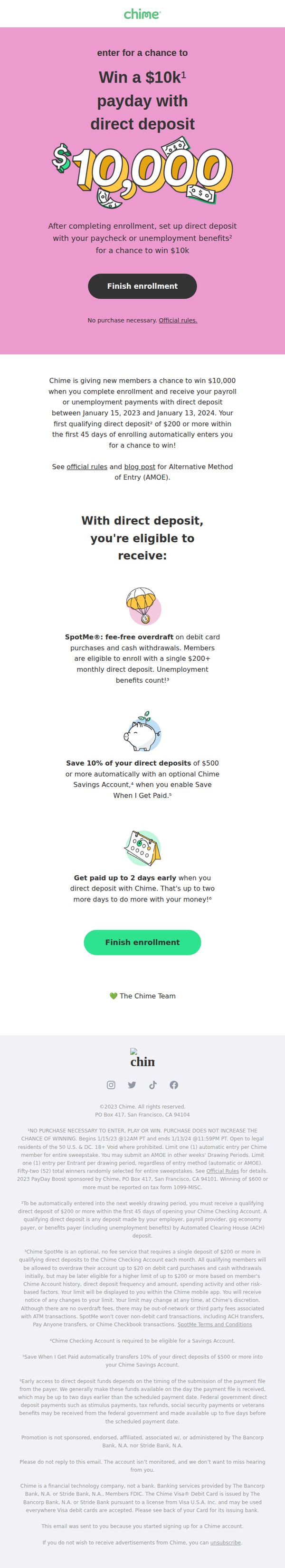
4. Your payday + $10K = 🤑. Enter for a chance to win.
Objective
This email aims to convert new users into active Chime members by incentivizing direct deposit setup with a high-value $10,000 payday giveaway, while simultaneously highlighting key product benefits that reinforce long-term value beyond the promotion.
Why this works
The email brilliantly ties a high-emotion, high-value prize to a core product behavior, direct deposit setup, making the action feel both rewarding and essential, not just transactional.
How to implement
By layering three distinct product benefits beneath the main offer, Chime transforms a simple giveaway into a value-packed onboarding experience that educates users while they’re emotionally engaged.
Pro Tip
Add a subtle countdown timer near the CTA to create urgency around the January 13, 2024 deadline, leveraging FOMO to nudge procrastinators toward immediate enrollment. • Include a short, real-member testimonial near the benefits section to build social proof and reduce skepticism around the $10K giveaway, making the offer feel more attainable and trustworthy.
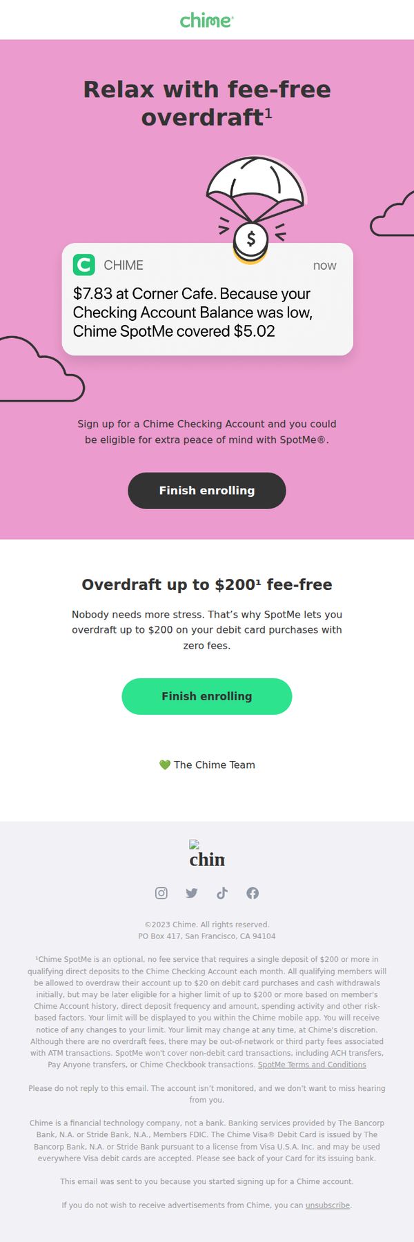
5. We'll Spot You - No More Overdraft Fees
Objective
This email aims to convert users who started signing up for a Chime account by highlighting the stress-free benefit of fee-free overdraft protection through SpotMe, encouraging them to complete enrollment with a clear, reassuring message and prominent CTA.
Why this works
Chime brilliantly frames overdraft protection not as a financial product but as emotional relief, using phrases like 'Relax with fee-free overdraft' to position SpotMe as a stress-reducing safety net rather than a banking feature.
How to implement
The email leverages a realistic, personalized transaction example, '$7.83 at Corner Cafe', to instantly demonstrate value in a relatable, everyday context, making the abstract benefit of overdraft coverage feel immediate and tangible.
Pro Tip
Add a subtle countdown timer or progress bar near the CTA to create gentle urgency, especially since this targets users who started but didn’t complete enrollment, a visual nudge could reduce drop-off. • Include a short testimonial or social proof element, even one sentence from a real user, to validate the emotional benefit of 'peace of mind,' making the claim feel more authentic and less promotional.
6. A better way to help build your credit history 📈
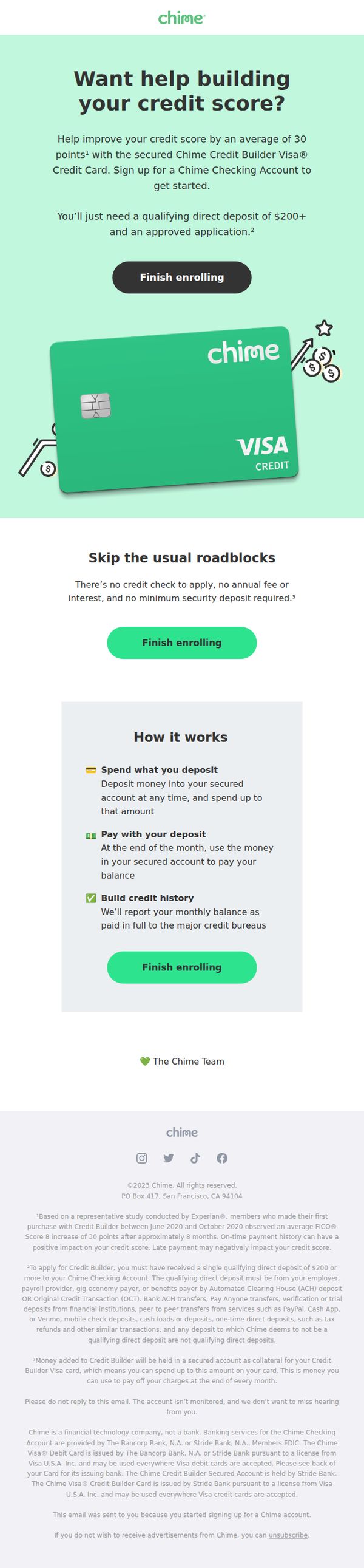
Objective
This email aims to convert users into Chime Credit Builder Visa cardholders by highlighting how the product helps improve credit scores without traditional barriers like credit checks or fees. It targets users who have started signing up but haven’t completed enrollment.
Why this works
Chime positions its Credit Builder Visa as a frictionless solution by explicitly stating there’s no credit check, no annual fee, and no minimum deposit, directly addressing common pain points that deter users from traditional credit-building tools.
How to implement
The email uses a clear, three-step ‘How it works’ breakdown that transforms a potentially complex financial product into an intuitive, trustworthy process, making it easy for users to visualize their path to better credit without feeling overwhelmed.
Pro Tip
Add a subtle countdown timer or progress bar near the CTA to create urgency and reinforce that the user is one step away from completing enrollment, which can reduce drop-offs in the final stage. • Include a micro-testimonial or user stat (e.g., ‘92% of users saw credit score improvement within 6 months’) in the hero section to strengthen social proof and reduce perceived risk for hesitant users.
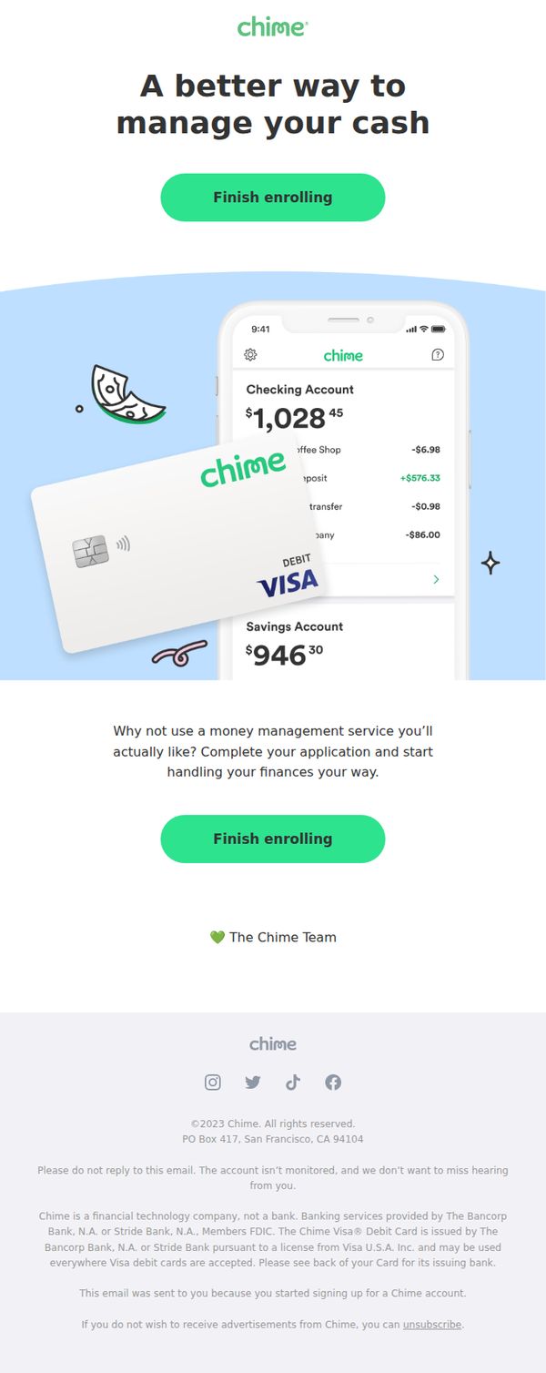
7. Manage your money with one simple app 📱
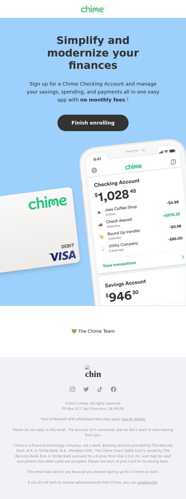
Objective
The email aims to convert users who started signing up for Chime into fully enrolled customers by emphasizing the simplicity and fee-free benefits of managing finances through their app. It reinforces trust and convenience to reduce drop-off during onboarding.
Why this works
Chime brilliantly positions its app as a one-stop solution for modern money management by visually showcasing real-time account balances and transaction history, making financial control feel effortless and intuitive for new users.
How to implement
The email leverages social proof subtly by signing off with 'The Chime Team' and a heart emoji, creating a warm, human connection that reassures users they’re joining a supportive financial community, not just a faceless institution.
Pro Tip
Add a micro-testimonial or user stat (e.g., 'Join 12M+ users who simplified their money') near the CTA to boost social proof and urgency without cluttering the clean layout. • Include a subtle progress indicator (e.g., 'Step 2 of 3: Finish Enrolling') above the CTA to reduce abandonment by helping users visualize how close they are to completion.
8. An account and debit card made for the 21st century.
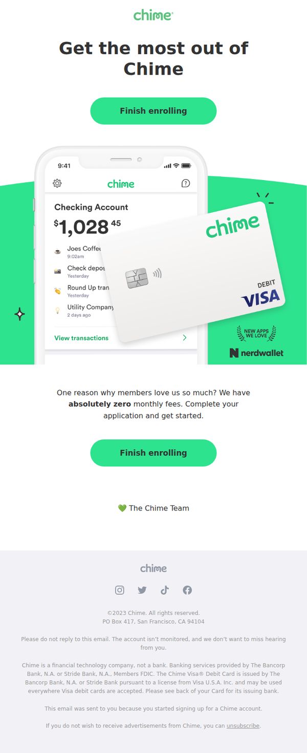
Objective
This email aims to convert users who started signing up for a Chime account by reminding them of the benefits and urging them to complete enrollment. It emphasizes zero fees and modern banking features to reinforce value and reduce friction in the onboarding process.
Why this works
The email strategically uses a visual of the mobile app and debit card together to create an instant, tangible impression of convenience and modernity, making abstract banking benefits feel real and accessible to the user.
How to implement
By highlighting 'absolutely zero monthly fees' in bold and pairing it with a direct CTA, the email turns a key differentiator into a persuasive trigger that addresses a common pain point and reduces hesitation in completing sign-up.
Pro Tip
Add a brief testimonial or social proof near the second CTA to build trust, for example, 'Join 12M+ members who bank with zero fees', to strengthen credibility and reduce perceived risk for hesitant users. • Include a subtle progress indicator or time-sensitive nudge (e.g., 'Your account setup is 80% complete, finish in 2 minutes') to create gentle urgency and reduce drop-off by framing completion as quick and nearly done.
9. Your account is still waiting
Objective
This email aims to re-engage users who started but didn’t complete their Chime account setup, encouraging them to finish enrollment by highlighting the benefits of personalized money management and visualizing their potential account balances.
Why this works
The email leverages a sense of ownership by showing mock account balances, making the user feel like they’re already part of the Chime experience, a subtle but powerful psychological nudge to complete what they started.
How to implement
Using a clean, mobile-first visual of the app interface with real-looking transaction data builds instant credibility and reduces perceived friction, helping users imagine the ease of managing money once enrolled.
Pro Tip
Add a brief social proof element, like 'Join 12M+ users who’ve simplified their money,' to strengthen trust and reduce hesitation for users still on the fence about completing enrollment. • Include a micro-copy line under the CTA such as 'It only takes 60 seconds' to lower perceived effort and address potential friction points around time commitment.
10. Send your friends a few bucks with Chime 👍
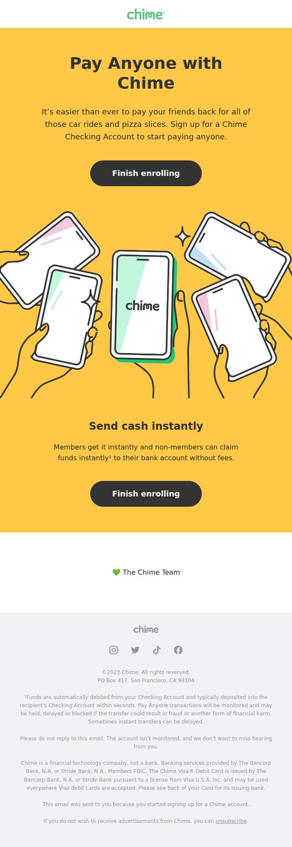
Objective
This email aims to convert users who started signing up for a Chime account by highlighting the ease of sending money to friends, encouraging them to complete enrollment with a clear, benefit-driven CTA.
Why this works
The email brilliantly frames peer-to-peer payments as a social convenience, not a financial chore, by tying it to relatable moments like splitting pizza or rideshares, making the feature feel instantly useful and emotionally resonant.
How to implement
By repeating the 'Finish enrolling' CTA twice, once after the headline and again after the benefit explanation, the email reinforces urgency without being pushy, guiding the user naturally toward conversion at key decision points.
Pro Tip
Add a small trust indicator near the CTA, like 'Join 12M+ members' or a security badge, to reduce hesitation for users still evaluating Chime’s legitimacy before completing enrollment. • Include a micro-testimonial or social proof snippet under the 'Send cash instantly' section, e.g., '“I paid my roommate back in 3 seconds, no fees, no hassle.”, Sarah, CA', to humanize the benefit and boost credibility.