Condé Nast Traveler campaign ideas that work
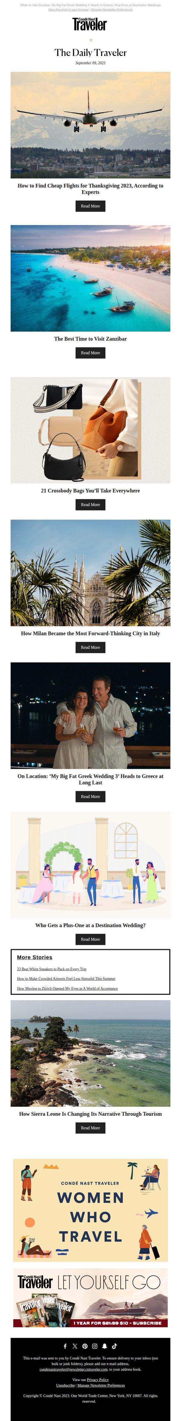
1. How to Find Cheap Flights for Thanksgiving 2023
Objective
To engage readers with timely, expert-backed travel advice for Thanksgiving 2023 while promoting broader editorial content and brand loyalty through curated destination and lifestyle stories.
Why this works
The email opens with a high-value, time-sensitive travel tip, finding cheap Thanksgiving flights, immediately hooking readers who are actively planning holiday travel and positioning the brand as a trusted expert.
How to implement
Each article preview pairs a stunning, emotionally resonant image with a curiosity-driven headline, creating visual rhythm and psychological pull that encourages scrolling and multiple clicks without overwhelming the reader.
Pro Tip
Add a subtle countdown timer or urgency indicator near the 'How to Find Cheap Flights' headline to reinforce time sensitivity and nudge immediate action, since Thanksgiving travel planning is already in progress. • Reposition the subscription CTA to appear after the first 2–3 article cards instead of at the very bottom, capturing attention while readers are still engaged, rather than waiting until they’ve scrolled past all content.
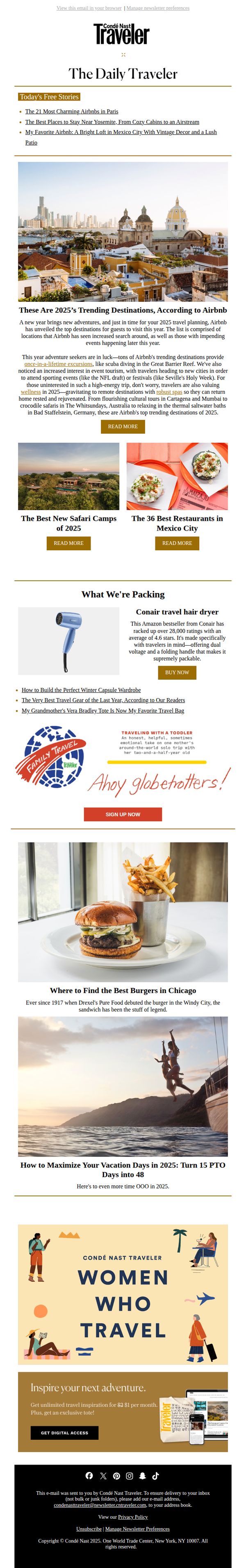
2. These Are 2025’s Trending Destinations, According to Airbnb
Objective
This email aims to inspire readers to plan their 2025 travels by highlighting trending destinations sourced from Airbnb data, while also promoting Condé Nast Traveler’s premium content and digital subscription through curated travel stories and product recommendations.
Why this works
The email smartly leverages Airbnb’s data authority to position Condé Nast Traveler as a trusted curator of 2025’s most sought-after destinations, blending data-driven insights with editorial storytelling to spark wanderlust and planning urgency.
How to implement
By embedding product recommendations like the Conair travel hair dryer alongside editorial content, the campaign subtly monetizes reader interest without disrupting the travel inspiration narrative, creating a seamless blend of utility and aspiration.
Pro Tip
The primary CTA 'GET DIGITAL ACCESS' is buried near the bottom; relocating it above the fold or repeating it after the hero section would better capture attention from readers already engaged by the trending destinations headline. • The email lacks a visual hierarchy that guides the eye from inspiration to action, adding subtle directional cues or a progress bar toward the subscription offer would reinforce the journey from discovery to conversion.
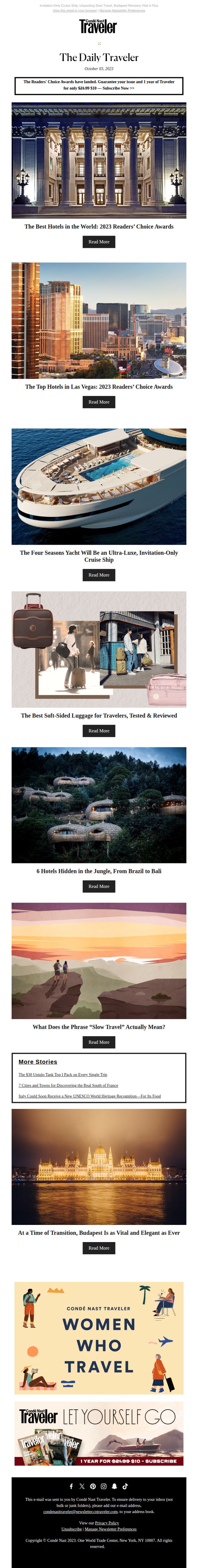
3. These Are the Best Hotels in the World, As Voted by Our Readers
Objective
This email aims to engage readers by showcasing the most prestigious travel destinations and experiences as voted by the Condé Nast Traveler community, while subtly encouraging subscription through exclusive content and award highlights.
Why this works
The email leverages social proof by spotlighting reader-voted awards, which builds trust and positions the brand as a curator of elite travel experiences rather than just a publisher of content.
How to implement
Each story is visually anchored with high-impact imagery and paired with a clear, consistent 'Read More' CTA, creating a seamless browsing experience that encourages deeper engagement without overwhelming the reader.
Pro Tip
The subscription CTA in the hero section could be more visually distinct, perhaps with a contrasting color or icon, to draw immediate attention and increase conversion without disrupting the editorial tone. • Adding a brief testimonial or quote from a past reader who discovered a life-changing hotel through the Readers’ Choice Awards would strengthen emotional appeal and reinforce the value of the subscription.
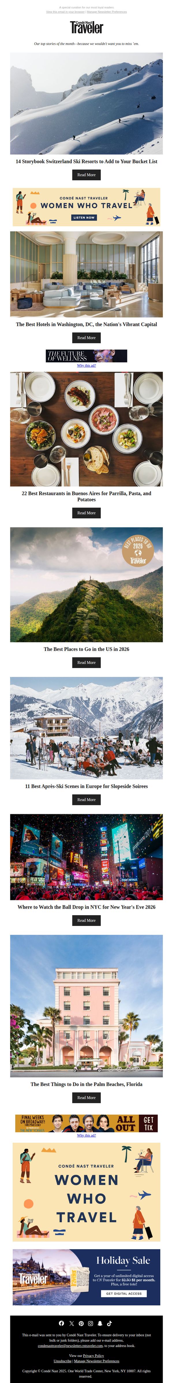
4. 14 Storybook Switzerland Ski Resorts to Add to Your Bucket List
Objective
To inspire readers to dream and plan future travel by showcasing visually stunning, bucket-list-worthy destinations while subtly promoting brand loyalty and digital subscription. The email positions Condé Nast Traveler as the authority on aspirational global travel experiences.
Why this works
The email opens with a breathtaking hero image paired with a highly specific, emotionally resonant headline, '14 Storybook Switzerland Ski Resorts', which instantly hooks wanderlusters by promising curated, fairy-tale escapes rather than generic travel tips.
How to implement
Each content block uses vivid, destination-specific photography combined with tightly written, benefit-driven headlines that evoke sensory experiences, like après-ski soirees or New Year’s Eve in Times Square, making readers feel the thrill of being there before they even click.
Pro Tip
Add a subtle visual hierarchy to the CTA buttons, perhaps using color contrast or micro-animations, to guide the eye more effectively through the scrollable content grid, especially since all CTAs currently use identical styling and may blend into the background. • Integrate a short teaser sentence beneath each headline (e.g., 'Cozy chalets, powder-perfect slopes, and Alpine charm await') to give readers an immediate emotional hook before clicking, increasing perceived value and reducing bounce rate.
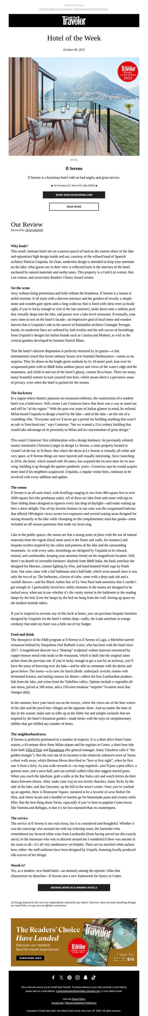
5. Refined Luxury Sits on Lake Como’s Eastern Shore
Objective
This email aims to showcase Il Sereno as a premier luxury hotel on Lake Como’s eastern shore, enticing readers to book a stay by highlighting its design, service, and exclusive ambiance. It also promotes Condé Nast Traveler’s editorial authority and drives engagement through affiliate links and subscription offers.
Why this works
The email masterfully blends editorial storytelling with commercial intent, using rich sensory details and designer credits to elevate the hotel’s appeal beyond mere accommodation into a curated lifestyle experience worth investing in.
How to implement
By anchoring the hotel’s value in its architectural pedigree and regional context, like referencing Urquiola’s design and the ‘golden triangle’ location, it transforms a travel feature into a compelling cultural argument for why this stay matters now.
Pro Tip
Add a subtle countdown or limited-availability indicator near the CTA to create urgency without undermining the luxury tone, e.g., ‘Only 3 suites available this week’, to nudge hesitant readers toward booking. • Include a mini map or visual iconography in the ‘neighborhood/area’ section to quickly orient readers geographically, reducing cognitive load and reinforcing proximity to Como and Milan for time-sensitive travelers.
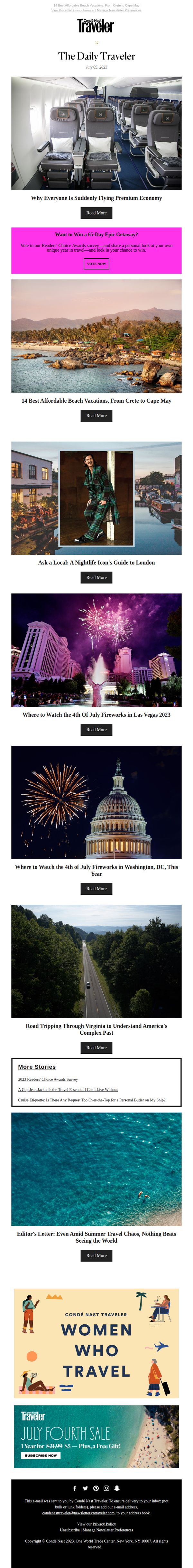
6. What's So Great About Premium Economy, Anyway?
Objective
This email aims to engage subscribers with curated travel content while subtly promoting brand loyalty and subscription conversion through seasonal offers and reader participation. It balances editorial value with commercial intent to keep readers informed and invested in Condé Nast Traveler’s authority on global travel.
Why this works
The email masterfully blends editorial storytelling with commercial intent by leading with a compelling, curiosity-driven headline about premium economy, immediately hooking travelers who are weighing comfort against cost in their next flight decision.
How to implement
By embedding a vibrant, high-contrast pink CTA banner for a 65-day getaway contest, the campaign leverages FOMO and reader participation to drive engagement without disrupting the editorial flow, making the promotion feel like a natural extension of the travel experience.
Pro Tip
The primary CTA 'Read More' is repetitive and generic across all articles; personalizing it per section (e.g., 'Discover Beach Deals' or 'Plan Your Fireworks Escape') would increase click-through rates by aligning with user intent and content context. • The 'Women Who Travel' banner and July Fourth sale are visually strong but buried near the footer; moving one of them higher, perhaps after the first 2–3 articles, would increase visibility and conversion without compromising editorial flow.
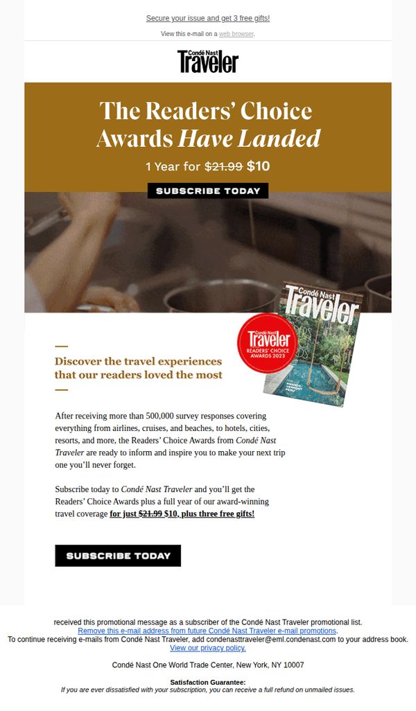
7. The Readers’ Choice Awards are here
Objective
To drive subscriptions by leveraging the prestige of the Readers’ Choice Awards, positioning the magazine as an essential guide for memorable travel experiences while offering a limited-time discount and bonus gifts to incentivize immediate action.
Why this works
The email brilliantly ties the authority of 500,000+ survey responses to the credibility of the Readers’ Choice Awards, making the subscription feel like access to trusted, crowd-sourced travel wisdom rather than just another magazine.
How to implement
By anchoring the offer to a specific, time-sensitive price drop, from $21.99 to $10, and bundling three free gifts, the campaign creates urgency and perceived value that transforms a passive reader into an active subscriber.
Pro Tip
Add a brief testimonial or quote from a past subscriber who used the Awards to plan a trip, which would humanize the data and strengthen emotional appeal without cluttering the layout. • Include a small countdown timer or 'limited-time offer' badge near the CTA to amplify urgency, since the current design relies solely on price reduction without visual reinforcement of scarcity.
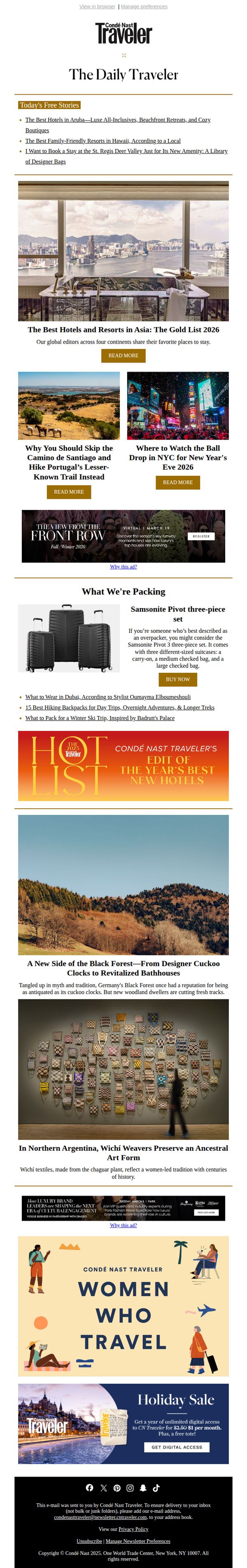
8. The Asia Hotels Our Editors Keep Going Back To
Objective
To engage luxury travelers by showcasing Asia’s top hotels curated by editors, while subtly promoting digital subscriptions and travel gear through editorially-driven content that blends inspiration with commercial intent.
Why this works
The email leverages editorial authority by framing hotel picks as ‘Gold List 2026’ selections from global editors, which builds trust and positions the brand as a curator of elite travel experiences rather than just a publisher.
How to implement
By embedding product recommendations like the Samsonite luggage set within a ‘What We’re Packing’ section, the campaign seamlessly blends lifestyle content with commerce, making promotional placements feel organic and useful rather than interruptive.
Pro Tip
The primary CTA ‘READ MORE’ is repeated identically across multiple articles, diluting urgency and specificity; tailoring CTAs to each story (e.g., ‘See the Gold List Hotels’ or ‘Explore Portugal’s Hidden Trails’) would better guide user intent and improve click-through clarity. • The digital subscription offer at the bottom feels disconnected from the editorial content above; integrating a teaser like ‘Unlock the full Gold List + 100+ expert guides with a subscription’ directly under the hero section would strengthen conversion alignment.
9. How to Build the Perfect Fall Travel Capsule Wardrobe
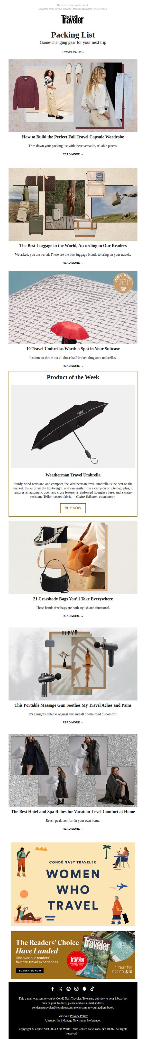
Objective
To inspire and guide travelers in curating smart, stylish, and functional travel essentials for the fall season while subtly promoting product discovery and brand engagement through curated editorial content and reader-driven recommendations.
Why this works
The email masterfully blends editorial storytelling with product curation, making each item feel like a trusted recommendation rather than a sales pitch, which builds credibility and encourages deeper engagement with the content.
How to implement
By featuring reader-voted favorites like the best luggage and travel umbrellas, the campaign leverages social proof to validate product choices, subtly guiding subscribers toward high-confidence purchases without overtly pushing them.
Pro Tip
Add a subtle countdown timer or limited-time badge to the ‘Product of the Week’ section to create urgency around the Weatherman umbrella, encouraging faster clicks and reducing decision fatigue for subscribers already primed to buy. • Reposition the ‘Women Who Travel’ banner above the subscription offer to reinforce brand identity and community before the hard sell, creating a smoother emotional-to-commercial transition that aligns with the audience’s aspirational travel mindset.
10. The Miami Hotels You Loved This Year
Objective
This email aims to engage readers by showcasing top travel destinations and hotels based on the 2023 Readers’ Choice Awards, while subtly encouraging subscription through exclusive content and value-driven offers. It positions Condé Nast Traveler as the authority in curated, reader-vetted travel experiences.
Why this works
The email leverages social proof by spotlighting reader-voted awards, which builds trust and positions the brand as a curator of authentic, community-validated travel experiences rather than just a publisher of editorial content.
How to implement
By mixing destination guides with lifestyle features like Victoria Beckham’s fragrance project, the email broadens its appeal beyond hotel bookings to aspirational travel culture, keeping readers engaged across multiple interest points without feeling salesy.
Pro Tip
The primary CTA 'Read More' is repetitive and generic across all sections; customizing CTAs to reflect content intent (e.g., 'See the Top 10 Miami Hotels' or 'Explore Portugal’s Best Villas') would increase click-through relevance and user intent alignment. • The email lacks a visual hierarchy that guides the eye toward the subscription offer; adding a subtle arrow, border, or color accent around the '1 Year for $10' banner in the footer would draw attention to the highest-value conversion point without disrupting the editorial flow.