Employment email designs from top brands
1. HiBob : HiBob’s February 2026 content roundup
Objective
This email aims to position HiBob as a thought leader in people-first HR strategy by curating and promoting its latest content, including podcast episodes, reports, and customer stories, to engage HR professionals and drive them toward deeper engagement through webinars and resource downloads.
Why this works
The email masterfully frames HR and Finance alignment as a strategic growth lever, not just an operational tactic, making the content feel essential for leaders who want to turn people strategy into measurable business outcomes.
How to implement
By leading with a branded podcast and using conversational, benefit-driven headlines like 'Speak the same language' and 'Better together,' the email builds emotional resonance while subtly reinforcing HiBob’s unique positioning as a connector of siloed functions.
Pro Tip
Add a visual progress indicator or 'You’re 3/5 through the insights' counter near the top to gamify engagement and encourage scrolling through all content blocks, increasing time-on-email and reducing early drop-offs. • Reposition the 'Register Now' CTA higher, ideally after the first two content blocks, with a secondary CTA like 'Download the Playbook' beneath the resources section to capture intent at multiple decision points.
2. Workana : Cathie, we have two especially important benefits to tell you about
Objective
This email aims to convert a registered but inactive user into an active client by highlighting Workana’s two core value propositions, transparency and security, to build trust and encourage them to post their first project.
Why this works
The email opens with a personalized, benefit-driven hook that immediately frames the message around the recipient’s needs, not the brand’s features, making the value proposition feel relevant and urgent from the first sentence.
How to implement
Workana smartly separates its two biggest trust signals, transparency and security, into distinct, digestible sections with clear explanations and a supporting video, which reduces cognitive load and builds credibility without overwhelming the reader.
Pro Tip
Add a visual element, even a simple icon or divider, between the transparency and security sections to improve scannability and reinforce the separation of these two distinct trust pillars, helping the reader process each benefit more clearly. • Include a micro-testimonial or social proof near the CTA (e.g., '87% of clients say Workana’s escrow system made them feel safer hiring') to reinforce security claims with peer validation, which can reduce hesitation right before the conversion point.
3. Workana : Cathie, let a freelancer take care of your to-do list. What are you waiting for?
Objective
This email aims to guide a new user, Cathie, through the initial steps of hiring a freelancer on Workana by simplifying the process into three clear actions, encouraging immediate engagement with the platform to convert her from a passive account holder to an active client.
Why this works
The email opens with a personalized, conversational tone that immediately addresses the recipient by name and acknowledges her recent sign-up, creating a sense of relevance and reducing friction for first-time users who might otherwise feel overwhelmed.
How to implement
By breaking down the hiring process into three digestible, numbered steps with clear sub-bullets, the email transforms a potentially complex task into a simple, reassuring journey that builds confidence and reduces decision paralysis for new clients.
Pro Tip
Add a brief testimonial or social proof near the CTA to reinforce trust, for example, '92% of new clients hire their first freelancer within 48 hours', to reduce hesitation and validate the ease of the process. • Include a small visual icon or progress bar next to each step to enhance scannability and create a more intuitive, gamified experience that visually guides the user through the onboarding journey.
4. PeoplePerHour : AI, Loyalty & More: Smart Ways to Grow Your Business on PeoplePerHour in 2025
Objective
This email aims to educate freelancers and business owners on leveraging AI and client relationship strategies to grow their income on PeoplePerHour in 2025, while encouraging engagement with curated blog content that drives platform loyalty and repeat usage.
Why this works
The email brilliantly segments value by audience, freelancers versus business owners, making each reader feel personally addressed and increasing the relevance of the AI-driven tips offered for 2025’s evolving marketplace.
How to implement
By framing AI not as a threat but as a productivity multiplier, the campaign reframes technology as an ally, which reduces reader resistance and positions PeoplePerHour as a forward-thinking partner in professional growth.
Pro Tip
Add a visual progress indicator or checklist showing how many of the five AI strategies the reader has explored, encouraging completion and reinforcing the value of consuming all content in the series. • Include a short testimonial or stat from a real PeoplePerHour user who successfully implemented one of the AI tips, adding social proof and credibility to the educational claims made in each section.
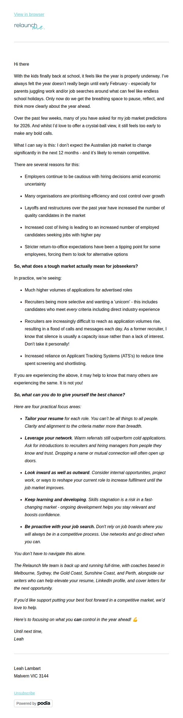
5. Relaunch Me: 🎯 The job market in 2026: what to expect (and how to stay competitive)d
Objective
This email aims to position Relaunch Me as a trusted advisor by offering realistic, actionable insights into the 2026 job market while gently guiding readers toward their coaching services as a solution to stay competitive. It balances empathy with practicality to build trust and encourage engagement.
Why this works
The email opens with a relatable, human moment, kids returning to school, to ground the reader emotionally before diving into market analysis, making the content feel less like a forecast and more like a conversation with a trusted mentor.
How to implement
Instead of overwhelming readers with predictions, it focuses on what job seekers can control, tailoring resumes, leveraging networks, and proactive learning, turning anxiety into agency and subtly positioning the brand as the guide to that empowerment.
Pro Tip
Add a clear, visually distinct CTA button labeled 'Book a Free Strategy Session' near the end to reduce friction and convert interest into action, since the current 'we’d love to help' is passive and lacks urgency or next-step clarity. • Include a short testimonial or client result (e.g., 'Sarah landed 3 interviews in 4 weeks after our resume overhaul') to social proof the coaching value, making the offer feel more tangible and reducing perceived risk for hesitant readers.
6. Workana : Did not find what you were looking for?
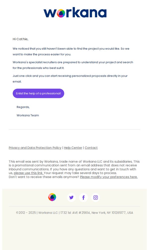
Objective
This email aims to re-engage users who haven’t successfully found a project by offering personalized recruiter assistance, reducing friction in their search journey and encouraging them to take action with a single click.
Why this works
The email opens with a personalized, empathetic tone that acknowledges the user’s struggle, which builds trust and positions the brand as a helpful partner rather than a sales channel.
How to implement
By offering specialist recruiters to handle the search, the campaign removes decision fatigue and positions the service as a premium, time-saving solution tailored to the user’s specific project needs.
Pro Tip
Add a brief testimonial or success stat near the CTA to reinforce credibility, for example, '87% of clients who used recruiter help found their ideal freelancer within 48 hours.' • Include a subtle visual cue like a small icon or progress bar next to the CTA to imply speed or ease, helping users mentally reduce perceived effort before clicking.
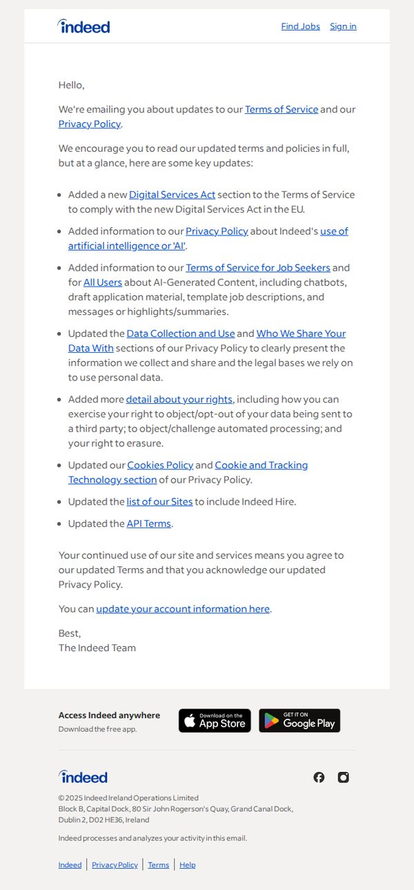
7. Indeed: We've updated our Terms of Service and Privacy Policy
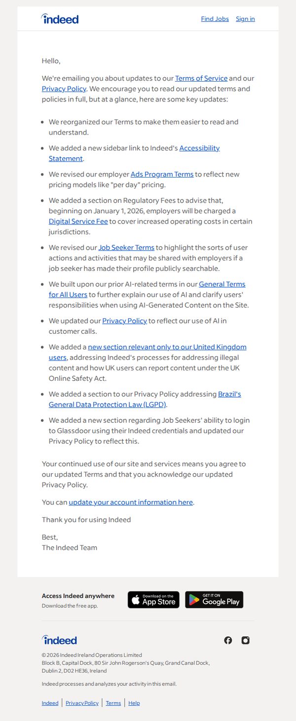
Objective
This email aims to inform users of updates to Indeed’s Terms of Service and Privacy Policy, encouraging them to review the changes while reassuring them that continued use constitutes acceptance of the new terms.
Why this works
Indeed smartly balances legal transparency with user reassurance by summarizing complex policy updates in digestible bullet points, making compliance feel less intimidating and more like a collaborative update rather than a corporate mandate.
How to implement
The email strategically links to specific policy sections like Accessibility Statement and Ads Program Terms, allowing users to dive deep only where relevant, this reduces friction while still honoring legal disclosure requirements without overwhelming the reader.
Pro Tip
Add a secondary CTA button or link labeled 'Read Full Updates' near the top to reduce scroll friction for users who want immediate access to the full policies, rather than relying solely on embedded hyperlinks in the bullet list. • Include a brief FAQ or 'What This Means for You' section after the bullet points to translate legal jargon into plain-language impacts, e.g., 'You’ll now see clearer AI disclosures when using chat features', to strengthen user comprehension and reduce anxiety.
8. Workana : A message from Workana’s founder
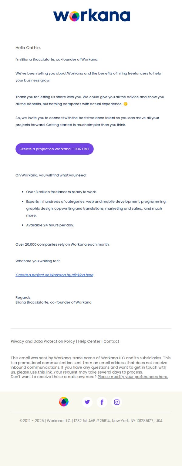
Objective
This email aims to build trust and drive immediate action by having the founder personally invite the recipient to experience Workana’s freelance talent platform, emphasizing simplicity and real-world results over generic sales pitches.
Why this works
The founder’s direct, personal message creates instant credibility and emotional resonance, making the recipient feel valued rather than targeted, which significantly lowers resistance to taking action.
How to implement
By positioning the platform as a simple, no-risk starting point, ‘Getting started is much simpler than you think’, the email removes psychological barriers and frames the CTA as a low-effort experiment, not a commitment.
Pro Tip
Add a subtle visual hierarchy to the bullet points, such as icons or bolded keywords, to help scanners quickly grasp the platform’s value without reading every word, improving conversion for time-poor recipients. • Include a micro-testimonial or short client quote near the CTA to reinforce trust at the moment of decision, bridging the gap between the founder’s message and the user’s hesitation to click.
9. Workana : Cathie, this is the secret to working 4 hours per week.
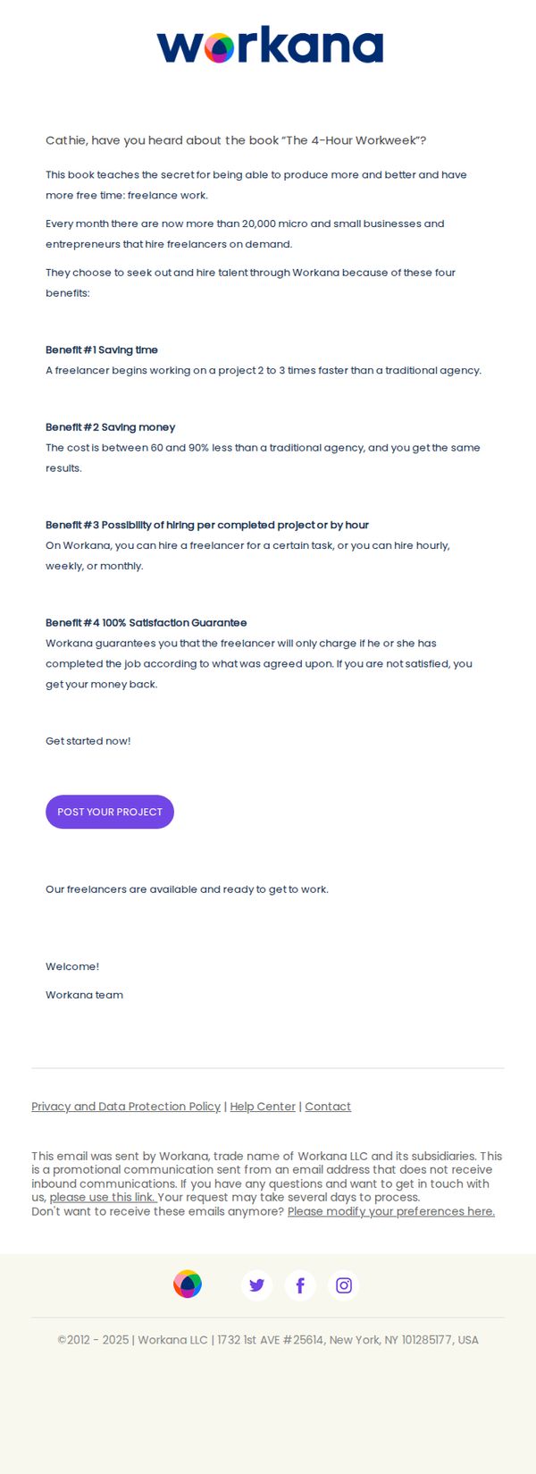
Objective
The email aims to convert the recipient, Cathie, into a client by positioning Workana as the ideal platform to achieve the lifestyle promised in 'The 4-Hour Workweek', specifically by hiring freelancers to save time and money while maintaining quality and flexibility.
Why this works
By anchoring the message to a well-known productivity book, the email instantly taps into the recipient’s existing aspirations, making the value proposition feel familiar, credible, and emotionally resonant rather than purely transactional.
How to implement
The email strategically breaks down abstract benefits into four concrete, numbered advantages, saving time, saving money, flexible hiring models, and a satisfaction guarantee, making the offer feel structured, trustworthy, and easy to digest in seconds.
Pro Tip
Add a testimonial or short client quote near the CTA to reinforce social proof, since the email relies heavily on abstract benefits, a real user story would humanize the promise and reduce skepticism. • Include a visual element like a simple icon or mini-infographic next to each benefit to break up text density and improve scannability, especially since the email’s current layout is text-heavy and may lose attention on mobile.
10. Indeed: We've updated our Terms of Service and Privacy Policy
Objective
This email aims to inform users of updates to Indeed’s Terms of Service and Privacy Policy, ensuring legal compliance while encouraging transparency and user awareness of new data rights and AI-related policy changes.
Why this works
Indeed frames legal updates as user-centric by summarizing key changes in bullet points, making complex policy revisions digestible and reducing friction for readers who might otherwise skip the email entirely.
How to implement
The inclusion of direct hyperlinks to specific policy sections like 'Digital Services Act' and 'AI use' empowers users to self-serve deeper information without overwhelming the main message, balancing clarity with compliance.
Pro Tip
Add a visual indicator like a small icon or color highlight next to each bullet point to draw attention to the most impactful changes, especially those involving AI and data rights, to increase scannability and user retention. • Reposition the CTA 'update your account information here' higher in the email, perhaps immediately after the summary bullets, to reduce drop-off and align user action with the peak of policy awareness.