Proven GQ email designs you can use
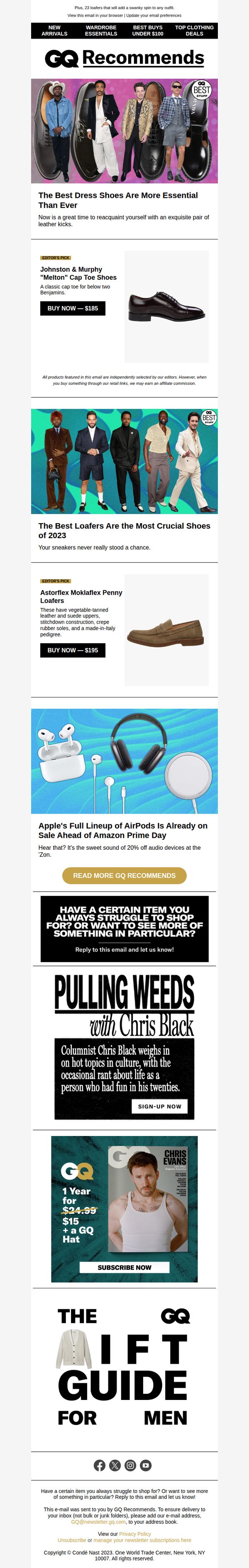

1. The Best Dress Shoes Are More Essential Than Ever
Objective
This email aims to drive immediate product purchases by showcasing curated, editor-selected dress shoes and loafers while reinforcing GQ’s authority in men’s style. It also seeks to grow newsletter engagement and magazine subscriptions through personality-driven content and exclusive offers.
Why this works
GQ leverages editorial authority by labeling picks as 'Editor’s Pick' and tying them to cultural relevance, making product recommendations feel like insider advice rather than sales pitches, which builds trust and urgency.
How to implement
The email smartly juxtaposes high-end fashion with accessible price points, like 'below two Benjamins', to make luxury feel attainable, lowering psychological barriers while still preserving aspirational appeal for style-conscious men.
Pro Tip
The CTA 'BUY NOW, $185' appears only once per product and lacks visual hierarchy; adding a sticky or repeated CTA button near the top of each product section would reduce friction and increase conversion likelihood. • The Apple AirPods section feels disconnected from the men’s footwear theme; either reframe it as a complementary accessory or replace it with a related shoe category (e.g., 'Best Shoes for Travel') to maintain thematic consistency and audience focus.
2. This $195 Watch Is a Marvel of Y2K Blob Design
Objective
This email aims to educate readers on the cultural and design significance of Fossil’s Y2K Big Tic watch while subtly positioning it as a desirable, nostalgic fashion statement. It leverages GQ’s editorial authority to elevate a mass-market product into a conversation piece worthy of style-conscious consumers.
Why this works
The email brilliantly frames a mainstream watch as a cultural artifact by weaving design history, generational nostalgia, and tech-era psychology into its narrative, turning product description into storytelling that resonates beyond utility.
How to implement
By anchoring the watch’s appeal in the emotional zeitgeist of Y2K, optimism, playfulness, and rebellion against minimalism, the campaign taps into deeper consumer motivations rather than just features, making the product feel culturally essential rather than merely functional.
Pro Tip
Add a clear, secondary CTA near the top of the email, such as 'Shop the Y2K Big Tic Collection', to capture immediate interest from readers who recognize the product and want to buy before diving into the editorial content. • Include a small visual comparison grid or timeline showing the original 1999 Big Tic next to the 2026 Y2K reissue to reinforce the nostalgic revival angle and help readers instantly grasp the design evolution and collectibility.
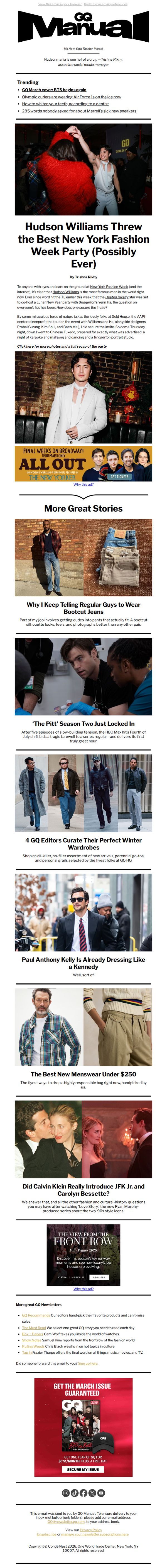
3. Hudson Williams Threw the Best Fashion Week Party
Objective
This email aims to engage readers with exclusive, behind-the-scenes coverage of New York Fashion Week while driving traffic to GQ’s digital content and promoting subscription to the March issue through a limited-time offer.
Why this works
GQ masterfully blends celebrity access with cultural commentary, turning a Fashion Week party into a must-read narrative that feels both insider-y and universally appealing to fashion-curious readers.
How to implement
The email uses a strong visual hierarchy to guide the eye from the headline party story down through curated fashion picks and cultural deep dives, keeping readers scrolling without overwhelming them with ads or clutter.
Pro Tip
The subscription CTA is buried at the bottom after multiple content blocks; moving a sticky or secondary CTA above the fold, perhaps as a banner under the hero image, would capture early interest before scroll fatigue sets in. • The ad placements for 'All Out' and 'The View From the Front Row' interrupt the editorial flow and lack visual integration; replacing them with native-style sponsored content or aligning their design with GQ’s editorial aesthetic would reduce friction and increase engagement.
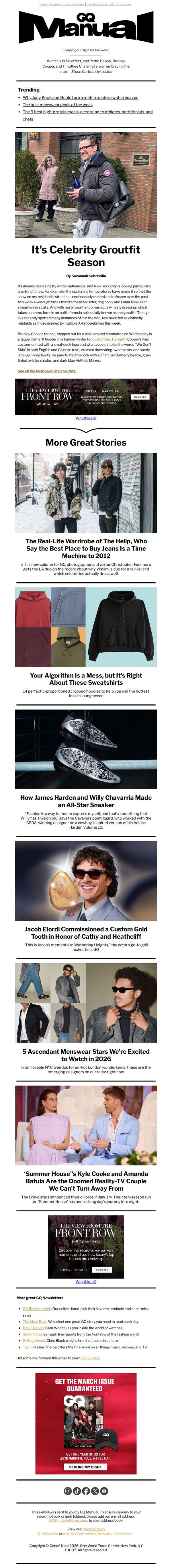
4. It's Celebrity Groutfit Season
Objective
This email aims to engage readers with timely, celebrity-driven fashion content while subtly promoting GQ’s editorial authority and driving subscriptions through a limited-time offer at the bottom. It blends cultural relevance with commerce to maintain reader loyalty and convert casual readers into subscribers.
Why this works
The email leverages real-time cultural moments, like celebrity street style and seasonal weather, to create urgency and relatability, making fashion feel immediate and accessible rather than aspirational or distant.
How to implement
By weaving editorial credibility with commerce, the campaign positions GQ not just as a style guide but as a curator of cultural moments, subtly guiding readers from content consumption to subscription without breaking the editorial tone.
Pro Tip
Add a visual countdown timer or scarcity indicator near the 'SECURE MY ISSUE' CTA to heighten urgency, since the offer is time-sensitive and the current design lacks temporal pressure cues. • Integrate a micro-testimonial or social proof near the CTA, such as 'Join 500,000+ style-savvy readers', to reinforce credibility and reduce hesitation for new subscribers.
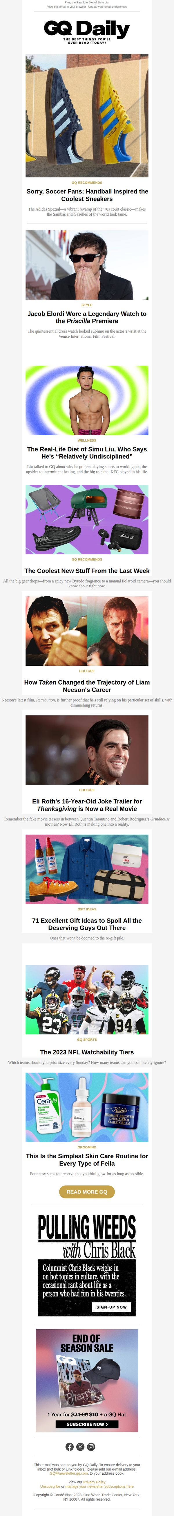
5. Jacob Elordi Wore a Legendary Watch to the Priscilla Premiere
Objective
To engage readers with culturally relevant, celebrity-driven content while subtly promoting GQ’s editorial authority and driving subscriptions through a compelling end-of-season offer.
Why this works
GQ masterfully leverages celebrity moments, like Jacob Elordi’s watch at the Priscilla premiere, to anchor fashion narratives in real-world cultural events, making style feel immediate and aspirational rather than staged or distant.
How to implement
The email balances editorial depth with commercial intent by embedding product recommendations within lifestyle stories, allowing readers to discover gear naturally without feeling interrupted by overt advertising or sales pressure.
Pro Tip
The CTA 'SUBSCRIBE NOW' is buried beneath multiple content blocks; reposition it after the first two high-impact stories to capture attention before reader fatigue sets in, increasing conversion likelihood. • Add a micro-copy line under the subscription offer clarifying what ‘1 Year for $10’ includes, e.g., ‘Full digital access + exclusive member-only content’, to reduce ambiguity and strengthen perceived value.
6. Can GQ do better? Tell us how.
Objective
GQ aims to gather reader feedback through a short survey to better understand audience interests and improve future content offerings, while incentivizing participation with a high-value sweepstakes entry.
Why this works
GQ smartly pairs audience insight gathering with a high-stakes incentive, turning passive readers into active participants by offering a sweepstakes worth up to $1,000, a tactic that boosts survey completion while building goodwill.
How to implement
The email opens with a humble, reader-centric tone, 'What can GQ do for you?', which disarms skepticism and positions the brand as responsive, making subscribers feel valued rather than surveyed for corporate gain.
Pro Tip
Add a progress bar or visual indicator near the CTA to reinforce the '10-minute' promise and reduce abandonment by showing users how much time remains, increasing perceived ease of completion. • Include a brief testimonial or quote from a past survey participant who benefited from GQ’s changes, to build social proof and demonstrate that feedback actually leads to tangible improvements.
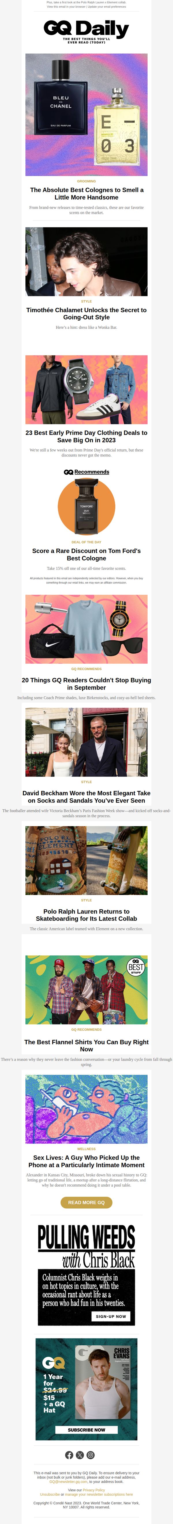
7. Timothée Chalamet Unlocks the Secret to Going-Out Style
Objective
This email aims to engage male readers with curated style, grooming, and cultural content while subtly promoting product deals and subscriptions. It blends editorial storytelling with commerce to drive clicks, conversions, and brand loyalty.
Why this works
GQ brilliantly blends celebrity style moments with actionable fashion advice, making readers feel like insiders who’ve unlocked exclusive tips from stars like Timothée Chalamet, which builds both aspiration and trust.
How to implement
By anchoring product promotions within editorial narratives, like pairing Tom Ford’s cologne with a ‘Deal of the Day’, GQ makes commerce feel organic and editorially justified, reducing resistance and increasing perceived value.
Pro Tip
The primary CTA 'SUBSCRIBE NOW' appears too late and is visually buried under a large graphic; moving it higher or adding a sticky CTA bar would capture attention before readers scroll past the conversion point. • The 'Deal of the Day' section lacks a visible countdown timer or stock indicator, which could heighten urgency; adding either would reinforce scarcity and encourage faster decision-making for the Tom Ford discount.
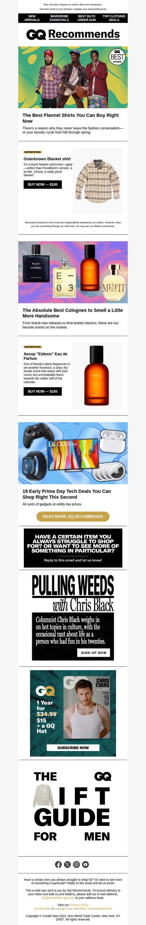
8. The Best Flannel Shirts You Can Buy Right Now
Objective
This email aims to drive immediate purchases by showcasing GQ’s top editorially curated products, flannel shirts, colognes, and tech deals, while also promoting newsletter engagement and magazine subscriptions through compelling content hooks and time-sensitive offers.
Why this works
GQ leverages editorial authority by labeling picks as 'Editor’s Pick' to instantly build trust and reduce decision fatigue, making readers feel confident they’re buying what experts genuinely recommend rather than just what’s trending.
How to implement
The email smartly cross-promotes unrelated but high-interest categories, flannel shirts, colognes, and tech deals, to maximize conversion opportunities per reader, turning a single product focus into a multi-category shopping journey without feeling cluttered or salesy.
Pro Tip
The CTA 'BUY NOW, $100' appears only under the flannel shirt and not repeated under the cologne or tech sections, missing an opportunity to drive conversions on other high-intent products, adding consistent CTAs under each product block would improve revenue potential. • The subscription offer for '1 Year for $24.99 + a GQ Hat' is visually buried near the bottom and lacks urgency or social proof; adding a countdown timer or a line like 'Join 50,000+ subscribers who got their hat last week' would significantly boost sign-up conversion.
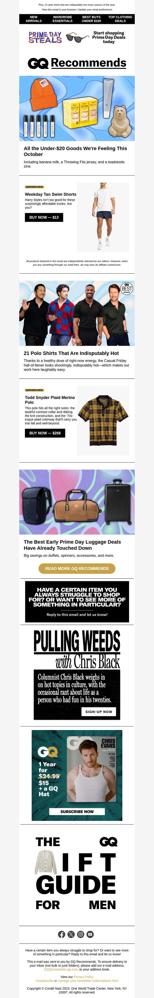
9. All the Under-$20 Goods We're Feeling This October
Objective
To drive immediate purchases by showcasing curated, affordable products under $20 while reinforcing GQ’s editorial authority and encouraging newsletter engagement through personalized content requests.
Why this works
GQ brilliantly blends editorial voice with commerce by framing each product as a cultural moment, like calling polo shirts 'indisputably hot', which transforms price-driven shopping into identity-driven discovery for their audience.
How to implement
The email strategically layers urgency and exclusivity by anchoring the campaign in October’s seasonal vibe while featuring editor picks that feel personally curated, making readers feel like insiders rather than just customers.
Pro Tip
Add a subtle countdown timer or ‘limited stock’ indicator next to the Editor’s Pick CTAs to amplify urgency without disrupting the editorial tone, especially since some items are already marked as Prime Day deals. • Reposition the ‘PULLING WEEDS with Chris Black’ section higher or integrate it with the product grid to better leverage personality-driven content as a conversion driver rather than relegating it to mid-funnel engagement.
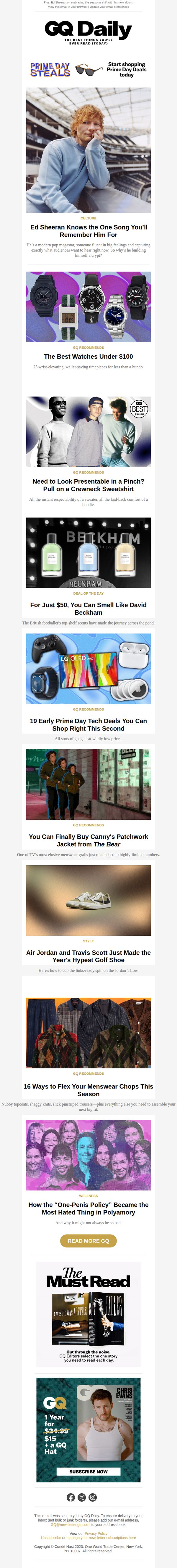
10. The Absolute Best Watches Under $100
Objective
This email aims to drive immediate engagement and clicks by showcasing a curated selection of trending, affordable, and culturally relevant products and stories, while subtly promoting GQ’s subscription and Prime Day shopping opportunities.
Why this works
GQ masterfully blends editorial storytelling with commerce by framing each product as a cultural moment, not just a purchase, making readers feel like they’re discovering trends, not being sold to.
How to implement
The email leverages urgency and exclusivity through time-sensitive deals and limited-edition drops, like Carmy’s jacket or Beckham’s cologne, which taps into FOMO without feeling pushy or salesy.
Pro Tip
The primary CTA ‘READ MORE GQ’ is too generic and doesn’t align with the product-driven intent; it should be action-specific like ‘Shop the Watches Under $100’ to match the top offer and reduce friction. • The layout buries the subscription offer at the bottom after 10+ content blocks; it should be moved above the fold or anchored as a sticky banner to capture attention before readers scroll away.