Online Medical Consultation email gallery from real brands

1. Everlife: 💪 Sermorelin: Feel The Strength and See The Results
Objective
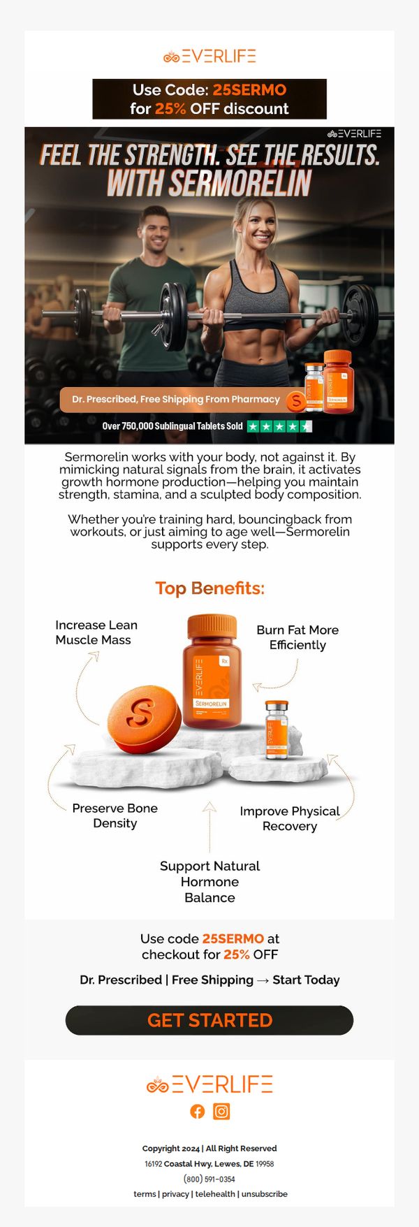
This email aims to drive immediate conversions for Sermorelin by highlighting its scientifically backed benefits for strength, recovery, and body composition while leveraging social proof and a time-sensitive discount to create urgency.
Why this works
The email brilliantly frames Sermorelin as a natural ally to the body’s own systems, not a synthetic fix, making it feel safe, trustworthy, and aligned with holistic wellness goals rather than just performance enhancement.
How to implement
By visually anchoring the CTA between the product’s core benefits and the discount reminder, the design creates a seamless psychological path from understanding value to taking action without friction or hesitation.
Pro Tip
Add a micro-testimonial quote from a verified customer directly under the hero image to humanize the results claim and reinforce trust before the user scrolls to the benefits section. • Introduce a subtle countdown timer next to the discount code to amplify urgency, since the current offer lacks temporal pressure, users may delay action despite the compelling copy.
2. Ro: Get started on GLP-1s, the right way
Objective
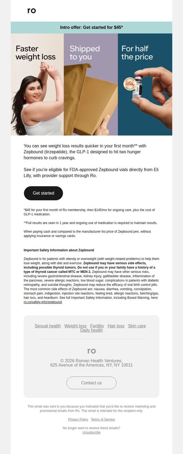
This email aims to convert interested users into first-time Ro members by promoting an introductory offer for Zepbound, a GLP-1 medication, while emphasizing convenience, affordability, and medical legitimacy through direct access to FDA-approved vials from Eli Lilly.
Why this works
The email strategically positions the $45 intro offer not as a discount but as a gateway to medically supervised weight loss, subtly reframing cost as investment in health outcomes rather than mere savings.
How to implement
By visually segmenting benefits into three digestible panels, faster results, direct shipping, and half-price value, the design reduces cognitive load while reinforcing trust through imagery of real product and human interaction.
Pro Tip
Add a subtle countdown timer or limited-availability indicator near the CTA to create urgency around the $45 intro offer, since the current static presentation lacks time-sensitive motivation that could boost immediate conversions. • Reposition the 'Important Safety Information' section immediately after the CTA button, not below it, so users encounter key risks before committing, reducing post-click friction and potential drop-offs due to surprise disclosures.
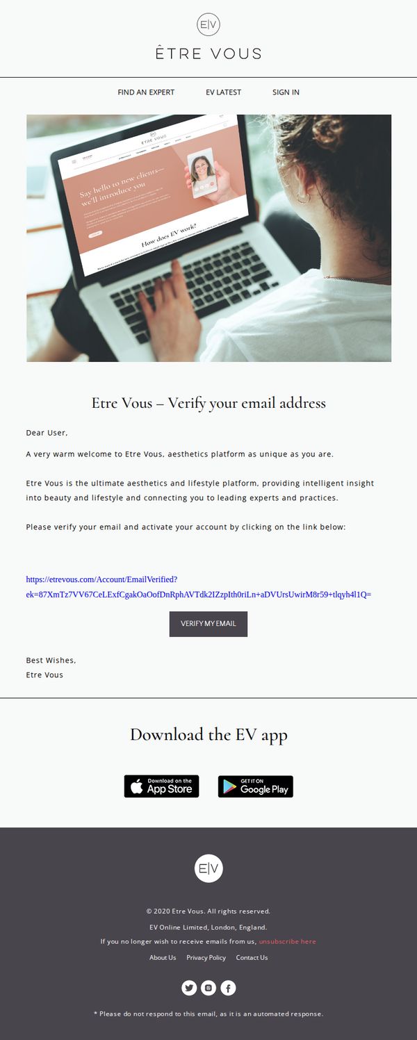
3. Etre Vous: Etre Vous – Verify your email address
Objective
This email aims to guide new users to verify their email address to activate their Etre Vous account, while introducing them to the brand’s positioning as a personalized aesthetics and lifestyle platform connecting users with expert insights.
Why this works
The email opens with a warm, personalized welcome that immediately frames Etre Vous as a unique, client-first platform, subtly building emotional connection before asking for action.
How to implement
By positioning the brand as an 'ultimate aesthetics and lifestyle platform' with 'intelligent insight,' the copy elevates perceived value and justifies the verification step as access to exclusive expertise.
Pro Tip
Add a brief visual indicator or progress bar near the CTA to show users they’re one step away from unlocking full platform access, reinforcing urgency and reducing friction. • Include a short testimonial or social proof snippet from a verified user to build trust and reduce skepticism around clicking the verification link, especially for new signups.
4. Rugiet : Your Doctor Is Waiting with 20% Off
Objective
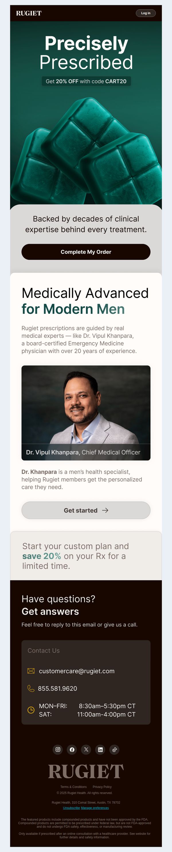
This email aims to convert recipients into customers by positioning Rugiet as a clinically credible, doctor-guided solution for men’s health, while incentivizing immediate action with a time-sensitive 20% discount. It leverages medical authority and personalized care to reduce hesitation and drive prescription completions.
Why this works
The email brilliantly frames the product as a medical prescription rather than a supplement, using clinical language and a real doctor’s photo to build instant trust and position the brand as a legitimate healthcare partner for men seeking personalized solutions.
How to implement
By anchoring the discount to a limited-time Rx savings offer instead of a generic sale, the campaign creates urgency while reinforcing the medical legitimacy of the service, making the discount feel like a professional benefit rather than a marketing gimmick.
Pro Tip
Add a subtle countdown timer or 'limited spots available' indicator near the 'Complete My Order' CTA to amplify urgency without disrupting the clinical tone, since the current 'limited time' mention lacks visual reinforcement to drive faster decisions. • Reposition the 'Get started' button under Dr. Khanpara’s bio to appear as a secondary CTA that funnels users into learning more, while keeping 'Complete My Order' as the primary CTA, this clarifies the user journey and reduces decision fatigue.
5. Jack: 😘 Valentine’s Day sale is live
Objective
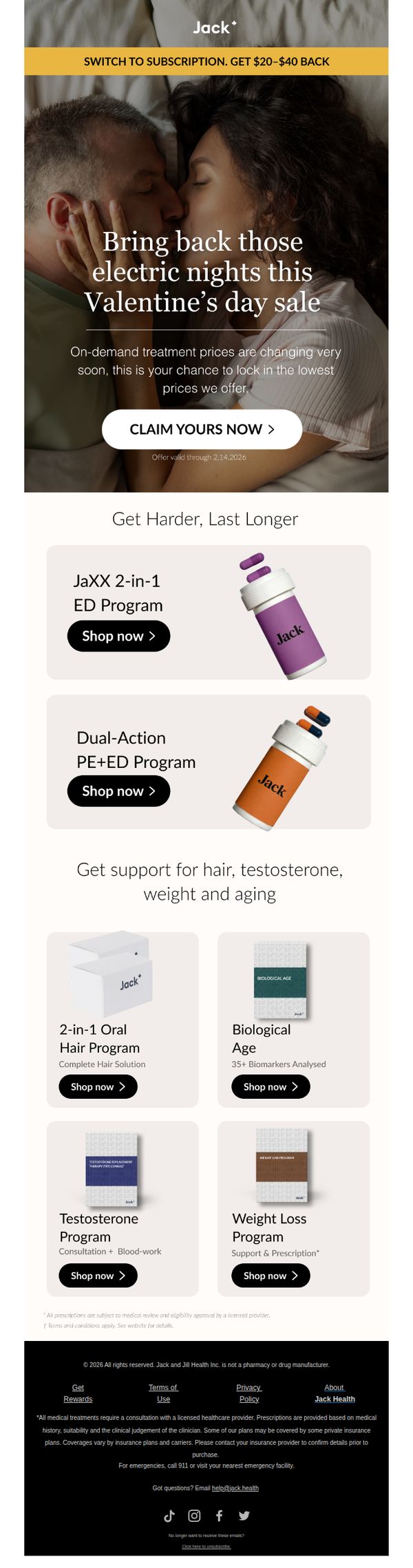
This email aims to drive immediate conversions by leveraging Valentine’s Day urgency to promote Jack’s sexual health and wellness programs, positioning them as romantic solutions to rekindle intimacy while highlighting limited-time pricing.
Why this works
The email brilliantly ties intimate wellness to romantic occasions, reframing clinical treatments as emotional gifts, a powerful emotional hook that transforms a medical product into a Valentine’s Day solution for couples.
How to implement
Using a time-sensitive offer with a clear expiration date (2.14.2026) creates urgency without being pushy, encouraging immediate action while subtly implying that prices will rise after the holiday, which boosts perceived value.
Pro Tip
Add a small countdown timer beneath the CTA to visually reinforce urgency, especially since the offer expires on Valentine’s Day, this would increase conversion pressure without altering the message. • Include a short testimonial or stat (e.g., '92% of users report improved intimacy within 4 weeks') near the hero section to build social proof and reduce hesitation around sensitive health topics.
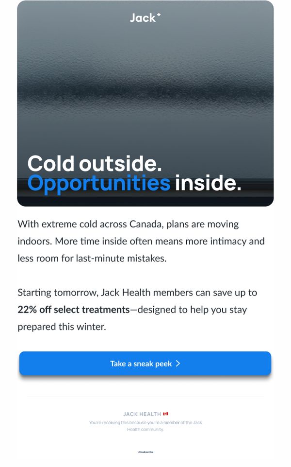
6. Jack: ❗Winter Sale starts Monday, Jan 26.
Objective
The email aims to drive immediate engagement from Jack Health members by teasing a time-sensitive winter sale starting the next day, positioning it as a solution for increased indoor time due to cold weather while encouraging users to explore discounted treatments.
Why this works
The email brilliantly ties seasonal behavior, staying indoors during extreme cold, to a relevant product benefit, making the sale feel timely and personally useful rather than just promotional.
How to implement
Using a bold, emotionally resonant headline like 'Cold outside. Opportunities inside.' creates instant contrast and curiosity, drawing the reader into the message with minimal friction and maximum relevance.
Pro Tip
Add a countdown timer or date stamp near the CTA to reinforce urgency, since the sale starts 'tomorrow', visual time pressure increases conversion likelihood for time-sensitive offers. • Include a brief preview of 1–2 featured treatments or categories under the CTA to reduce friction and give members a reason to click beyond curiosity, improving click-through intent.
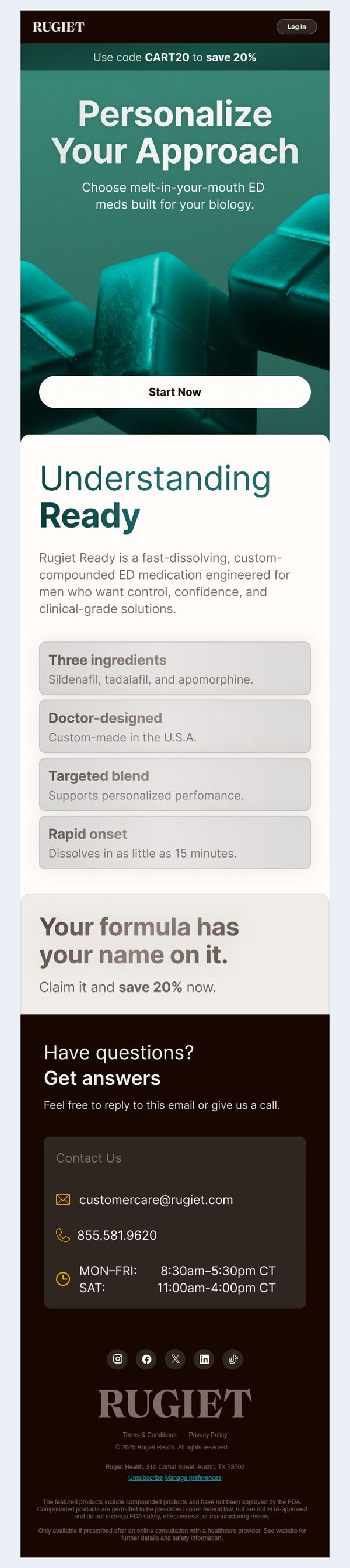
7. Rugiet : ED Med Guide: What to Know Before You Buy
Objective
This email aims to educate potential customers about Rugiet Ready’s personalized, fast-dissolving ED medication while encouraging immediate action through a limited-time discount. It positions the product as clinically tailored and trustworthy to reduce hesitation and drive conversions.
Why this works
The email masterfully blends education with urgency by framing the product as doctor-designed and biologically personalized, which builds trust before prompting action with a time-sensitive discount that feels exclusive rather than pushy.
How to implement
By highlighting just four key benefits, ingredients, U.S. manufacturing, targeted blend, and rapid onset, the email avoids overwhelming the reader while still delivering enough clinical credibility to justify the premium positioning of a compounded medication.
Pro Tip
Add a subtle countdown timer or urgency indicator near the 'Start Now' CTA to reinforce the 20% discount’s limited availability, increasing perceived scarcity without cluttering the clean layout. • Include a short testimonial or satisfaction statistic (e.g., '92% of users report improved confidence within 30 days') in the Education Section to strengthen social proof alongside the clinical claims.
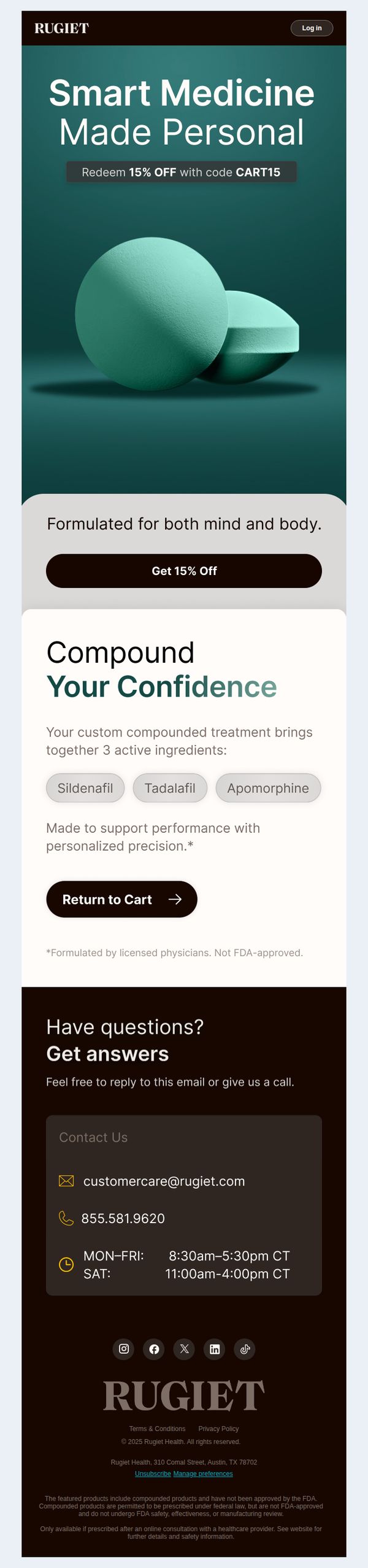
8. Rugiet : Custom-Compounded and Still In Your Cart
Objective
This email aims to re-engage users who have custom-compounded products lingering in their cart by offering a 15% discount to incentivize completion of the purchase, while reinforcing the personalization and clinical credibility of the formulation.
Why this works
The email masterfully blends urgency with personalization by referencing the user’s specific cart contents while offering a time-sensitive discount, creating a tailored nudge that feels less like a sales pitch and more like a helpful reminder.
How to implement
By clearly listing the three active ingredients in the compound and emphasizing ‘personalized precision,’ the email transforms a generic discount into a value-driven proposition that speaks to the customer’s desire for clinically informed, customized care.
Pro Tip
Add a subtle countdown timer next to the discount code to amplify urgency without overwhelming the design, since the current offer lacks time-bound pressure that could boost conversion. • Include a short testimonial or satisfaction stat (e.g., ‘92% of users report improved results’) near the ingredient list to build social proof and reinforce trust in the compound’s efficacy.
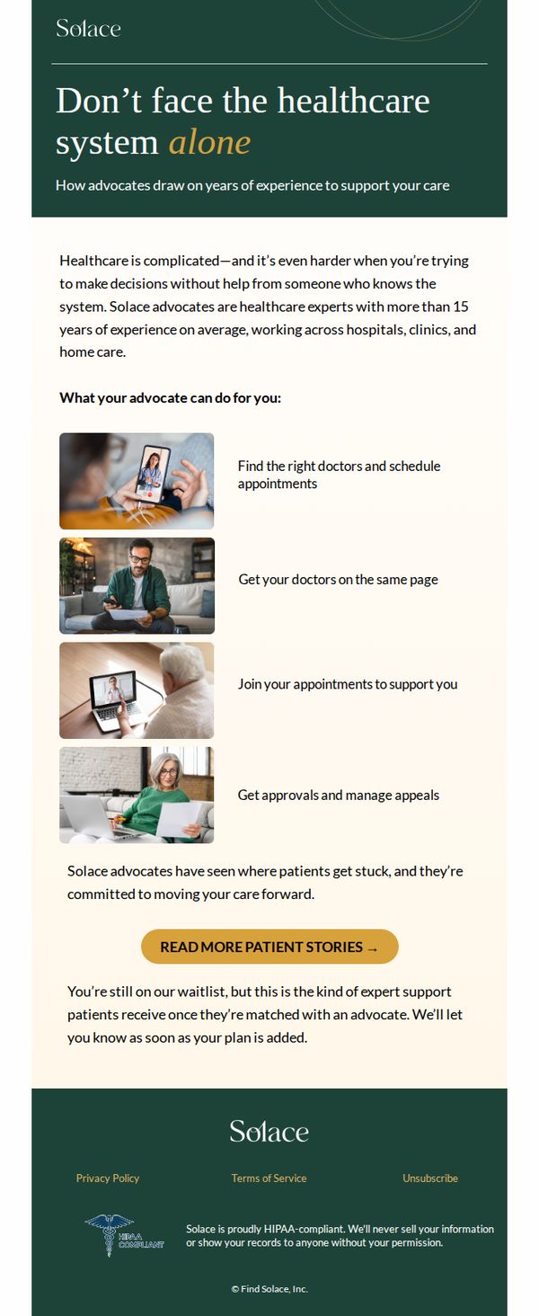
9. Solace : Who are Solace advocates?
Objective
This email aims to educate waitlisted users about the value of Solace advocates, experienced healthcare navigators, while reassuring them that expert support is imminent once matched. It seeks to reduce anxiety around healthcare complexity by highlighting tangible, personalized assistance.
Why this works
Solace brilliantly humanizes its service by spotlighting advocates as seasoned healthcare insiders, not just helpers, building trust through their 15+ years of cross-setting experience, which reassures users they’re not navigating alone.
How to implement
The email strategically uses visual storytelling with real-life scenarios, like joining appointments via laptop or reviewing documents with an advocate, to make abstract support feel tangible, immediate, and emotionally resonant for overwhelmed patients.
Pro Tip
Add a subtle countdown or estimated wait time near the CTA to reduce uncertainty, this would transform passive waiting into active anticipation and reinforce the value of the upcoming match. • Include a short testimonial snippet or quote from a matched patient directly under the CTA to strengthen social proof and bridge the gap between ‘what advocates do’ and ‘what you’ll experience.’
10. Etre Vous: Etre Vous – Verify your email address
Objective
This email aims to confirm the user’s email address to activate their account on Etre Vous, an aesthetics and lifestyle platform, while introducing them to the brand’s value proposition and encouraging app adoption.
Why this works
The email opens with a warm, personalized welcome that immediately frames Etre Vous as a unique, client-centric platform, subtly building emotional connection before asking for action.
How to implement
By positioning the brand as an 'ultimate aesthetics and lifestyle platform' with 'intelligent insight,' the copy elevates perceived value and justifies the verification step as a gateway to exclusive expertise.
Pro Tip
Add a brief, benefit-driven subheading under the CTA button, such as 'Unlock expert tips, personalized recommendations, and exclusive content', to reinforce why verification matters and reduce friction. • Replace the generic 'Dear User' with the recipient’s first name if available, or use 'Hi there' to create a more personal, conversational tone that aligns with the brand’s lifestyle positioning.