The complete PokerStars - CA email collection
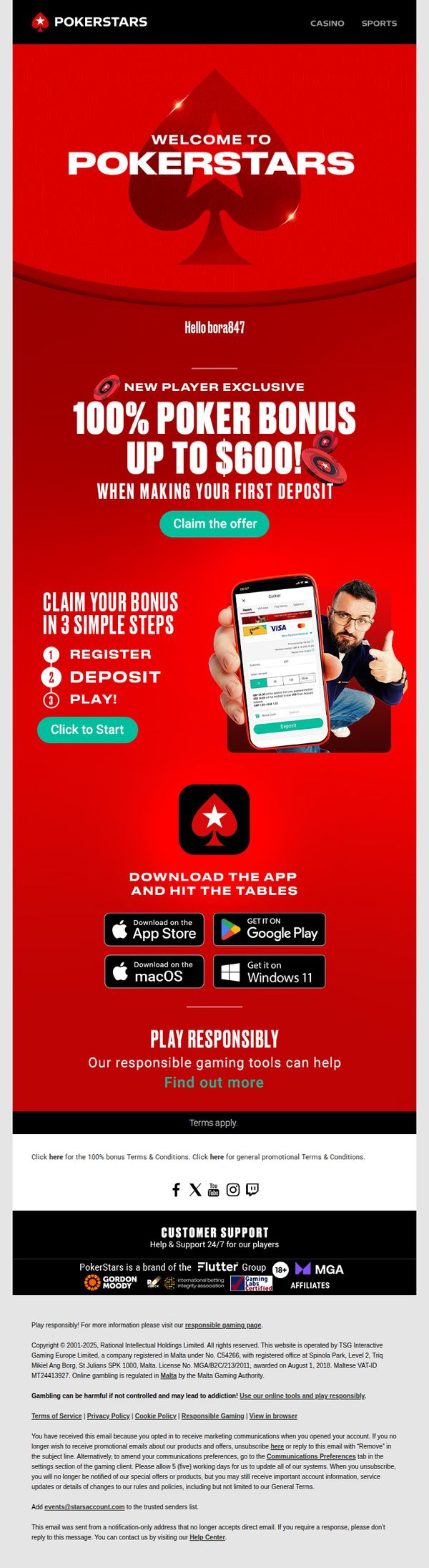
1. ♠️ Welcome to the world of online poker, bora847
Objective
This email aims to welcome new players to PokerStars by immediately incentivizing their first deposit with a 100% bonus up to $600, while guiding them through a simple three-step onboarding process to start playing quickly.
Why this works
The email instantly personalizes the experience by addressing the new player by username, creating a warm, one-on-one tone that makes the welcome feel exclusive and tailored, not generic or automated.
How to implement
By breaking down the bonus claim into three ultra-simple steps, register, deposit, play, the email removes friction and cognitive load, turning what could be a complex onboarding into a clear, confident path to action.
Pro Tip
Add a small countdown timer or urgency indicator near the bonus offer to encourage immediate action, since new player momentum is highest right after account creation. • Include a brief testimonial or social proof element, such as 'Join 10M+ players worldwide', near the CTA to reinforce trust and reduce hesitation for first-time depositors.
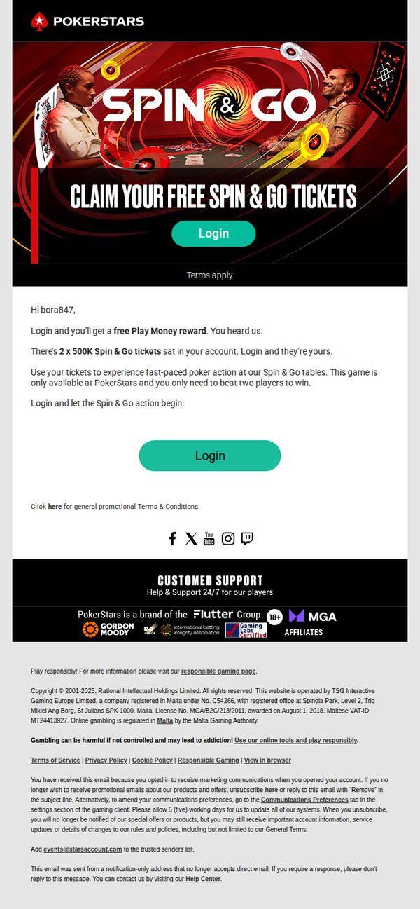
2. Who wants a free Play Money reward?
Objective
The email aims to re-engage the user by offering a free Play Money reward through Spin & Go tickets, encouraging immediate login to claim the offer and participate in fast-paced poker games. It leverages urgency and exclusivity to drive action.
Why this works
The email opens with a personalized greeting and immediately highlights a tangible reward, two 500K Spin & Go tickets, creating instant value perception and reducing friction for the user to act.
How to implement
By emphasizing that the game is exclusive to PokerStars and only requires beating two players to win, the email frames the offer as both accessible and uniquely rewarding, tapping into competitive psychology without overwhelming the user.
Pro Tip
Add a countdown timer or urgency indicator near the CTA to reinforce time sensitivity, since the email implies exclusivity but doesn’t communicate if the offer expires or is limited in quantity. • Include a brief testimonial or social proof snippet, such as '92% of players who claimed this reward won their first Spin & Go', to reduce perceived risk and increase conversion confidence.
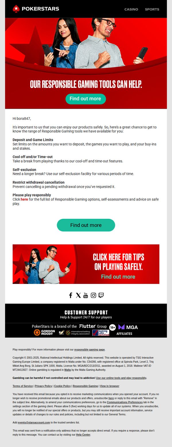
3. Welcome bora847, learn about our Responsible Gaming tools
Objective
This email aims to educate new Canadian user bora847 about PokerStars’ Responsible Gaming tools, encouraging safe play habits while reinforcing brand trust through transparency and user empowerment. It subtly promotes engagement by framing safety as a feature, not a restriction.
Why this works
PokerStars smartly positions responsible gaming not as a restriction but as a helpful, empowering toolset, turning compliance into a customer-centric benefit that builds trust while reducing friction for new users.
How to implement
The email uses a warm, personalized greeting combined with clear, scannable bullet points to explain complex tools like self-exclusion and deposit limits, making sensitive content feel approachable and actionable without overwhelming the reader.
Pro Tip
Add a visual progress bar or checklist next to each tool (e.g., ‘Set your deposit limit → 1/5 steps done’) to gamify responsible behavior and give users a sense of accomplishment as they engage with safety features. • Include a short testimonial or quote from a real player who benefited from using these tools, this would humanize the message and increase emotional resonance, making responsible gaming feel like a community norm rather than a corporate requirement.
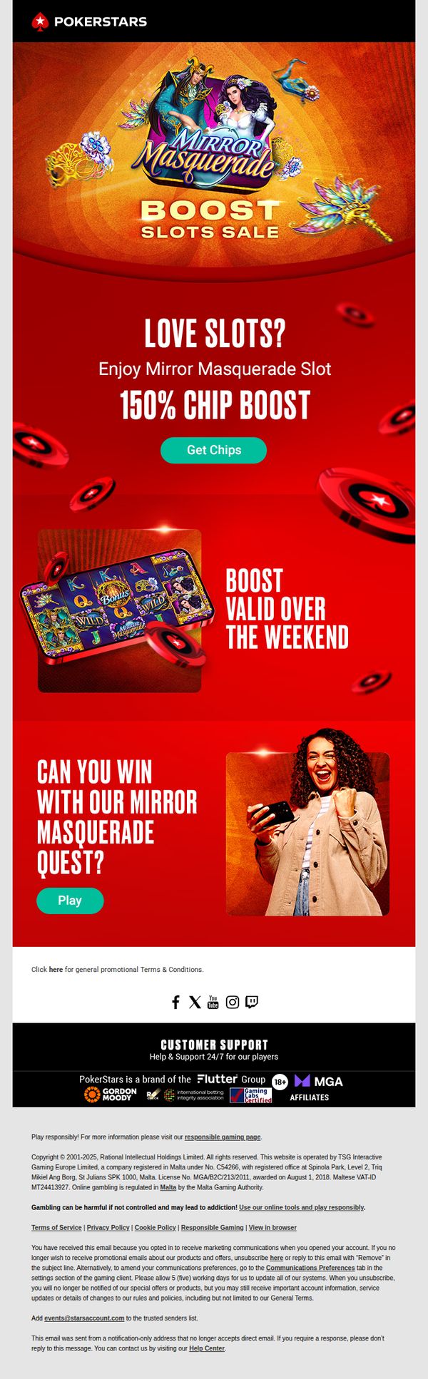
4. Mirror Masquerade 150% chip boost.
Objective
This email aims to drive immediate engagement and deposits by promoting a limited-time 150% chip boost on the Mirror Masquerade slot game, leveraging urgency and visual excitement to convert slot enthusiasts into active players over the weekend.
Why this works
The email brilliantly uses a high-energy, carnival-themed visual identity to emotionally align with the slot’s ‘Mirror Masquerade’ branding, making the promotion feel immersive and not just transactional, which increases perceived value and player curiosity.
How to implement
By anchoring the offer to a time-sensitive weekend window and pairing it with a bold 150% chip boost, the campaign creates urgency without sounding desperate, a delicate balance that motivates action while preserving brand prestige.
Pro Tip
Add a small countdown timer beneath the ‘Boost Valid Over the Weekend’ text to visually reinforce urgency and reduce the cognitive load of calculating time remaining, which can increase conversion rates for time-sensitive offers. • Include a brief testimonial or win statistic (e.g., ‘Players won $X in the last 24 hours’) near the ‘Can you win…’ section to build social proof and reduce perceived risk, encouraging hesitant users to click ‘Play’.
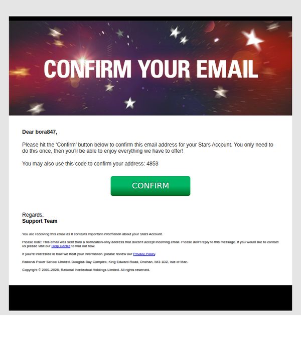
5. Activate your Stars account<BONUS_D_SEPARATOR> <html xmlns="http://www.w3.org/1999/xhtml"> <!-- rpcampaign: PROMONAMECOMEN_YYYYMMDD--> <head> <meta http-equiv="Content-Type" content="text/watch-html; charset=utf-8"> <meta name="viewport" content="width=device-width, initial-scale=1.0"> <title>Please hit the ���Confirm’ button below to confirm this email address for your Stars Account.</title> <style type="text/css"> /* Client-specific Styles */ #outlook a { padding
Objective
This email aims to prompt the recipient to confirm their email address for their PokerStars account, ensuring account activation and access to platform features. It emphasizes a one-time action for full service access.
Why this works
The email uses a bold, action-driven headline 'CONFIRM YOUR EMAIL' against a dynamic starry background to immediately signal urgency and importance, making the purpose unmistakable even at a glance.
How to implement
Including a backup verification code (4853) alongside the primary CTA button reduces friction for users who may face technical issues, demonstrating thoughtful user experience design that anticipates real-world obstacles.
Pro Tip
The CTA button lacks visual hierarchy, adding a subtle shadow or border would make it pop more against the white background, especially on mobile, improving tap accuracy and conversion. • The footer contains dense legal text that competes for attention; relocating the Privacy Policy link and copyright to a collapsible 'Legal' section would declutter the bottom and reinforce the primary CTA’s prominence.