Publix campaign emails worth copying
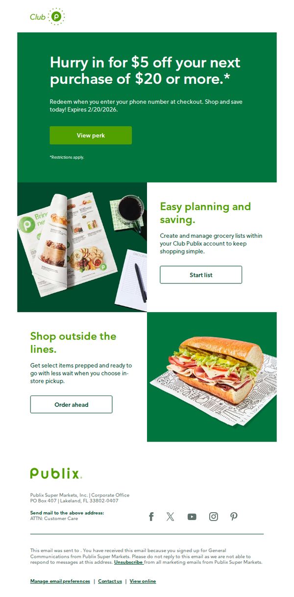
1. There’s still time to redeem your $5 perk, Jayme ⏰
Objective
This email aims to drive immediate in-store or online redemption of a personalized $5 discount by creating urgency with a clear expiration date, while also promoting additional Club Publix features like grocery list planning and in-store pickup to increase overall engagement and basket size.
Why this works
Personalizing the subject line with the recipient’s name and adding a time-sensitive emoji creates an immediate emotional pull, making the offer feel exclusive and urgent rather than generic promotional noise.
How to implement
Pairing the core discount offer with secondary value propositions, like list-building and curbside pickup, transforms a simple coupon into a multi-benefit experience, subtly encouraging broader platform adoption beyond the initial transaction.
Pro Tip
Add a visible countdown timer next to the expiration date in the hero section to visually reinforce urgency and reduce the cognitive load of calculating remaining days. • Reposition the ‘View perk’ CTA button to be more prominent, perhaps larger or centered, since it’s the primary conversion goal, and currently competes visually with secondary CTAs like ‘Start list’ and ‘Order ahead’.
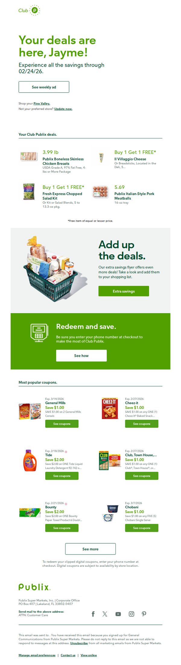
2. See the weekly ad. Available now!
Objective
This email aims to drive immediate engagement with Publix’s weekly ad by personalizing the offer for the recipient, Jayme, and encouraging her to explore deals before they expire on 02/24/26. It also promotes digital coupon redemption to increase in-store visits and loyalty program usage.
Why this works
The email opens with a personalized greeting that immediately creates a sense of relevance and belonging, making the recipient feel recognized and more likely to engage with the content rather than dismiss it as generic spam.
How to implement
By prominently featuring time-sensitive deals with clear pricing and product visuals, the email leverages urgency and visual clarity to guide the shopper’s attention toward high-value items without overwhelming them with too many options at once.
Pro Tip
Add a countdown timer near the hero section to visually reinforce the urgency of the 02/24/26 deal expiration, which could increase click-through rates by creating a stronger psychological trigger for immediate action. • Include a small map or store locator link near the 'Shop your Pine Valley' text to reduce friction for users who may not know their preferred store’s location or hours, improving the likelihood of in-store redemption.
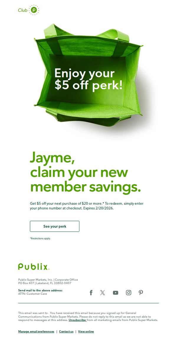
3. Hurry in to redeem your $5 off perk!
Objective
This email aims to drive immediate in-store traffic by prompting the recipient to redeem a time-sensitive $5 discount, while reinforcing loyalty through personalized member recognition and a clear, low-friction redemption process.
Why this works
The email leverages personalization by addressing the recipient by name and framing the discount as a 'member perk,' which transforms a generic coupon into a valued reward that strengthens emotional loyalty and exclusivity.
How to implement
By placing the offer’s terms directly beneath the headline and using a clean, single CTA button labeled 'See your perk,' the design removes friction and guides the user seamlessly from awareness to action without visual clutter or decision fatigue.
Pro Tip
Add a countdown timer or urgency indicator near the CTA to amplify time sensitivity, since the expiration date (2/20/2026) is distant and doesn’t currently create a compelling reason to act immediately. • Include a small map pin or 'Find a Store Near You' link below the CTA to reduce friction for new or infrequent shoppers who may not know where to redeem the perk, increasing conversion likelihood.
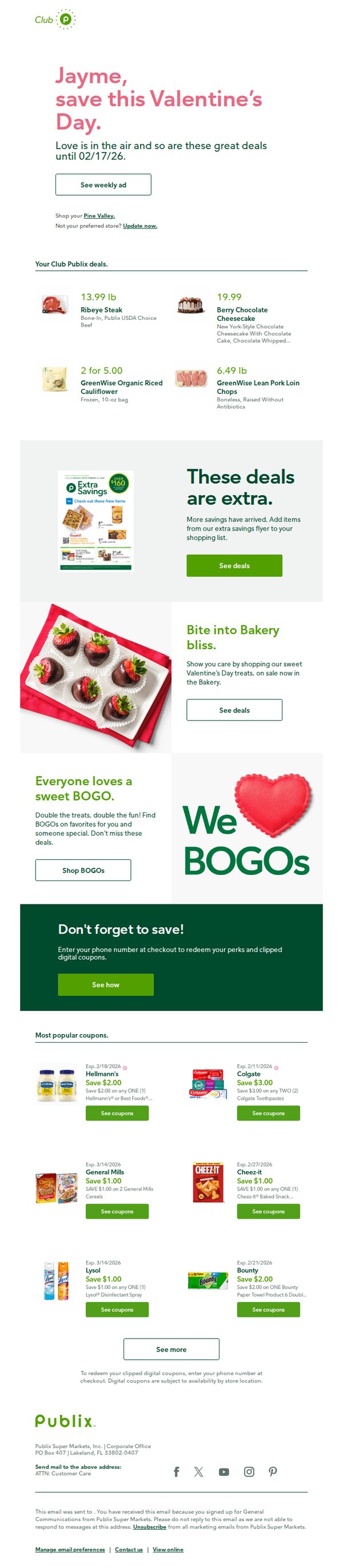
4. Jayme, enjoy sweet Valentine’s Day savings
Objective
This email aims to drive Valentine’s Day shopping by personalizing offers for the recipient, Jayme, while highlighting time-sensitive savings on romantic treats and everyday essentials to encourage immediate in-store or digital coupon redemption.
Why this works
The email opens with a personalized greeting and a romantic seasonal hook, immediately creating emotional relevance while anchoring the campaign in a limited-time window to drive urgency without sounding pushy.
How to implement
By featuring both indulgent Valentine’s treats and practical household BOGOs, the campaign balances emotional appeal with everyday utility, subtly broadening the purchase intent beyond just holiday gifting to include regular grocery needs.
Pro Tip
Add a countdown timer near the hero section to visually reinforce the 02/17/26 deadline, which would heighten urgency and reduce the cognitive load of calculating time remaining. • Include a small map or store locator link next to the 'Shop your Pine Valley' prompt to reduce friction for users who may want to verify store proximity before planning a visit.
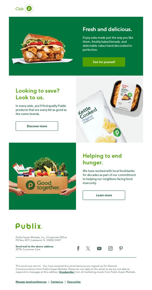
5. So many reasons to love Publix 💚
Objective
This email aims to reinforce customer loyalty by highlighting Publix’s core strengths, fresh food, value pricing, and community impact, while encouraging engagement through exploration of products and social responsibility initiatives.
Why this works
Publix smartly anchors its brand in emotional appeal by leading with fresh, made-to-order food, immediately triggering sensory desire and positioning the store as a destination for quality, not just convenience.
How to implement
The email strategically pairs value messaging with visual proof by showing store-brand products side-by-side with name brands, subtly reassuring budget-conscious shoppers without undermining perceived quality or experience.
Pro Tip
The CTA 'See for yourself' is vague, rephrase to 'Build Your Perfect Sub Now' to align with the hero image and drive immediate, actionable intent tied to the product shown. • Add a subtle countdown or urgency cue near the 'Discover more' button in the savings section to nudge price-sensitive shoppers toward faster exploration and conversion.
6. Make the most of your Club perks ❇️
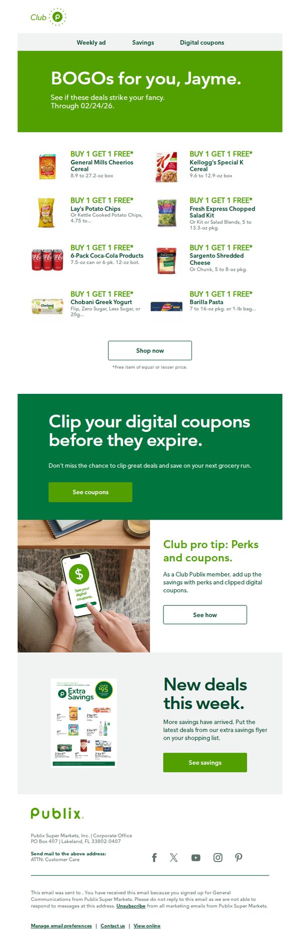
Objective
This email aims to drive immediate engagement from Club Publix members by highlighting personalized BOGO deals and urging them to clip expiring digital coupons, thereby increasing in-store or online purchase frequency and reinforcing loyalty through perceived value.
Why this works
Personalizing the subject line and hero message with the recipient’s name creates an instant emotional connection, making the promotional content feel tailored rather than generic, which significantly boosts open and engagement rates among loyalty members.
How to implement
The strategic placement of time-sensitive BOGO offers with clear product visuals and size specifications reduces decision fatigue, helping shoppers quickly identify relevant deals and feel confident they’re selecting the right items for maximum savings.
Pro Tip
Add a subtle countdown timer next to the BOGO offer expiration date to create urgency without overwhelming the layout, encouraging faster decision-making from users who may delay action until the last minute. • Reposition the ‘See coupons’ CTA button to appear immediately after the first product grid, rather than after the hero section, to reduce friction for users ready to act and prevent them from scrolling past the primary conversion point.