Real Simple email examples & ideas


1. 5 Curb Appeal Mistakes to Avoid
Objective
This email aims to engage readers with practical, visually appealing home and lifestyle tips while subtly promoting affiliate products and retail deals. It balances educational content with shoppable moments to drive clicks and conversions without overwhelming the reader.
Why this works
The email opens with a high-impact, emotionally resonant hero image that immediately signals the theme, curb appeal, while using bold color blocking to create visual hierarchy and draw the eye downward into the content flow.
How to implement
Each content block pairs a compelling, benefit-driven headline with a lifestyle or product image that feels aspirational yet attainable, making the reader feel both informed and inspired to click through for more, which boosts engagement and time-on-page.
Pro Tip
The primary CTA 'Read More' is repetitive and generic across all sections; varying the language to reflect each article’s benefit (e.g., 'Steal This Color Combo' or 'Get the Deal') would increase click-through rates by creating urgency and specificity. • The email lacks a clear visual hierarchy for commercial offers, adding a small 'Deal' or 'Sale' badge to product sections like the Nordstrom promotion would help users instantly distinguish editorial from shoppable content, improving conversion efficiency.
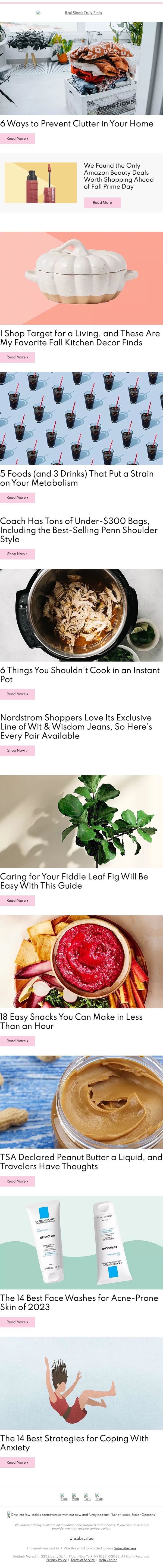
2. 6 Ways to Prevent Clutter in Your Home
Objective
This email aims to engage readers by delivering a curated mix of practical lifestyle tips, shopping deals, and wellness advice, encouraging clicks to internal articles and affiliate product pages while reinforcing Real Simple’s brand as a trusted source for everyday solutions.
Why this works
The email masterfully blends evergreen lifestyle advice with timely retail deals, creating a seamless experience that feels helpful rather than salesy, which builds trust while still driving affiliate revenue through natural content integration.
How to implement
Each content block uses a high-quality, emotionally resonant image paired with a curiosity-driven headline that promises immediate value, making it easy for readers to self-select what matters most to them without feeling overwhelmed or marketed to.
Pro Tip
Add a sticky or anchored CTA button near the top that says 'Jump to Best Deals' or 'See Top Picks' to help users who are shopping-focused skip ahead, improving conversion efficiency without alienating content readers. • Include a brief personalization tagline like 'Because you loved our clutter guide, here’s what’s trending this week' to strengthen relevance and connection, making the content feel curated rather than generic.
3. Sherwin-Williams' 2024 Color of the Year
Objective
This email aims to engage readers with a curated mix of lifestyle, home, and wellness content while subtly promoting brand-aligned products and trends. It encourages clicks to internal articles and external product pages to drive traffic and affiliate revenue.
Why this works
The email masterfully blends editorial content with shoppable moments, making product placements feel organic rather than promotional, which builds trust while driving conversions without alienating the reader.
How to implement
By leading with Sherwin-Williams’ Color of the Year, the campaign taps into timely design trends to position Real Simple as a tastemaker, encouraging readers to see the brand as a go-to source for home inspiration and decor authority.
Pro Tip
The CTA 'Read More' is overused and generic; varying CTAs like 'Get the Look,' 'Shop This Trend,' or 'Try This Hack' would better match the intent of each section and increase click-through specificity. • The product placement for the 111SKIN mask feels disconnected from the surrounding content; integrating it into a beauty or self-care-themed section would improve contextual relevance and conversion potential.
4. 4 Things You'll Never See at Trader Joe's
Objective
This email aims to engage readers with a mix of lifestyle, shopping, and wellness content while subtly promoting products and brand partnerships. It encourages clicks through curiosity-driven headlines and visually appealing product highlights to drive traffic and potential conversions.
Why this works
The email masterfully blends editorial curiosity with shoppable moments, using headlines like '4 Things You’ll Never See at Trader Joe’s' to hook readers before guiding them toward product-driven content without feeling overly promotional.
How to implement
Each content block uses a strong visual anchor paired with a benefit-driven headline, creating a scrollable magazine experience that feels personalized and binge-worthy, encouraging readers to click through multiple stories in one session.
Pro Tip
The primary CTA 'Read More' is generic and underwhelming, consider customizing CTAs per section (e.g., 'See the Hoodies', 'Get the Recipe') to increase click-through by aligning with user intent and content context. • The email lacks a clear visual hierarchy for the most important content, consider adding a subtle 'Editor’s Pick' badge or larger hero treatment to the Trader Joe’s story to leverage its curiosity-driven headline and boost engagement.
5. 7 Things You Shouldn't Store in Your Car
Objective
To engage readers with practical, lifestyle-focused content that solves everyday home and organization problems while subtly promoting affiliated products and driving traffic to Real Simple’s website.
Why this works
The email masterfully blends useful life hacks with product recommendations, making each article feel like a helpful tip rather than a sales pitch, which builds trust and encourages clicks without overwhelming the reader.
How to implement
By using bright, seasonal visuals and concise, benefit-driven headlines like 'These Fridge Mats Drastically Reduce Cleaning Time,' the email creates instant emotional appeal and positions everyday products as essential solutions to common frustrations.
Pro Tip
Add a clear visual hierarchy to the CTA buttons, consider using a contrasting color or bold border on the first article’s 'Read More' to guide attention and increase initial click-through rates. • Include a short personalized intro line at the top, such as 'Hi [Name], since you loved our garage organization tips, here are 7 more smart storage hacks you’ll want to try this week.'
6. 11 Fresh Fall Haircuts to Try This Season

Objective
To engage subscribers with a curated list of seasonal, lifestyle-focused content that drives clicks to articles and product pages while reinforcing Real Simple’s brand as a trusted source for practical, stylish fall living tips.
Why this works
The email opens with a strong seasonal hook, '11 Fresh Fall Haircuts', that immediately taps into timely consumer interest, making the content feel urgent and relevant without being salesy or overwhelming.
How to implement
Each article preview pairs an evocative image with a benefit-driven headline and a simple 'Read More' CTA, creating visual rhythm and reducing cognitive load so readers can quickly scan and choose what resonates most with their current needs.
Pro Tip
Add a secondary CTA like 'Shop the Look' or 'Get the Product' beneath shoppable items (e.g., Clarins serum) to clarify intent and reduce friction for users ready to buy rather than just browse. • Introduce a subtle visual hierarchy by using varied font weights or background tints to distinguish editorial content from sponsored/product-driven sections, helping readers instantly identify what’s inspirational vs. commercial.
7. The 21 Best Trader Joe’s Fall Products for 2023

Objective
This email aims to engage readers with curated, seasonal lifestyle content that blends product discovery, home tips, and personal care advice, encouraging clicks to explore articles and shop featured items while reinforcing Real Simple’s authority in everyday living.
Why this works
The email masterfully blends seasonal product roundups with lifestyle advice, creating a natural bridge between discovery and utility that keeps readers scrolling and clicking without feeling overtly promotional.
How to implement
Each content block uses vivid, context-rich imagery paired with punchy, curiosity-driven headlines that tap into seasonal trends and personal aspirations, making every section feel like a mini editorial feature worth exploring.
Pro Tip
Add a subtle visual hierarchy to the CTA buttons, such as varying button colors or sizes, to distinguish 'Read More' from 'Shop Now' actions, helping users intuitively prioritize based on intent without reading the text. • Include a short, personalized intro line at the top (e.g., 'Hi [Name], fall’s coziest finds are here, starting with Trader Joe’s fan favorites') to increase relevance and connection before diving into the content grid.
8. Grimes is suing Elon Musk for the parental rights of their three children
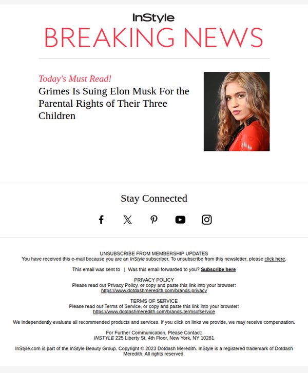
Objective
This email aims to drive immediate engagement by alerting subscribers to a high-profile celebrity legal drama, leveraging urgency and curiosity to encourage clicks and social sharing while reinforcing brand relevance in pop culture news.
Why this works
The email masterfully uses a breaking news headline with emotional stakes, parental rights, to instantly capture attention, proving that human drama outperforms generic product pitches in driving open rates and shares.
How to implement
By pairing a bold, high-contrast color scheme with a celebrity photo and urgent typography, the design creates visual urgency that aligns perfectly with the breaking news format, making the message impossible to ignore in a crowded inbox.
Pro Tip
Add a secondary CTA above the footer, such as 'Read the Full Story' or 'See What Fans Are Saying', to guide readers toward deeper engagement before they reach the unsubscribe link, reducing drop-off. • Include a brief 1–2 sentence teaser or quote from Grimes or legal experts to add narrative depth and credibility, helping subscribers understand why this story matters beyond the headline and encouraging them to click through.
9. 4 Things to Declutter This Weekend

Objective
This email aims to engage readers with a mix of practical home organization tips, seasonal fashion finds, and lifestyle advice, all designed to inspire weekend action while subtly promoting shoppable products and affiliate content. It balances utility with commerce to keep subscribers returning for curated, everyday solutions.
Why this works
The email opens with a highly actionable, time-bound headline, '4 Things to Declutter This Weekend', which immediately gives readers a clear, achievable mission, making the content feel urgent and personally relevant without being pushy.
How to implement
Each content block pairs a compelling visual with a benefit-driven headline that speaks to aspiration or anxiety, like 'This Now $24 Wireless Bra Is So Comfy, You’ll Ditch Underwire for Good', which turns everyday products into emotional solutions, not just items.
Pro Tip
The CTA 'Read More' is overused and dilutes urgency; replace it with action-oriented variants like 'Get the Checklist' or 'See the Deals' in relevant sections to better match the intent behind each content block. • The hero section’s decluttering headline doesn’t visually connect to the rest of the email’s fashion/lifestyle focus; add a small visual cue (like a decluttered shelf icon or minimalist layout) to bridge the theme and maintain visual cohesion.
10. Pantone's Top Color Trends for Spring 2024

Objective
This email aims to engage readers by showcasing timely home and lifestyle content, from seasonal color trends to practical organization tips and product deals, while subtly driving traffic to articles and affiliate-linked shopping opportunities.
Why this works
The email smartly opens with Pantone’s 2024 color trends to immediately capture design-savvy readers, using bold swatches and a compelling headline that frames color as transformational, not just decorative, which elevates the content’s perceived value.
How to implement
By blending evergreen organization tips with time-sensitive deals like Prime Day sheet discounts, the campaign creates urgency without sacrificing evergreen utility, making it relevant both now and later, which increases the likelihood of repeated engagement and clicks.
Pro Tip
The CTA 'Read More' is generic and underwhelming, consider customizing it per section (e.g., 'See the Colors', 'Grab the Deal', 'Get the Recipe') to increase click-through by aligning the action with the reader’s intent. • The email lacks a clear visual hierarchy or anchor point, adding a subtle hero banner or sticky CTA button near the top would guide the eye and reduce scroll abandonment, especially for mobile users who may miss the first article.