TIME email examples & ideas
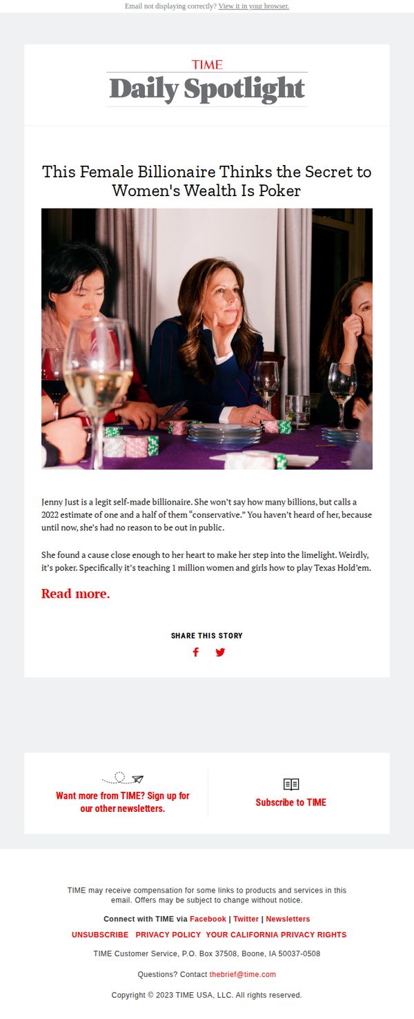
1. This female billionaire thinks the secret to women's wealth is poker
Objective
This email aims to drive engagement with a compelling human-interest story about a self-made female billionaire who believes poker is key to women’s financial empowerment, while subtly encouraging newsletter signups and brand loyalty through TIME’s editorial authority.
Why this works
The email masterfully hooks readers by leading with a provocative, counterintuitive premise, that poker holds the key to women’s wealth, which instantly creates curiosity and positions the story as both unexpected and culturally relevant.
How to implement
By introducing Jenny Just as a mysterious, self-made billionaire who’s never sought the spotlight, the email leverages intrigue and credibility simultaneously, making readers feel they’re being let in on an exclusive, high-value insight worth their time.
Pro Tip
The 'Read more.' CTA is underwhelming, replacing it with a benefit-driven phrase like 'Discover how poker teaches women to win big with money' would better align with the curiosity hook and increase click-through intent. • The footer’s newsletter and subscription prompts feel tacked on, integrating a micro-CTA earlier, perhaps after the first paragraph (“Want more stories like this? Join 500K+ readers who get TIME’s Daily Spotlight”), would improve conversion flow without disrupting the narrative.
2. A Day in Their Lives
Objective
This email aims to connect with parents by sharing a relatable, emotionally resonant personal essay about the stress of back-to-school season, while subtly reinforcing TIME’s authority on parenting topics and encouraging newsletter engagement.
Why this works
The email opens with a vulnerable, first-person narrative that immediately validates the reader’s emotional experience, making the content feel personal and trustworthy rather than promotional.
How to implement
By framing school stress as a universal parental struggle, the message builds community and positions TIME as a compassionate, insightful guide, not just a news source, deepening reader loyalty.
Pro Tip
Add a secondary CTA above the footer, such as 'Read the full story' or 'Explore more parenting insights', to guide readers deeper into TIME’s content before they scroll away. • Include a small visual element or icon next to the 'MORE STORIES' section to break up text density and draw attention to related content, improving scanability and click-through potential.
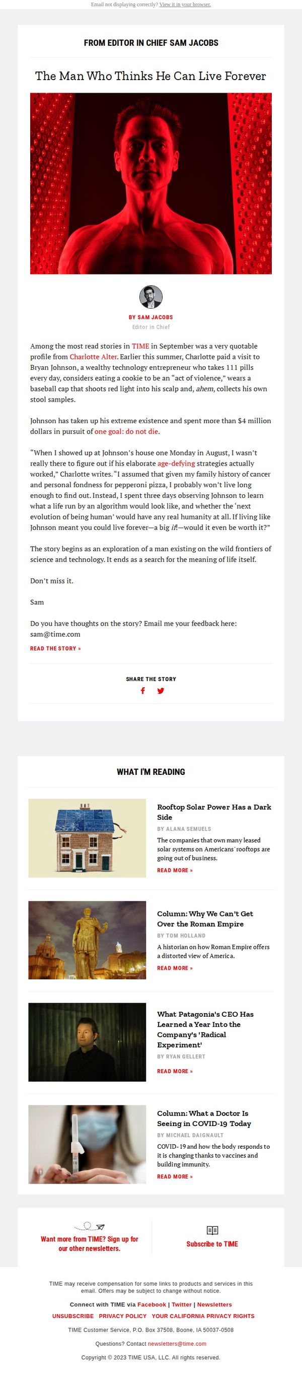
3. The man who thinks he can live forever
Objective
To engage subscribers with a curated selection of timely, thought-provoking stories that reflect TIME’s editorial voice, while encouraging deeper interaction through article clicks and newsletter subscriptions.
Why this works
The email opens with a bold, emotionally charged headline that immediately hooks curiosity, proving that leading with a human-centered, provocative angle can dramatically increase open-to-read-through rates.
How to implement
Each article is presented with a clean, consistent layout featuring a compelling image, clear byline, and a universally placed 'READ MORE' CTA, which reduces friction and guides users toward deeper engagement without overwhelming them.
Pro Tip
Add a visual hierarchy to the CTA buttons, such as color contrast or subtle animation, to make 'READ MORE' stand out more against the grayscale layout and reduce accidental scroll-past behavior. • Include a brief editorial note or curator’s comment above the first article to personalize the curation and reinforce TIME’s authoritative voice, helping subscribers feel they’re getting insider context, not just headlines.
4. The fight over trans sports is ugly, but not bad politics
Objective
This email aims to inform readers about the political and cultural tensions surrounding transgender participation in sports, highlighting how even Democrats are shifting positions due to electoral pressures and public sentiment. It seeks to position TIME as a thought leader in unpacking complex, emotionally charged policy debates.
Why this works
The email brilliantly frames a polarizing cultural issue through the lens of political strategy, showing how even progressive politicians are recalibrating positions not out of ideology but electoral calculus, a compelling narrative hook for politically engaged readers.
How to implement
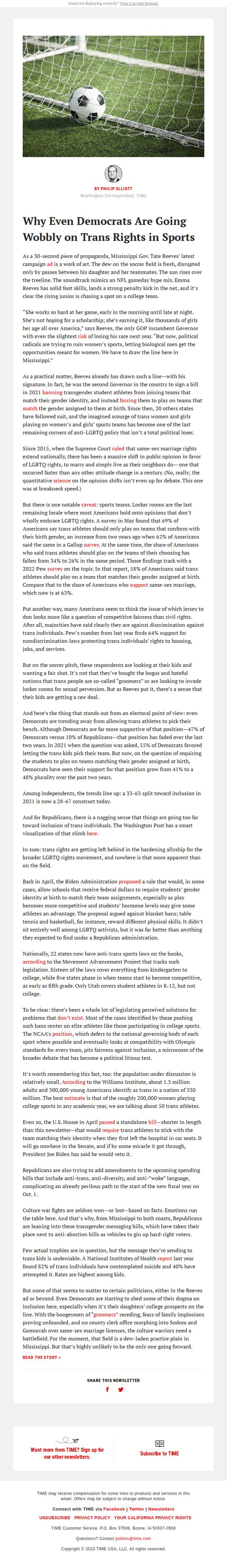
By grounding abstract policy debates in tangible visuals, like the soccer ball in the net, and personal stories, such as Mississippi Governor Reeves’ campaign ad, the email transforms a complex topic into an emotionally resonant, human-centered narrative that’s easier to digest and share.
Pro Tip
Add a brief visual timeline or infographic near the Biden Administration section to illustrate the legislative progression of trans sports policies, this would help readers quickly grasp the scale and speed of policy changes without scrolling through dense text. • Reposition the 'READ THE STORY »' CTA higher in the email, perhaps beneath the hero image or after the first paragraph, to reduce friction for readers who want to dive deeper immediately rather than scroll through the entire analysis.
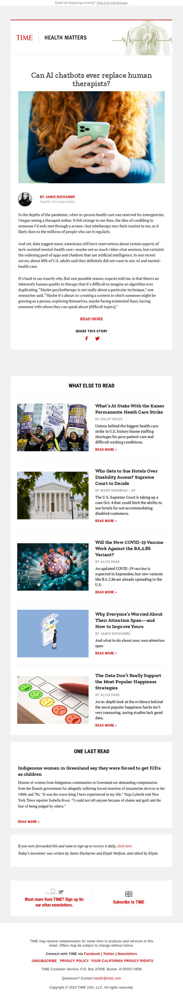
5. Say 'hi' to your new AI therapist
Objective
This email aims to engage readers with a thought-provoking exploration of AI’s role in mental health care, positioning TIME as a trusted voice on emerging health technologies while encouraging deeper engagement through article reads and newsletter sign-ups.
Why this works
The email opens with a personal, relatable anecdote about teletherapy during the pandemic, instantly humanizing the AI mental health topic and building emotional resonance before diving into data and expert analysis.
How to implement
By framing AI therapy as a cultural and psychological question rather than a purely technical one, the email invites readers to reflect on their own comfort with digital intimacy, making the content feel personally relevant and conversation-starting.
Pro Tip
Add a subtle visual hierarchy to the 'WHAT ELSE TO READ' section, such as bolding the first article or using a slightly larger thumbnail, to guide attention toward the most timely or high-impact story and reduce decision fatigue. • Include a short, compelling pull quote or statistic from the main article in the hero section to reinforce the stakes of AI therapy and increase scroll depth by teasing value before the first 'READ MORE' button.
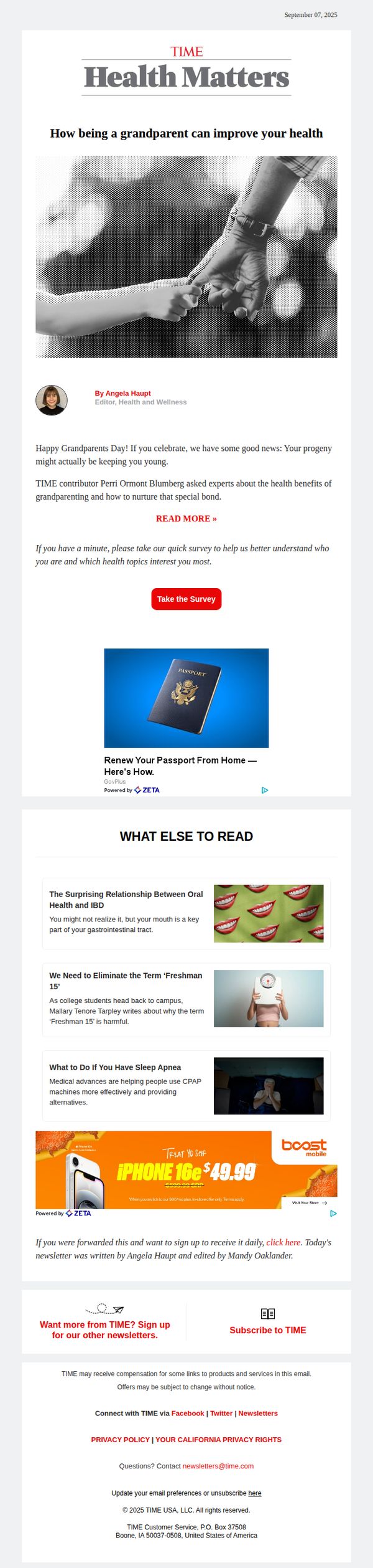
6. How being a grandparent can improve your health
Objective
This email aims to engage readers by highlighting the emotional and physical health benefits of grandparenting, while subtly encouraging interaction through a survey and promoting additional content and subscriptions.
Why this works
The email opens with an emotionally resonant hook, tying Grandparents Day to personal health benefits, which immediately creates relevance for its target audience and encourages them to keep reading.
How to implement
By embedding a quick survey right after the main article teaser, the campaign cleverly turns passive readers into active participants, gathering valuable data while deepening engagement without disrupting the flow.
Pro Tip
The primary CTA 'READ MORE »' is visually underwhelming and buried beneath the author bio; elevating it with stronger contrast or animation would better guide users toward the core content. • The ad placements (passport renewal and iPhone deal) feel disconnected from the health/grandparenting theme; replacing them with health-related sponsorships or TIME-branded wellness products would improve thematic cohesion and trust.
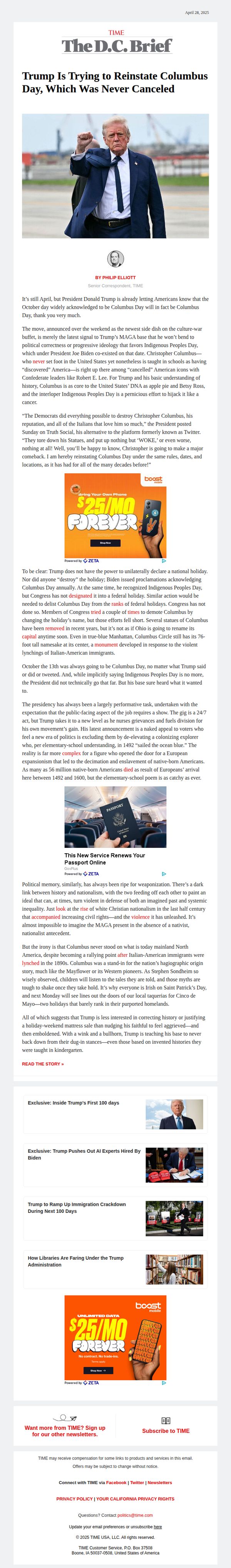
7. Trump tries to reinstate Columbus Day, which was never canceled
Objective
This email aims to inform readers about President Trump’s attempt to reinstate Columbus Day, clarifying that it was never officially canceled, while also highlighting the cultural and political tensions surrounding historical narratives and national holidays. It seeks to drive engagement through provocative analysis and encourage newsletter subscriptions.
Why this works
The email masterfully reframes a seemingly trivial political gesture into a broader cultural commentary, using historical context and sharp irony to deepen reader engagement beyond surface-level outrage or partisan reaction.
How to implement
By embedding a bold visual contrast, juxtaposing Trump’s declaration with an ad for $25/month phone plans, the campaign subtly critiques the commodification of political messaging while keeping the reader visually anchored in the moment.
Pro Tip
Replace the repetitive Boost Mobile ad with a dynamic element like a poll or interactive timeline comparing past presidential stances on Columbus Day to increase reader participation and reduce visual fatigue. • Add a clear secondary CTA after the main article summary, such as 'Sign up for our Politics Brief', to capture interest from readers who may not click through but are engaged enough to subscribe for more context-driven analysis.
8. The man who thinks he can live forever
Objective
This email aims to drive engagement with a high-profile feature story by positioning it as a must-read cultural moment, while subtly encouraging newsletter signups and brand loyalty through curated supplementary content and editorial authority.
Why this works
The email leverages editorial authority by opening with a personal note from the Editor in Chief, instantly lending credibility and framing the story as a curated, must-read experience rather than just another article.
How to implement
It masterfully balances intrigue and context by teasing the subject’s eccentric habits and extreme goal, without spoiling the narrative, creating psychological pull that compels the reader to click through for the full story.
Pro Tip
Add a secondary CTA beneath the hero image, such as 'Subscribe for More Exclusive Stories', to capture interest from readers who may not click the main story but are intrigued by the tone or subject matter. • Include a brief social proof element near the CTA, such as 'Over 500,000 readers clicked this story last week,' to amplify urgency and validate the story’s cultural relevance for hesitant readers.
9. Legal challenges to abortion medication could set off a domino effect
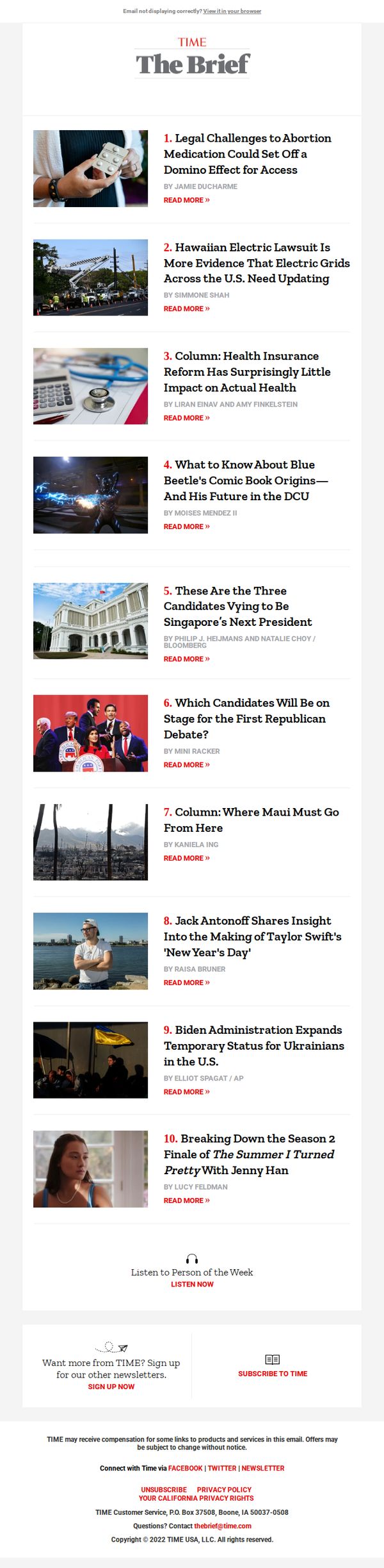
Objective
This email aims to inform subscribers of TIME’s daily newsletter, The Brief, about the most urgent and relevant news stories of the day, encouraging them to read further and stay engaged with the brand’s journalism through direct article links and newsletter retention efforts.
Why this works
The email leads with a high-stakes, timely headline that immediately signals urgency and relevance, drawing readers in by framing the story as a potential catalyst for nationwide consequences rather than just a legal footnote.
How to implement
Each article is paired with a compelling, context-rich image and a concise, curiosity-driven headline that balances specificity with intrigue, making it easy for readers to scan and self-select stories that match their interests.
Pro Tip
Add a subtle visual indicator (like a red dot or 'NEW' tag) next to the top story to reinforce its breaking nature and encourage immediate clicks, since the current layout treats all 10 stories with equal visual weight despite the subject line’s emphasis on the lead story. • Include a short, one-sentence teaser under the top headline to amplify urgency, e.g., 'A federal court ruling could restrict access in 20+ states within weeks', to reduce cognitive load and increase click-through by pre-framing the stakes for skimmers.
10. Homeland Security shuts down in battle over ICE reform
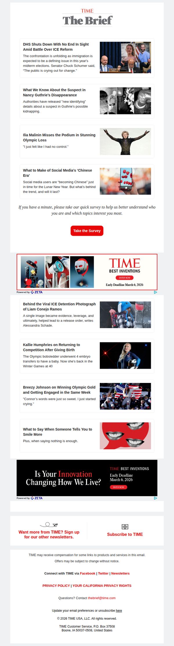
Objective
To inform subscribers of breaking news and trending stories while encouraging engagement through a reader survey and promoting TIME’s Best Inventions campaign to drive brand interaction and newsletter sign-ups.
Why this works
The email opens with a high-impact political headline to immediately capture attention, leveraging urgency and relevance to draw readers into the full briefing while anchoring the newsletter’s authority on breaking news.
How to implement
By embedding a reader survey mid-content, the campaign smartly converts passive readers into active participants, gathering valuable audience data without disrupting the flow of news consumption or diluting the editorial tone.
Pro Tip
The CTA ‘Take the Survey’ is visually prominent but lacks urgency or incentive; adding a micro-benefit like ‘Help shape our coverage, takes 60 seconds’ would increase conversion without cluttering the design. • The two ‘TIME Best Inventions’ banners are visually repetitive and occupy valuable real estate; consolidating them into one dynamic, scroll-triggered banner with a countdown timer would reduce redundancy and heighten FOMO.