Uber Eats - ES campaign ideas that work
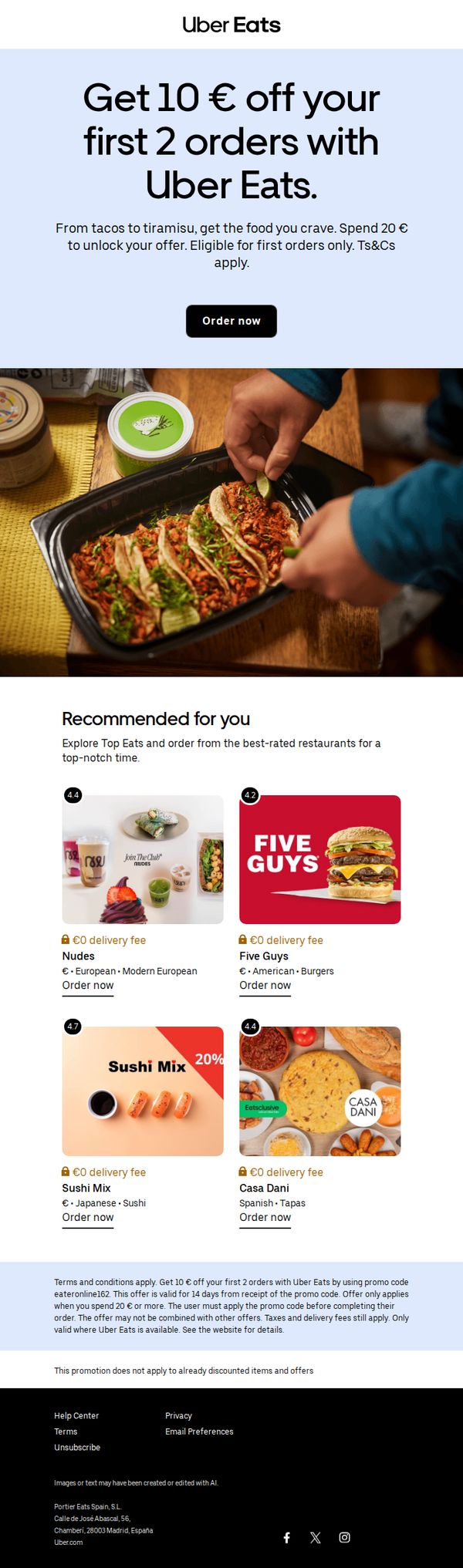
1. Jan, get 10 € off your next 2 orders
Objective
This email aims to convert new users by offering a compelling discount on their first two orders, encouraging immediate action while showcasing popular restaurant options to reduce decision friction.
Why this works
The email opens with a bold, benefit-driven headline that immediately communicates the discount’s value while anchoring it to the user’s name, creating a personal and urgent tone that boosts conversion intent.
How to implement
By featuring a curated grid of high-rated restaurants with delivery fee badges and cuisine tags, the email reduces cognitive load and subtly guides users toward quick, confident ordering decisions without overwhelming them.
Pro Tip
Add a countdown timer beneath the CTA to create urgency, since the offer expires in 14 days, visually reinforcing that deadline could increase immediate conversion rates. • Include a micro-testimonial or star rating badge directly on each restaurant tile to reinforce social proof and reduce perceived risk for first-time users.
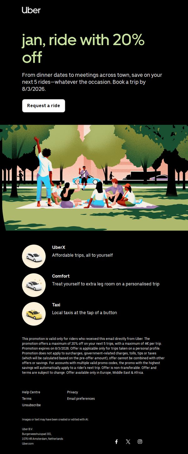
2. Enjoy 20% off your next 5 rides
Objective
This email aims to incentivize immediate ride bookings by offering a time-sensitive 20% discount on the next five trips, encouraging user engagement and conversion before the 8/3/2026 deadline.
Why this works
The email brilliantly anchors urgency and value by front-loading the 20% discount with a clear expiration date, making the offer feel exclusive and time-sensitive without overwhelming the reader with fine print upfront.
How to implement
By visually pairing the promotion with a warm, social park scene, the campaign emotionally connects the discount to real-life moments, dinner dates, meetings, and casual hangs, making the savings feel like an enabler of lifestyle, not just a transactional perk.
Pro Tip
Add a small countdown timer or 'Offer expires in X days' badge near the CTA to amplify urgency visually, since the current text-based deadline may be overlooked in fast-scrolling behavior. • Reposition the fine print disclaimer above the product grid or as a collapsible 'Terms' toggle, currently buried below the ride options, it risks undermining trust or causing confusion after the user has already engaged with the offer.
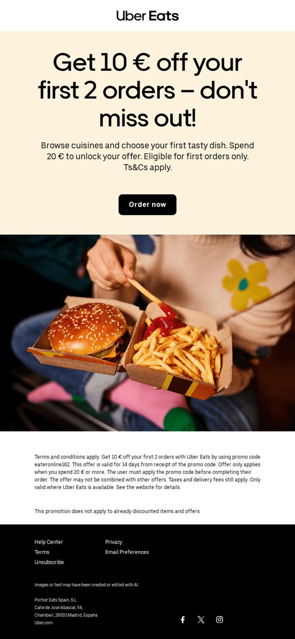
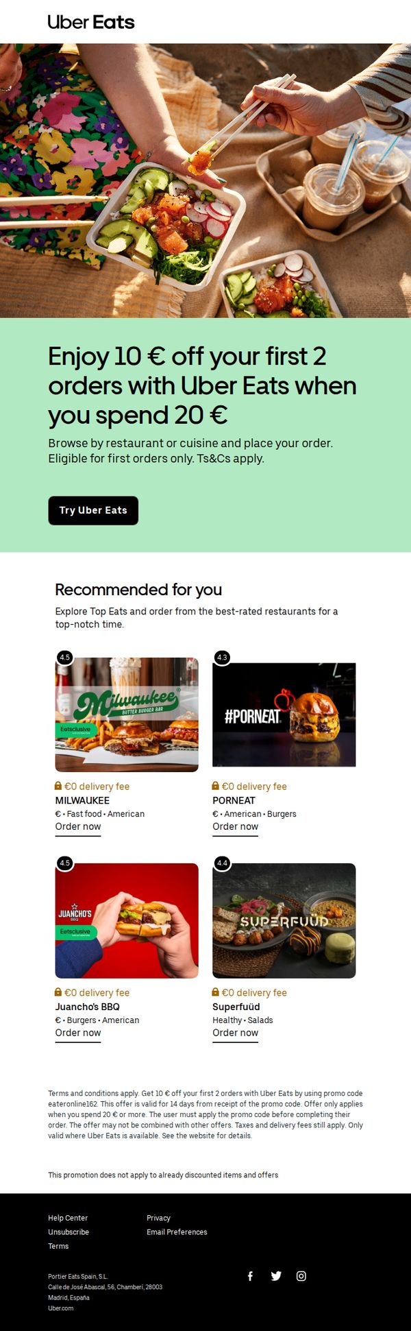
3. 10 € off your first 2 orders is yours for the taking
Objective
This email aims to convert new users by incentivizing their first two orders with a €10 discount, encouraging immediate app engagement and trial of the service through a time-sensitive, spend-based offer.
Why this works
The email brilliantly anchors the offer in urgency and simplicity, 'Get 10 € off your first 2 orders', making the value instantly digestible while subtly implying a two-step customer journey that builds early loyalty.
How to implement
By pairing the bold headline with a warm, relatable lifestyle image of someone enjoying food at home, the campaign emotionally connects with the user’s desire for comfort and convenience, not just discounts.
Pro Tip
Add a countdown timer or expiration date near the CTA to heighten urgency, since the offer is valid for only 14 days, visualizing that deadline could significantly boost conversion rates. • Include a small 'How it works' visual or bullet list under the offer to clarify the 20€ spend requirement and promo code step, reducing friction for users unfamiliar with the redemption process.
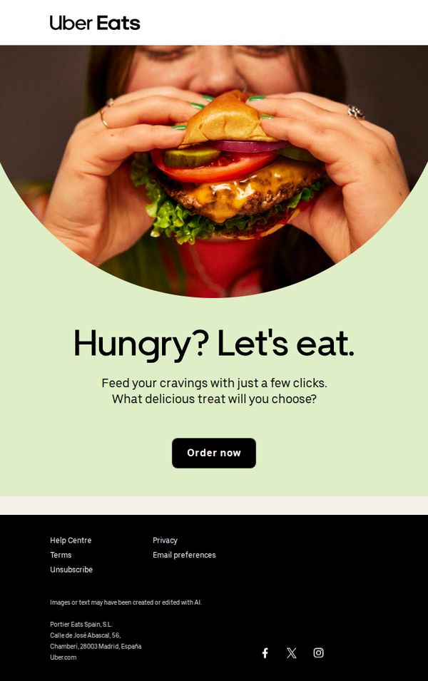
4. Place an order, Jan
Objective
The email aims to re-engage users by triggering immediate hunger-driven action through visual temptation and minimal friction, encouraging them to place an order with just a few clicks. It leverages emotional appeal and simplicity to convert passive readers into active customers.
Why this works
The email masterfully uses a close-up, mouth-watering food image to instantly trigger appetite-driven decision-making, making the viewer feel the craving before they even read the copy.
How to implement
By pairing the bold headline 'Hungry? Let's eat.' with a frictionless CTA, the campaign removes mental barriers and positions ordering as an effortless, satisfying solution to immediate desire.
Pro Tip
Add a time-sensitive incentive like 'Order in the next 30 minutes for 10% off' to the hero section to increase urgency and conversion, especially since the current CTA lacks motivational triggers beyond curiosity. • Include a small, dynamic product carousel or 'Most Ordered This Week' section beneath the CTA to reduce decision fatigue and guide users toward popular choices, enhancing the path to purchase.
5. Jan check out this promo!
Objective
This email aims to convert new users by offering a compelling discount on their first two orders, encouraging immediate trial of Uber Eats while highlighting popular local restaurants to reduce decision fatigue and increase conversion likelihood.
Why this works
The email strategically anchors the offer around a specific spending threshold (20€) to encourage higher basket sizes while making the discount feel exclusive and achievable for first-time users.
How to implement
By showcasing four visually distinct, high-rated restaurants with delivery fee badges and cuisine tags, the email reduces friction for new users who might otherwise struggle to choose where to order from.
Pro Tip
Add a subtle countdown timer near the CTA to create urgency, since the promo expires in 14 days, this would leverage time sensitivity without cluttering the clean layout. • Include a micro-testimonial or star rating overlay on each restaurant tile to reinforce social proof, helping undecided users feel more confident in their choice.
6. We've just added new spots in your area
Objective
This email aims to re-engage users by announcing newly added local restaurants on Uber Eats, encouraging immediate orders through personalized flavor-driven messaging and zero-fee incentives.
Why this works
The email opens with a personalized, crave-focused headline that taps into emotional hunger cues while immediately signaling value through new local additions, a smart blend of urgency and delight.
How to implement
Each restaurant tile includes a clear visual, star rating, and zero-fee badge, reducing friction by pre-answering key user questions about cost, quality, and trust before they even click.
Pro Tip
Add a subtle countdown or 'New This Week' badge near the hero section to create time-sensitive urgency, encouraging users to explore new spots before they’re overlooked. • Include a short testimonial or user quote under one or two top-rated restaurants to build social proof and reinforce trust in new additions without cluttering the layout.
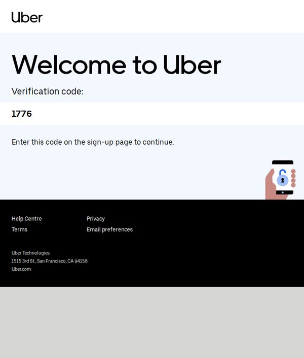
7. Welcome to Uber
Objective
This email aims to guide new users through account verification by delivering a one-time code, ensuring secure onboarding while reinforcing brand trust and encouraging immediate action to complete sign-up.
Why this works
The email instantly builds credibility by clearly stating the purpose of the verification code and linking it directly to the next user action, reducing friction and confusion during onboarding.
How to implement
Using minimal design with high contrast between text and background ensures the verification code stands out visually, helping users locate and act on the most critical information without delay.
Pro Tip
Add a subtle countdown timer or expiration notice for the verification code to create urgency and reduce abandonment, especially since users may delay entering the code. • Include a secondary CTA button labeled 'Resend Code' in case the user misses or forgets the code, improving usability without requiring them to restart the sign-up process.