WIRED email examples & ideas from real campaigns


1. Cities need to get spongier to deal with devastating deluges
Objective
To engage readers with WIRED’s latest thought-provoking tech, science, and culture stories while driving subscriptions through a compelling offer and encouraging audience interaction via surveys and job listings.
Why this works
WIRED masterfully balances urgency and curiosity by pairing climate-driven headlines with bold visuals, making complex topics feel immediate and relevant to urban readers concerned about environmental resilience.
How to implement
The email strategically embeds a high-value subscription offer mid-campaign, using social proof and exclusivity, like Steven Levy’s column and free stickers, to transform passive readers into paying subscribers without disrupting content flow.
Pro Tip
The subscription CTA appears twice but lacks visual hierarchy, consider using contrasting colors or animation on the primary CTA to draw immediate attention and reduce decision fatigue. • The ‘New York Needs to Get Spongier’ article, while relevant, feels disconnected from the tech-forward brand voice, adding a brief bridge sentence could better align climate content with WIRED’s innovation narrative.
2. India’s lander touches down on the moon. Russia’s has crashed
Objective
This email aims to engage WIRED readers with a curated selection of timely, thought-provoking tech, science, and culture stories while subtly promoting subscription through a limited-time offer and podcast content. It balances editorial depth with commercial intent to drive both readership and conversions.
Why this works
WIRED masterfully balances hard-hitting global news with niche tech reviews and cultural commentary, creating a content rhythm that keeps readers scrolling while feeling intellectually rewarded with every new section they encounter.
How to implement
The inclusion of a time-sensitive, deeply discounted subscription offer right after a high-impact story creates psychological momentum, readers are more likely to convert when they’re emotionally engaged and perceive immediate value in continued access.
Pro Tip
The subscription CTA appears buried after multiple articles, move the 'Subscribe now' button higher, perhaps after the first or second story, to capture attention while reader interest is highest and reduce scroll fatigue before conversion. • The 'Summer Sale' banner uses conflicting pricing visuals ($29.99 crossed out next to $5) that may confuse or erode trust, simplify to 'Just $5 for a limited time' with a countdown timer to create urgency without visual clutter.
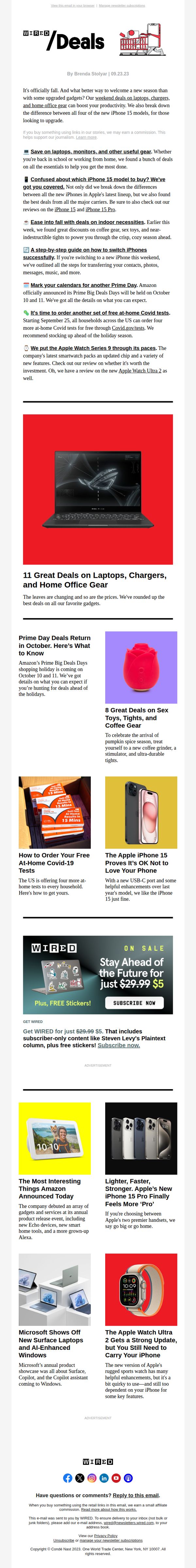
3. Grab a Macbook Air for $200 off
Objective
This email aims to drive immediate consumer action by highlighting time-sensitive tech deals, especially the MacBook Air discount, while positioning WIRED as a trusted guide for smart, seasonally relevant gadget purchases across work, home, and personal tech categories.
Why this works
WIRED smartly anchors its entire fall campaign around seasonal transitions, linking gadget upgrades to back-to-school and cozy indoor living, making tech purchases feel timely, emotionally resonant, and practically necessary rather than purely transactional.
How to implement
By bundling deal alerts with educational content like iPhone switching guides and model comparisons, WIRED transforms a promotional email into a trusted advisory resource, subtly building authority while reducing buyer hesitation through informed decision-making support.
Pro Tip
The primary CTA 'Subscribe now' is buried under an ad and disconnected from the main offer; it should be replaced with a product-specific CTA like 'Grab the MacBook Air Deal' directly beneath the hero image to align with the subject line and drive immediate clicks. • The email lacks visual hierarchy around the MacBook Air discount, the hero image shows a ROG laptop, not the advertised MacBook, creating confusion; replacing it with the actual product or adding a bold overlay label would reinforce message clarity and reduce bounce risk.
4. Part 2: ‘The Hunt for the Dark Web’s Biggest Kingpin’
Objective
This email aims to engage subscribers with the second installment of a high-stakes investigative series on AlphaBay’s kingpin, while subtly driving conversions by anchoring the narrative to WIRED’s subscription value proposition.
Why this works
By weaving personal anecdotes and vivid field reporting into a tech-crime narrative, the email transforms a complex topic into an emotionally resonant story that keeps readers invested beyond the headline.
How to implement
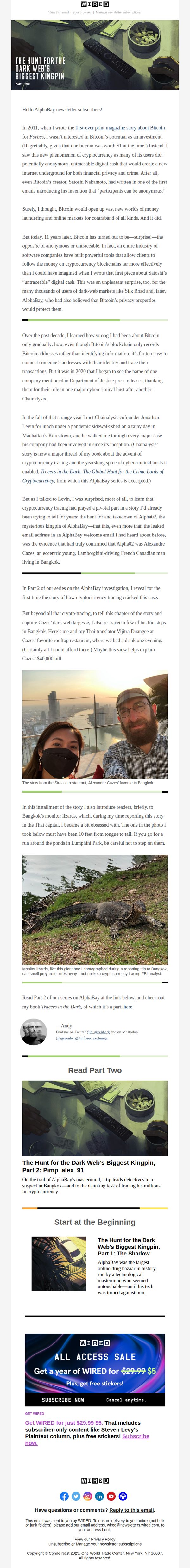
The strategic placement of a visually striking, thematically consistent hero image at both the top and mid-email reinforces the story’s gravity and sustains visual momentum without overwhelming the reader.
Pro Tip
The CTA ‘SUBSCRIBE NOW’ appears visually dominant but is buried below the story’s emotional peak; moving it immediately after the ‘Read Part Two’ section would capitalize on reader momentum and increase conversion likelihood. • While the Bangkok photo adds authenticity, adding a short caption or pull quote directly beneath it, like ‘This rooftop view was where Cazes believed he was untouchable’, would deepen narrative immersion and reinforce the story’s stakes.
5. People are increasingly worried that AI will make life worse
Objective
This email aims to inform readers about growing public concern over AI’s societal impact while positioning WIRED as a trusted voice for navigating the complexities of emerging technology. It also seeks to convert engaged readers into subscribers by highlighting exclusive content and limited-time offers.
Why this works
The email opens with a relatable, emotionally resonant question, 'How Do You Feel About Our AI-Mediated Future?', which immediately invites readers to reflect personally, making the topic feel urgent and relevant rather than abstract or academic.
How to implement
By anchoring the narrative in credible data from Pew Research Center and weaving in expert commentary from AI ethicists and former government officials, the email builds authority without overwhelming the reader, striking a balance between journalistic depth and digestible insight.
Pro Tip
The CTA 'SUBSCRIBE NOW' appears only in the advertisement banner and lacks visual prominence in the main content flow; adding a secondary, contextually placed CTA after the 'Need to Know' section would capture readers at peak engagement. • The email lacks a clear visual hierarchy between editorial content and promotional material; separating the subscription offer with a distinct visual break or color block would reduce cognitive friction and improve conversion clarity.
6. Last Chance: Get WIRED for $5 + Enjoy FREE Stickers in Our Flash Sale!
Objective
This email aims to drive urgent subscription conversions by highlighting a limited-time flash sale price of $5 for WIRED, while sweetening the offer with free stickers to increase perceived value and reduce hesitation. It targets existing readers with an exclusive, time-sensitive incentive to act now.
Why this works
The email leverages urgency and exclusivity by framing the discount as a flash sale available only to email subscribers, which taps into FOMO and encourages immediate action without overwhelming the reader with too many options.
How to implement
By visually striking through the original price and boldly displaying the discounted rate alongside a bonus gift (free stickers), the email creates a compelling value proposition that feels like a personal reward rather than a generic promotion.
Pro Tip
Add a countdown timer in the hero section to visually reinforce urgency and create real-time pressure, which could increase conversion rates by making the 'ending soon' claim more tangible and immediate. • Include a short testimonial or subscriber quote near the CTA to build social proof, for example, 'Over 50,000 readers upgraded this week', to validate the offer and reduce skepticism about the steep discount.
7. Preppers are patriots
Objective
This email aims to engage readers with WIRED’s editorial voice by blending provocative cultural commentary with deep-dive reporting, encouraging clicks to long-form stories while reinforcing brand identity through curated content and reader interaction.
Why this works
The email opens with a bold, personality-driven hook that immediately establishes editorial tone, using irony and self-awareness to disarm readers while drawing them into a culturally charged topic that feels both urgent and unexpected.
How to implement
By weaving in reader engagement prompts, like inviting comments or emails, it transforms passive consumption into active participation, subtly building community around WIRED’s editorial mission without sacrificing journalistic authority or depth.
Pro Tip
The primary CTA ‘READ THE BIG STORY →’ is visually underwhelming and buried beneath the editor’s bio; repositioning it as a bold, color-contrasted button directly under the headline would significantly increase click-through rates. • The ‘What Say You?’ section invites reader feedback but lacks a clear, clickable submission mechanism, adding a direct mailto link or embedded form would reduce friction and increase response rates from engaged subscribers.
8. The 18 Best Subscription Boxes for Gifts
Objective
This email aims to engage readers with a curated selection of tech-forward gift ideas and practical DIY tools while driving subscriptions through a limited-time promotional offer. It balances editorial value with conversion by positioning WIRED as a trusted source for smart, modern living.
Why this works
WIRED masterfully blends gift guides with utility-driven content, making the email feel less like a sales pitch and more like a curated lifestyle digest that happens to include a compelling subscription offer.
How to implement
The placement of the subscription CTA immediately after a high-value editorial section creates a natural transition from trust-building content to conversion, leveraging reader momentum without disrupting the reading experience.
Pro Tip
The subscription CTA appears only once and is buried mid-email; adding a sticky or repeated CTA button at the top and bottom would capture attention from skimmers and increase conversion rates. • The email lacks personalization cues, adding the recipient’s name or referencing past article views (e.g., ‘Since you liked our AI tools guide…’) would strengthen relevance and emotional connection to the offer.
9. A medieval French skeleton is rewriting the history of syphilis

Objective
This WIRED newsletter aims to engage readers with a curated mix of science, tech, and culture stories while subtly promoting subscription and job listings. It balances editorial depth with commercial intent to retain and monetize its audience.
Why this works
WIRED masterfully blends high-impact science storytelling with timely tech news, creating a compelling narrative rhythm that keeps readers scrolling without feeling overwhelmed by commercial breaks or ads.
How to implement
The newsletter strategically places its subscription CTA after a strong editorial hook, the medieval syphilis story, leveraging curiosity and credibility to convert engaged readers into paying subscribers.
Pro Tip
The subscription CTA appears twice, once as a banner and again as text, which creates redundancy; consolidating into one visually dominant, scroll-triggered CTA after the third article would reduce friction and increase conversion focus. • The job listings at the bottom lack visual hierarchy and context; adding a brief headline like 'Top Tech Jobs This Week' or a small icon set would help them stand out and feel more integrated with the editorial tone.
10. Chinese hackers are hiding in routers in the US and Japan

Objective
This email aims to engage WIRED readers with a curated selection of timely, tech-forward stories while driving subscriptions through a limited-time offer and promoting an AI-focused educational newsletter. It balances editorial depth with commercial conversion.
Why this works
The email masterfully blends high-stakes tech news with quirky, human-centered storytelling, like robots playing Tetris or sweat saving lives, to keep readers emotionally invested while reinforcing WIRED’s brand as both authoritative and delightfully unexpected.
How to implement
By placing the subscription CTA immediately after a hard-hitting security story, the campaign leverages urgency and relevance to convert curious readers into paying subscribers, turning fear of digital vulnerability into a tangible, value-driven action.
Pro Tip
The subscription CTA appears twice, once in a banner and again in text, but lacks visual hierarchy; the second CTA should be styled as a button to match the first, ensuring consistent conversion cues and reducing decision fatigue. • The AI Unlocked promo at the bottom feels disconnected from the rest of the content; adding a brief transitional line like 'Want to turn today’s tech headlines into real skills? Start here.' would better bridge editorial and promotional intent.