Café email designs from top brands
1. Get our mobile app 📲
Objective
The email aims to drive mobile app downloads by positioning the app as the fastest way to stay connected with the brand’s community, while encouraging user feedback to foster engagement and improve the experience.
Why this works
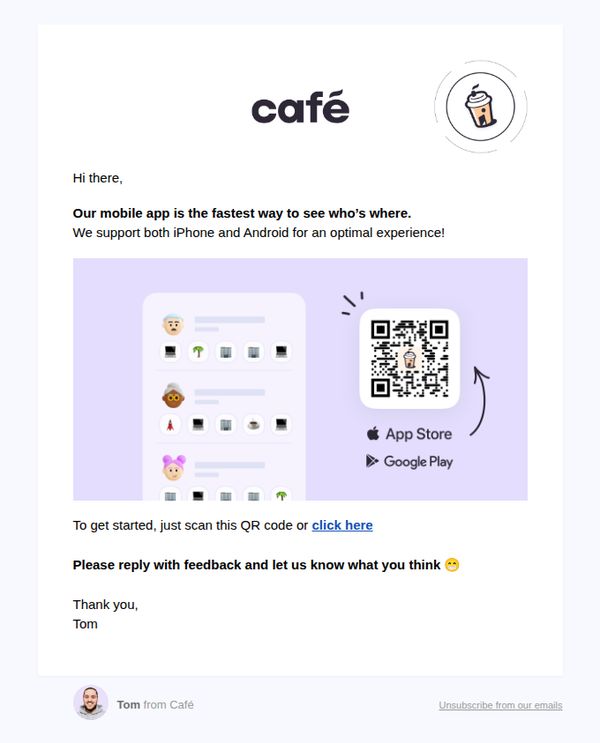
The email frames the app not just as a utility but as a social connector, 'the fastest way to see who’s where', which taps into FOMO and community belonging, making the download feel socially rewarding rather than transactional.
How to implement
Including both QR code and hyperlink options removes friction for different user preferences, while the visual arrow guiding the eye to the QR code subtly trains users to scan rather than click, increasing conversion likelihood.
Pro Tip
Add a brief social proof element, such as 'Join 50,000+ members already using the app', near the QR code to reduce hesitation and reinforce credibility before the user commits to downloading. • Replace the generic 'click here' CTA with a benefit-driven phrase like 'Get instant access to your favorite café spots' to clarify value and increase click-through motivation.
2. Don't miss out on your work besties 🌟
Objective
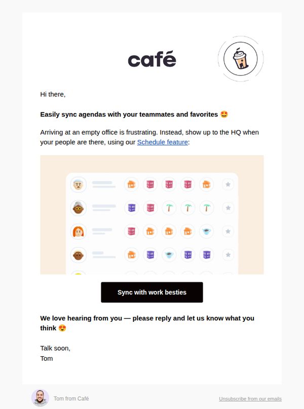
This email aims to encourage users to engage with the Schedule feature by framing it as a social tool to coordinate with coworkers, reducing the frustration of showing up to an empty office and fostering a sense of workplace connection.
Why this works
The email brilliantly reframes a productivity tool as a social connector by using the phrase 'work besties,' which humanizes the feature and taps into emotional motivation rather than just functional utility.
How to implement
By acknowledging a relatable pain point, arriving at an empty office, the message builds instant empathy and positions the Schedule feature as the intuitive, emotionally satisfying solution to a shared workplace frustration.
Pro Tip
Add a subtle countdown or urgency cue near the CTA (e.g., 'Join 5,000 teams syncing schedules this week') to nudge action without being pushy, leveraging social proof to reinforce the feature’s popularity. • Include a micro-testimonial or quote from a real user beneath the CTA, such as 'I finally stopped showing up to empty offices!', to strengthen credibility and mirror the emotional payoff already hinted at in the copy.
3. 🆕 Join a community in Café 👋
Objective
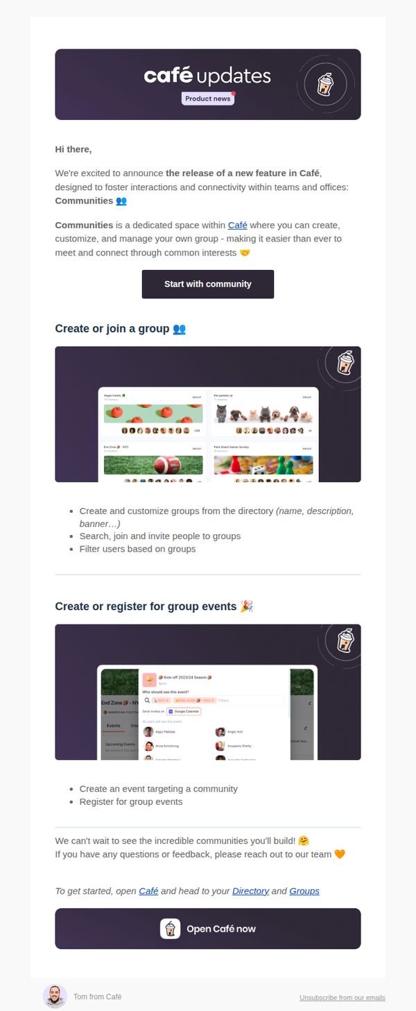
This email aims to introduce and drive adoption of Café’s new 'Communities' feature by highlighting its value for team connectivity and group interaction, encouraging immediate user engagement through clear next steps and visual examples.
Why this works
The email opens with warm, conversational tone and emoji-enhanced copy to instantly humanize the product update, making technical features feel inviting and socially relevant rather than corporate or overwhelming.
How to implement
It strategically breaks down complex functionality into digestible, benefit-driven sections, like group creation and event registration, each paired with real UI screenshots to reduce cognitive load and build user confidence.
Pro Tip
Add a subtle countdown or urgency cue near the CTA, such as 'First 100 groups get custom banners', to nudge procrastinators and increase conversion without compromising the friendly tone. • Include a short testimonial or quote from an early adopter within the education section to reinforce social proof and demonstrate real-world value beyond feature descriptions.
4. Time for a random coffee ☕️
Objective
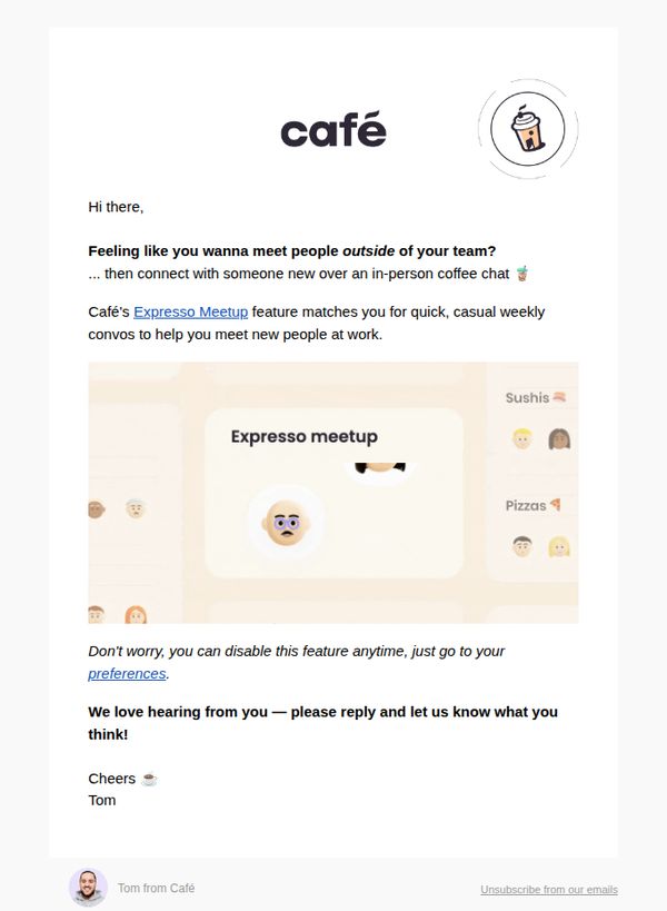
The email aims to encourage users to engage with Café’s Expresso Meetup feature by framing it as a low-pressure, casual way to connect with colleagues outside their immediate team, thereby fostering workplace community and increasing feature adoption.
Why this works
The email brilliantly reframes networking as a casual, low-stakes coffee chat, making it feel approachable and human rather than transactional or intimidating, which significantly lowers the psychological barrier to participation.
How to implement
By positioning the feature as optional and user-controlled, with a clear path to disable it, the email builds trust and reduces friction, subtly signaling that user autonomy is respected, which increases willingness to try the feature.
Pro Tip
Add a visual cue or icon next to the 'Expresso Meetup' CTA to reinforce its function, such as a calendar or handshake symbol, to help users instantly recognize it as an action item rather than just a feature name. • Include a short social proof element, like 'Over 2,000 teams have already matched for coffee chats this month', to leverage scarcity and peer validation, which would strengthen the persuasive pull of the offer.
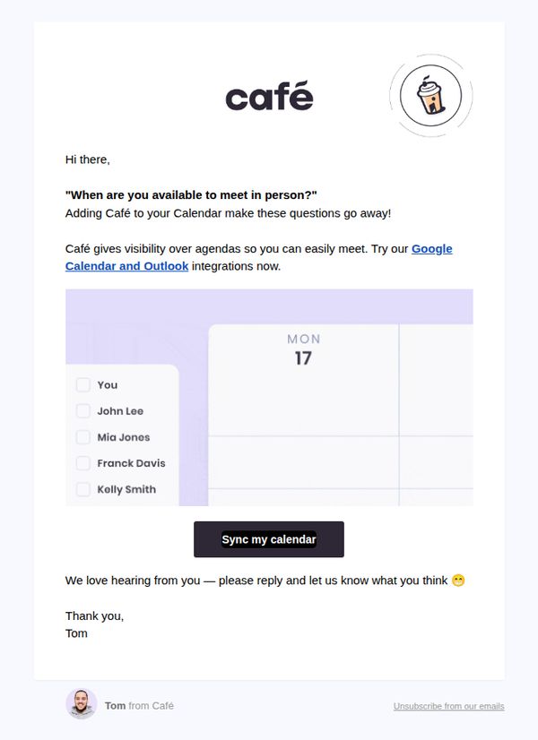
5. Outlook and Google Calendar 🔌
Objective
This email aims to drive user adoption of Café’s calendar integrations with Google Calendar and Outlook by highlighting how they eliminate scheduling friction and improve meeting coordination. It encourages immediate action through a prominent CTA and personalizes the message with a friendly sign-off.
Why this works
The email brilliantly reframes a common pain point, scheduling meetings, as a solvable problem by positioning the product as the effortless solution that removes friction from daily coordination.
How to implement
By embedding the integration names directly into the body copy and hyperlinking them, the campaign leverages familiar tools to build instant credibility and reduce perceived adoption risk for the user.
Pro Tip
Add a visual cue or icon next to the 'Sync my calendar' button to reinforce its function, for example, a calendar or sync symbol, to reduce cognitive load and increase click-through intent. • Include a micro-testimonial or social proof snippet near the CTA, such as 'Join 10,000+ teams who sync their calendars with Café,' to build trust and urgency without cluttering the layout.
6. Café Email Verification
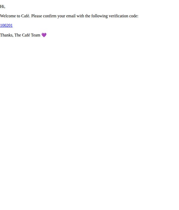
Objective
To verify the user’s email address and welcome them to the Café platform, establishing trust and initiating their onboarding journey with a simple, friendly confirmation prompt.
Why this works
The email opens with a warm, personalized greeting that immediately makes the recipient feel welcomed, setting a positive tone for their first interaction with the brand.
How to implement
By placing the verification code as a clickable, highlighted element, the design reduces friction and guides the user intuitively toward completing the required action without confusion.
Pro Tip
Add a secondary CTA button or link labeled 'Resend Code' beneath the verification code to accommodate users who may have missed or lost the original code, reducing drop-off. • Include a brief sentence explaining why email verification is necessary, such as 'to keep your account secure and unlock personalized offers', to increase user motivation and reduce abandonment.
7. Slack and Teams apps 🔌
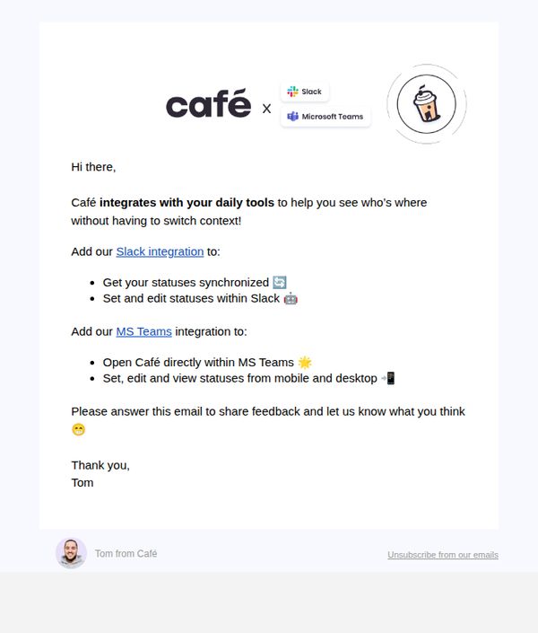
Objective
This email aims to drive adoption of Café’s new Slack and Microsoft Teams integrations by highlighting their convenience and seamless workflow benefits, while also inviting user feedback to improve the experience.
Why this works
The email immediately establishes value by framing the integrations as context-saving tools, which speaks directly to productivity-focused users who hate switching between apps during their workday.
How to implement
By listing specific, tangible benefits for each platform, like syncing statuses in Slack or launching Café inside Teams, the message turns abstract features into concrete, relatable wins that reduce perceived friction.
Pro Tip
Add a visual screenshot or GIF showing the integration in action within Slack or Teams to reduce cognitive load and help users instantly visualize the benefit. • Include a secondary CTA button or link for the MS Teams integration to avoid forcing users to scroll or click through text links, improving conversion equity across both platforms.
8. Yayyy, welcome to Café! 🎉
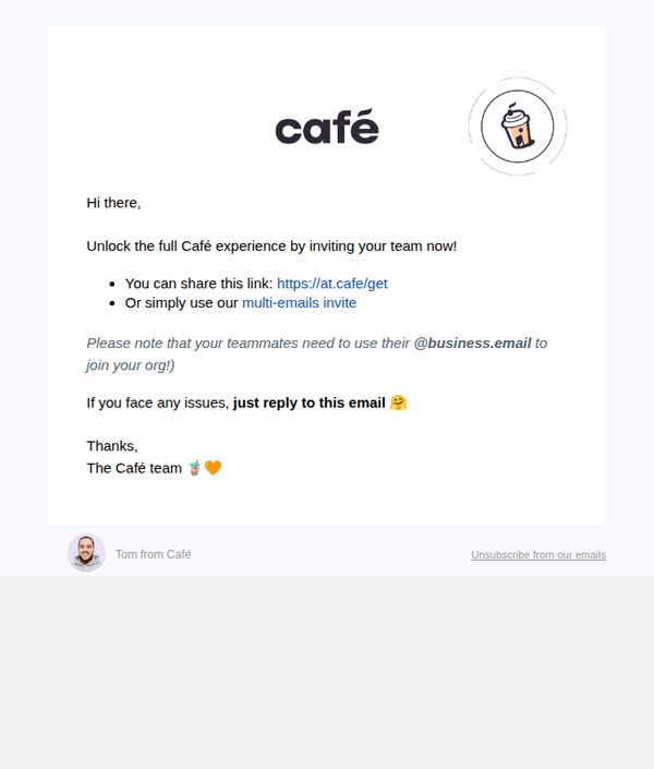
Objective
This email aims to welcome new users and encourage them to invite their team members to join Café, thereby expanding platform adoption within organizations through peer-driven onboarding.
Why this works
The email opens with a warm, celebratory tone using emojis and casual language to make the recipient feel personally welcomed, which builds immediate emotional connection and reduces friction in early engagement.
How to implement
It offers two clear, frictionless pathways to invite teammates, a direct link and a multi-email tool, giving users flexibility based on their workflow, which increases the likelihood of conversion through choice architecture.
Pro Tip
Add a visual cue or button highlighting the primary CTA 'Invite your team now' instead of burying it in bullet points, this would improve click-through by making the next step visually dominant and action-oriented. • Include a brief social proof element, like 'Join 10,000+ teams already using Café' or a mini testimonial, to reinforce trust and urgency, currently, the email lacks persuasive validation that could boost team adoption rates.
9. Plan your next event 🥳
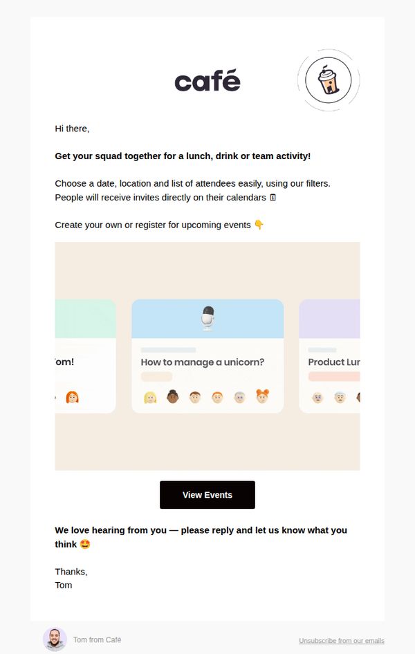
Objective
This email aims to encourage users to plan and organize group events, like lunches, drinks, or team activities, by leveraging Café’s event coordination tools, while also prompting engagement through a personal reply request from Tom.
Why this works
The email opens with a warm, conversational tone that invites users to gather their squad, making event planning feel social and effortless rather than transactional or administrative.
How to implement
By highlighting calendar integration and attendee management, the email subtly reassures users that the platform handles logistical friction, which reduces perceived effort and increases conversion likelihood.
Pro Tip
Add a visual example or screenshot of the event creation interface to reduce cognitive load and demonstrate ease of use, since the current abstract card graphics don’t clearly convey functionality. • Include a secondary CTA like 'See How It Works' or 'Watch a 30-Second Demo' above the main button to cater to users who need more context before committing to view events.