Squarespace email examples & ideas from real campaigns
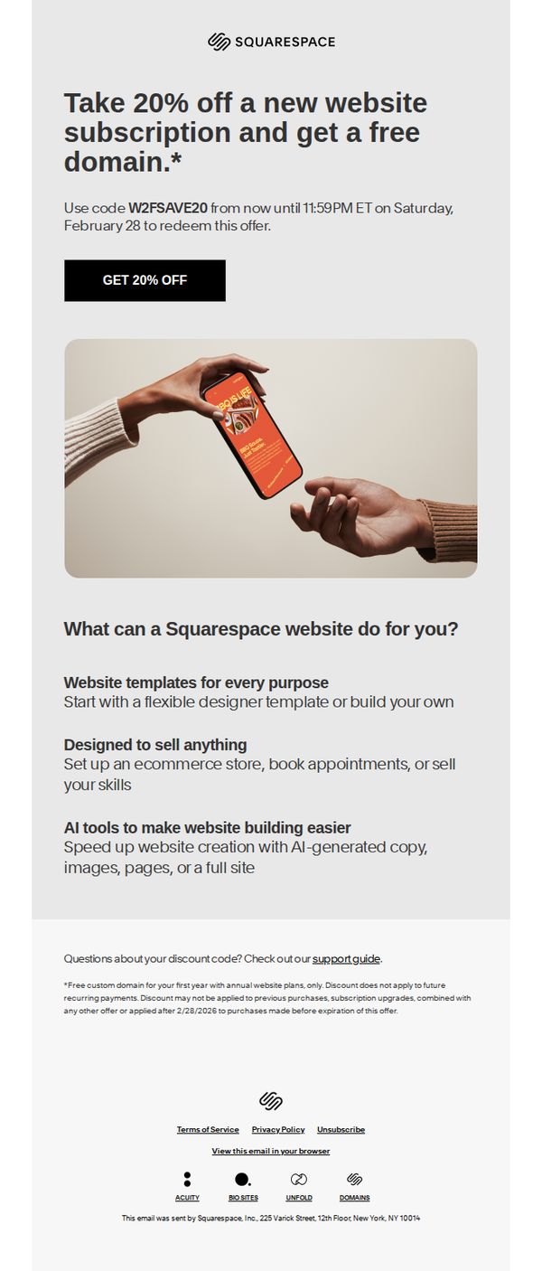


1. Get 20% off your website and a free domain
Objective
This email aims to drive new customer sign-ups by offering a time-sensitive 20% discount on website subscriptions paired with a free domain, encouraging immediate action before the offer expires.
Why this works
The email immediately anchors the reader with a bold, benefit-driven headline that combines two high-value incentives, a discount and a free domain, making the offer feel urgent and irresistible.
How to implement
By visually showing hands exchanging a phone with a Squarespace interface, the email creates an emotional, human moment that subtly implies trust, collaboration, and seamless onboarding, not just a transaction.
Pro Tip
Add a countdown timer near the CTA to visually reinforce urgency, since the offer expires at 11:59 PM ET, this would reduce cognitive load and increase conversion pressure without adding clutter. • Include a short testimonial or social proof near the offer section, even one sentence from a real user, to build credibility and reduce perceived risk for first-time buyers.
2. 20% off ends today
Objective
This email aims to drive immediate sign-ups for new Squarespace website subscriptions by offering a time-sensitive 20% discount and a free domain, creating urgency to convert prospects before the offer expires.
Why this works
The email masterfully combines a limited-time discount with a high-value freebie, a custom domain, to increase perceived value and motivate immediate action without overwhelming the reader with options.
How to implement
By visually anchoring the offer with a clean, device-responsive hero image and bold headline, Squarespace instantly communicates versatility and modernity, subtly reassuring prospects that their website will look professional across all platforms.
Pro Tip
Add a countdown timer beneath the CTA to visually reinforce urgency and reduce the cognitive load of calculating time remaining, which could increase conversion rates among hesitant users. • Include a short customer testimonial or social proof near the CTA to validate the offer’s credibility and reduce perceived risk, especially for first-time website builders who may be skeptical of discounts.
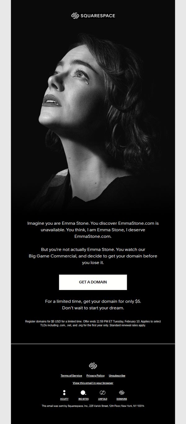
3. Get your domain for $5
Objective
The email aims to drive immediate domain registrations by creating emotional urgency through a relatable narrative, positioning Squarespace as the solution to securing a personal brand identity before it’s lost to someone else.
Why this works
The email brilliantly uses narrative psychology by casting the reader as a celebrity who almost lost their dream domain, making the offer feel personal and emotionally urgent rather than transactional.
How to implement
By anchoring the $5 domain offer to a time-sensitive deadline and tying it to a fictional commercial, the campaign transforms a routine purchase into a high-stakes moment of identity ownership.
Pro Tip
Add a subtle countdown timer beneath the CTA to visually reinforce urgency and reduce the cognitive load of calculating the deadline, increasing conversion likelihood. • Include a micro-testimonial or social proof near the CTA, such as 'Over 50,000 domains claimed this week', to reduce perceived risk and validate the offer’s popularity.
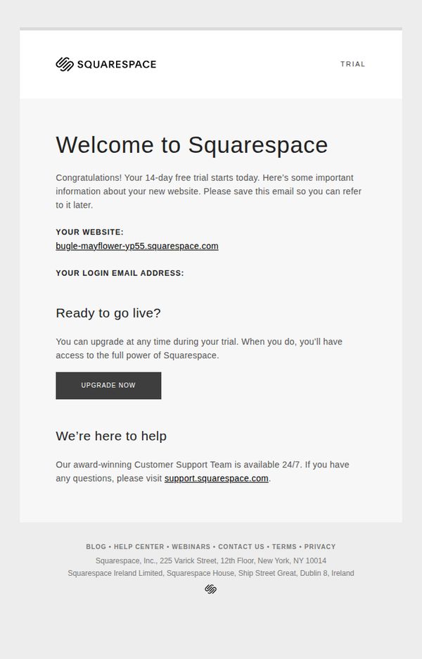
4. Welcome to Squarespace
Objective
To welcome new users to Squarespace and guide them through the initial steps of their 14-day free trial, while encouraging early upgrade by highlighting access to full features and 24/7 support.
Why this works
The email immediately validates the user’s action by celebrating the start of their trial, which builds momentum and reduces early drop-off by framing the experience as a milestone rather than a setup task.
How to implement
By including the exact website URL and login email upfront, Squarespace eliminates friction and reduces support requests, turning what could be a confusing first step into a seamless, self-service experience.
Pro Tip
Add a secondary CTA like 'Explore Templates' or 'Start Building' below the main upgrade button to guide trial users who aren’t ready to pay but want to engage with the product immediately. • Include a brief visual or icon-driven checklist (e.g., 'Step 1: Pick a template → Step 2: Add your content → Step 3: Go live') to reduce overwhelm and provide a clear path forward during the trial.
5. Have a dream? Get a domain for it.
Objective
The email aims to inspire users to turn their creative visions into reality by securing a custom domain through Squarespace, positioning domain ownership as the foundational step toward building a unique online identity and brand presence.
Why this works
Squarespace brilliantly ties emotional aspiration to a practical action by framing domain registration as the first heroic step toward realizing a dream, making a technical task feel empowering and deeply personal.
How to implement
The use of medieval armor imagery subtly conveys strength, legacy, and ownership, aligning the act of claiming a domain with the timeless narrative of building something enduring and worthy of protection.
Pro Tip
Add a subtle countdown timer or urgency indicator near the CTA to reinforce the limited-time discount and nudge immediate action without disrupting the email’s elegant tone. • Include a micro-testimonial or social proof element, such as '10,000+ creators launched their dream sites this month', to validate the offer and reduce perceived risk for hesitant users.
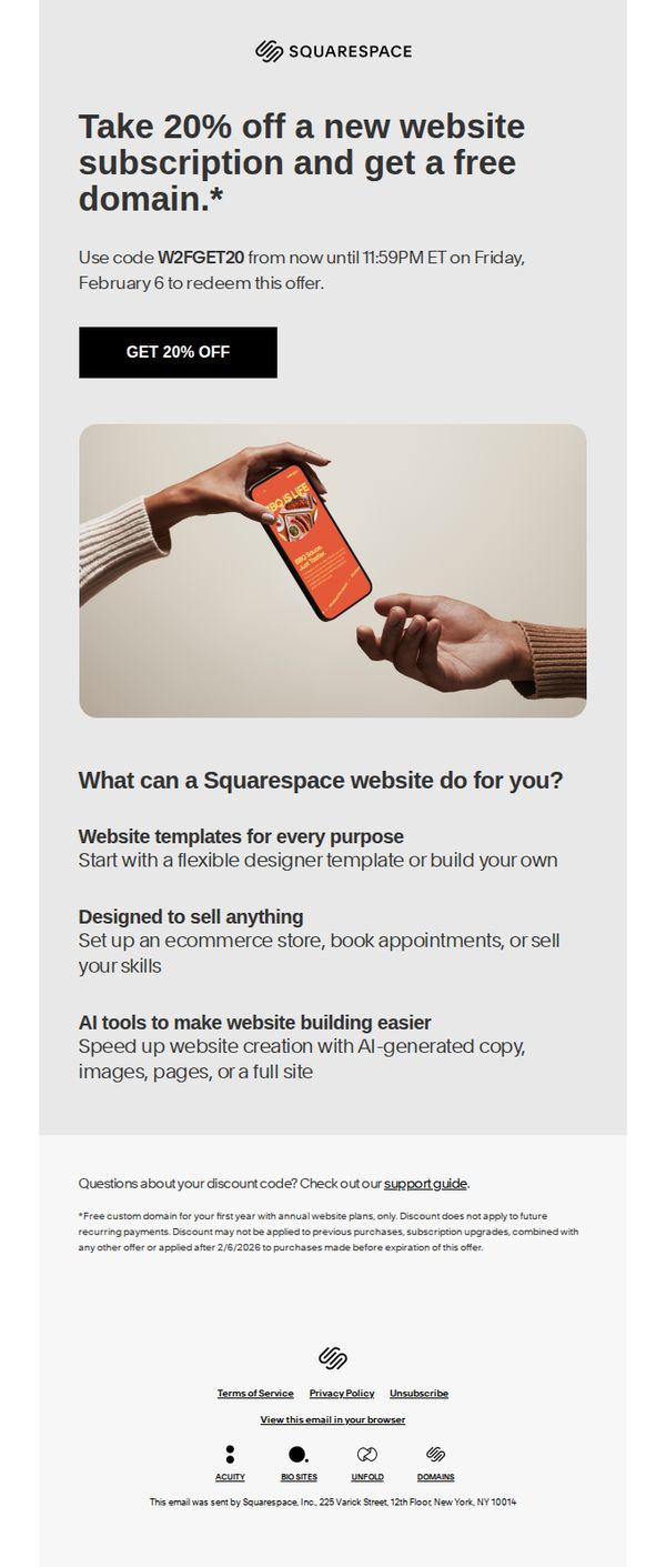
6. Get 20% off your website and a free domain
Objective
This email aims to drive new customer sign-ups by offering a time-sensitive 20% discount on website subscriptions paired with a free domain, encouraging immediate action before the offer expires.
Why this works
The email brilliantly pairs a high-value discount with a free domain to create irresistible perceived value, making the offer feel like a limited-time upgrade rather than just a price cut.
How to implement
By visually anchoring the CTA button directly beneath the offer details and deadline, the design eliminates friction and guides the user’s eye naturally toward conversion without distraction.
Pro Tip
Add a subtle countdown timer near the CTA to visually reinforce urgency, since the deadline is specific but currently only mentioned in small text, reducing its psychological impact. • Include a short testimonial or social proof near the offer section to build trust, new users may hesitate without seeing real results from others who used the discount.
7. 20% off ends today
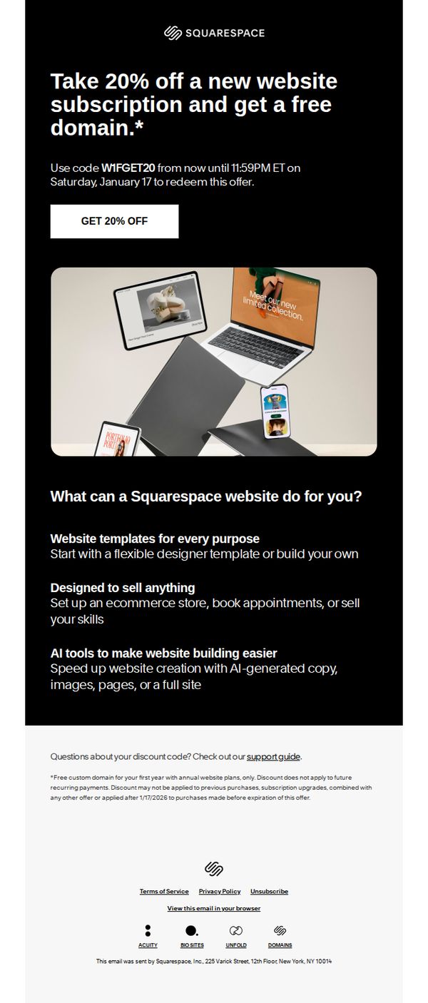
Objective
This email aims to drive immediate conversions by promoting a time-sensitive 20% discount on new Squarespace subscriptions, paired with a free domain to incentivize sign-ups before the offer expires at 11:59 PM ET on Saturday, January 17.
Why this works
The email leverages urgency effectively by anchoring the discount to a specific end time and date, creating a psychological nudge that compels immediate action from potential customers who might otherwise delay their decision.
How to implement
By pairing the 20% discount with a free domain, Squarespace adds perceived value without increasing cost, making the offer feel more generous and reducing friction for users evaluating whether to commit to a new subscription.
Pro Tip
Add a visual countdown timer near the CTA to reinforce urgency in real time, especially for users who may open the email hours before the deadline, making the time constraint feel more immediate and tangible. • Include a brief testimonial or social proof near the offer section, such as 'Join 50,000+ creators who launched with Squarespace this month', to build trust and reduce hesitation for first-time buyers.
8. Need some site inspiration?
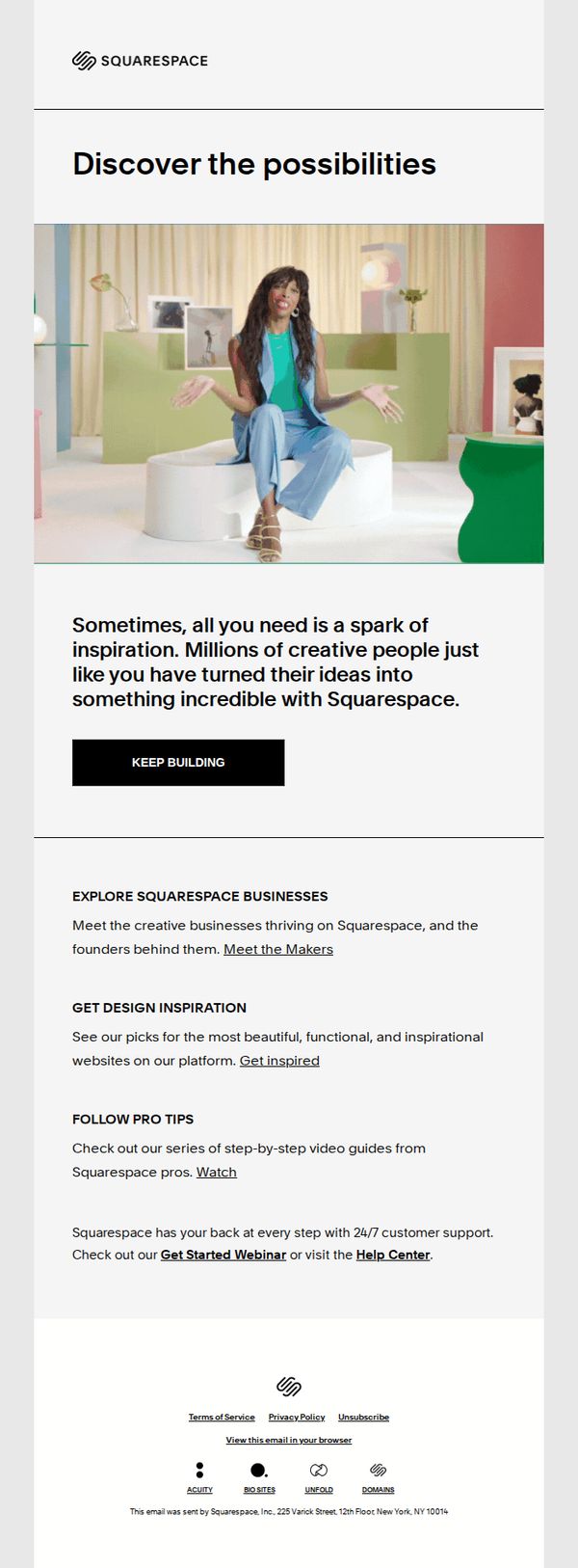
Objective
This email aims to re-engage users who may be stuck or uncertain in their website-building journey by offering curated inspiration and resources to reignite their creativity and confidence in using Squarespace. It encourages continued progress with motivational messaging and direct access to success stories, design examples, and expert guidance.
Why this works
The email brilliantly reframes user hesitation as a natural creative pause, then immediately validates their potential by highlighting millions of others who’ve turned ideas into success, making the reader feel part of a thriving community rather than alone in their struggle.
How to implement
Instead of pushing a sale, it offers three distinct, value-driven pathways, business spotlights, design inspiration, and pro tutorials, giving users autonomy to choose what motivates them most, which builds trust and reduces pressure while still guiding them deeper into the platform.
Pro Tip
Add a visual thumbnail or mini-gallery under ‘GET DESIGN INSPIRATION’ to preview the websites, this would reduce friction by letting users instantly see the value before clicking, increasing click-through rates. • Include a short testimonial or quote from a ‘Maker’ under ‘EXPLORE SQUARESPACE BUSINESSES’ to humanize the section and create emotional resonance before the user clicks through.
9. Verify Your Account
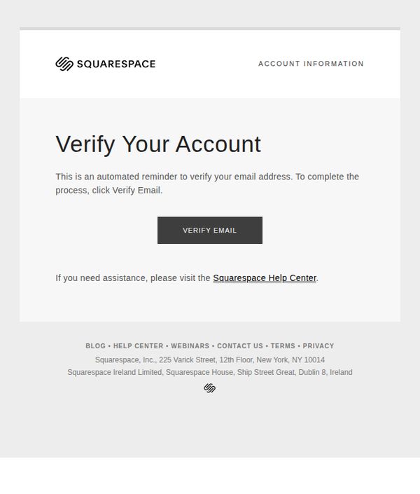
Objective
This email aims to prompt the recipient to verify their email address as part of account setup or security protocol, ensuring account legitimacy and enabling full platform access. It also directs users to support resources if they encounter issues.
Why this works
The email uses minimal design and clear hierarchy to eliminate distractions, ensuring the user’s attention is immediately drawn to the verification action without visual noise or competing elements.
How to implement
By framing the request as an automated reminder rather than a demand, the message reduces friction and positions verification as a routine, helpful step rather than a barrier to entry.
Pro Tip
Add a brief explanation of why verification is required (e.g., 'to protect your site and enable secure logins') to increase user motivation and reduce abandonment due to perceived irrelevance. • Include a secondary CTA or visual cue (like an arrow or icon) pointing to the 'VERIFY EMAIL' button to reinforce action, especially for users who may overlook the button due to its neutral styling.
10. 20% off ends today

Objective
This email aims to drive immediate sign-ups for new Squarespace website subscriptions by offering a time-sensitive 20% discount and a free domain, creating urgency to convert prospects before the offer expires.
Why this works
The email masterfully combines urgency with value by anchoring the discount to a hard deadline and pairing it with a free domain, a dual incentive that reduces perceived risk and accelerates decision-making for hesitant buyers.
How to implement
By visually showcasing multi-device responsiveness in the hero image, Squarespace subtly communicates professionalism and adaptability, reassuring prospects that their site will look polished across all platforms without requiring technical expertise.
Pro Tip
Add a countdown timer near the CTA to visually reinforce urgency, the current text-based deadline is easy to overlook, and a dynamic timer would increase perceived scarcity and conversion pressure. • Include a short testimonial or social proof near the offer section to build trust, since the email targets new users, a quote from a satisfied customer who used the discount would validate the offer’s legitimacy and reduce hesitation.