Proven Kit email designs you can use
1. UNIGNORABLE 👀 Gary Vee
Objective
This email aims to inspire subscribers to embrace authentic, unpolished content creation by showcasing Gary Vaynerchuk’s journey and strategy, while subtly promoting the UNIGNORABLE newsletter as a valuable resource for personal branding.
Why this works
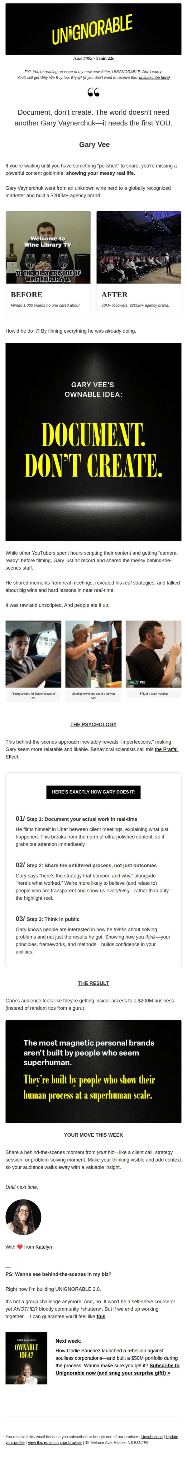
The email brilliantly reframes content creation as documentation of real life, not performance, making it instantly relatable and lowering the psychological barrier for creators who feel they need to be perfect before sharing.
How to implement
By breaking Gary Vee’s strategy into three digestible, actionable steps, the email transforms an abstract success story into a replicable framework, empowering readers to immediately apply the advice to their own personal brand building.
Pro Tip
Add a countdown timer or urgency cue near the CTA to increase conversion, since the 'surprise gift' is mentioned but not time-bound, reducing perceived scarcity and immediate action motivation. • Include a short video or GIF of Gary Vee documenting a real moment (e.g., in-car filming or team meeting) directly in the 'How Gary Does It' section to reinforce the 'document, don’t create' message with dynamic proof.
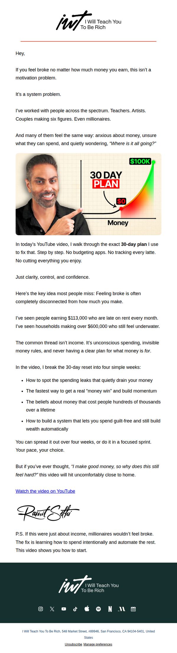
2. If you still feel broke, this is the 30-day reset you need
Objective
This email aims to position the sender as a trusted guide for high earners who still feel financially strained, by offering a 30-day money system that replaces budgeting with clarity and automation. It drives viewers to watch a YouTube video that delivers the core framework.
Why this works
The email reframes financial struggle not as a personal failure but as a systemic flaw, which instantly validates the reader’s pain and positions the solution as strategic rather than shaming.
How to implement
By citing real-world examples of high earners still feeling broke, the message builds credibility and emotional resonance, making the audience feel seen and understood before offering the fix.
Pro Tip
Add a short video preview or animated thumbnail above the CTA to increase click-through rates by giving users a visual taste of the content before committing to watch. • Include a testimonial snippet or social proof from someone who completed the 30-day plan, even if brief, to reinforce credibility and reduce perceived risk for new viewers.
3. Which of these 3 money skills are you missing?
Objective
This email aims to engage readers by diagnosing their financial skill gaps across earning, managing, and spending money, then guiding them toward the Money Coaching program as the solution to master all three. It also promotes an upcoming expert event to deepen urgency and perceived value.
Why this works
The email brilliantly frames financial mastery as a three-part skill set, earning, managing, and spending, which transforms abstract money advice into a measurable, achievable journey that readers can self-assess and feel motivated to complete.
How to implement
By using a relatable anecdote about a man in his 70s and his Paris fantasy, the email humanizes financial advice, making the emotional cost of poor spending habits tangible and prompting readers to reflect on their own relationship with money beyond spreadsheets and savings goals.
Pro Tip
Add a visual progress bar or checklist next to the three money skills to help readers instantly self-diagnose which skill they’re missing, this would increase engagement and make the educational content more interactive and scannable. • Reposition the event promotion above the signature, not as a PS, to give it equal visual weight with the main CTA, this would better align with the campaign’s dual goal of driving both coaching signups and event registrations.
4. “What’s the point of making money if this is it?”
Objective
This email aims to inspire readers by showcasing a real-life transformation through Money Coaching, positioning financial freedom as a gateway to a richer, more intentional life, not just numbers on a screen. It seeks to convert readers into subscribers by proving the program’s emotional and experiential ROI.
Why this works
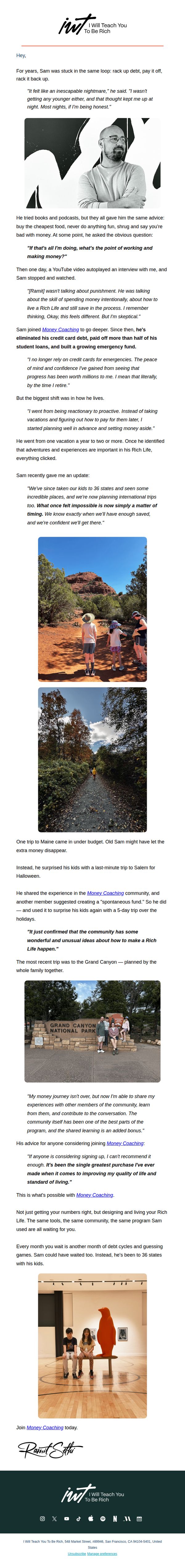
The email masterfully reframes financial coaching not as a spreadsheet exercise but as a life-enriching journey, using Sam’s emotional arc, from debt despair to family adventures, to make the abstract idea of ‘wealth’ feel tangible, human, and deeply desirable.
How to implement
By embedding real photos of Sam’s family at iconic destinations like the Grand Canyon, the campaign visually proves the program’s outcome: not just financial stability, but the freedom to create unforgettable memories, making the value proposition emotionally irresistible and instantly relatable.
Pro Tip
Add a subtle countdown timer or urgency trigger near the CTA (e.g., ‘Join before the next cohort closes’) to reduce procrastination, since the current version relies solely on emotional appeal without a time-sensitive nudge to act. • Include a mini FAQ or ‘How It Works’ bullet list beneath the testimonial to preemptively address skepticism, many readers may wonder how coaching translates to real-life trips, and a quick 3-point breakdown would reinforce credibility without disrupting the narrative flow.
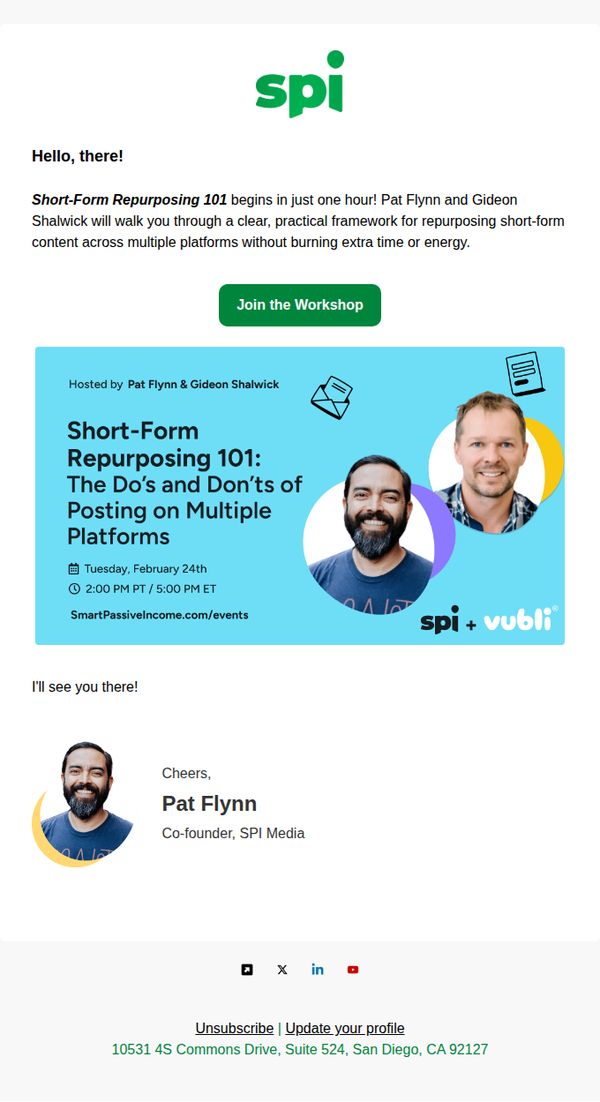
5. [One Hour Reminder] Short-Form Repurposing 101 Begins Soon!
Objective
This email aims to remind recipients that the 'Short-Form Repurposing 101' workshop is starting in one hour and to drive immediate attendance by highlighting the practical value and expert hosts. It seeks to convert last-minute interest into live participation through urgency and credibility.
Why this works
The email leverages time-sensitive urgency with a clear 'one hour' reminder, which taps into FOMO while still offering value by previewing the practical framework attendees will receive, making the click feel like a low-risk, high-reward decision.
How to implement
By prominently featuring both hosts’ names and photos alongside the workshop title, the email builds instant credibility and personal connection, helping recipients feel they’re joining a trusted, human-led session rather than a generic webinar.
Pro Tip
Add a countdown timer above the CTA to visually reinforce urgency and create a dynamic, real-time nudge that encourages immediate action before the workshop begins. • Include a brief bullet-point list under the workshop title highlighting 2–3 specific takeaways (e.g., 'Learn how to turn 1 video into 5 platform-ready clips') to strengthen perceived value and reduce hesitation.
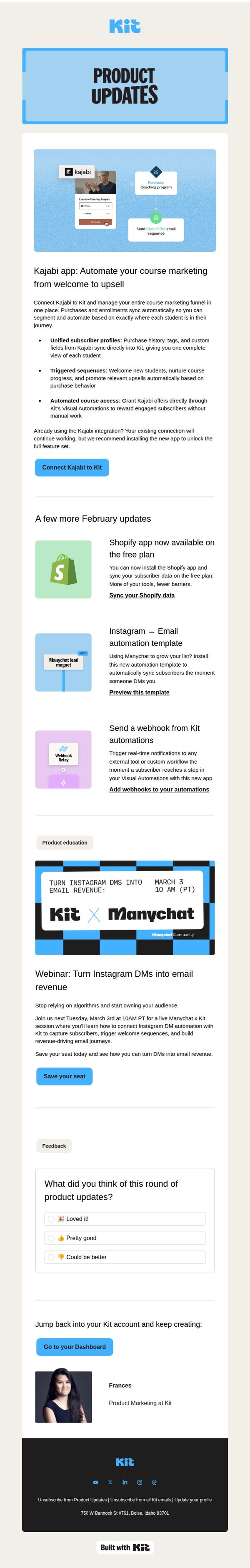
6. Kit Product Updates: February 2026
Objective
This email aims to inform Kit users about new product features and integrations released in February 2026, encouraging adoption through clear CTAs while reinforcing brand value by showcasing strategic partnerships and educational opportunities.
Why this works
The email leads with a high-impact integration, Kajabi, that solves a real pain point for course creators, immediately signaling value by showing how automation reduces manual work while increasing student engagement and revenue potential.
How to implement
Each new feature is presented with a clean visual icon, a benefit-driven headline, and a direct CTA, making it effortless for users to understand what’s new and take action without scrolling or searching for next steps.
Pro Tip
The 'Save your seat' CTA for the webinar is visually underwhelming compared to the primary 'Connect Kajabi to Kit' button; increasing its size or using a contrasting color would better reflect its strategic importance in driving user education and platform stickiness. • The feedback section at the bottom uses radio buttons without a submit button, which may confuse users; adding a clear 'Submit Feedback' CTA or converting it to a one-click rating system would improve completion rates and data quality.