How Lightdash does product update emails
1. ⚡️ Building Lightdash: Welcome to Agentic BI
Objective
This email aims to introduce Lightdash’s new Agentic BI feature, positioning it as a game-changer for data teams by enabling dashboard creation directly in code editors. It also highlights recent product updates and integrations to reinforce credibility and encourage demo bookings.
Why this works
By framing Agentic BI as a solution to data team bottlenecks, the email taps into a real pain point, slow, manual workflows, and positions code-based dashboard building as a liberating, time-saving innovation that aligns with developers’ existing tools.
How to implement
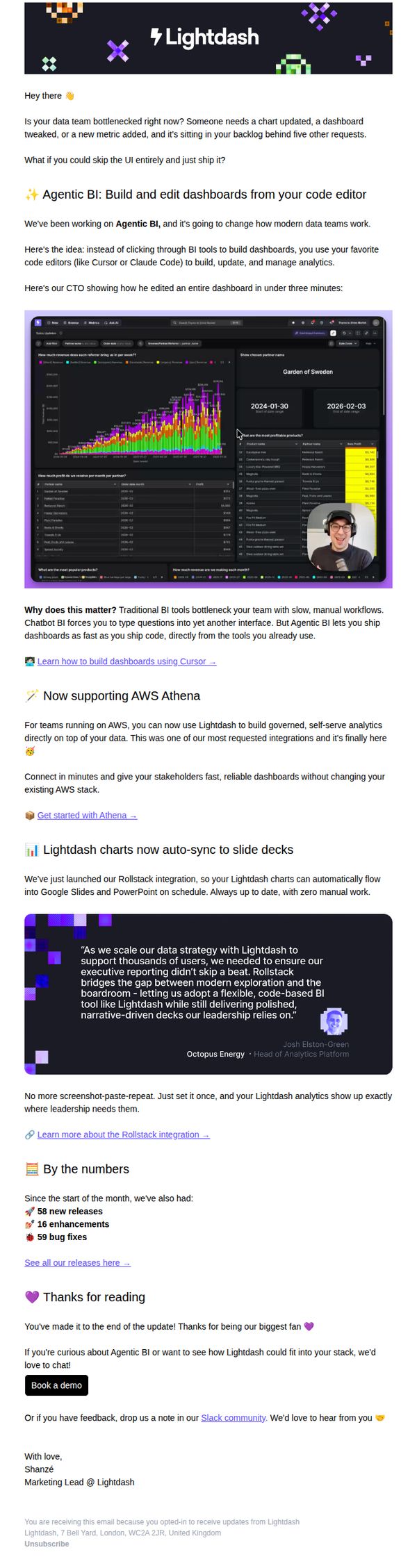
Including a real customer quote from Octopus Energy adds social proof while subtly reinforcing enterprise readiness, helping skeptical prospects visualize how Lightdash integrates into high-stakes, leadership-driven environments without disrupting existing data infrastructure.
Pro Tip
The CTA 'Book a demo' appears only once at the bottom; adding a secondary, sticky CTA button after the hero section or testimonial would capture early interest before users scroll away, improving conversion flow. • The 'By the numbers' section lists releases and fixes but lacks visual emphasis or context, adding icons, progress bars, or a mini-timeline would make the metrics more scannable and emotionally resonant, reinforcing product momentum.
2. What if your analysts had 10 extra hours a week?
Objective
The email aims to position Lightdash’s Agentic BI as a solution that frees data teams from dashboard-building bottlenecks, enabling them to focus on high-impact strategic work that drives revenue and growth.
Why this works
The email opens with a provocative, benefit-driven question that immediately reframes the reader’s pain point, not as a technical limitation, but as a lost revenue opportunity waiting to be unlocked by automation.
How to implement
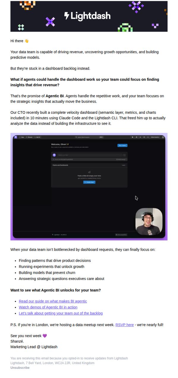
By spotlighting a real CTO’s 10-minute dashboard win using Claude Code and the Lightdash CLI, the email delivers social proof that’s both technical and time-bound, making the promise feel achievable and urgent for data leaders.
Pro Tip
Add a visual progress bar or time-saving counter next to the CTO’s 10-minute dashboard claim to quantify the efficiency gain and make the benefit more tangible at a glance. • Reposition the 'Let’s talk about getting your team out of the backlog' CTA higher in the email, perhaps after the CTO story, to capture interest while momentum is highest, rather than burying it after bullet points.
3. ⚡ Feature Friday: Auto-titles are here + what's next for 2026
Objective
To celebrate the final Feature Friday of 2025 by announcing the launch of auto-generated chart titles, spotlighting a key customer success story, and recapping the year’s progress, all while building anticipation for 2026 and encouraging community engagement.
Why this works
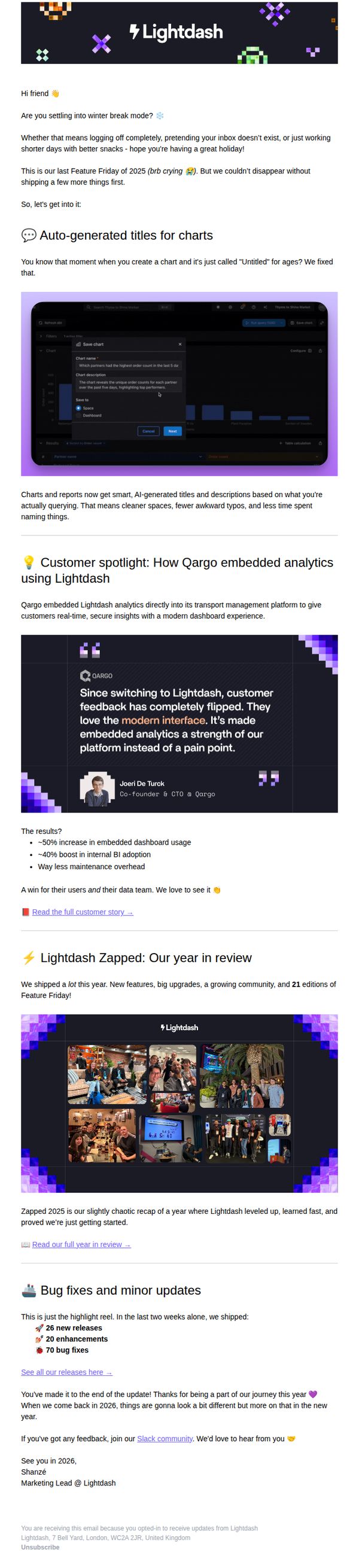
The email brilliantly frames a small but impactful feature, auto-generated chart titles, as a time-saving, frustration-reducing upgrade that speaks directly to users’ daily pain points, making technical improvements feel personally valuable.
How to implement
By spotlighting Qargo’s transformation with embedded analytics, the campaign turns a customer success story into social proof that validates the platform’s modern interface and ROI, subtly nudging prospects to envision similar wins for their own teams.
Pro Tip
Add a secondary CTA after the year-in-review section encouraging users to join the Slack community or suggest 2026 features, this would capitalize on the momentum of the recap and turn passive readers into active participants. • Include a subtle visual countdown or teaser graphic near the footer hinting at 2026’s roadmap, this would heighten anticipation without disrupting the email’s celebratory tone and give readers a reason to stay engaged beyond the current message.
4. March 4: Watch us build a dashboard from a single prompt live
Objective
This email aims to drive registrations for Lightdash’s live product demonstration on March 4, where the CTO will build a production-ready dashboard from a single prompt in real time. It also seeks to position Lightdash as a solution for data team bottlenecks by offering educational content alongside the event.
Why this works
The email brilliantly combines event promotion with educational value by teasing a live demo that solves a real pain point, building dashboards from prompts, which instantly grabs attention from data professionals tired of manual workflows.
How to implement
By featuring the CTO as the live builder, the email leverages founder credibility and authenticity, making the demo feel more like an exclusive insider session rather than a generic sales pitch, which increases perceived value and trust.
Pro Tip
Add a visual thumbnail or animated GIF of the dashboard being built live to the hero section, this would dramatically increase click-through by giving users a preview of the value they’ll see, rather than relying solely on text description. • Include a countdown timer or urgency indicator near the CTA (e.g., 'Only 48 spots left') to create scarcity and nudge procrastinators to register immediately, especially since the event is time-bound and live.