Marketing email examples & ideas from real campaigns
1. Pilothouse : 📦 - ‘Persuasive Creative’ is Dead
Objective
This email aims to educate DTC marketers on evolving creative strategies beyond traditional persuasion, using real-world examples like Heinz’s KegChup and Meta’s intent-based ads, while promoting Pilothouse’s podcast and platform insights to position itself as a thought leader in modern brand growth.
Why this works
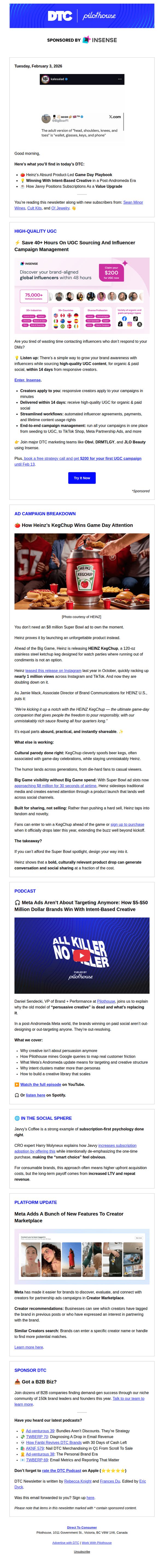
Heinz’s KegChup campaign brilliantly merges cultural relevance with product utility, proving that absurdity can be strategic when it taps into existing consumer rituals like game-day gatherings, making the product feel essential rather than gimmicky.
How to implement
The email positions Pilothouse as a curator of forward-thinking DTC strategy by spotlighting brands that win through intent-based creative, not persuasion, this reframing helps marketers rethink their own creative frameworks and align with post-Andromeda consumer behavior.
Pro Tip
The primary CTA 'Try It Now' is buried beneath multiple sections and lacks visual hierarchy; reposition it immediately after the sponsor’s value proposition with a contrasting color and larger button to capture attention before readers scroll past. • The podcast section includes a compelling headline but doesn’t leverage urgency or social proof, add a stat like '50,000+ marketers listened' or a countdown to the next episode release to incentivize immediate engagement.
2. Common Thread Collective: What’s actually incremental? (free 3-model build)
Objective
The email aims to educate high-revenue brands on measuring true incremental revenue across platforms and positions Common Thread Collective as the expert by offering a free, customized 3-model build to clarify what’s actually driving net-new growth.
Why this works
The email opens with a sharp, pain-point-driven hook that immediately resonates with data-savvy marketers by calling out the hidden danger of platform-attributed revenue misleading media mix decisions, a bold, credibility-building move that stops skimmers in their tracks.
How to implement
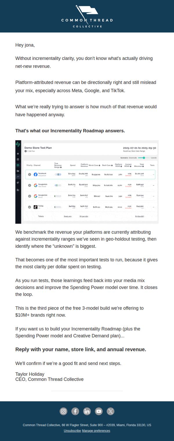
By embedding a real, annotated screenshot of their Incrementality Roadmap dashboard, the brand transforms abstract value into tangible proof, letting prospects visualize the clarity they’ll gain, a powerful trust-building tactic that turns skepticism into curiosity without needing a demo.
Pro Tip
Add a brief, bolded sub-headline under the subject line (e.g., 'See what your platforms aren’t telling you') to reinforce the hook and improve scannability for mobile readers who may miss the first sentence. • Include a micro-testimonial or client result snippet (e.g., 'Brand X found 37% of their Meta revenue wasn’t incremental, and reallocated $2M') near the CTA to reduce perceived risk and strengthen social proof before the reply request.
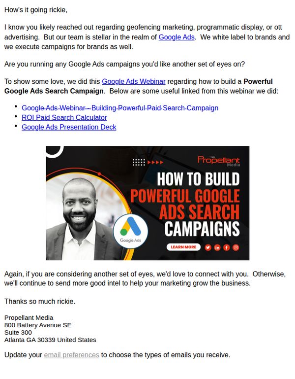
3. Propellant Media: If you're running Google Ads, would you let us audit your account rickie?
Objective
The email aims to position Propellant Media as a trusted expert in Google Ads by offering a personalized account audit, while subtly promoting their webinar and tools to nurture leads into deeper engagement with their services.
Why this works
Personalizing the subject line and opening with the recipient’s name immediately builds rapport and signals this isn’t a generic blast, which increases the likelihood of the reader feeling seen and willing to engage with the offer.
How to implement
Positioning the audit as a value-first gesture, rather than a sales pitch, creates psychological reciprocity, making the recipient more open to exploring the webinar and tools without feeling pressured to commit immediately.
Pro Tip
Add a secondary CTA button or link near the top of the email (e.g., 'Schedule Your Free Audit') to capture interest before the reader scrolls, since the only CTA is buried in the hero image and may be missed on mobile or in preview mode. • Include a short testimonial or client result snippet near the offer section to build social proof, since the email relies heavily on self-promotion, adding third-party validation would strengthen trust and reduce perceived risk for the recipient.
4. Technology Therapy Group : Webinar Today: Nurture Smarter, Not Louder
Objective
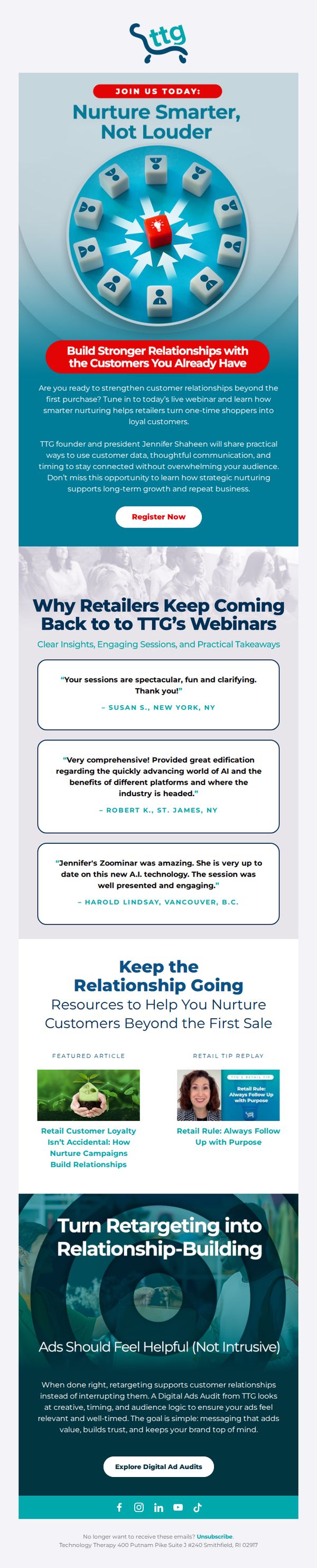
This email aims to drive immediate registration for a live webinar focused on customer relationship nurturing strategies for retailers, positioning TTG as a trusted advisor while reinforcing the value of post-purchase engagement for long-term growth.
Why this works
The email masterfully frames customer nurturing as a strategic growth lever rather than a tactical task, helping retailers reframe their mindset around post-purchase engagement as the foundation for repeat business and loyalty.
How to implement
By featuring authentic, geographically diverse testimonials from past attendees, the email builds credibility and social proof without sounding salesy, subtly reassuring prospects that the content is both practical and engaging for real-world retail leaders.
Pro Tip
Add a countdown timer or time-sensitive language near the CTA to create urgency, since the subject line indicates the webinar is happening 'today' but the body lacks visual or textual reinforcement of immediacy. • Reposition the 'Explore Digital Ad Audits' CTA to appear earlier or as a secondary option alongside 'Register Now,' since it’s a strong lead-gen offer that aligns with the nurturing theme but currently feels buried and disconnected from the primary goal.
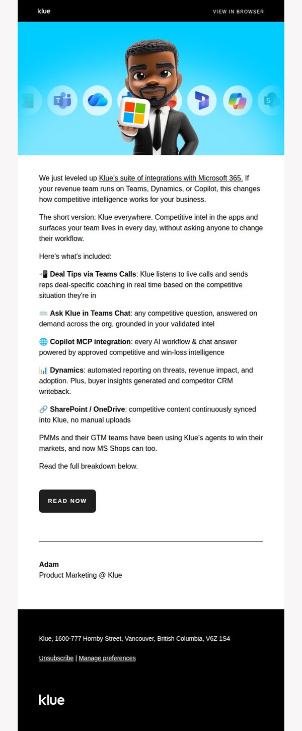
5. Klue: Klue is now inside Microsoft 365
Objective
To announce Klue’s expanded integration with Microsoft 365 and demonstrate how revenue teams can now access competitive intelligence seamlessly within their existing workflows without disruption or additional training.
Why this works
Klue brilliantly frames its Microsoft 365 integration not as a technical upgrade but as a workflow revolution, positioning competitive intelligence as an invisible, always-on assistant embedded where teams already operate, reducing friction and increasing adoption.
How to implement
By listing specific, high-impact use cases like Deal Tips via Teams Calls and Copilot MCP integration, Klue transforms abstract ‘integration’ into tangible, role-specific value that speaks directly to sales reps, GTM leaders, and product marketers with precision and relevance.
Pro Tip
Add a subtle countdown or urgency trigger near the CTA, such as ‘First 50 teams get free onboarding’, to convert passive readers into active users by introducing scarcity tied to the integration launch. • Include a short video or animated GIF in the hero section showing Klue’s interface inside Teams or Dynamics to visually demonstrate the seamless workflow, reducing cognitive load and increasing perceived ease of adoption.
6. Echelonn: Product page vs. Sale page: Which works better for Shopping Ads?
Objective
This email aims to educate e-commerce marketers on optimizing Shopping Ads by comparing product pages versus dedicated sales pages, and to drive engagement by offering a free landing page playbook and audit for qualified brands.
Why this works
The email brilliantly reframes a technical SEO question into a customer-centric narrative by focusing on the cold shopper’s overwhelm, making the case for sales pages feel intuitive rather than tactical, which builds instant credibility with time-strapped marketers.
How to implement
Instead of just stating a recommendation, the email provides clear, situational triggers, like selling higher-ticket items or operating in skeptical markets, that help readers self-qualify, turning abstract advice into actionable, personalized strategy they’re more likely to implement.
Pro Tip
The CTA 'Grab our Landing Page Playbook' is buried mid-email and lacks visual emphasis; moving it above the fold with a contrasting button and adding urgency (e.g., 'Download before Friday') would increase conversion rates for cold traffic. • The email lacks social proof or data points to back up the claim that sales pages 'perform way better', adding a short stat (e.g., 'Clients saw 37% higher ROAS') or a mini testimonial would strengthen credibility and reduce skepticism.
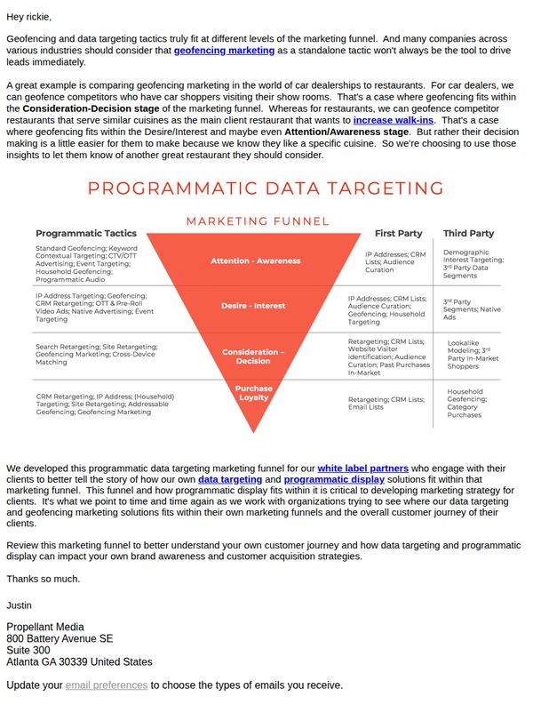
7. Propellant Media: How does white label geofencing fit within your marketing funnel?
Objective
This email aims to educate white label partners on how geofencing and programmatic data targeting can be strategically placed within different stages of the marketing funnel, helping them better position these tools for client campaigns and improve customer acquisition outcomes.
Why this works
By mapping geofencing tactics to specific funnel stages, like Awareness, Consideration, and Loyalty, the email helps partners visualize how to position location-based targeting as a strategic, not just tactical, tool in client campaigns.
How to implement
The email smartly uses industry-specific analogies, like car dealerships versus restaurants, to show how the same technology can serve different goals, making abstract concepts feel tangible and actionable for partners.
Pro Tip
Add a visual CTA button beneath the funnel graphic labeled 'Download the Funnel Guide' to convert interest into a tangible asset, reinforcing the educational value and encouraging deeper engagement. • Include a short testimonial or case study snippet from a white label partner who successfully implemented this funnel strategy, to build social proof and demonstrate real-world application.
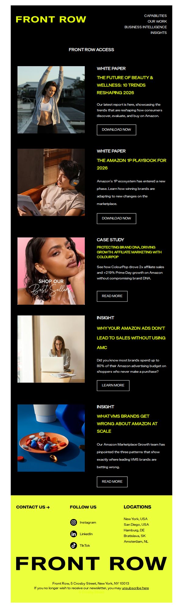
8. Front Row: Front Row Access | Download The Future of Beauty & Wellness White Paper, Learn How Affiliate Marketing Drives Growth
Objective
This email aims to position Front Row as a thought leader in beauty, wellness, and Amazon marketplace strategy by offering high-value downloadable content and case studies that appeal to brand marketers and growth teams. It seeks to drive engagement through educational resources while subtly promoting their consulting capabilities.
Why this works
Front Row strategically positions itself as an industry authority by offering a white paper on 2026 beauty trends, which not only educates but also subtly primes prospects to view them as indispensable partners in navigating Amazon’s evolving landscape.
How to implement
The email leverages real-world case studies like ColourPop’s affiliate marketing success to demonstrate tangible ROI, making abstract strategies feel actionable and trustworthy while reinforcing the value of Front Row’s consulting expertise without overt sales pressure.
Pro Tip
The email lacks a personalized subject line or dynamic content that speaks to the recipient’s brand category or past engagement, which could significantly increase open and click-through rates by making the offer feel more relevant and tailored. • While the CTAs are clear, they’re visually uniform across different content types (white papers, case studies, insights), which dilutes urgency and intent, consider varying CTA text (e.g., 'Get the Playbook' vs. 'Read the Case Study') to better match the value proposition of each section.
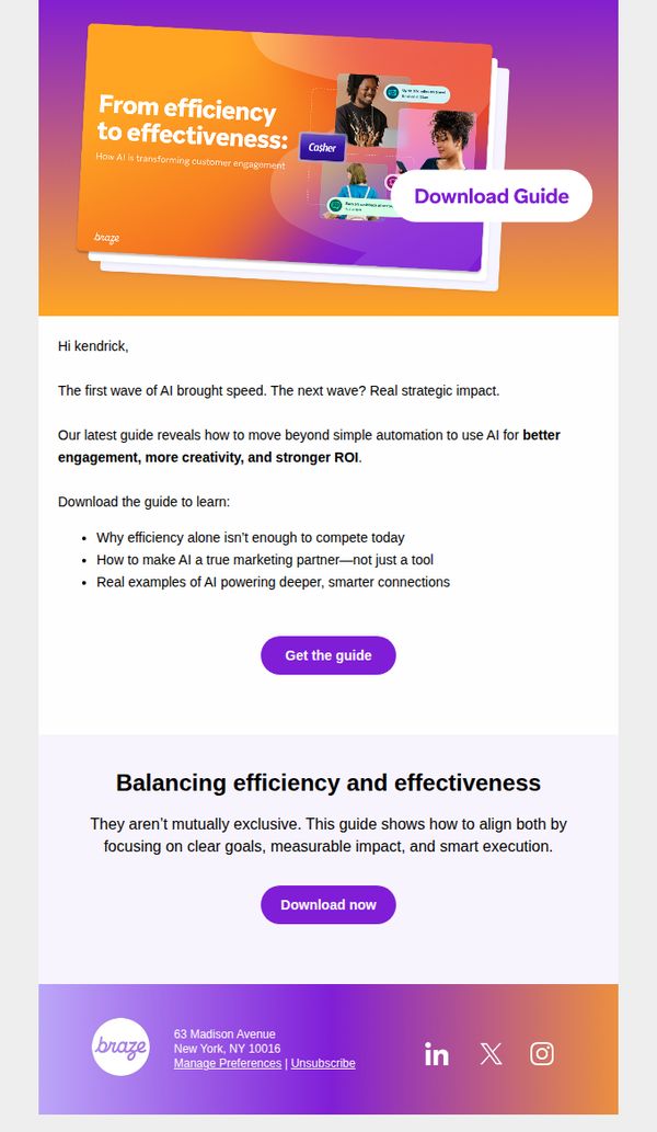
9. Braze: Is your AI strategy stuck on speed?
Objective
This email aims to position Braze as a strategic AI partner by encouraging marketers to move beyond basic automation and download a guide that demonstrates how AI drives deeper engagement and measurable ROI. It targets decision-makers ready to evolve their AI strategy from tactical to transformational.
Why this works
The email brilliantly reframes AI not as a productivity tool but as a strategic growth engine, helping marketers shift their mindset from efficiency to effectiveness, which is exactly the mental pivot needed to justify deeper investment and executive buy-in.
How to implement
By using a bold, benefit-driven headline paired with a visually layered hero graphic that implies motion and transformation, the design subtly reinforces the message that AI should accelerate strategy, not just tasks, making the value proposition instantly intuitive and emotionally resonant.
Pro Tip
Add a subtle countdown timer or urgency indicator near the CTA to nudge procrastinators, since the guide promises strategic impact, implying limited-time access or early-adopter insights could increase conversion without compromising the premium tone. • Include a short, real-world stat or client result (e.g., ‘Brands using this framework saw 37% higher engagement’) in the education section to ground the abstract promise of ‘strategic impact’ in tangible proof, strengthening credibility and reducing perceived risk.
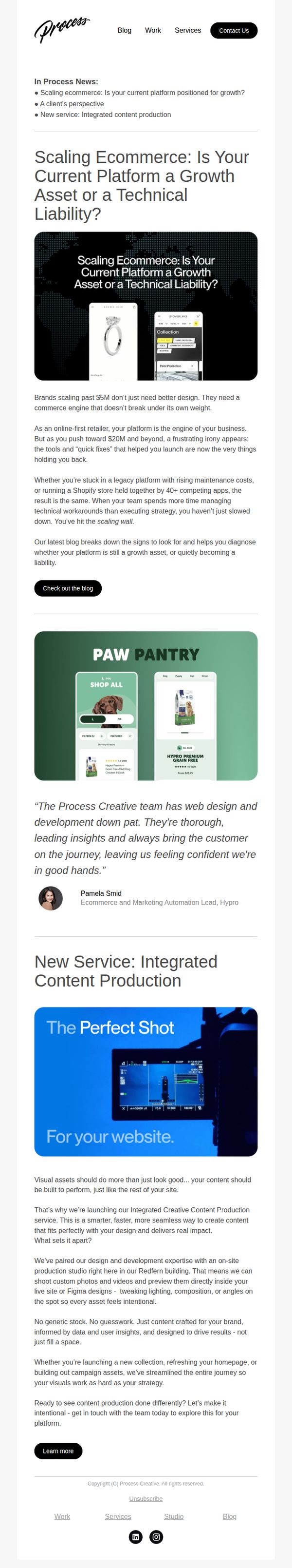
10. Process Creative: How to Scale Ecommerce When Complexity Kicks In
Objective
This email aims to position Process Creative as a strategic partner for high-growth ecommerce brands facing platform limitations, while introducing their new Integrated Content Production service as a solution to scale visual storytelling alongside technical infrastructure.
Why this works
The email opens with a provocative, high-stakes question that immediately resonates with scaling brands, framing platform choice not as a technical detail but as a make-or-break strategic asset that determines whether growth accelerates or stalls.
How to implement
By embedding a real client testimonial from a recognizable brand (Hydro) right after the core problem statement, the email builds instant credibility and emotional trust, subtly signaling that Process Creative has already solved this exact pain point for others in the same position.
Pro Tip
The primary CTA 'Check out the blog' is buried under a long educational section; reposition it as a sticky button or add a secondary CTA like 'Diagnose Your Platform Now' to capture urgency before the reader scrolls past the value proposition. • The new service section lacks a clear visual hierarchy, consider adding a short bullet list or icon-based benefits (e.g., 'On-site studio', 'Live preview in Figma', 'Data-driven visuals') to help skimmers grasp the unique value faster without reading dense paragraphs.