The complete Semana Santa email collection from real brands
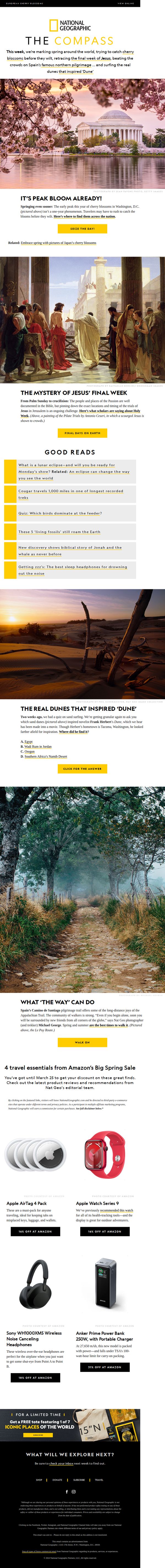
1. National Geographic: How did Jesus’ final days unfold? Plus, cherry blossoms, Monday’s eclipse, save on travel must-haves.
Objective
This email aims to engage subscribers with a curated mix of timely cultural, historical, and travel content while subtly promoting affiliate product sales and brand loyalty through exclusive offers and compelling storytelling. It balances education with commerce to keep readers returning weekly.
Why this works
The email masterfully blends high-curiosity cultural moments, like Jesus’ final days and cherry blossoms, with practical travel gear recommendations, making educational content feel personally relevant and commercially actionable without being pushy.
How to implement
By anchoring each section in a visually arresting photograph paired with a tight, question-driven headline, the email creates an immersive experience that invites exploration while maintaining a clear editorial voice that aligns with National Geographic’s trusted brand identity.
Pro Tip
The product grid section lacks visual hierarchy, the Apple Watch and AirTags are visually dominant but not clearly prioritized; consider using size, placement, or badges to highlight the highest-converting or most editorially relevant item first. • The footer’s ‘FREE tote’ offer is visually buried under dark background and small text; move it higher or add a bright accent color and icon to increase visibility and conversion potential without disrupting the editorial flow above.
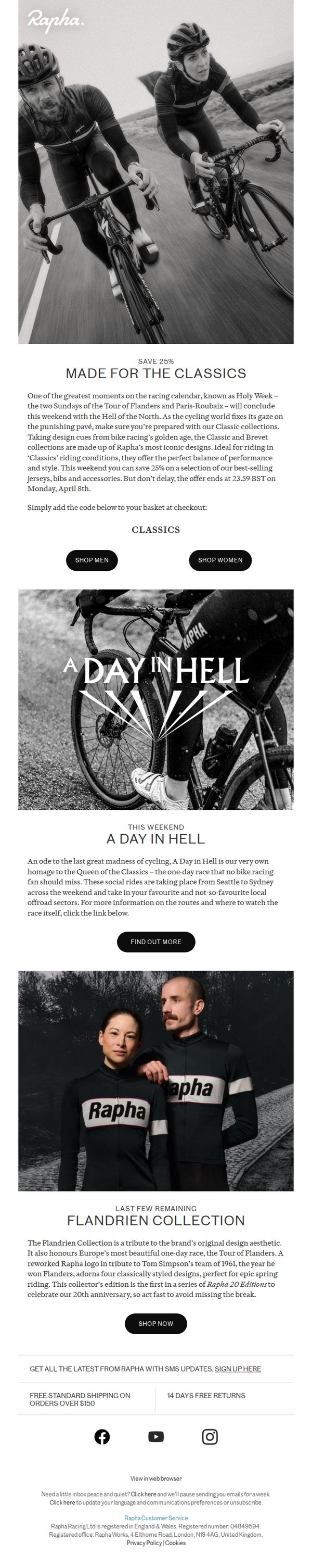
2. Rapha: Made for the Classics
Objective
This email aims to drive immediate sales by promoting a limited-time 25% discount on Rapha’s Classic and Brevet collections, timed to coincide with the cycling ‘Holy Week’ races, while also building brand affinity through storytelling around iconic events like ‘A Day in Hell’ and the Flandrien Collection.
Why this works
The email brilliantly ties product promotion to a real-time cultural moment in cycling, Holy Week, making the discount feel urgent, relevant, and emotionally resonant rather than just transactional.
How to implement
By weaving in storytelling around ‘A Day in Hell’ and the Flandrien Collection, Rapha elevates its products beyond apparel into symbols of cycling heritage, deepening customer connection and justifying premium positioning.
Pro Tip
The primary CTA ‘SHOP MEN’ is gendered and may alienate or overlook female riders; adding a more inclusive or dual-gender CTA like ‘SHOP CLASSICS’ above or alongside the gendered buttons would broaden appeal without losing clarity. • The discount deadline (April 8th) is mentioned only in the body text, adding a visual countdown timer near the CTA would heighten urgency and improve conversion by making the time-sensitive offer impossible to miss.
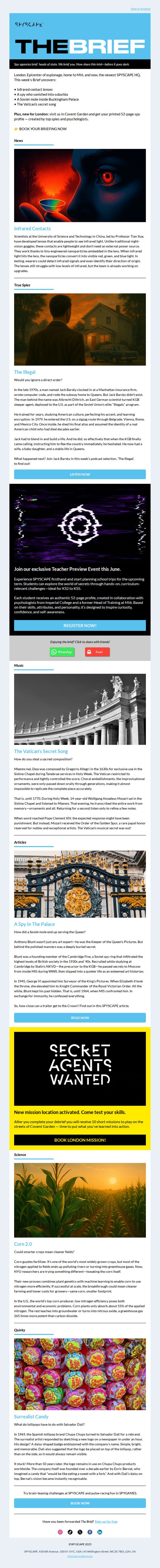
3. SPYSCAPE: The Brief - A Spy in the Palace 🕵🏼♂️
Objective
To engage subscribers with spy-themed intelligence, news, and historical intrigue while driving bookings for SPYSCAPE’s London experience and teacher preview events. The email blends education, entertainment, and conversion to position SPYSCAPE as both a cultural destination and an experiential learning hub.
Why this works
The email masterfully frames real-world espionage as immersive storytelling, using dramatic headlines and cinematic visuals to transform educational content into a thrilling narrative that compels readers to feel like active participants in global spy history.
How to implement
By anchoring each section around a specific spy mystery or scientific breakthrough, from infrared contact lenses to Vatican musical secrets, the campaign turns curiosity into a conversion engine, making every click feel like uncovering classified intel rather than just browsing an attraction.
Pro Tip
The CTA 'BOOK YOUR BRIEFING NOW' appears only once near the top; adding secondary CTAs after high-engagement sections (like after 'The Illegal' podcast teaser or the 'Secret Agents Wanted' banner) would capture momentum and reduce scroll abandonment. • While visually rich, the email lacks a clear hierarchy of urgency, integrating a countdown timer for the Teacher Preview Event or limited-availability missions would create scarcity and nudge time-sensitive decisions without disrupting the editorial tone.
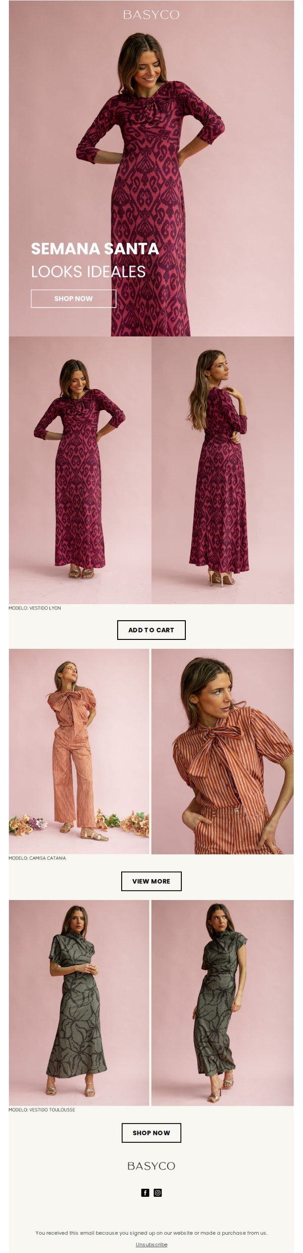
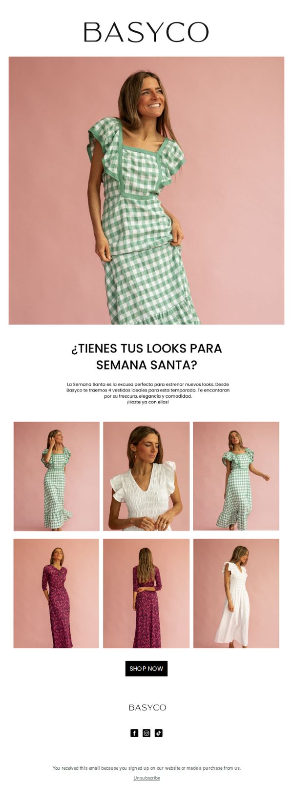
4. BasycoJerez: LOOKS PARA SEMANA SANTA, ¡ya está aquí!
Objective
This email campaign aims to drive immediate purchases by showcasing curated Holy Week fashion looks that align with cultural traditions and modern style, encouraging subscribers to shop the collection before the holiday season peaks.
Why this works
The email leverages cultural timing by anchoring its messaging to Semana Santa, creating urgency and relevance that resonates emotionally with the target audience while positioning the brand as a go-to for festive attire.
How to implement
Each outfit is presented with multiple angles and styled context, helping shoppers visualize themselves wearing the pieces, this reduces purchase hesitation by simulating an in-store try-on experience through digital storytelling.
Pro Tip
Add a subtle countdown timer or limited-availability tag near the hero CTA to amplify urgency, since Holy Week is time-sensitive and shoppers respond strongly to scarcity cues during cultural events. • Include a short testimonial or social proof snippet under each outfit (e.g., 'Worn by 200+ customers this season') to build trust and reduce perceived risk for first-time buyers.
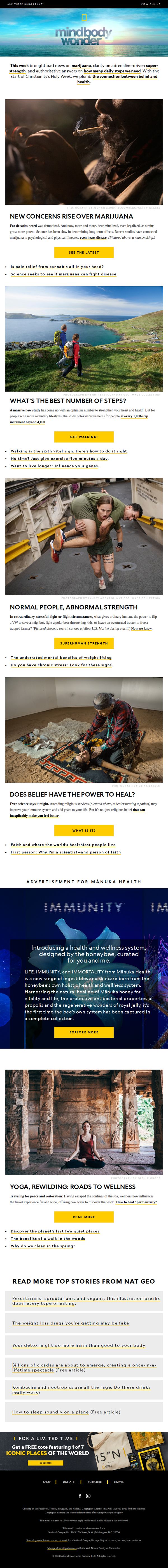
5. National Geographic: Does faith help health? Plus: Marijuana’s bad news; stress and superhuman strength; the new magic number for steps?
Objective
This email aims to engage readers with science-backed, curiosity-driven stories about health, belief, and human potential while subtly promoting National Geographic’s brand authority and driving traffic to deeper content. It also includes a promotional offer to convert interest into subscriptions.
Why this works
The email opens with a bold, question-driven subject line and immediately follows up with a punchy summary that teases multiple high-interest topics, creating instant curiosity and giving readers multiple reasons to keep scrolling.
How to implement
Each article section is anchored by a powerful, emotionally resonant image paired with a tight, benefit-focused headline and a single, action-oriented CTA button, making it effortless for readers to self-select their next deep dive without decision fatigue.
Pro Tip
The CTA 'SUBSCRIBE' at the bottom is visually underwhelming compared to the vibrant yellow article CTAs above it; it should be redesigned with higher contrast, larger size, or a more urgent label like 'Claim Your Free Tote Now' to match the promotional value offered. • The email lacks a clear visual hierarchy guiding the reader from curiosity to conversion, adding a subtle progress bar or 'Top 3 Stories You Can’t Miss' badge near the top would help funnel attention toward the most conversion-friendly content sections.
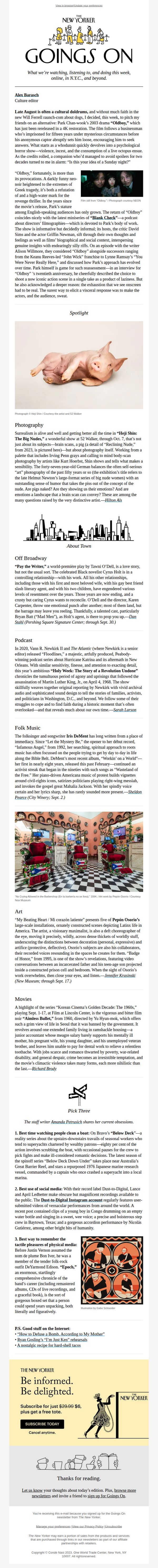
6. The New Yorker: Goings On: The Surreal Nudes of Heji Shin
Objective
This email aims to inform readers about culturally rich events, exhibitions, and media across New York City and beyond, while subtly encouraging subscription through a value-driven closing offer. It positions The New Yorker as a curator of intelligent, offbeat, and emotionally resonant experiences.
Why this works
The email masterfully blends highbrow cultural critique with accessible, human-centered storytelling, like describing a pig’s portrait as both surreal and emotionally evocative, to make avant-garde art feel personally relevant and worth exploring.
How to implement
By curating not just events but emotional experiences, from the exhaustion of watching ‘Oldboy’ to the tenderness in Iris DeMent’s music, the newsletter transforms passive consumption into active cultural participation, deepening reader loyalty through shared feeling.
Pro Tip
Add a visual hierarchy to the 'Pick Three' section by using icons or numbered badges next to each item to guide attention and improve scannability for mobile users who may miss the curated nature of the list. • Reposition the subscription CTA higher in the email, perhaps after the first major cultural highlight, to capture interest at peak engagement rather than waiting until the end when reader momentum may have waned.
7. 1-800-Flowers: What Suffering Can Teach Us

Objective
This email aims to deepen emotional connection with subscribers by exploring the philosophical and spiritual dimensions of suffering, while subtly reinforcing 1-800-Flowers’ brand as a thoughtful, human-centered companion during life’s hardest moments.
Why this works
The email masterfully reframes suffering not as a flaw in life but as a universal catalyst for growth, using cross-cultural spiritual traditions to create emotional resonance that aligns with the brand’s mission of meaningful connection.
How to implement
By inviting readers to share personal stories of hardship and resilience, the campaign transforms passive subscribers into active participants, building community and trust while gathering authentic user-generated content for future marketing narratives.
Pro Tip
Add a subtle visual cue or micro-animation near the 'SHARE YOUR STORY' buttons to draw attention without disrupting the contemplative tone, this would increase click-through by guiding the eye after emotional engagement. • Include a brief, empathetic sentence before the first CTA (e.g., 'Your story matters, no matter how small or quiet') to reduce psychological friction and encourage participation from readers who may feel their experience isn’t 'big enough' to share.
8. BasycoJerez: ¿Preparada para Semana Santa?
Objective
This email aims to inspire customers to shop for Semana Santa by showcasing four fresh, elegant, and comfortable dresses that align with the season’s aesthetic and occasion. It encourages immediate purchase through a clear call to action and visual storytelling.
Why this works
The email masterfully ties seasonal relevance to product selection by framing Semana Santa as the perfect excuse to refresh your wardrobe, making the purchase feel timely and culturally resonant rather than purely transactional.
How to implement
Using a consistent soft pink backdrop across all product images creates a unified, dreamy aesthetic that enhances brand identity and subtly suggests the feminine, elegant vibe associated with the holiday’s dress codes.
Pro Tip
Add a subtle countdown timer or urgency indicator near the CTA to reinforce the seasonal relevance and encourage immediate action, especially since Semana Santa is a time-bound event. • Include a short testimonial or customer review snippet under the hero section to build social proof and reassure shoppers about fit, comfort, or style, especially since the email highlights ‘comodidad’ as a key selling point.
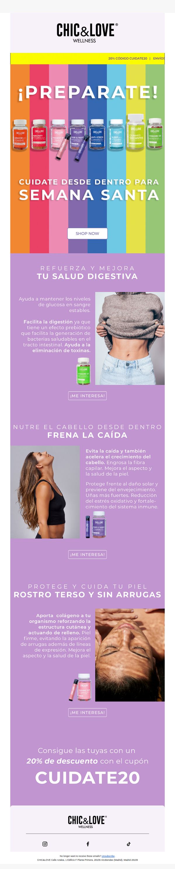
9. CHIC&LOVE: ¡Prepárate para la Semana Santa con nuestros productos! 🌈
Objective
This email aims to drive sales during Semana Santa by promoting CHIC&LOVE’s wellness products as essential self-care solutions for digestive health, hair growth, and skin rejuvenation, while incentivizing immediate purchases with a 20% discount code.
Why this works
The email brilliantly ties seasonal relevance to product benefits by framing wellness as essential preparation for Semana Santa, making self-care feel timely and culturally resonant rather than generic or salesy.
How to implement
Each product section pairs a compelling health benefit with a lifestyle image and a clear CTA button, creating a seamless flow that educates while guiding the reader toward conversion without overwhelming them.
Pro Tip
Add a countdown timer near the CTA to reinforce urgency around the Semana Santa promotion, since the current design lacks time-sensitive cues that could boost immediate conversions. • Include a brief testimonial or social proof snippet under each product section to build trust, especially for first-time buyers, since the current layout relies solely on claims without third-party validation.
10. TIME: When Americans viewed taxes as patriotic
Objective
This email aims to educate readers on the historical context of American taxation as a civic duty while promoting TIME’s partnership with 1440 and encouraging newsletter signups through curated historical content and archival magazine covers.
Why this works
By framing tax history as a patriotic narrative, this campaign successfully transforms a dry policy topic into an emotionally resonant story that connects modern fiscal debates with America’s foundational values and collective identity.
How to implement
The inclusion of vintage TIME magazine covers from pivotal cultural moments creates instant nostalgia and credibility, turning archival material into compelling visual anchors that invite deeper exploration without overwhelming the reader.
Pro Tip
Add a subtle countdown timer or urgency cue near the 'Join for free today!' CTA to nudge procrastinators, especially since the newsletter is positioned as a daily ritual for time-sensitive, intellectually curious readers. • Reposition the 'Subscribe to TIME' button higher in the footer or duplicate it near the top-right of the hero section to improve conversion pathways for users who skim quickly and may miss the bottom call-to-action.