Ukprefulfillment email gallery from real brands


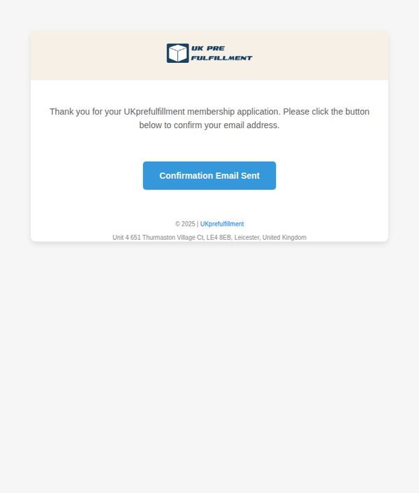
1. Signup Success! 👍
Objective
To confirm the user’s membership application and prompt them to verify their email address, ensuring account legitimacy and enabling future communication. This step builds trust and sets the foundation for onboarding.
Why this works
The email immediately acknowledges the user’s action with gratitude, creating a warm, personal tone that reassures them their application was received and is being processed.
How to implement
By using a clear, action-oriented button labeled 'Confirmation Email Sent,' the design guides users intuitively toward the next step without confusion or unnecessary text.
Pro Tip
Add a visual indicator or brief animation near the CTA button to show the email has been sent, reducing uncertainty and preventing users from repeatedly clicking. • Include a short line below the CTA explaining what to expect next, e.g., 'Check your inbox (and spam folder) within 5 minutes', to manage expectations and reduce support queries.
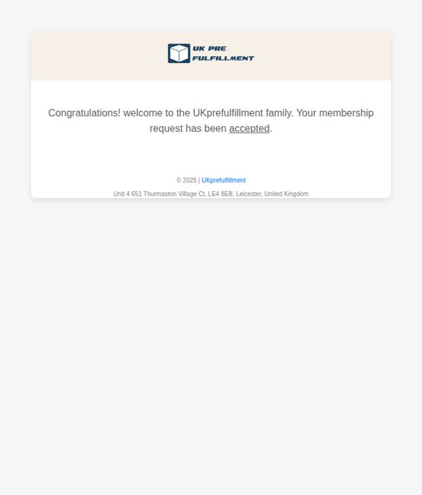
2. About Your Membership Request! 📨
Objective
This email aims to confirm the successful approval of a new member’s request and warmly welcome them into the UKprefulfillment community, reinforcing trust and setting the stage for future engagement.
Why this works
The email opens with an immediate emotional hook, 'Congratulations!', which transforms a routine approval notice into a celebratory moment, making the recipient feel personally valued from the first line.
How to implement
By referring to the brand as a 'family,' the message builds emotional loyalty early, subtly encouraging long-term retention and community participation rather than treating the user as just another account.
Pro Tip
Add a secondary CTA button or link (e.g., 'Get Started Now' or 'Explore Your Dashboard') to guide the new member toward their first action, reducing drop-off after the welcome message. • Include a brief onboarding tip or next-step guide in the body, such as 'Log in to set up your first order', to bridge the gap between approval and active usage, increasing early engagement.
3. Signup Success! 👍
Objective
This email aims to confirm the user’s membership application and prompt them to verify their email address to complete the onboarding process, ensuring account legitimacy and engagement from the outset.
Why this works
The email immediately acknowledges the user’s action with a warm, appreciative tone, reinforcing positive sentiment and reducing friction during the critical onboarding phase.
How to implement
By placing a clear, color-contrasted CTA button directly beneath the instruction, the design guides the user’s eye and minimizes decision fatigue, increasing confirmation completion rates.
Pro Tip
The CTA button text 'Confirmation Email Sent' is misleading, it should say 'Confirm Your Email' or 'Verify My Account' to reflect the user’s required action, not the system’s status. • Add a brief line explaining what happens after confirmation (e.g., 'You’ll gain instant access to your dashboard and fulfillment tools') to motivate immediate action and reduce drop-offs.
4. About Your Membership Request! 📨
Objective
This email aims to confirm the successful approval of a new member’s request and warmly welcome them into the UKprefulfillment community, fostering immediate trust and belonging.
Why this works
The email opens with an enthusiastic congratulations that instantly validates the recipient’s effort, turning a routine approval into a celebratory milestone that builds emotional connection from the first line.
How to implement
By referring to the recipient as part of the 'UKprefulfillment family,' the brand humanizes its service and cultivates loyalty early, subtly signaling long-term partnership rather than transactional engagement.
Pro Tip
Add a secondary CTA button or link (e.g., 'Get Started Now' or 'Explore Your Dashboard') to guide the new member toward their next action, reducing friction and increasing onboarding momentum. • Include a brief welcome message or onboarding checklist in the body to set expectations and provide immediate value, helping the user understand what to do next without needing to search elsewhere.